🧪 Design something with Race Number Vinyl
Transparent Effect
✦ Transparent Effect
Generates a PNG with the background removed — only the text and its visual effects remain. The AI automatically selects the optimal background color for clean removal based on your style.
Output is always PNG for lossless transparency.


More fonts like Race Number Vinyl


Looking for copy-paste fancy text? Try our free Font Generator Tools — cursive, gothic, bubble & 30+ styles.
About Race Number Vinyl Font
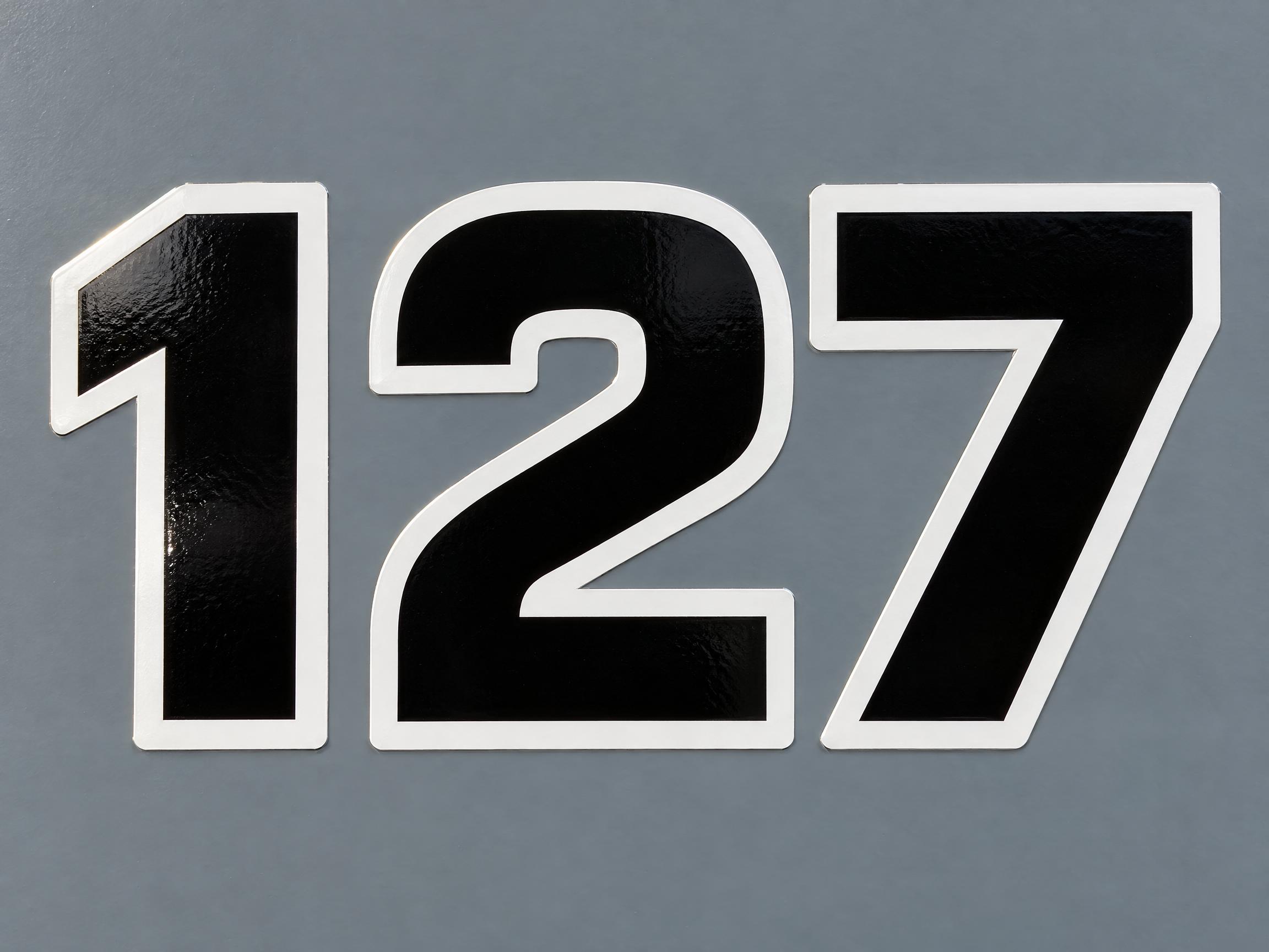
A competition number typeface: the digits come first — wide, never condensed, standing perfectly upright with thick even strokes and open counters. Every glyph is a piece of cut vinyl laid on a painted panel: a thick band of a second colour runs round the outside of each one at an even width, sitting entirely outside the glyph rather than tucked inside it, and the knife-cut edge stays visible all the way round, lifting slightly at the corners.
Emotions
decisiveofficialrace-readyunmissableno-nonsense
Best For
racing number designkart and club racing numbersrace bike number boardtrack day car numbersmotorsport event graphicspit crew and team livery numbers
Vibes
geometricclean
Visual Traits
competition-numberdigits-firstuprightwide-not-condensedthick-outer-bandband-outside-not-insidecut-vinylknife-cut-edgegloss-over-painteven-stroke-weightopen-counters
FAQ
What is the Race Number Vinyl font?
It is a competition number typeface — the digits come first. They stand perfectly upright, wide rather than condensed, with thick even strokes and open counters. Every glyph reads as a piece of cut vinyl on a painted panel: a thick band of a second colour runs round the outside at an even width, and the knife-cut edge of the vinyl stays visible the whole way round, lifting slightly at the corners.
How is it different from a football or sports jersey number font?
Jersey numbers are screen-printed ink on fabric: tall and narrow, with a thin outline tucked just inside the number's own edge. This is the opposite on both counts — the digits are wide rather than condensed, and the contrasting band sits entirely outside the glyph, thick enough to read as a second shape. It also behaves like vinyl rather than ink: a cut edge you can see, and gloss that separates it from the panel.
Does it do letters as well as numbers?
Yes. The digits are what the design is built around, and the letters are drawn to match them — same upright stance, same stroke weight, same outer band. Numbers are where it looks most at home, so short number-and-letter combinations work better than long words.
Can I download Race Number Vinyl?
There's no installable font file. You type your number and the generator builds the lettering fitted to what you actually typed, then returns a high-resolution image.
Where does this style work best?
Racing numbers of every kind — kart and club racing, track days, race bike number boards, motorsport event graphics and team livery numbers. Keep the surface behind it a plain mid tone so the glyph, the outer band and the panel all read apart from each other.
What fonts look similar?
For screen-printed football kit numbers with a thin inner outline, see Football Jersey. For a leaning, flat and wide racing wordmark aimed at words rather than numbers see Racing Slant. For collegiate block numbers with a double outline see Varsity Block.