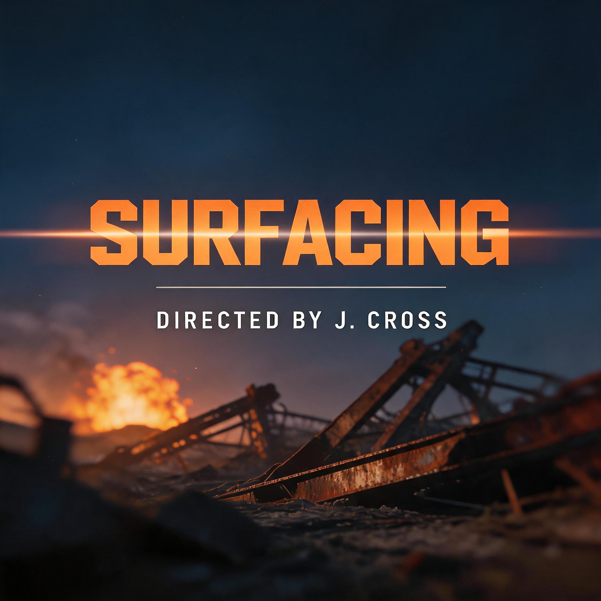
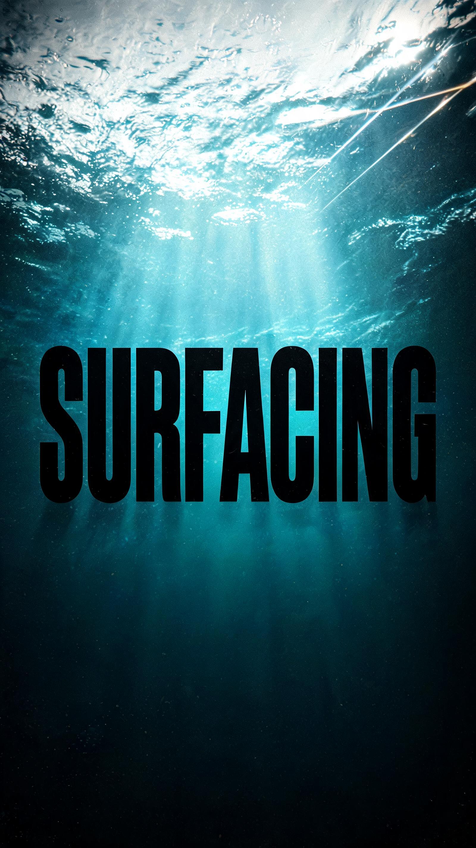
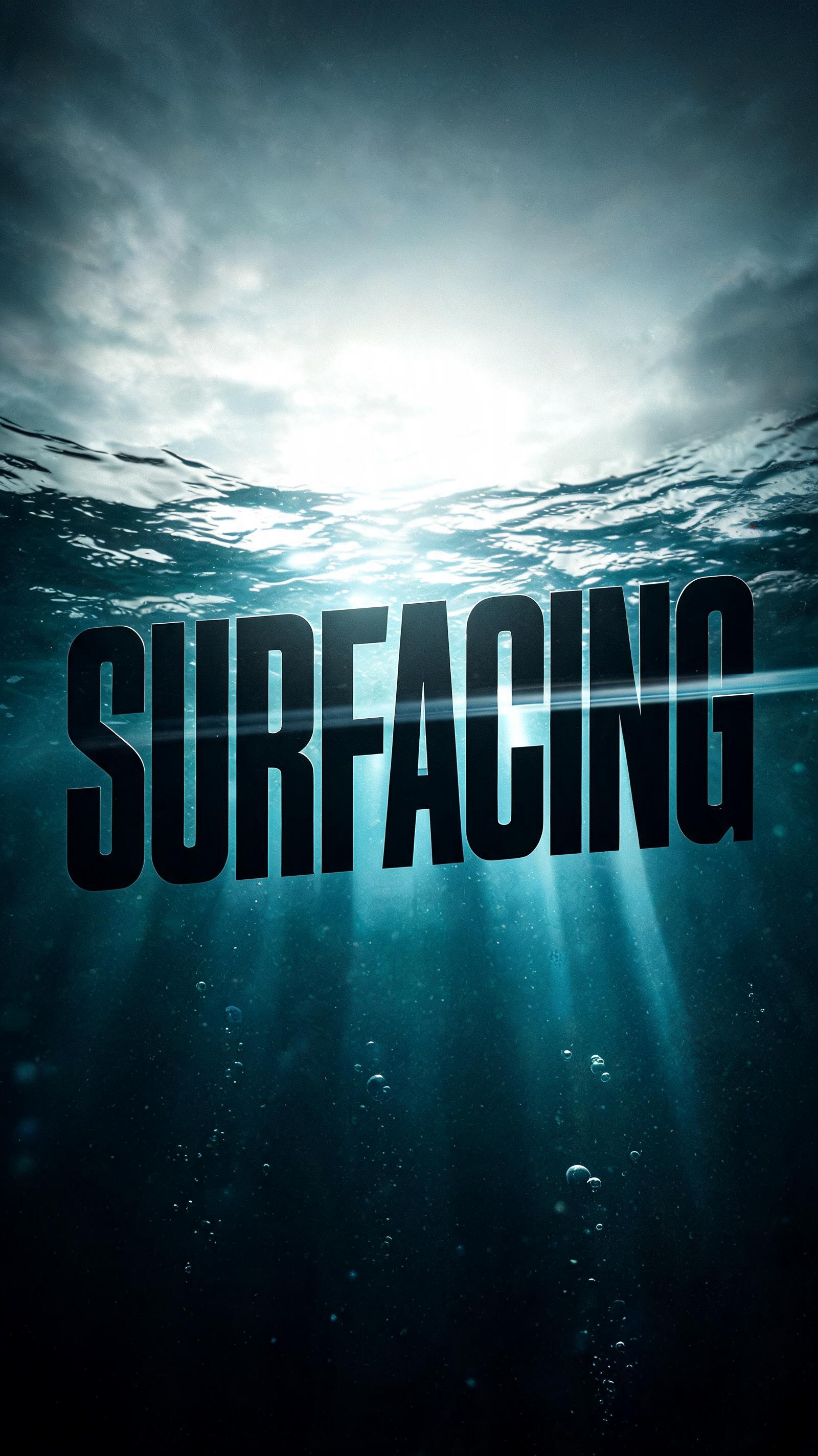
SURFACING - Minimalista Text Effect


Usa BytePlus Seedream 5.0, o modelo desta obra · 15 créditos





“SURFACING ” is a Minimal text effect efeito de texto criado com a IA da FontVibe. Sans serif geométrica cinza-escura com espaçamento generoso e uma única linha finíssima abaixo, chapada e fosca sobre um fundo off-white quase vazio.
a clean, minimal, spacious piece — restrained and modern, defined by what is left out. SURFACE / STYLE: refined typography with generous letterspacing and abundant negative space, a flat matte finish and at most a single fine accent rule or hairline detail — no texture, no gloss, no ornament. SCENE ATMOSPHERE: a calm, bright, uncluttered setting — clean white or soft neutral ground, even diffuse light, architectural emptiness, the luxury of breathing room. PALETTE: a sophisticated monochrome — soft white, light warm grey, charcoal and black, with at most a single muted accent — quiet and tonal, never loud. LETTERFORM PRIORITY: when the chosen font carries its own treatment (clean geometric sans, neutral grotesque, condensed sans, zen minimal, fine monoline), that font's letterform takes priority and owns the letters; this style governs the generous spacing, the negative space, the matte monochrome finish and the calm bright scene. FALLBACK MATERIAL: if the font carries no material of its own, render the letters in a clean thin modern sans in soft charcoal on a bright white ground with wide letterspacing, abundant negative space and a single fine accent rule, so the minimal elegance always reads. The word 'SURFACING' rendered with wide, open letterspacing on a clean pale warm-white ground — a single fine hairline rule running beneath the text, precise and unadorned. Abundant negative space surrounds the letterforms, the composition breathing with architectural stillness. Light is flat, even, diffuse — no shadow, no gradient, no hot spot — just a calm luminous field that makes the matte charcoal letterforms read with quiet authority. The surface is bone-white paper-smooth matte with zero texture or gloss. A faint secondary line of ultra-light letterforms in mid-grey — perhaps a repeated echo of the word at a fraction of the size — floats in the lower negative space as a delicate typographic device, adding spatial depth without noise. Palette: soft white ground, charcoal primary text, a single warm mid-grey accent rule, nothing more. The mood is editorial restraint — a magazine opener or architecture monograph title page — where whitespace is the dominant compositional element and the letterforms emerge from it the way a form surfaces from still water.
Gerada em 4 de julho de 2026 · 1728 × 2304 · JPEG · BytePlus Seedream 5.0 · Compartilhada pelo criador · Uso comercial gratuito (CC BY 4.0)