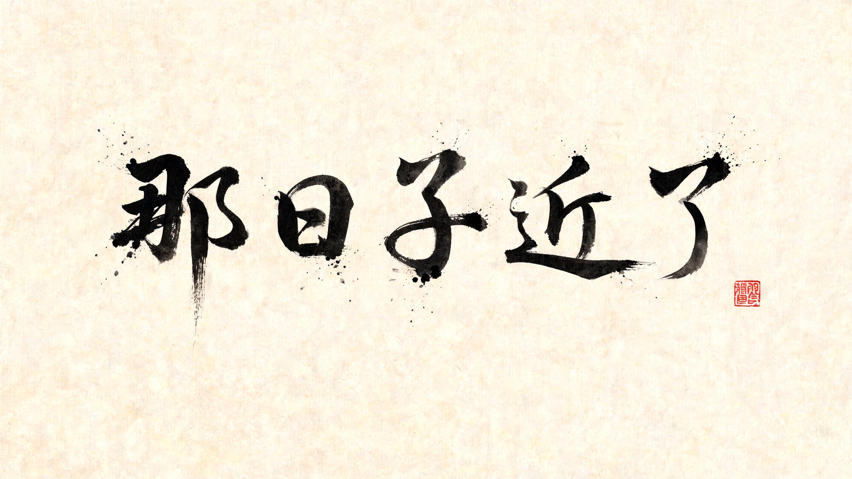
那日子近了 - Japanese Ink Brush Text Effect

Japanese ink brush aesthetic — the visual language of sumi calligraphy on washi paper. INK MEDIUM: sumi pigment in deep...


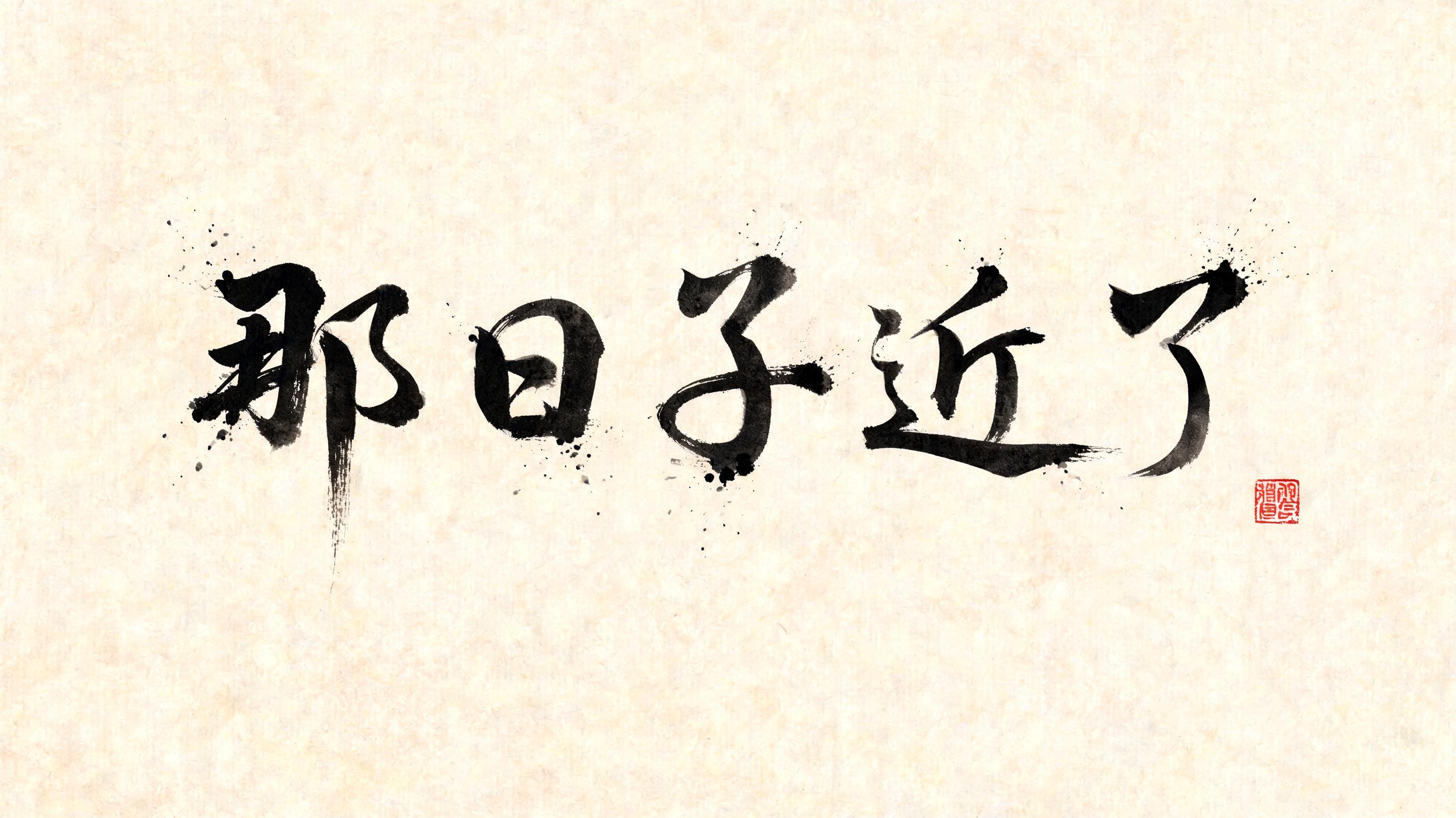
“那日子近了” is a Brush Japanese Ink text effect text effect created with FontVibe AI. Japanese Shodo ink brush calligraphy style applied to Latin letterforms. Deep sumi black ink with authentic fude brush energy, controlled single-direction strokes, and washi paper atmosphere. Perfect for Japanese restaurant branding, tattoo design, anime, martial arts, and cultural projects. Japanese ink brush aesthetic — the visual language of sumi calligraphy on washi paper. INK MEDIUM: sumi pigment in deep black to charcoal range — richest density at mark centers, naturally transitioning outward as ink supply depletes. Fully matte, absorbed into paper surface, producing a tonal range from dense opaque black to transparent grey depending on dilution and brush load. PAPER SURFACE: natural washi — warm cream-white base with visible paper fiber structure giving slight texture. The absorbent surface creates the characteristic soft border quality of East Asian brush work at all mark edges. LIGHT ATMOSPHERE: soft diffuse north-facing studio light — the traditional calligrapher's light source. Even, shadowless, allowing the full tonal range of ink marks to read clearly. Warm cream paper tone contrasts against deep sumi black. AESTHETIC REGISTER: the ma principle — the space between and around marks is as considered as the marks themselves. Compositions have breathing room and deliberate quietness. When no specific material is defined by the font: default environment — deep sumi black marks on warm cream washi paper, soft diffuse overhead light, meditative studio atmosphere. Wide horizontal composition, five characters 那日子近了 rendered in master-level shodo brushwork on aged washi paper with visible warm cream fiber texture. Entry strokes carry full brush load — near-black sumi pigment at maximum density — then the brush lifts and pulls away, thinning into translucent charcoal grey wisps that dissolve into the paper surface. Each character breathes with internal tonal variation: the densest ink pooling along downward pressure strokes, cross-strokes thinning to pale grey as ink depletes. The absorbent washi surface creates characteristic soft feathered edges along all mark boundaries, with controlled ink bleed tracing the paper fiber grain. Negative space between and around each character is deliberate and generous — the ma principle — allowing the eye to rest and the silence to accumulate weight. A fine ink-wash aureole halos the heaviest strokes, a subtle penumbra of diluted sumi bleeding into the cream ground. One small vermilion hanko seal placed with asymmetric intent, its red oxide pigment a single warm note against the cool sumi black. Soft diffuse north-light falls evenly across the composition, no cast shadows, the full tonal range from opaque black to near-invisible grey reading with perfect clarity. The overall atmosphere carries a quality of quiet anticipation — time slowing — rendered entirely through the physics of ink, absorbency, and breath-controlled brush pressure.
Generated on Aug 13 · 2848 × 1600 · JPG · Shared by the creator


