

Sometimes - Anime Text Effect


Usa ByteDance Seedream 5.0, el modelo de esta obra · 15 créditos
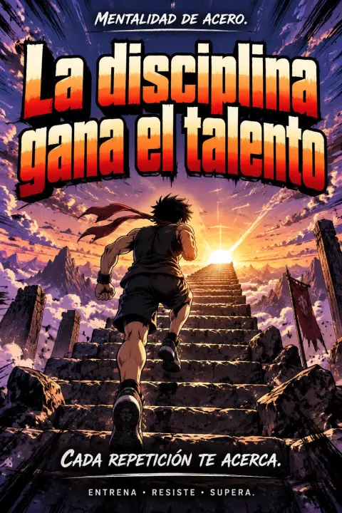

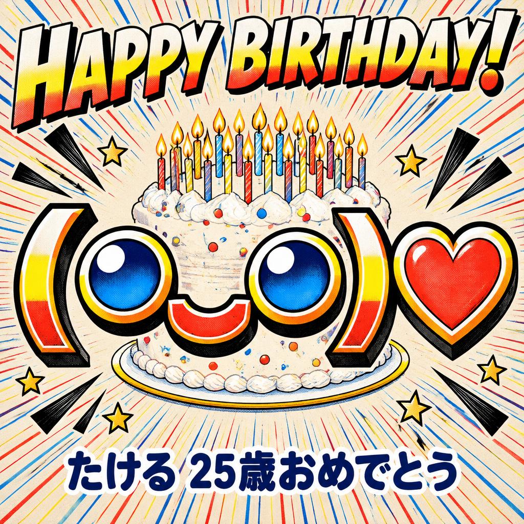
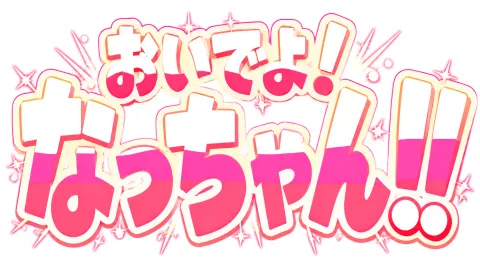
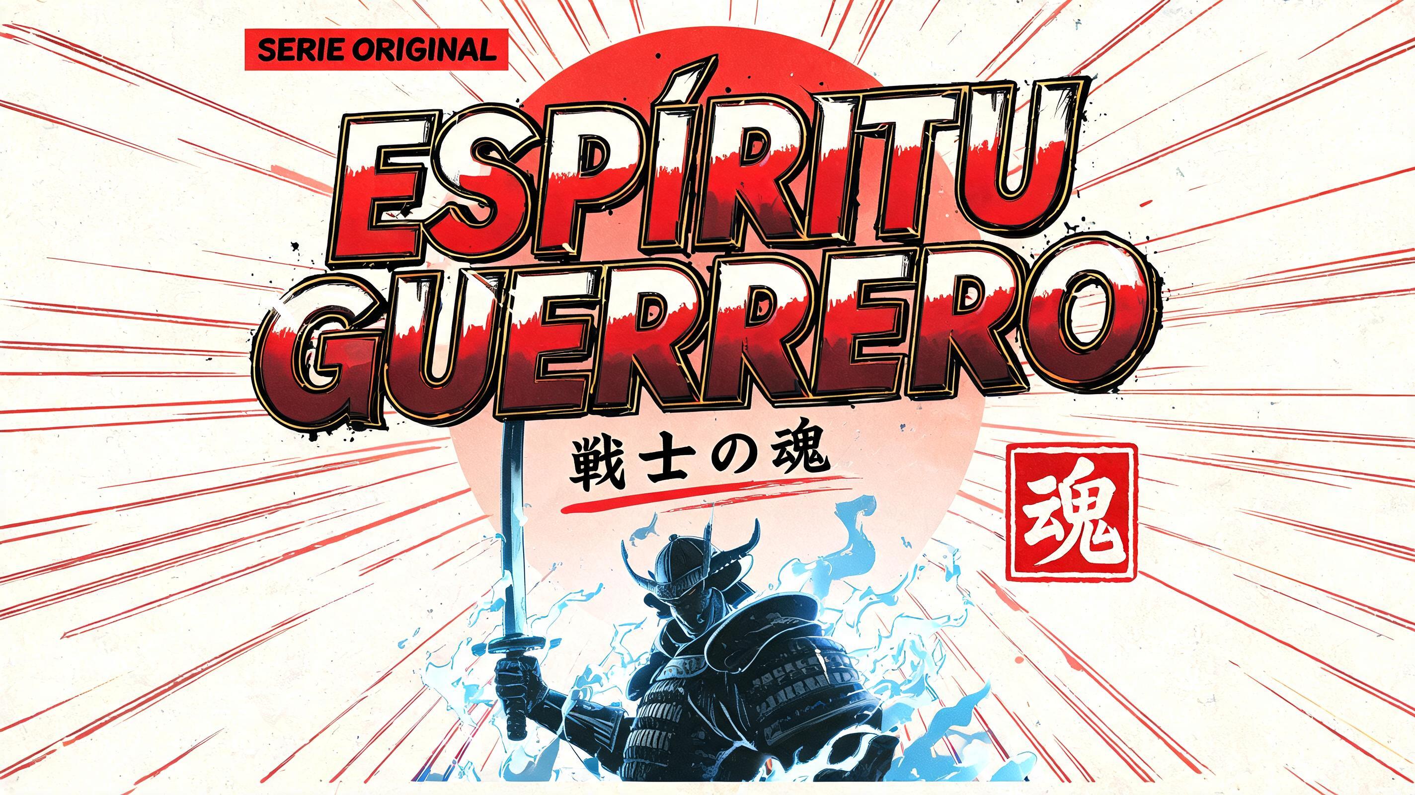

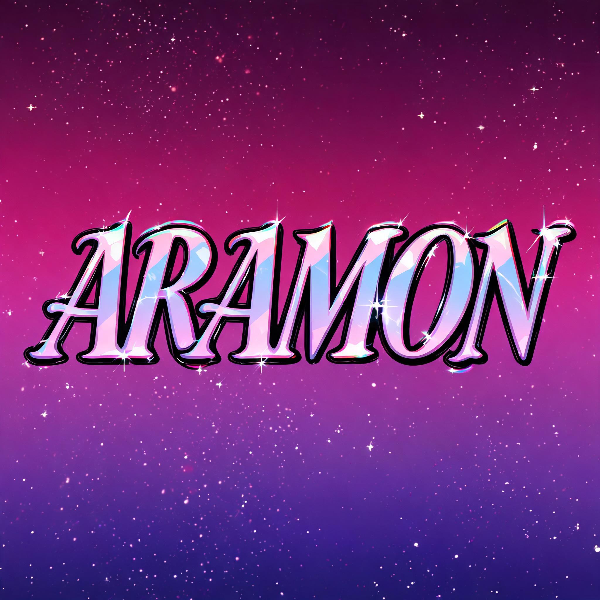
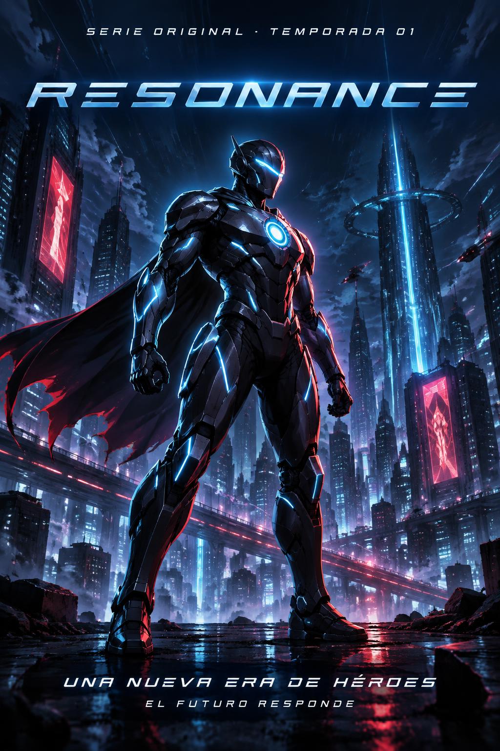
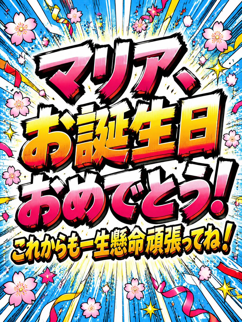
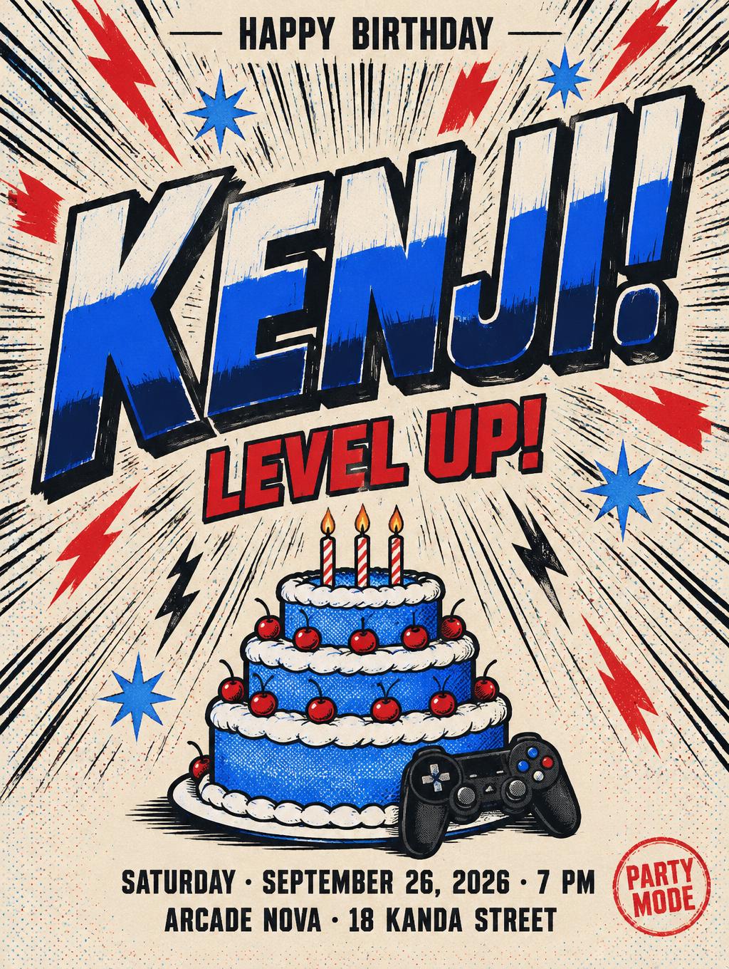



“Sometimes” es un efecto de texto Anime creado con FontVibe IA. Rotulación de título shōnen: contornos negros gruesos entintados a mano, sombreado cel plano dividido en bandas duras de luz y sombra, letras inclinadas y dinámicas sobre blanco con líneas de velocidad radiales.
rendered in Japanese gothic display letterforms adapting the visual language of Japanese Gothic (ゴシック体) typefaces to Latin alphabet — letters have near-uniform stroke weight with minimal thick-thin contrast, slightly rounded terminal treatment at stroke ends, high x-height with compact ascenders and descenders for dense grid packing, and consistent moderate letter width. The letter spacing is tight, creating a dense typographic texture. The construction philosophy follows the Japanese Gothic principle of maximum density with maintained readability. The typographic language of Japanese technology magazine cover typography, contemporary Japanese graphic design, J-pop album art, and cyberpunk anime title sequences — dense, precise, quietly technical. rendered in bold Japanese anime title style with thick dynamic outlines and vibrant color fills — sakura pink highlights and sky blue shadows. Manga speed lines radiating from behind, sparkle and star effects around letters. Dynamic tilted composition, clean cel-shaded look. SOMETIMES as nine bold anime title letters arranged in a slightly tilted composition, angled 4° clockwise, centered in frame. Thick black outlines wrap every letterform with crisp precision. The letters are rendered in a vibrant cel-shaded palette — sakura pink body fills with a single bright white highlight stripe running diagonally across each letter, sky blue cast shadows anchoring the base of each character. A blazing impact burst explodes from the center background, radiating sharp white and pale gold speed lines outward in all directions, filling the entire backdrop with explosive energy. Secondary manga speed lines streak horizontally and diagonally outward from the left and right edges of the word. Four-pointed gold star sparkles and white flash effects cluster at letter tips, corners, and stroke intersections throughout the word. A faint pastel gradient — warm pink at the top bleeding into cool lavender at the bottom — underlies the burst pattern. Small diamond-shaped sparkle trails drift upward from the tops of the tallest letters. The overall composition feels like a dramatic emotional freeze-frame from a slice-of-life anime, mid-transformation sequence energy, heartfelt shonen moment, bold and visually explosive yet with a soft romantic undertone carried by the pink and lavender atmosphere.
Generada el 9 de mayo de 2026 · 2048 × 2048 · JPEG · ByteDance Seedream 5.0 · Compartida por el creador · Uso comercial gratuito (CC BY 4.0)


