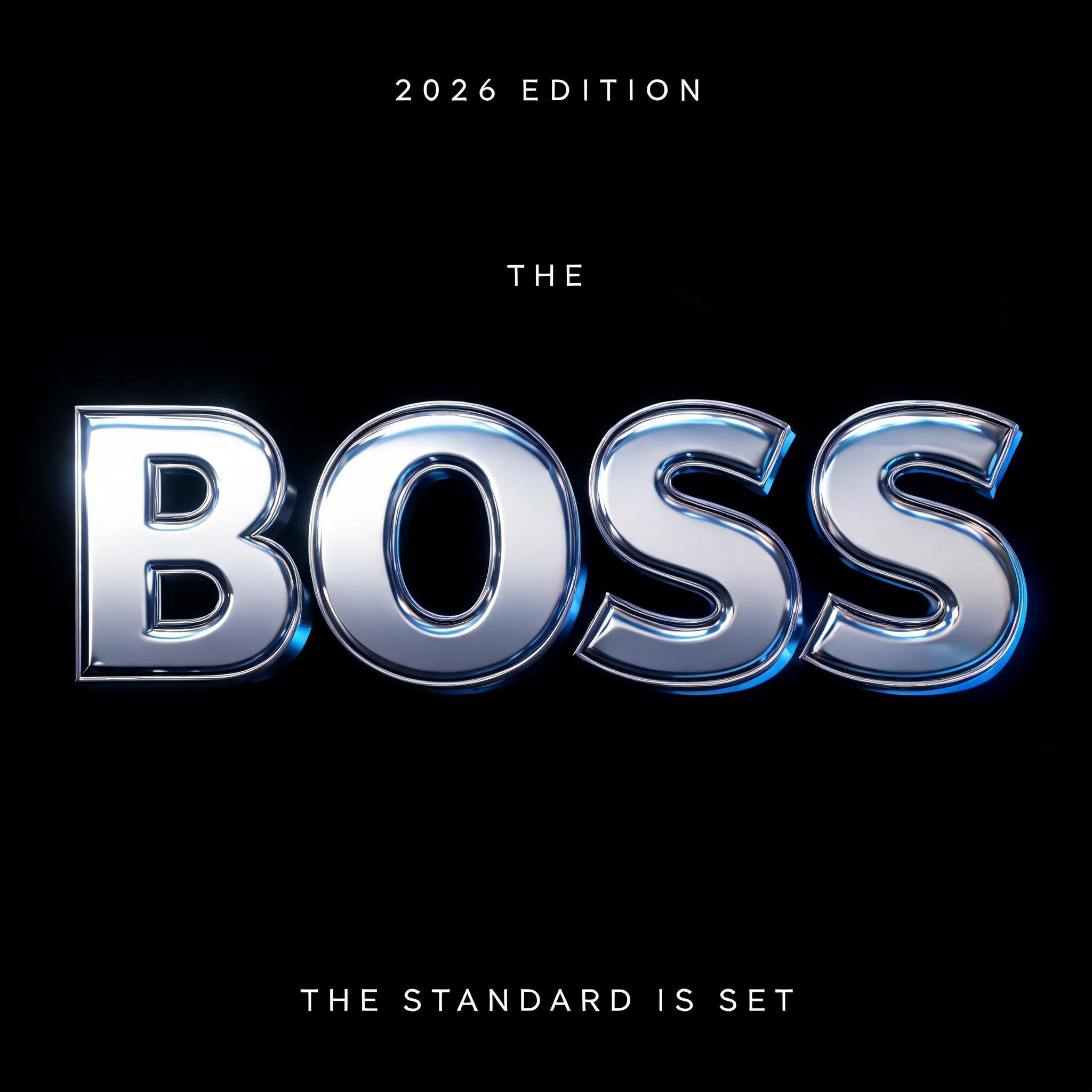
THE BOSS 2026 EDITION THE STANDARD IS SET - Cromo Metálico 3D Text Effect


Usa BytePlus Seedream 5.0, o modelo desta obra · 15 créditos
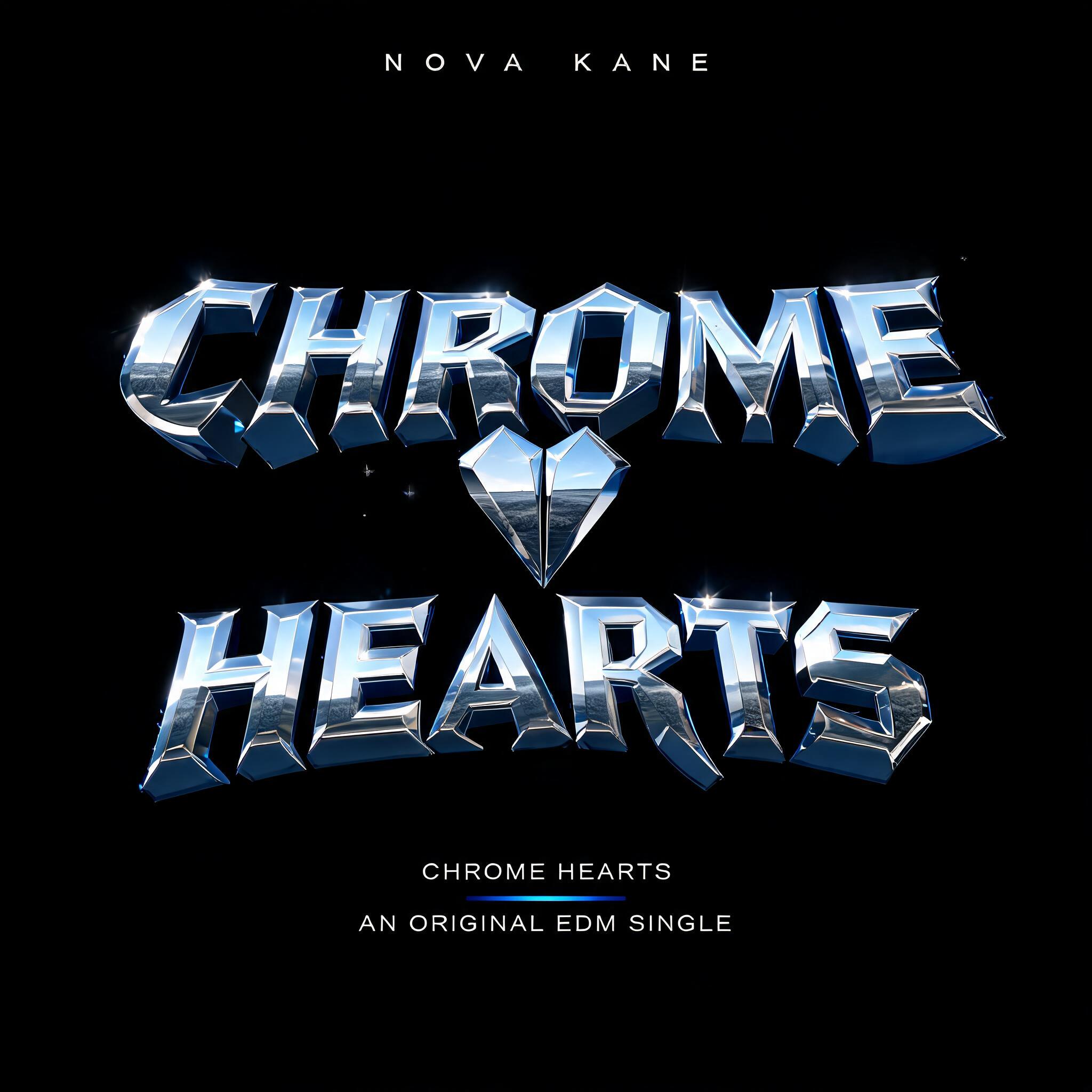
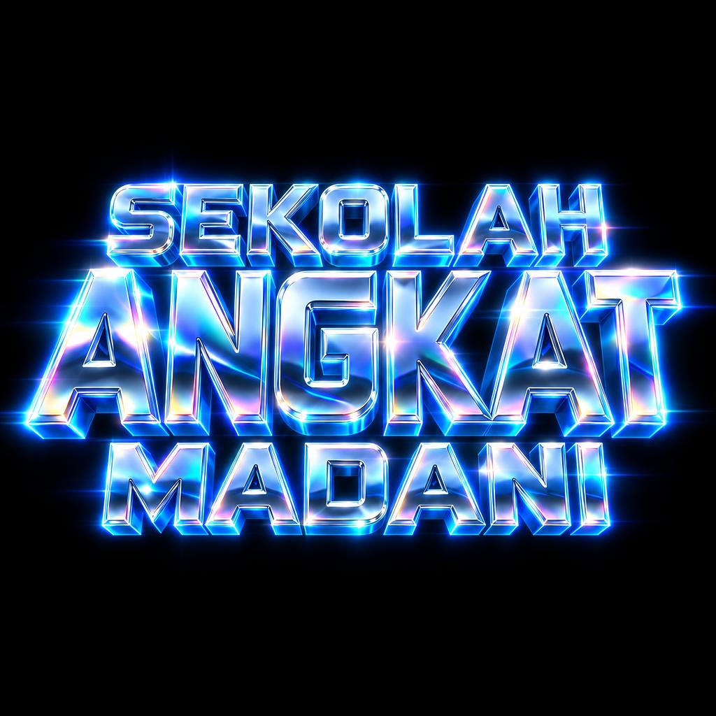
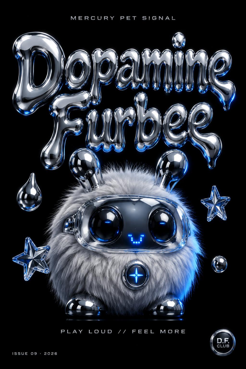
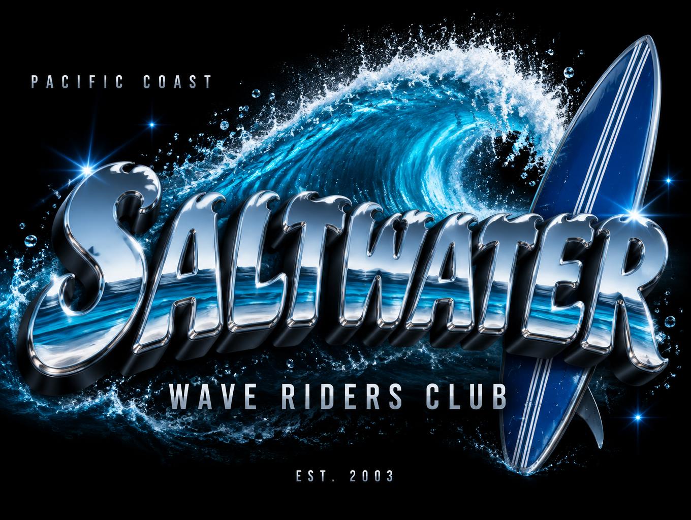
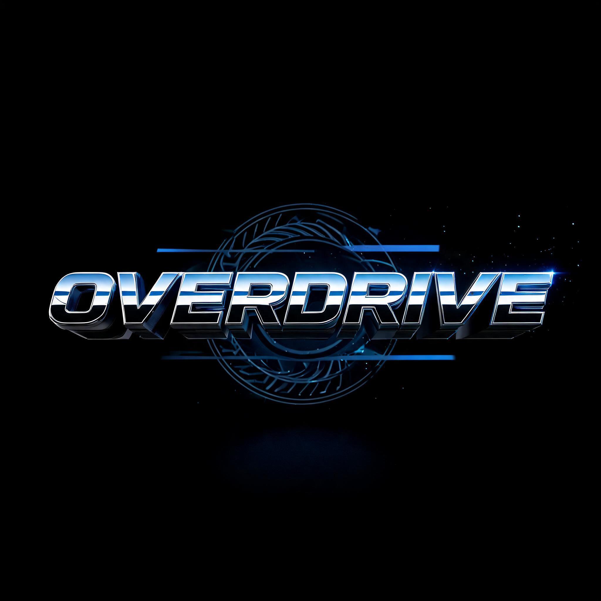
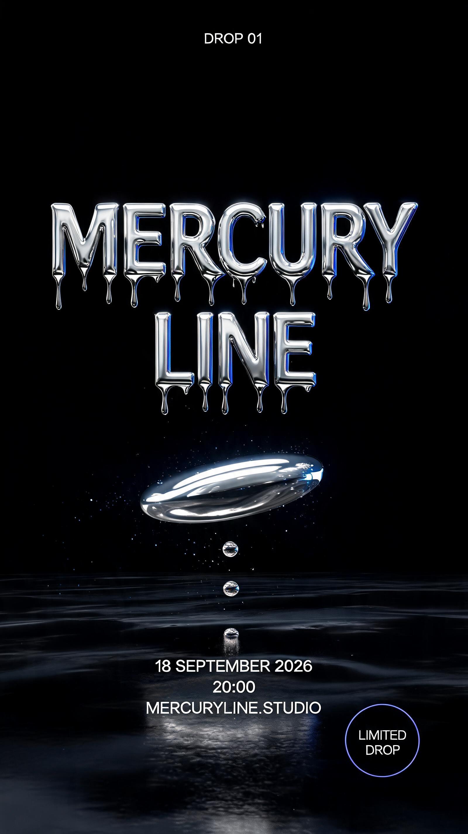
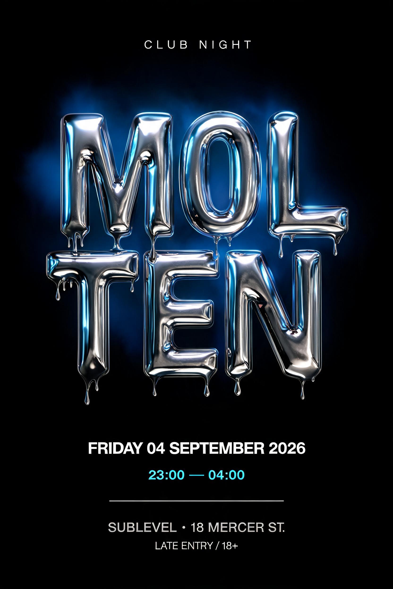
“THE BOSS 2026 EDITION THE STANDARD IS SET” is a Chrome Metal 3d text effect efeito de texto criado com a IA da FontVibe. Letras metálicas 3D com acabamento cromado espelhado, brilhos prateados afiados e uma precisão industrial fria. Branding de games, capas de música, times de esports: a escolha certa quando você quer autoridade metálica sem meias palavras.
Create a finished square 1:1 typographic key-art poster, not a mockup. Pure black void background with only faint reflected abstract blue geometric planes visible inside the metal surfaces; no warm tones, no colored background, no organic objects. Exact rendered copy, set with perfect spelling: - small top eyebrow: “2026 EDITION” - dominant two-line headline: “THE” / “BOSS” - small bottom line: “THE STANDARD IS SET” Composition: centered vertical layout with generous black negative space. “2026 EDITION” sits at top center, small and widely tracked. “THE” sits centered above “BOSS” at 18% canvas height, approximately one-third the size of BOSS. “BOSS” occupies the central 50% of the canvas width and height, oversized but fully inside the frame. Bottom statement is centered at 84% canvas height, small and sharply legible. Design “THE BOSS” as custom early-2000s Y2K silver display lettering: slightly wide proportions, rounded corners, subtly inflated smooth convex faces, heavy weight, tight but readable spacing. Build each letter as a deep 3D extrusion. The face is polished high-reflection silver aluminum: bright white convex-center highlight, cool mid-silver gradients across the sides, near-black cold shadow in recessed areas, and faint electric-blue reflections. Trace every top bevel and curved upper edge with an ultra-thin razor-white specular line. Add a narrow electric-blue rim light only along the right contours; cast deep blue-black extrusion shadows down-left. Mirror-clean surface, no scratches, no grain, no matte finish. The two smaller text tiers use thin compact silver capitals with the same cool reflective finish, restrained depth, and clean spacing. Studio-quality ray-traced metallic render, sharp bevel definition, high contrast, controlled bloom only on white highlights and blue rim edges, crisp typography, frontal camera, symmetrical alignment, 8k detail. No people, no logos, no extra words, no watermark.
Feito para Gerador de Fontes Prateadas
Gerada em 9 de setembro de 2026 · 2048 × 2048 · JPEG · BytePlus Seedream 5.0 · Compartilhada pelo criador · Uso comercial gratuito (CC BY 4.0)