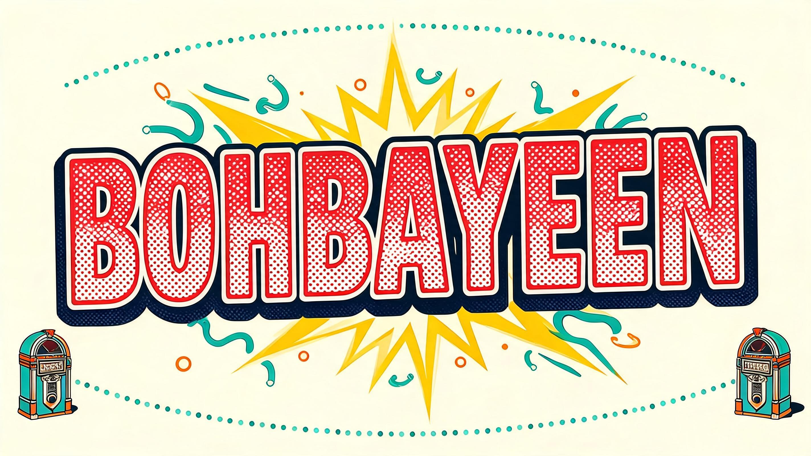
BOHBAYEEN - Retro Pop Text Effect


Usa BytePlus Seedream 5.0, o modelo desta obra · 15 créditos
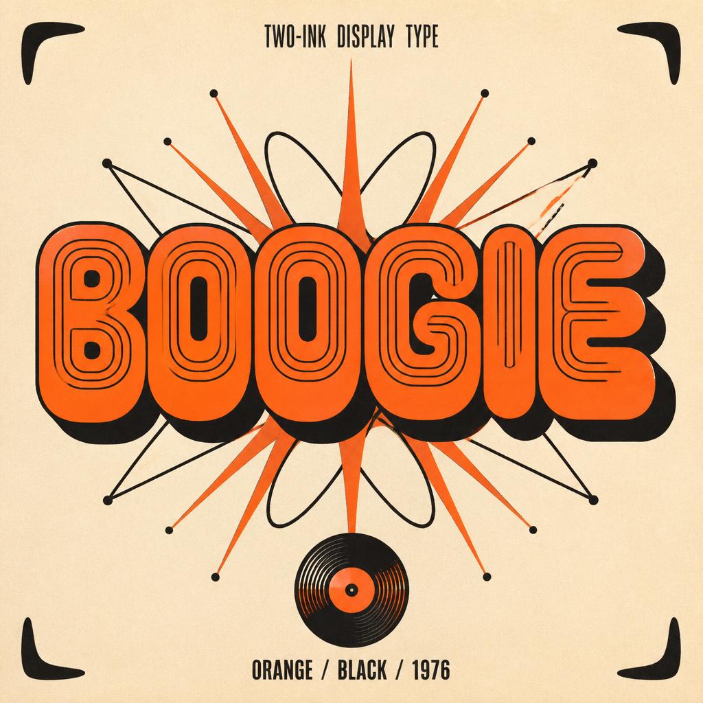
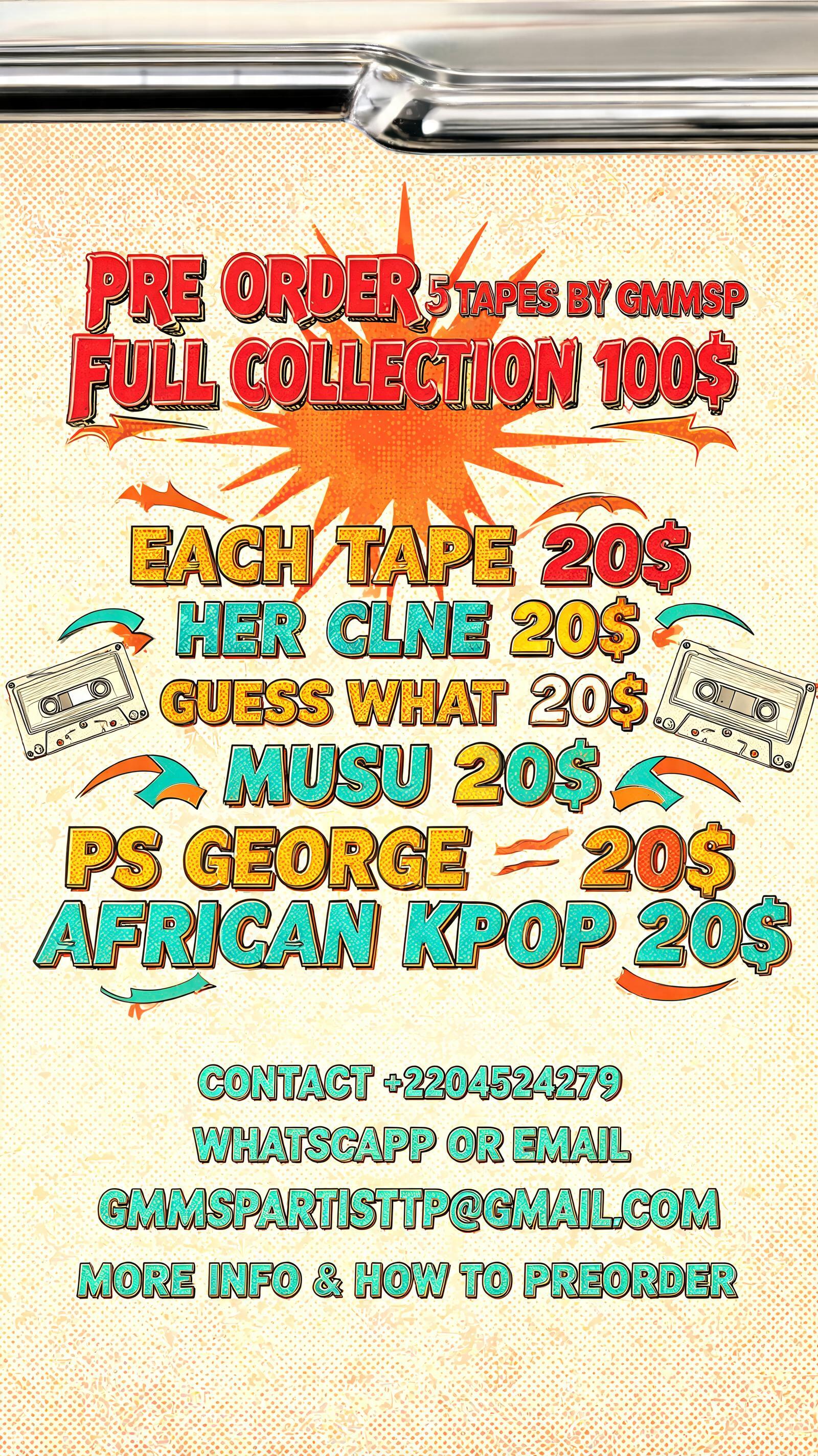
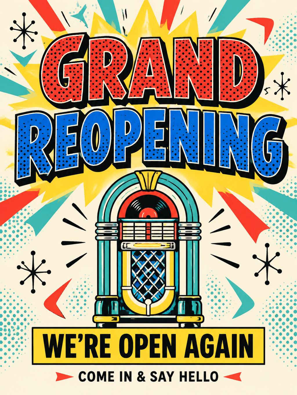

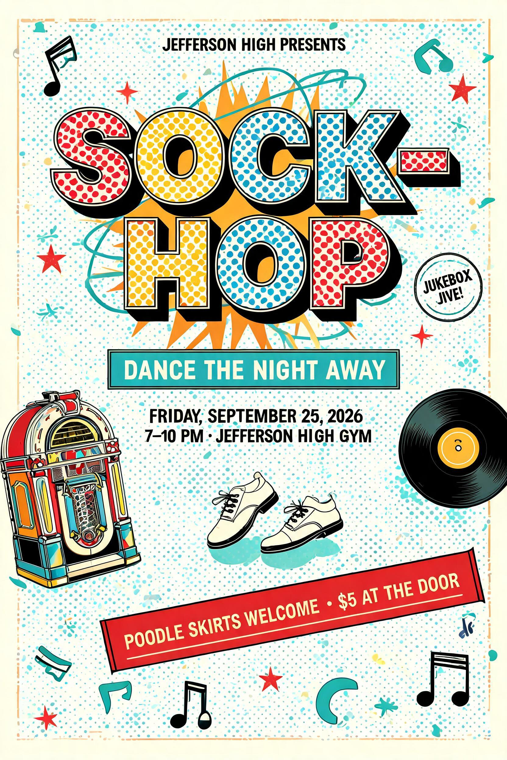
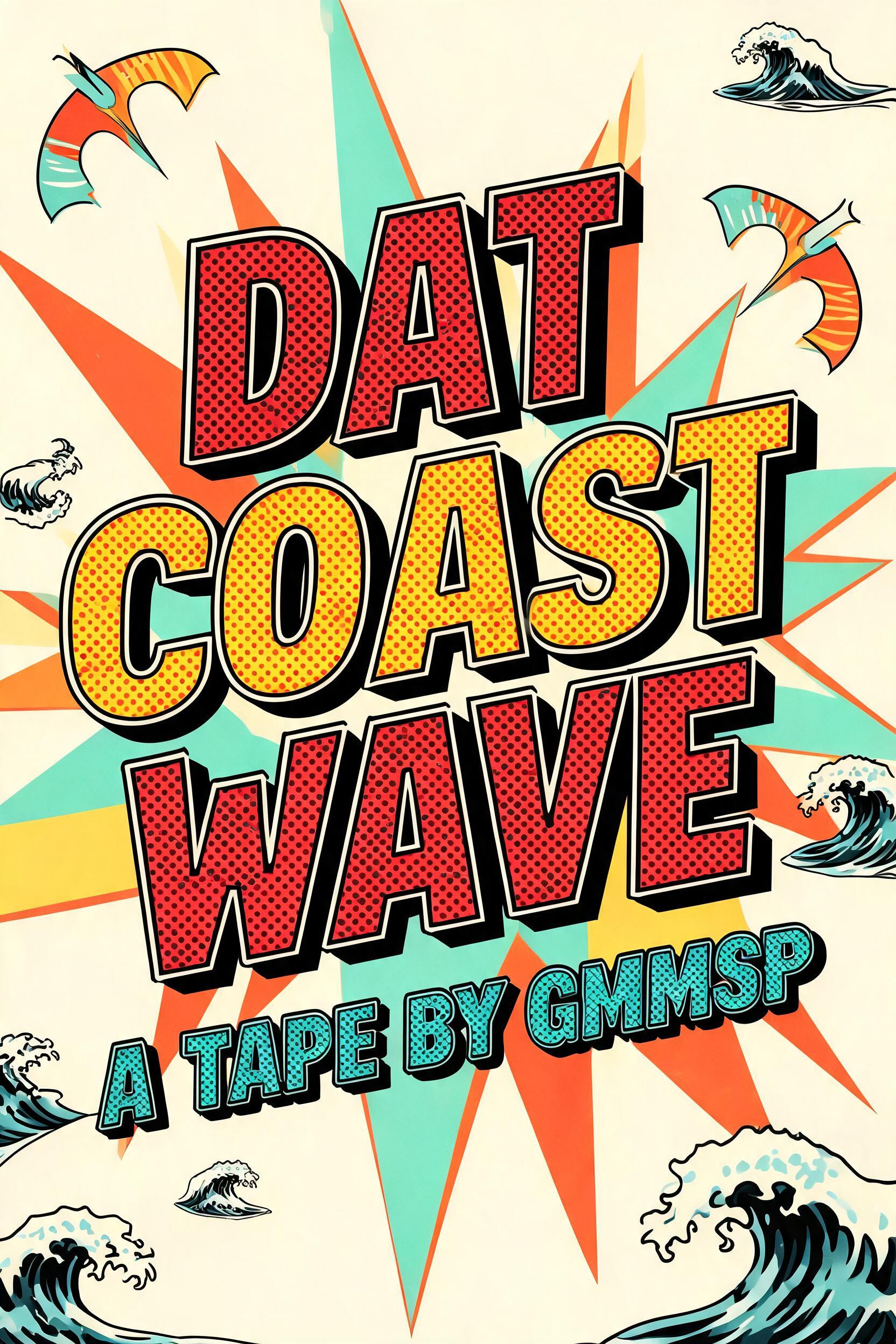
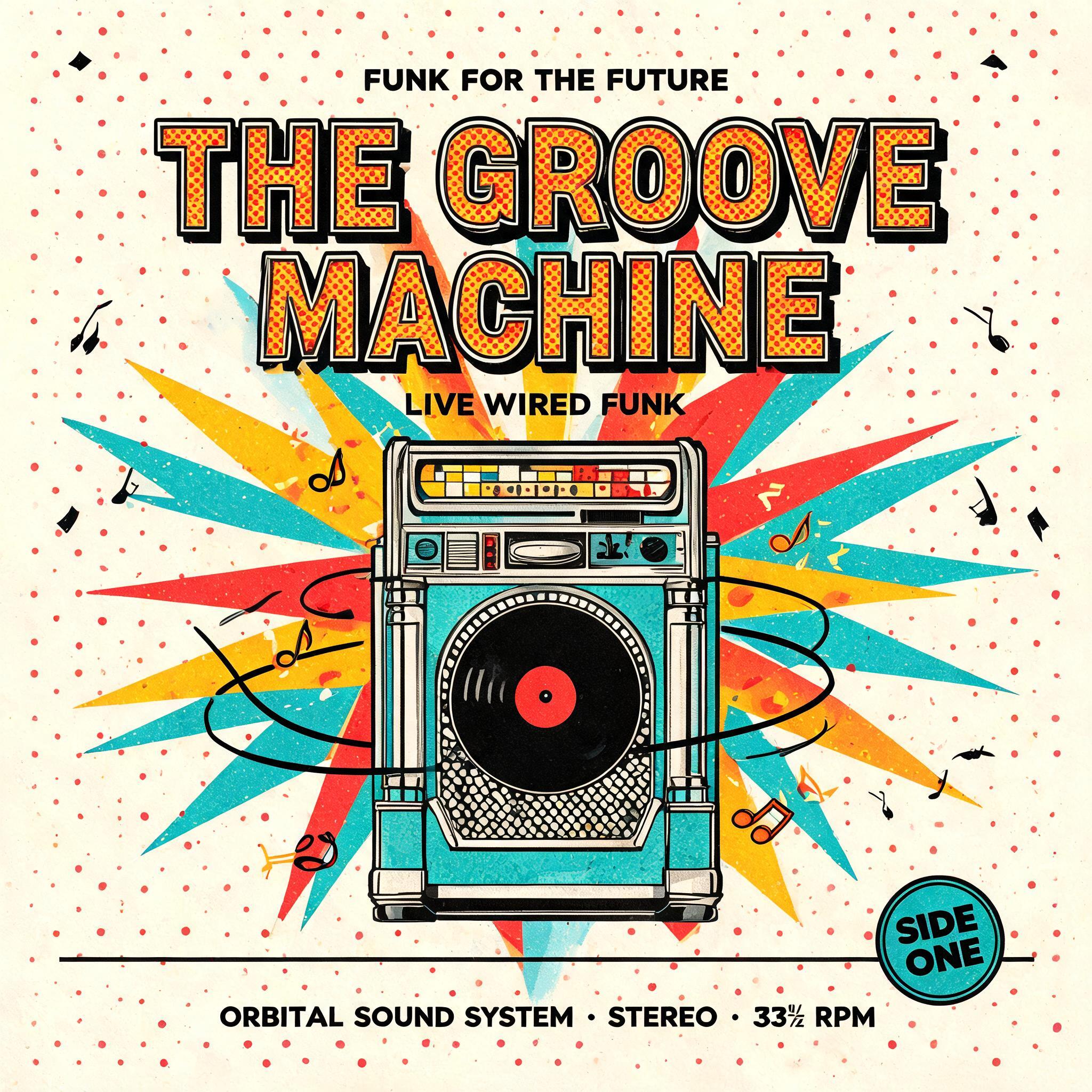

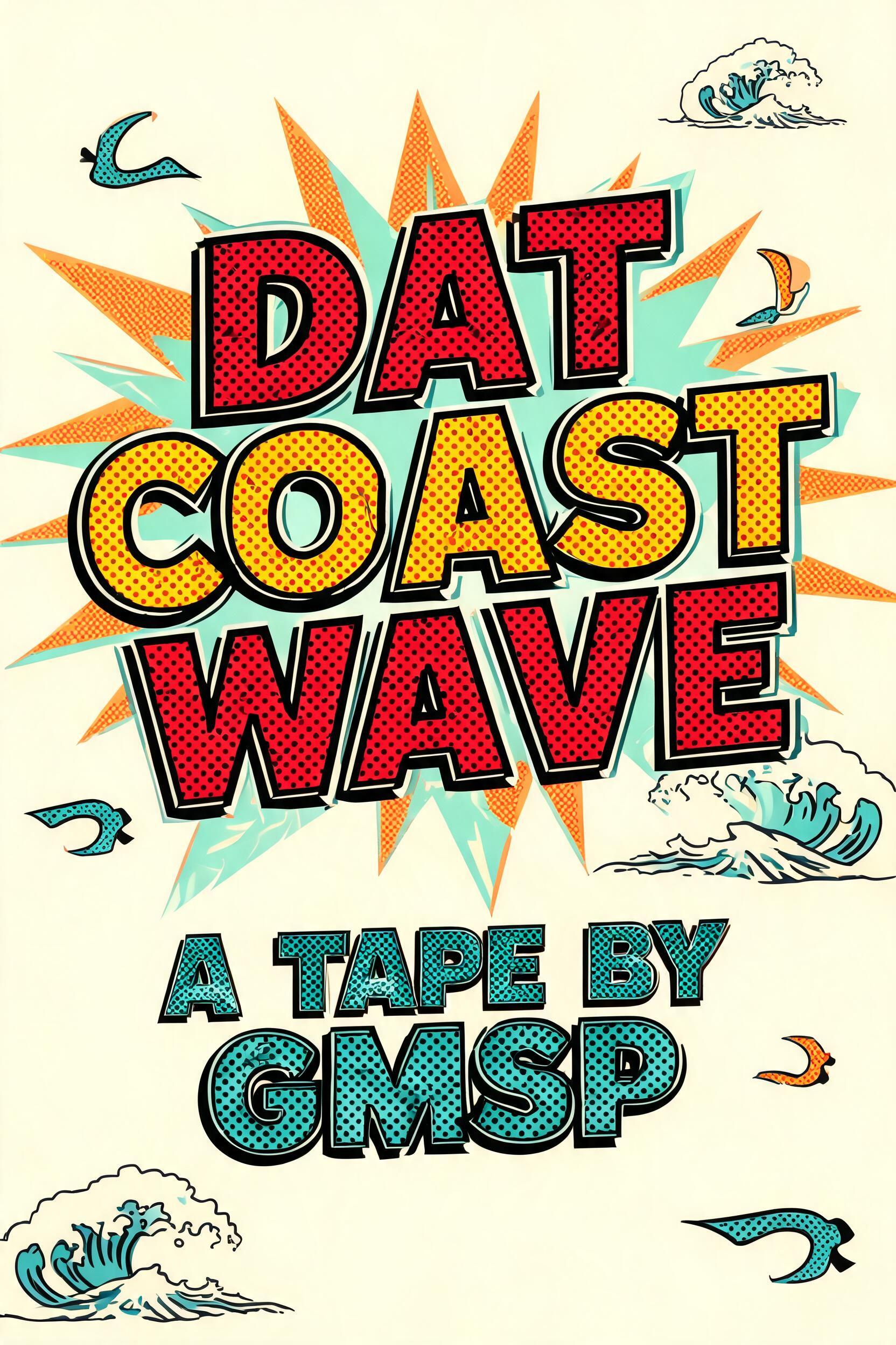

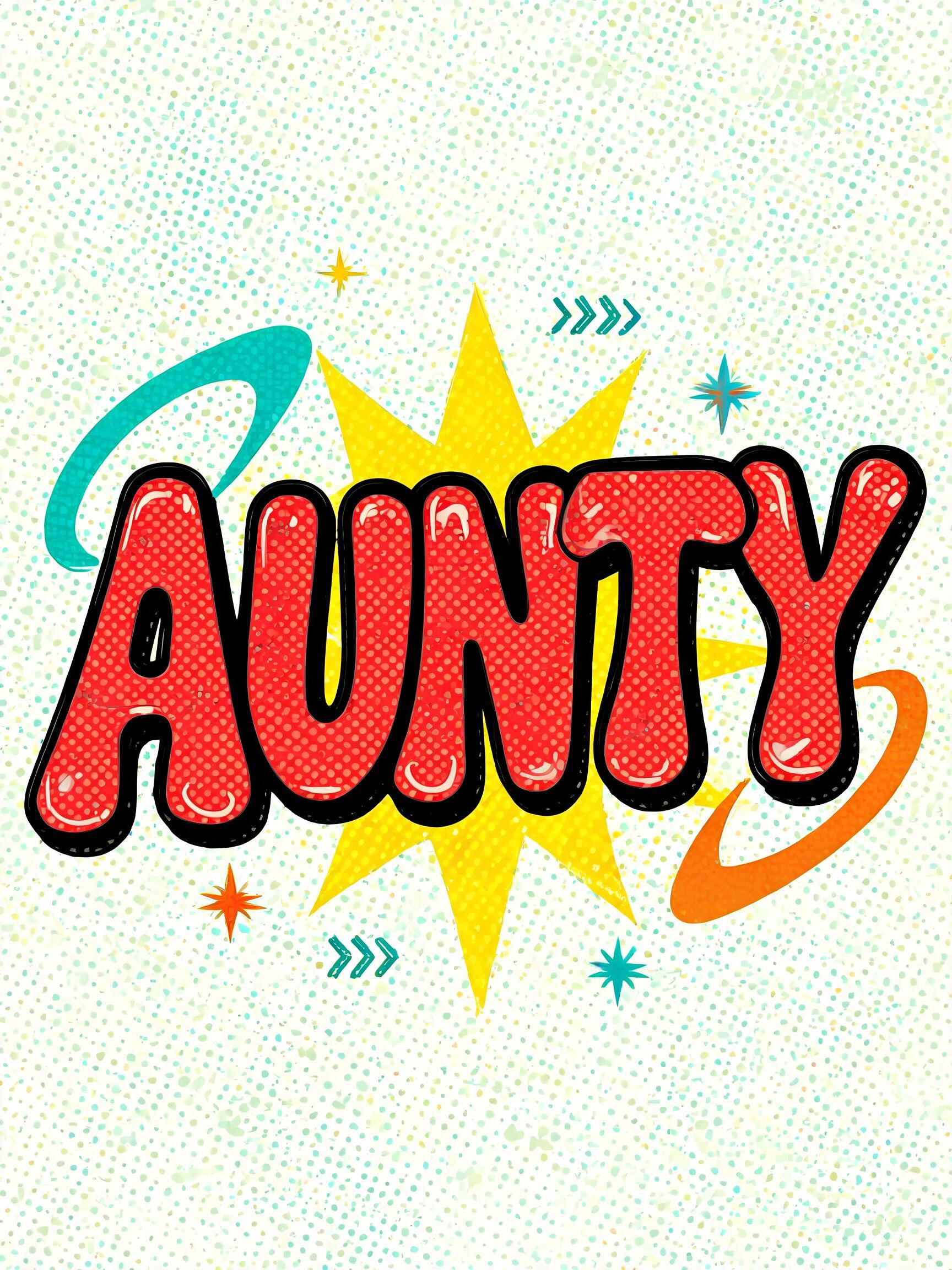


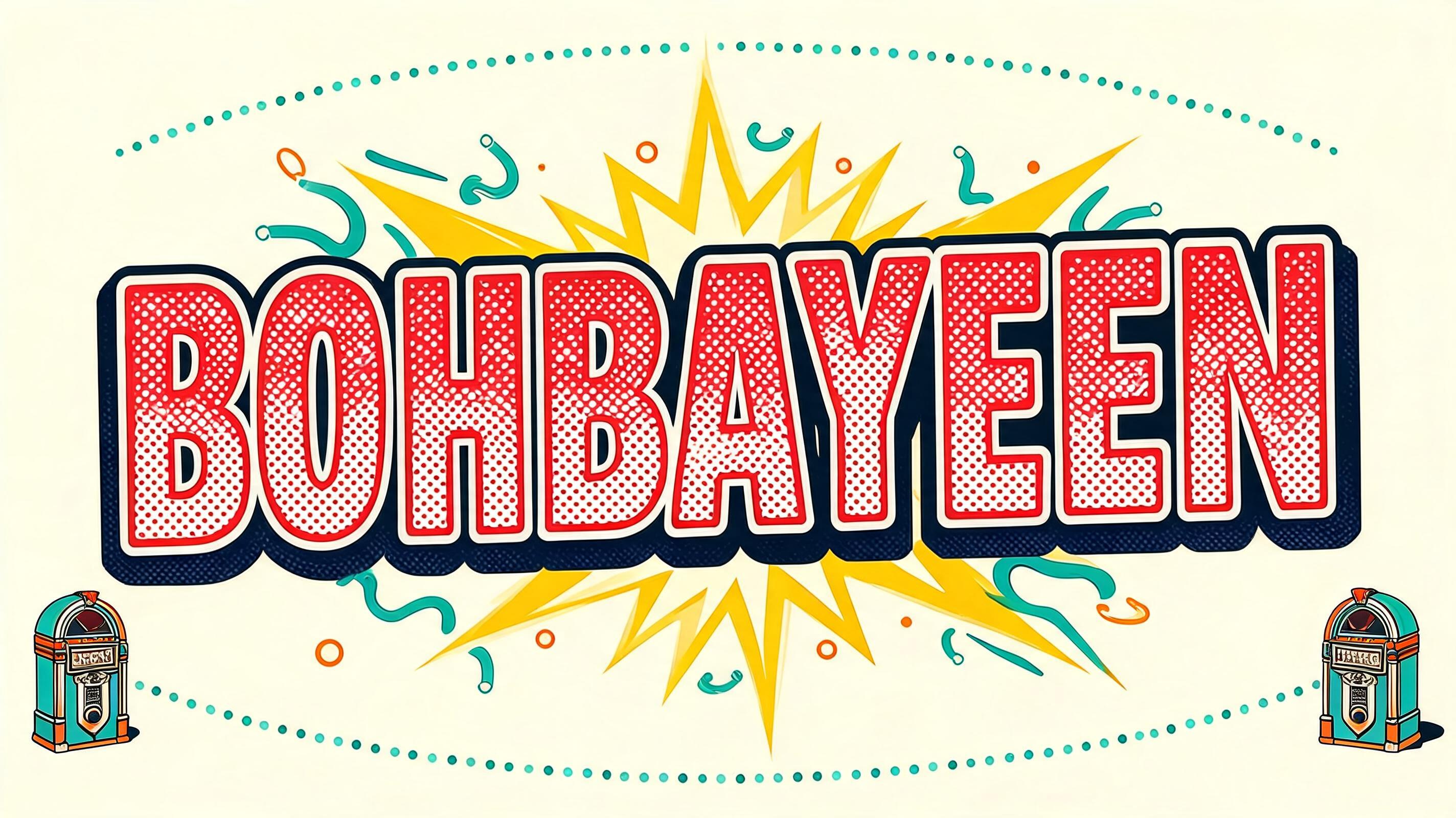
“BOHBAYEEN” is a Retro Pop text effect efeito de texto criado com a IA da FontVibe. Arte pop marcante de meados do século (anos 1950 a 70): contornos pretos grossos, cores caramelo chapadas, pontos de meio-tom Ben-Day e explosões de estrelas.
a mid-century retro pop poster (1950s-70s). SURFACE / STYLE: bold letters with thick black keyline outlines around flat, vibrant candy-color fills, a Ben-Day halftone dot texture across the colors, and a crisp comic-book drop shadow at a slightly tilted, playful angle. SCENE ATMOSPHERE: a starburst or atomic-orbit motif bursting behind the lettering, boomerang and jukebox accents, on a warm cream or candy-color ground. PALETTE: a saturated candy palette — cherry red, sunshine yellow, turquoise, mint, hot orange and cream — flat and cheerful, never muddy. LETTERFORM PRIORITY: when the chosen font carries its own treatment (Lichtenstein halftone, Googie diner chrome, groovy, varsity), that font treatment takes absolute priority and owns the letters; this style governs the outline, halftone, candy color, shadow and the starburst scene. FALLBACK MATERIAL: if the font carries no material of its own, render the letters with a thick black keyline outline, flat candy-color fill, a Ben-Day halftone texture and a comic drop shadow, so the retro-pop punch always reads. A vintage 1950s-60s retro pop poster treatment. 'BOHBAYEEN' dominates as the hero word, each letterform wrapped in a thick black keyline outline over a flat cherry-red candy fill, a dense Ben-Day halftone dot screen layered across the color to give it that authentic offset-printed ink texture. A radiating atomic starburst with alternating sunshine-yellow and cream spike rays explodes behind the lettering on a warm cream ground, the starburst tips punctuated by small boomerang and orbit accents in turquoise and hot orange. A crisp comic-book drop shadow in deep navy sits beneath the word at a slightly tilted playful angle, giving the lettering a lifted, punchy presence. Secondary decorative elements — a pair of small jukebox icons and a dotted arc stripe in mint — frame the composition at the periphery without competing with the hero text. The overall palette holds to candy saturated flat tones: cherry red, sunshine yellow, turquoise, mint, hot orange and warm cream, all printed-flat with zero gradient, zero soft glow, pure retro-pop halftone energy.
Gerada em 30 de julho de 2026 · 2848 × 1600 · JPEG · BytePlus Seedream 5.0 · Compartilhada pelo criador · Uso comercial gratuito (CC BY 4.0)