


AI Cyberpunk Cyberpunk 2077 Generador de efectos de texto
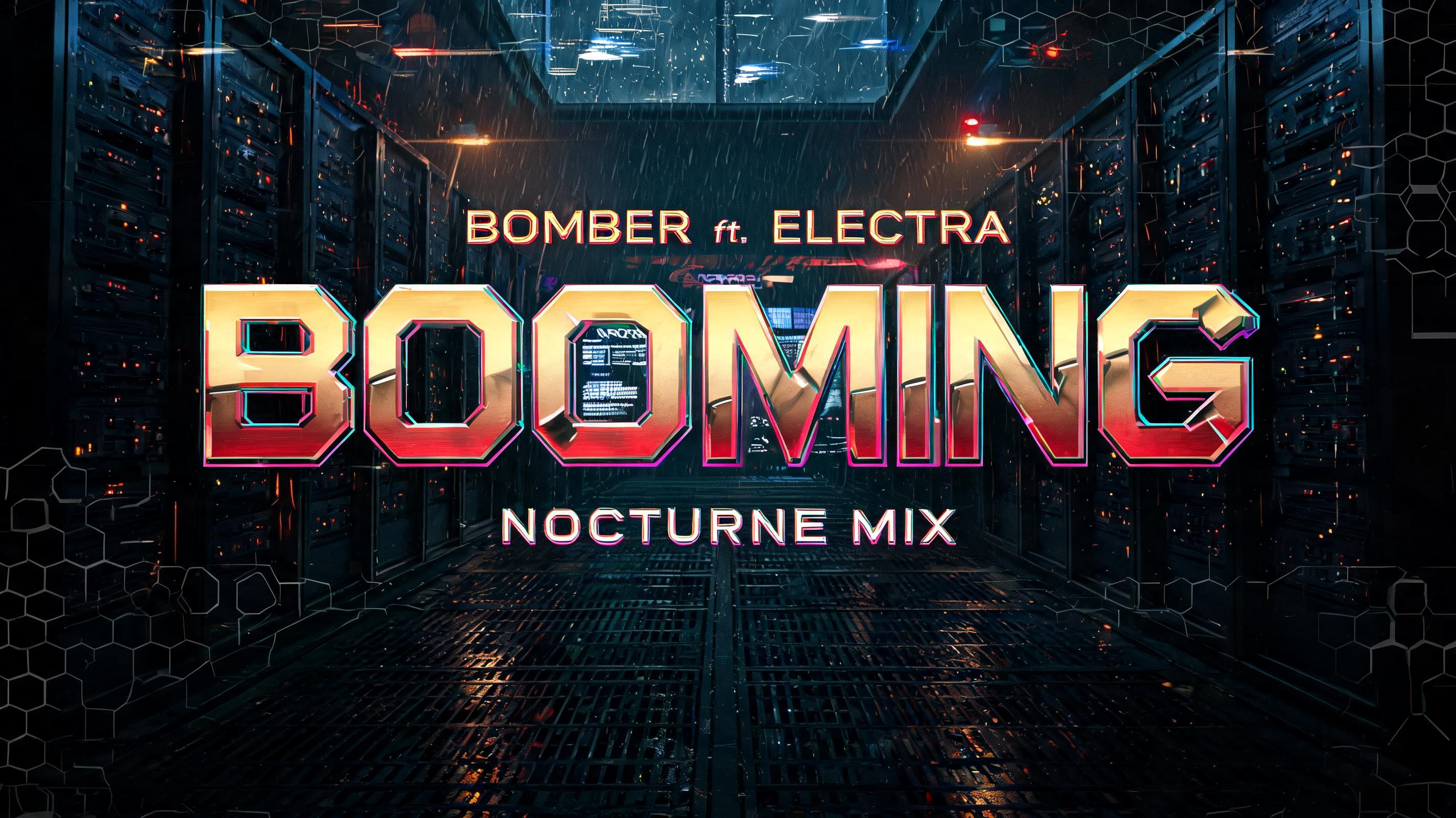
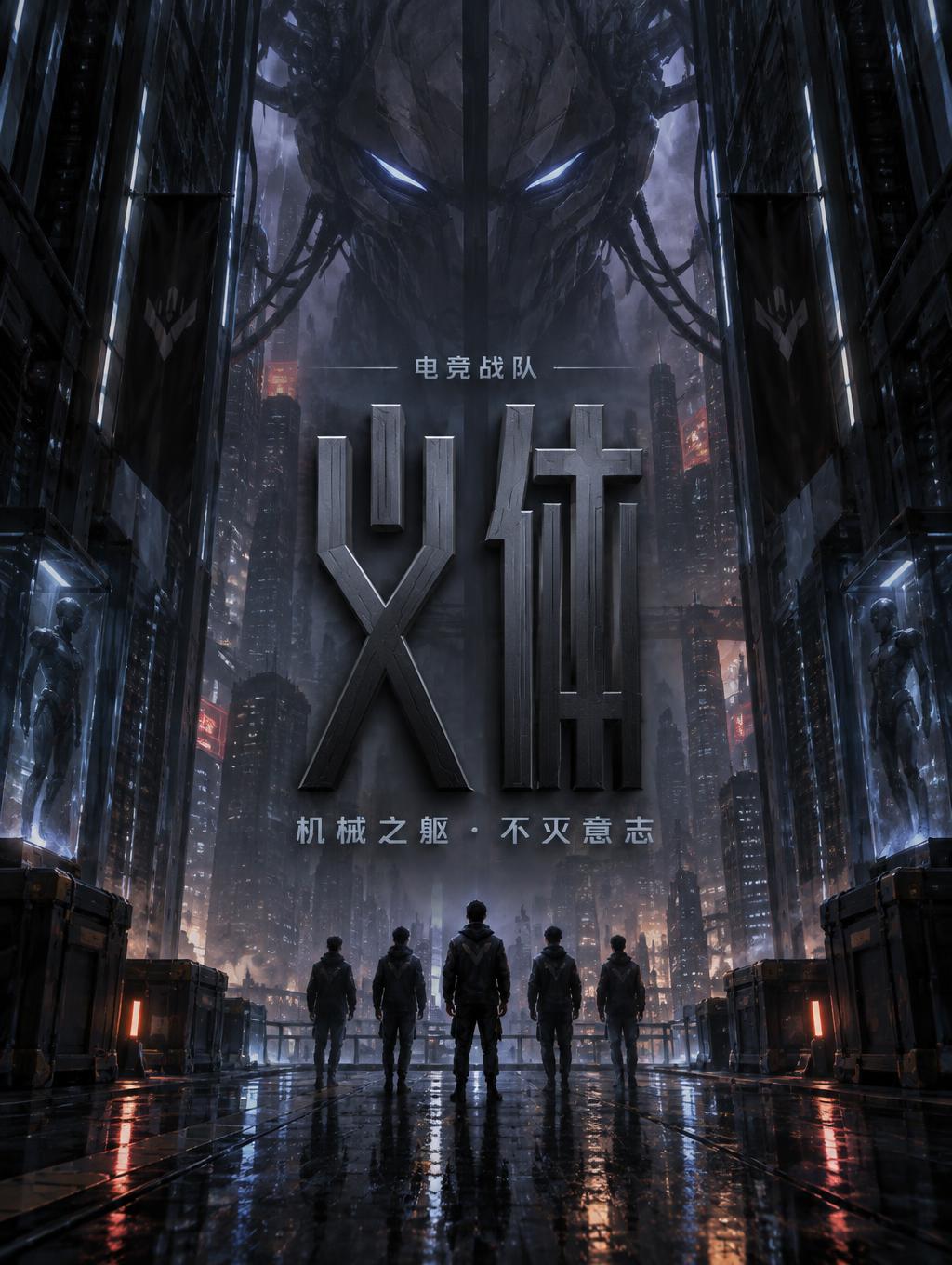
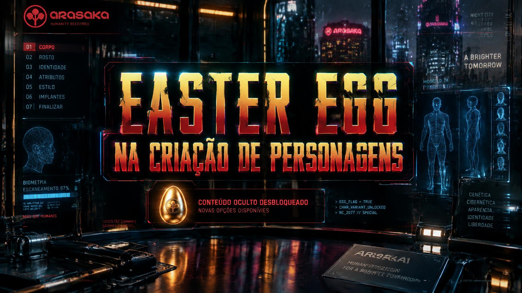
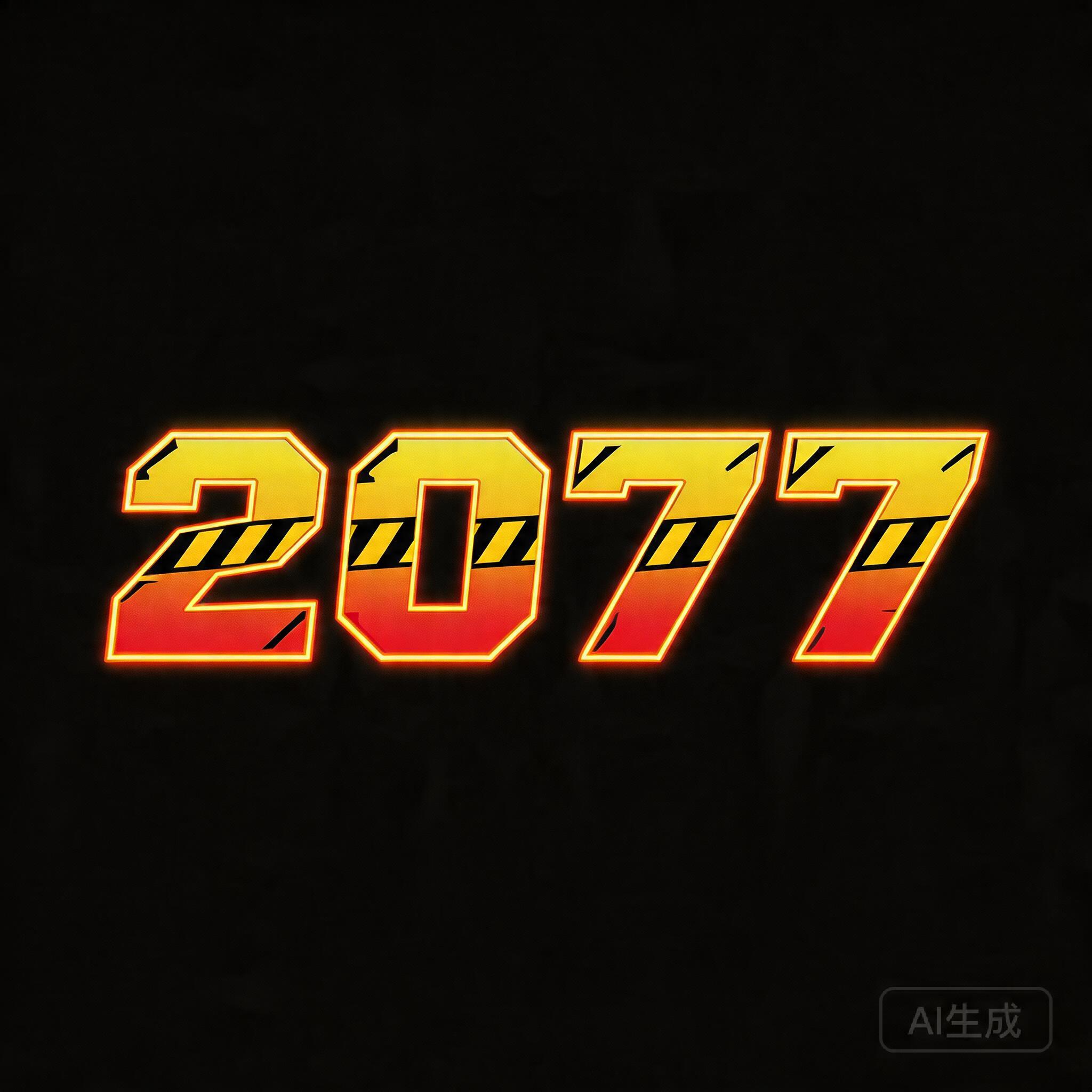
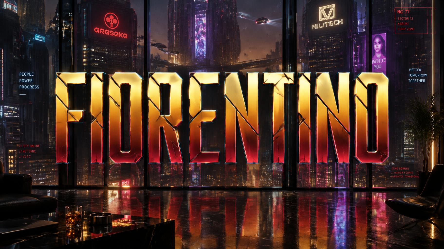
Inspiradas en la estética icónica de Night City: letras cromadas en amarillo y rojo con cortes angulares y una atmósfera empapada de neón. — sin licencia de fuente.
Cyberpunk 2077 con distintas fuentes de IA
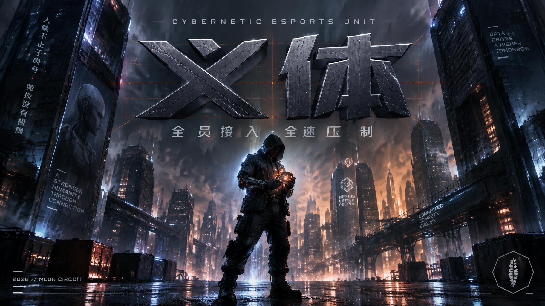
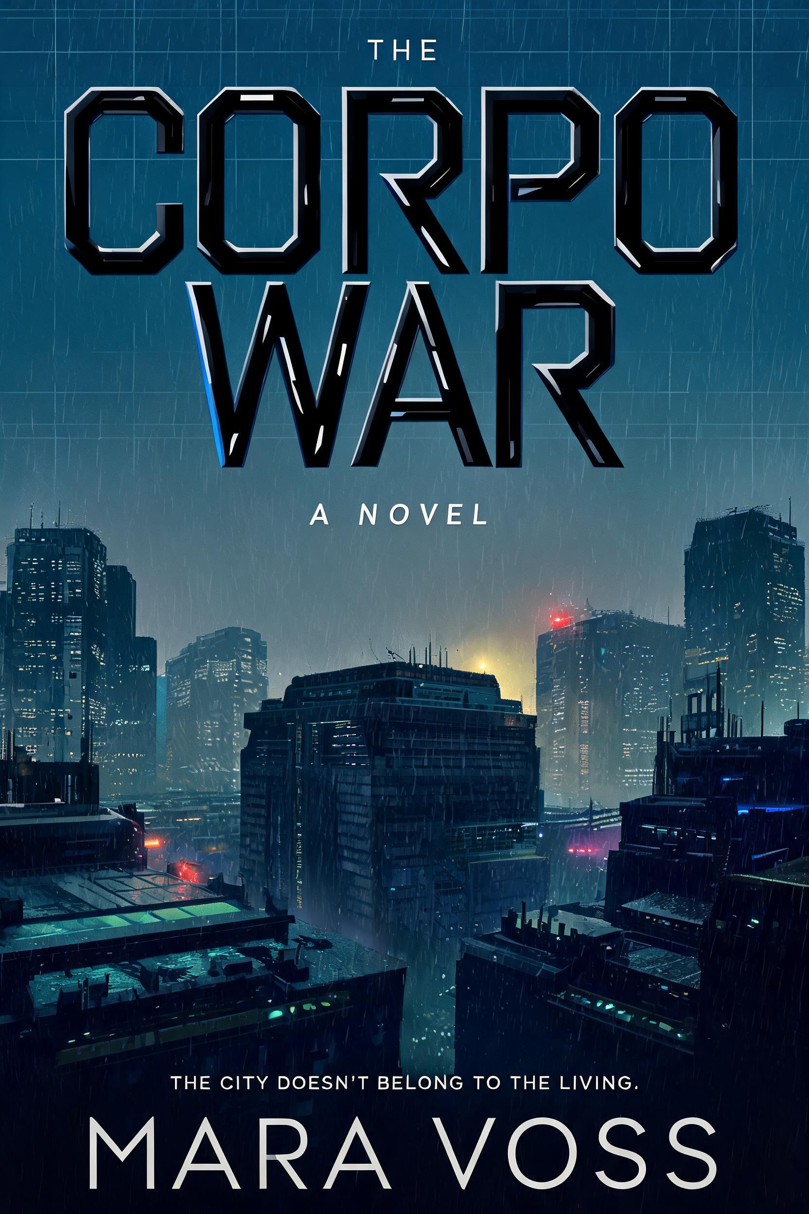
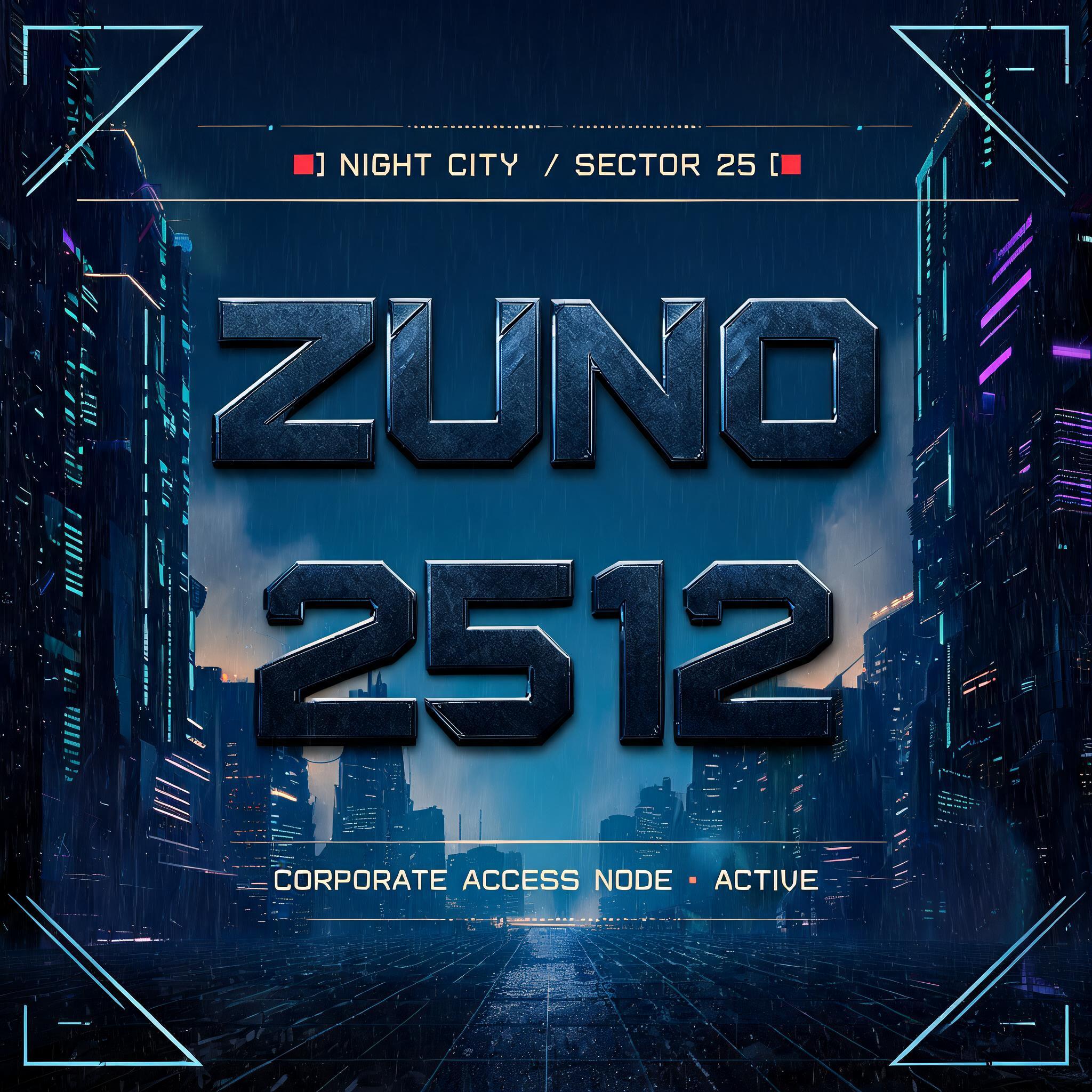
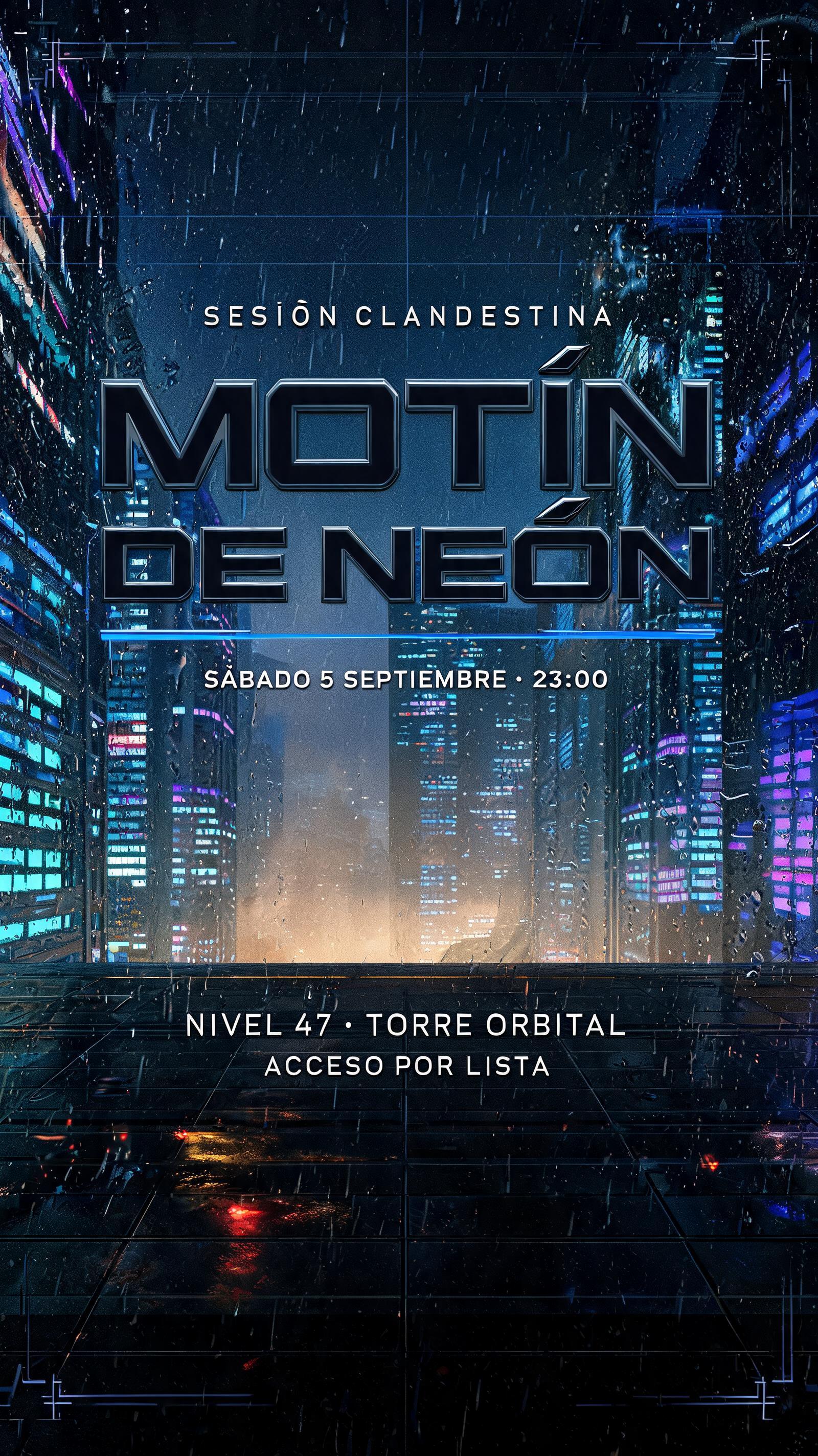


¿Qué vas a crear?
Usos reales, resultados reales. Elige tu escena.


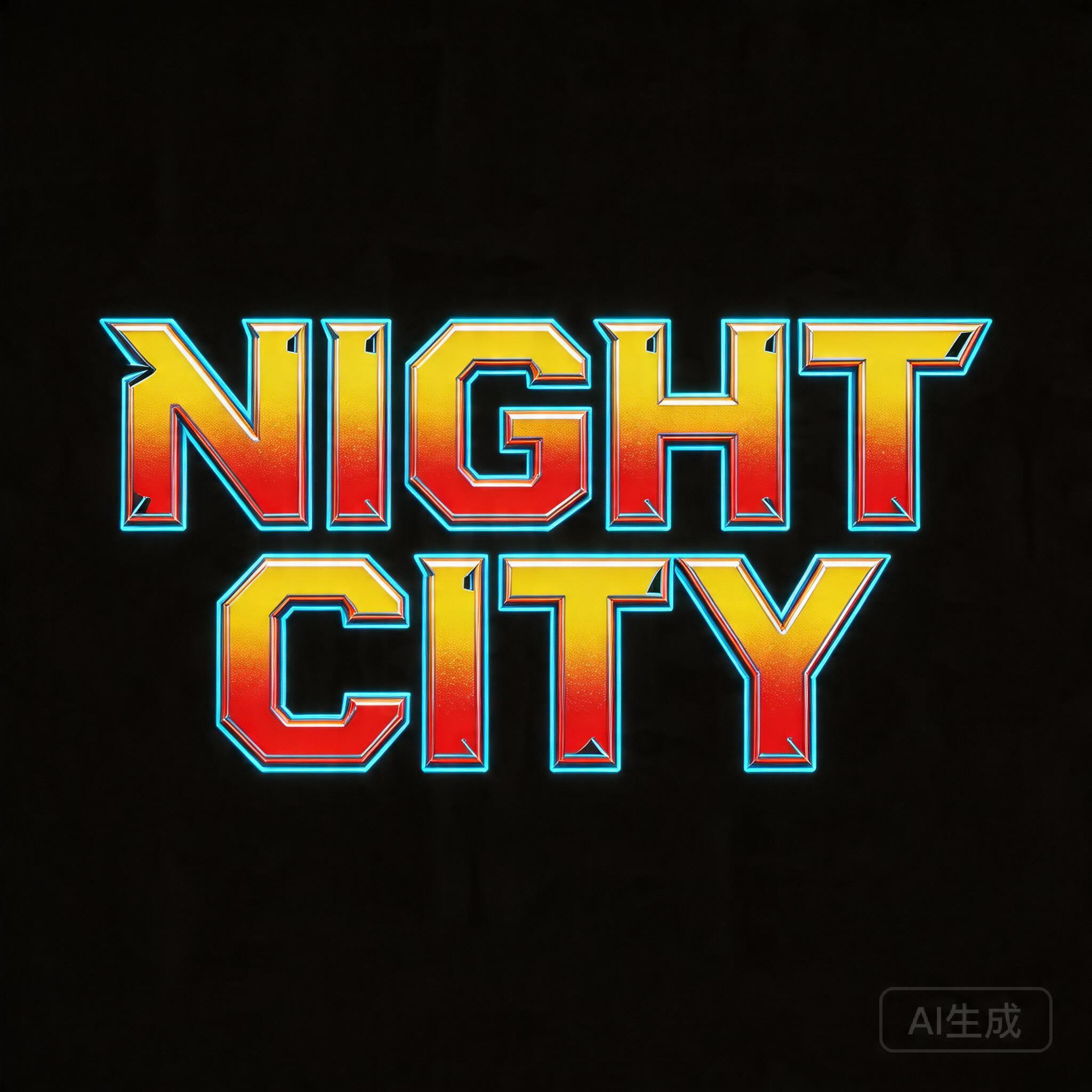


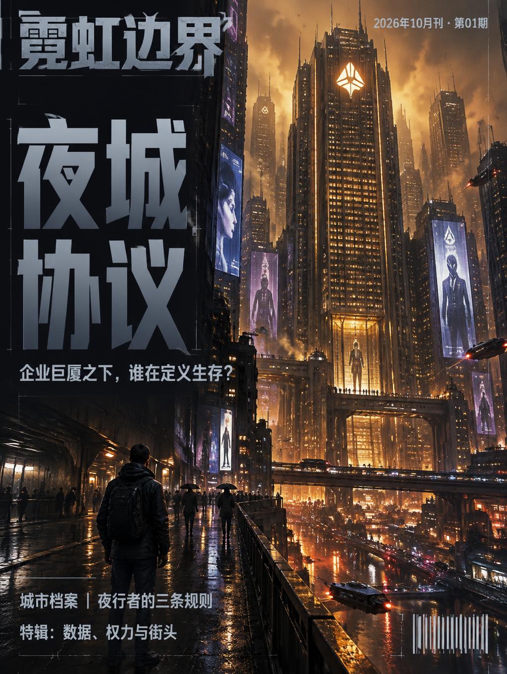
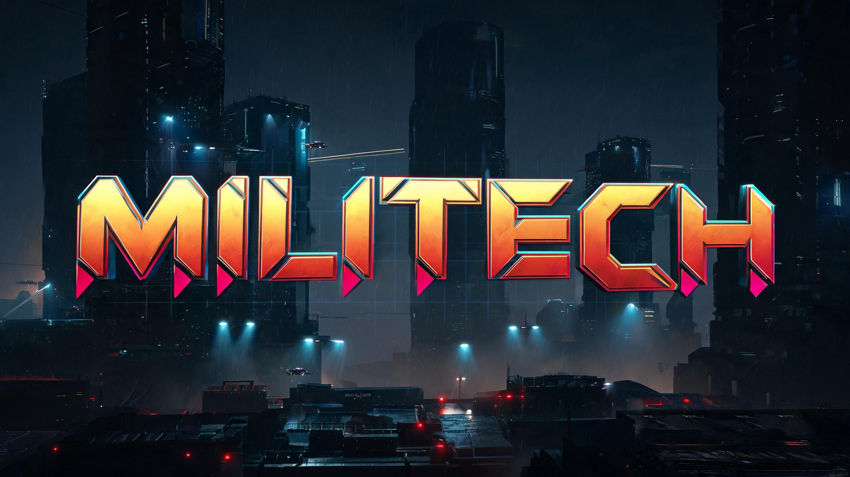
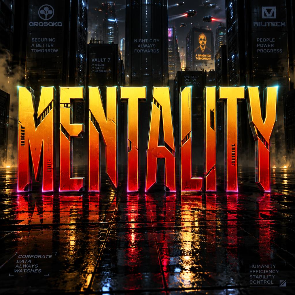
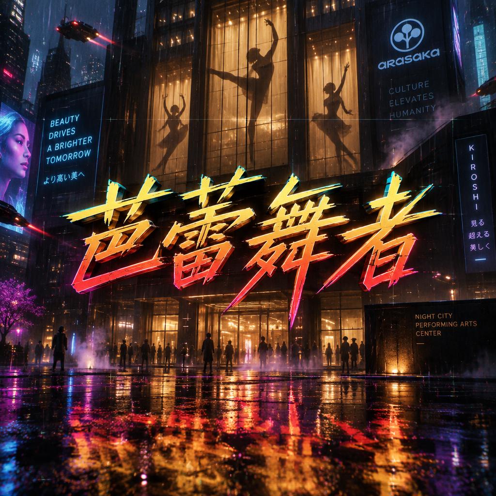
Galería Cyberpunk 2077
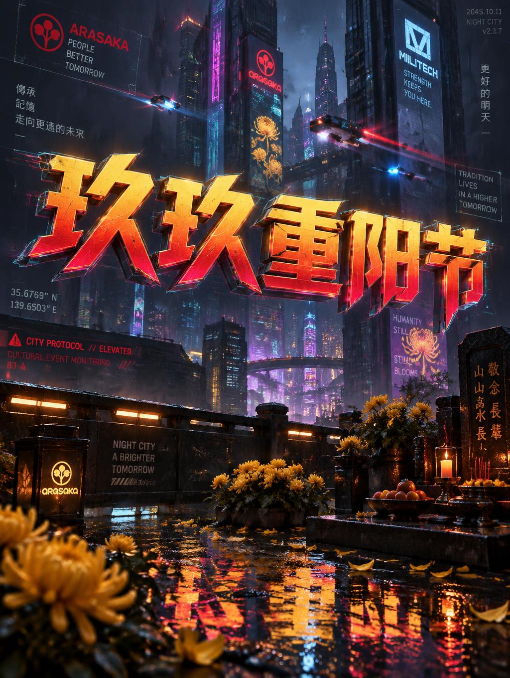
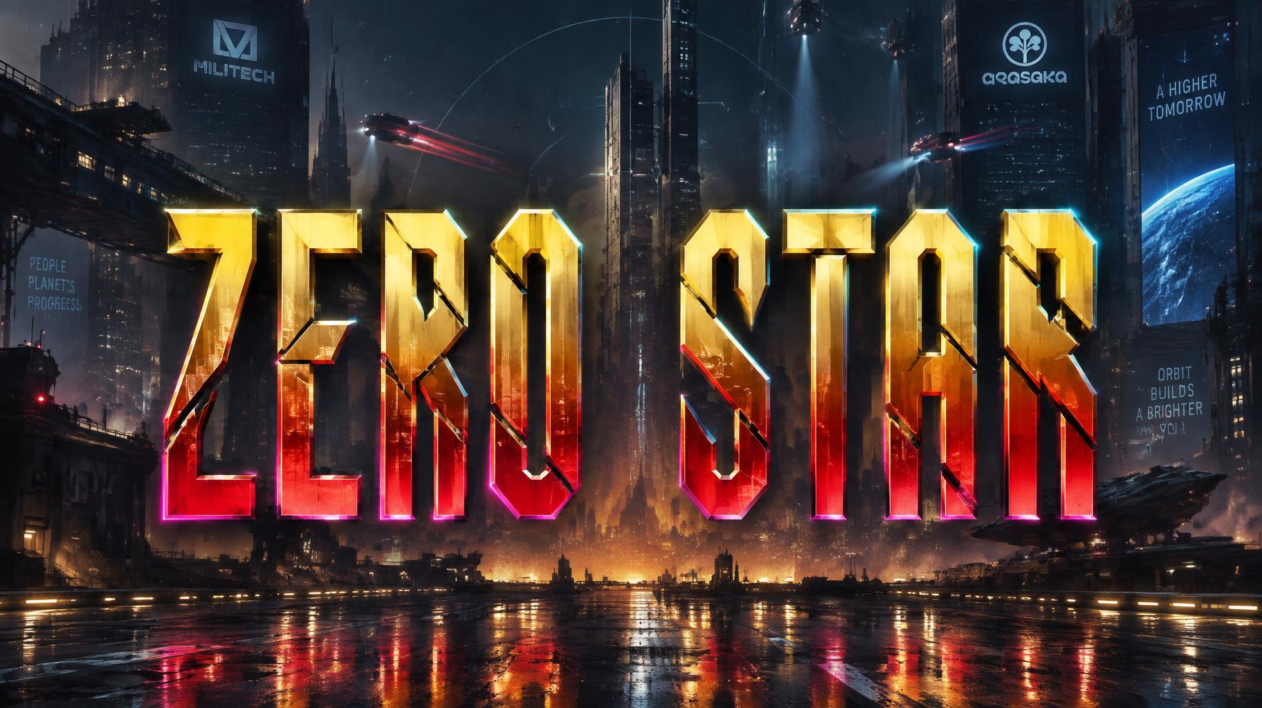
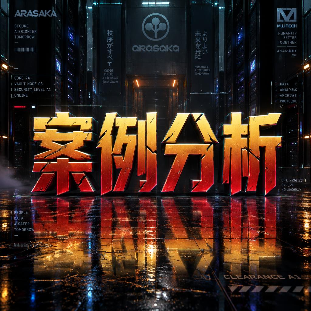
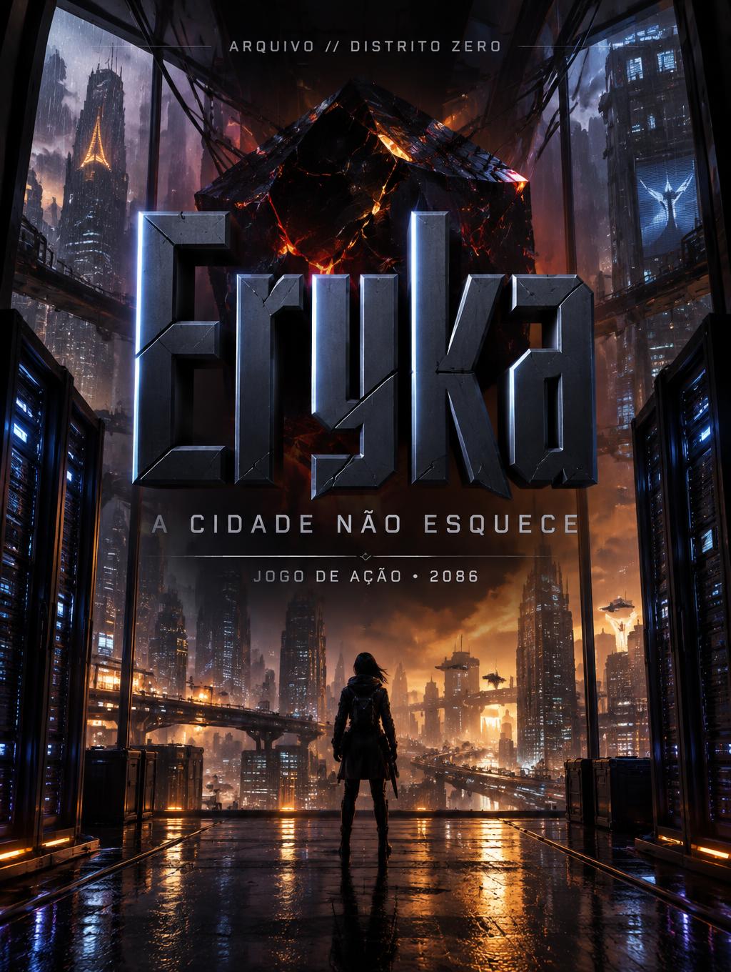
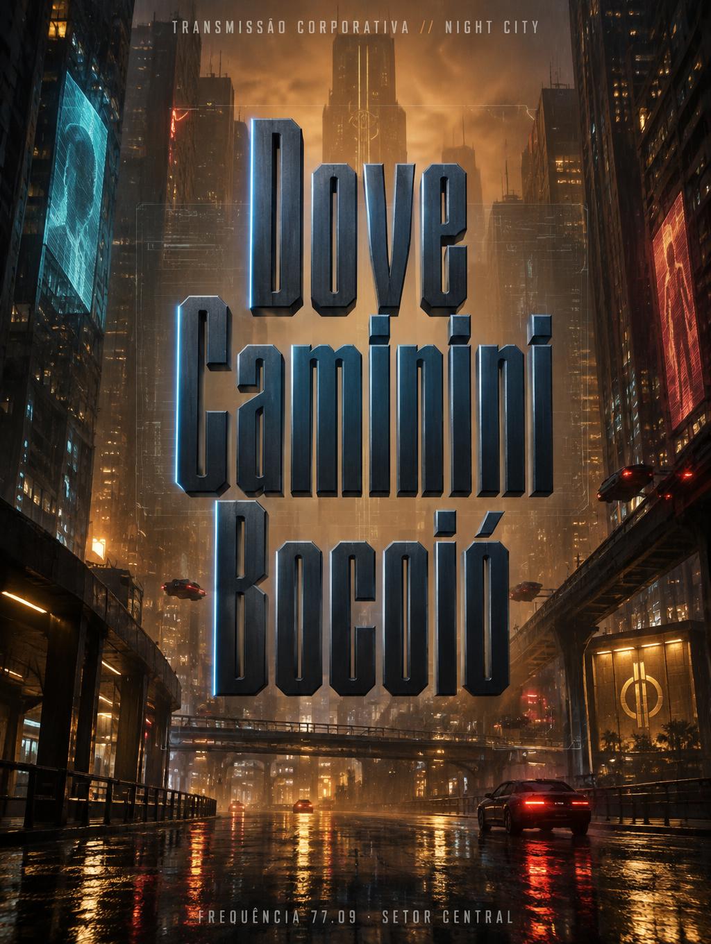
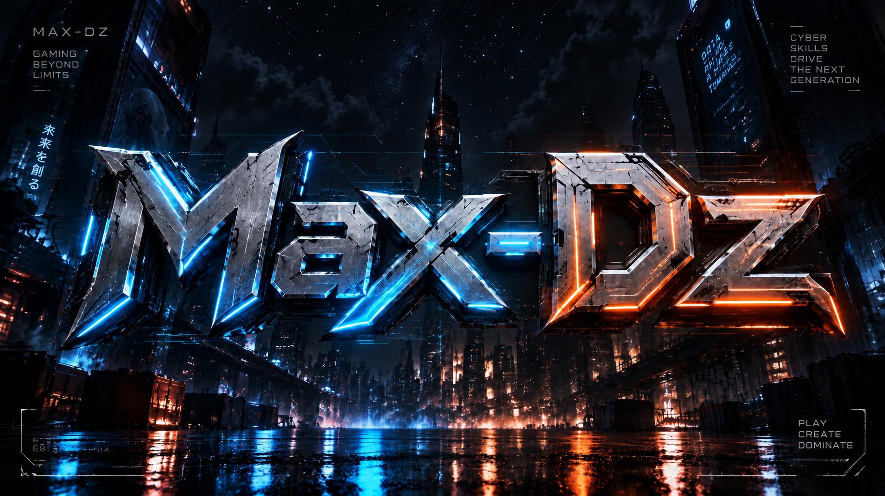
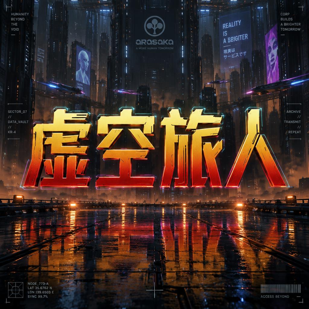
Resultados reales del estilo Cyberpunk 2077. Haz clic en cualquier imagen para ver detalles.
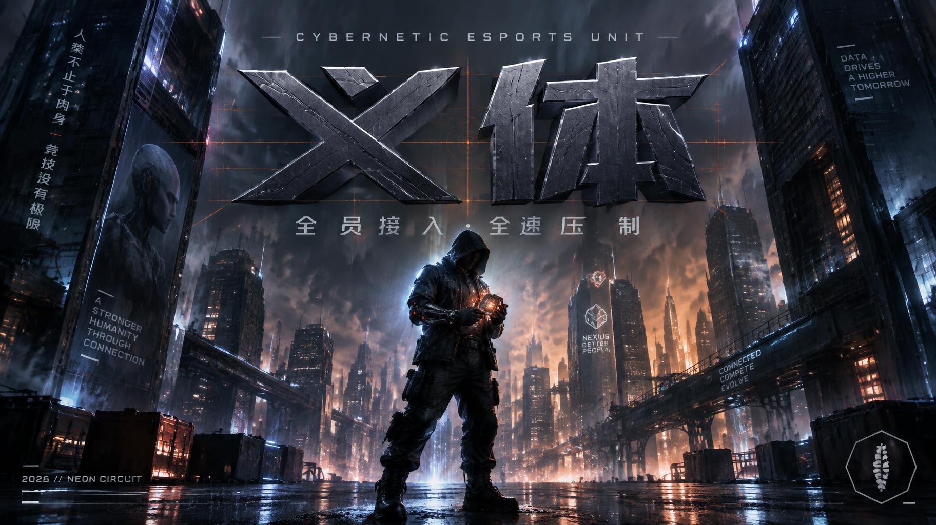
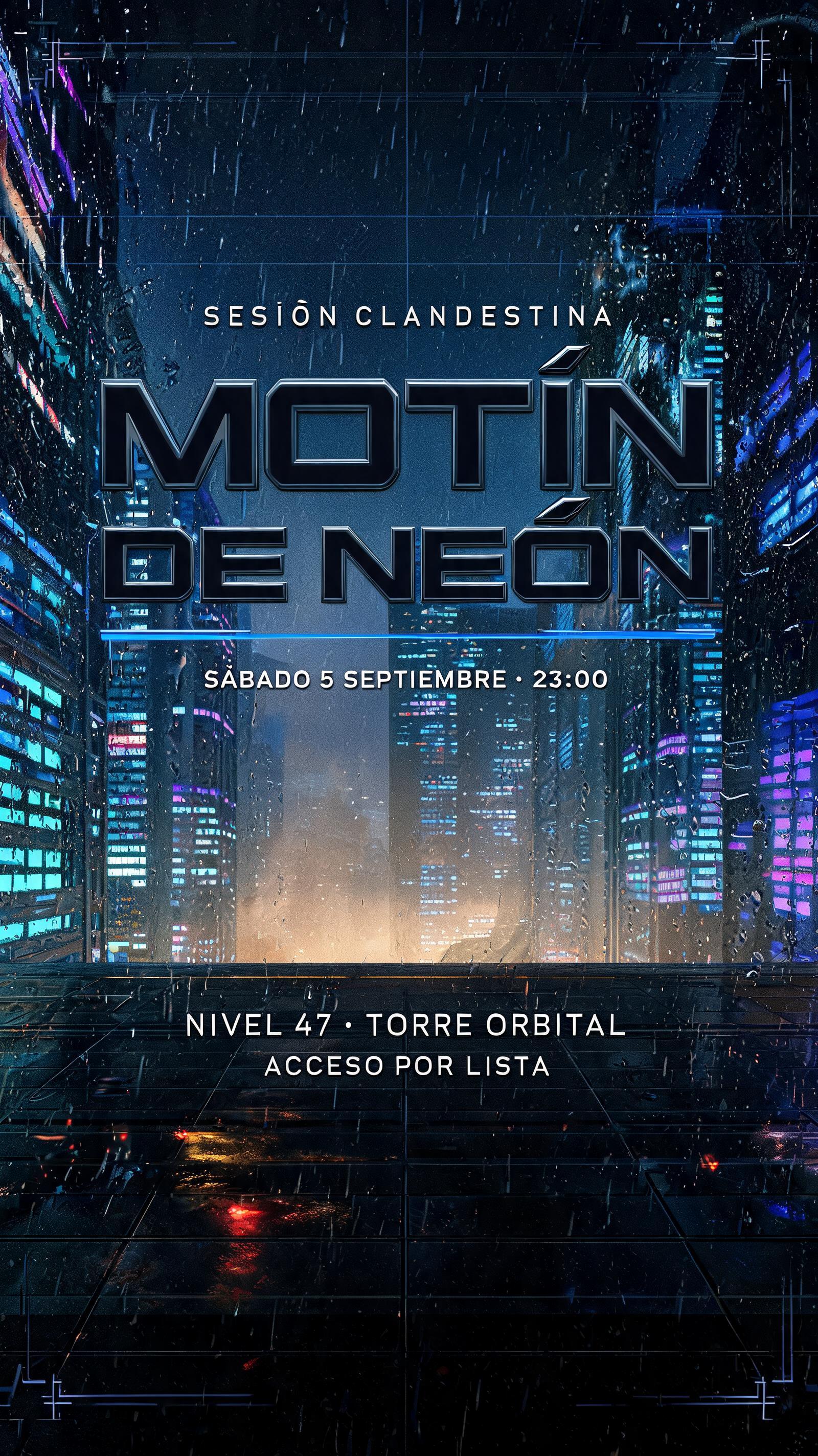
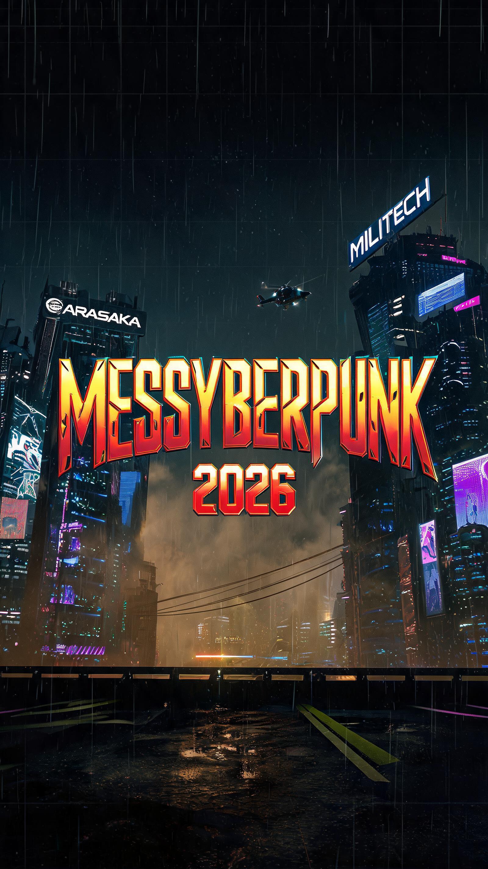


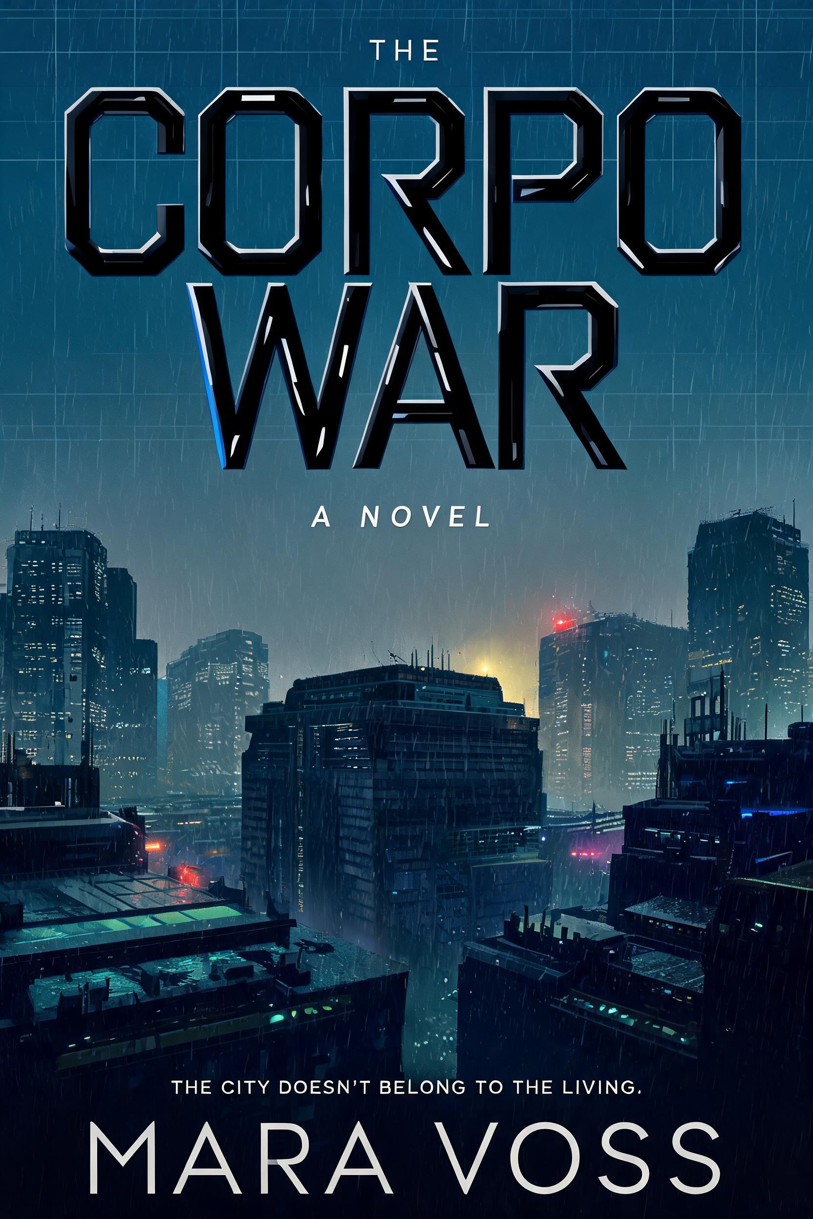
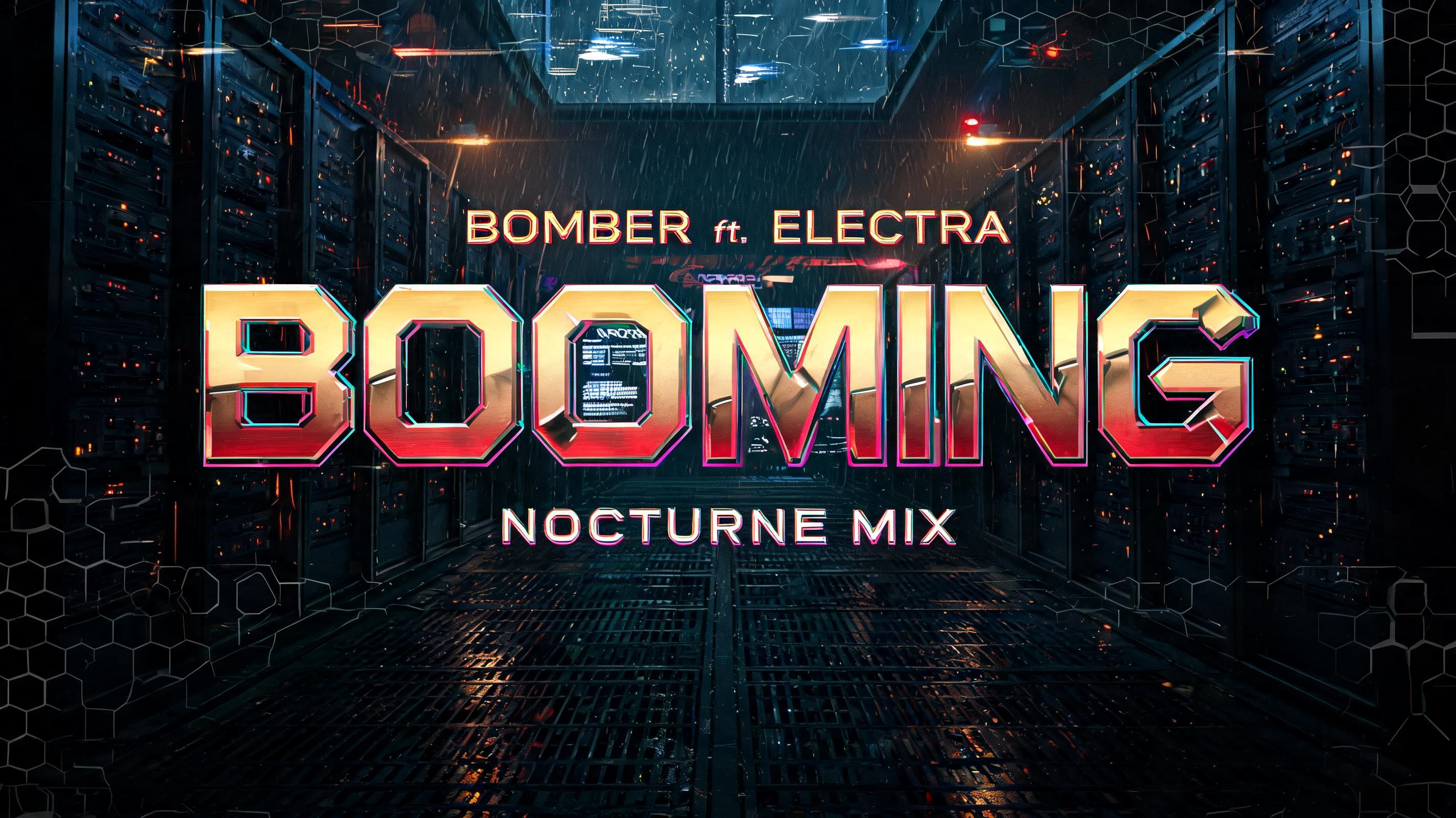


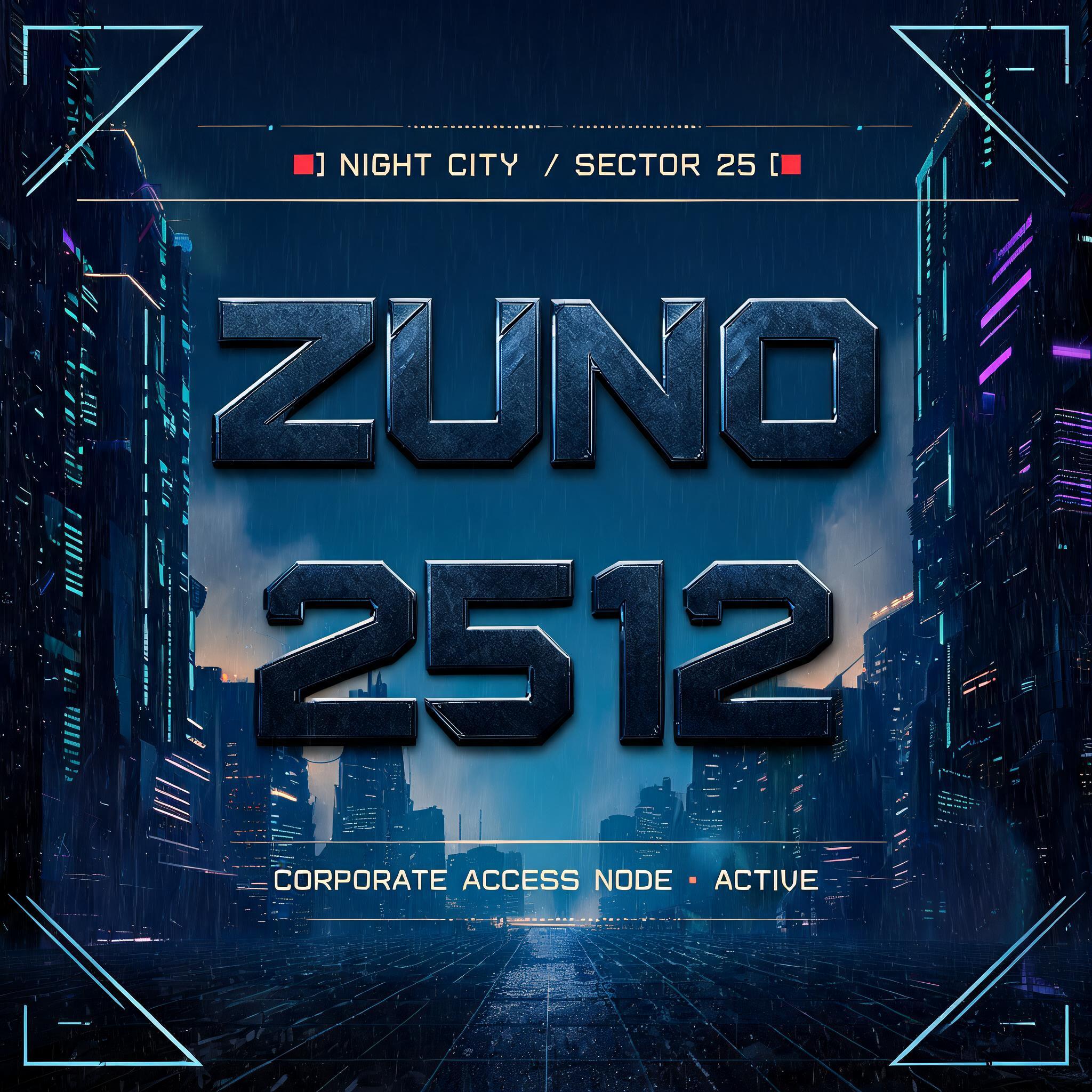
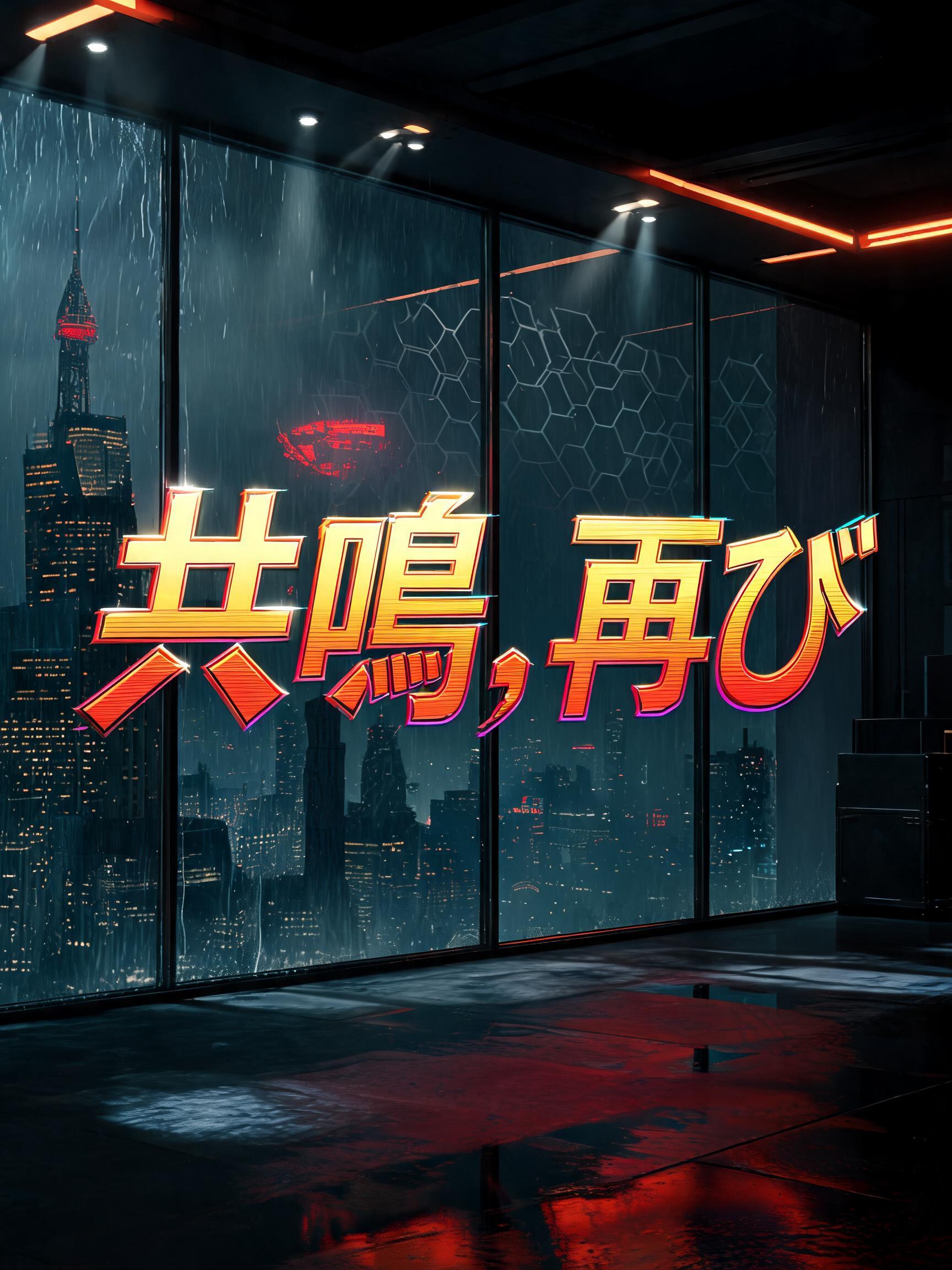



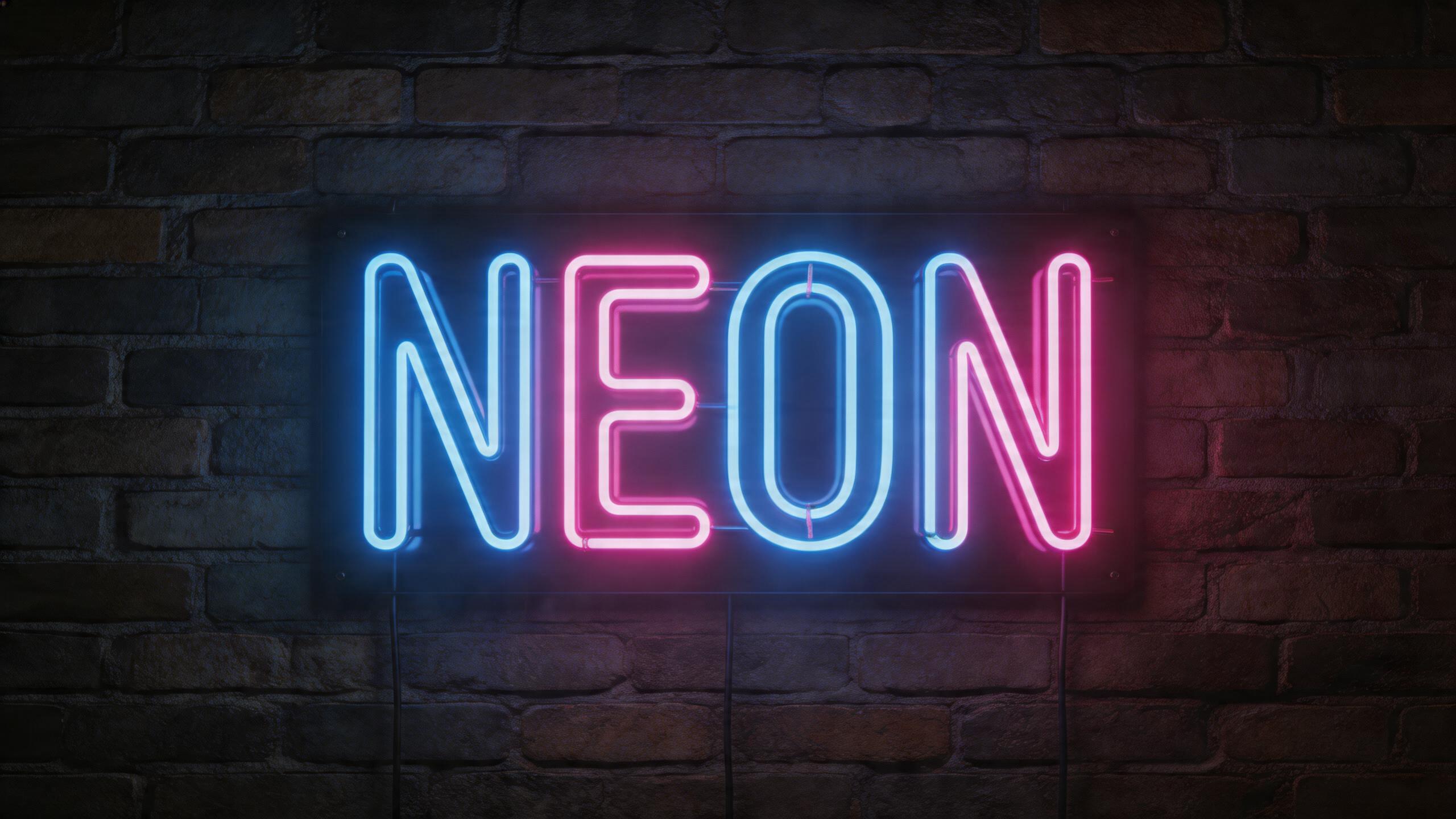


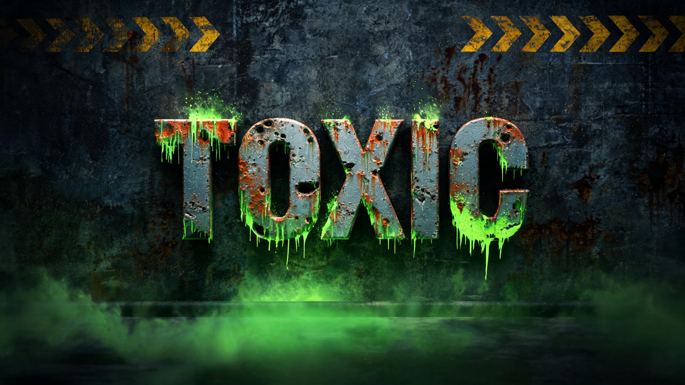


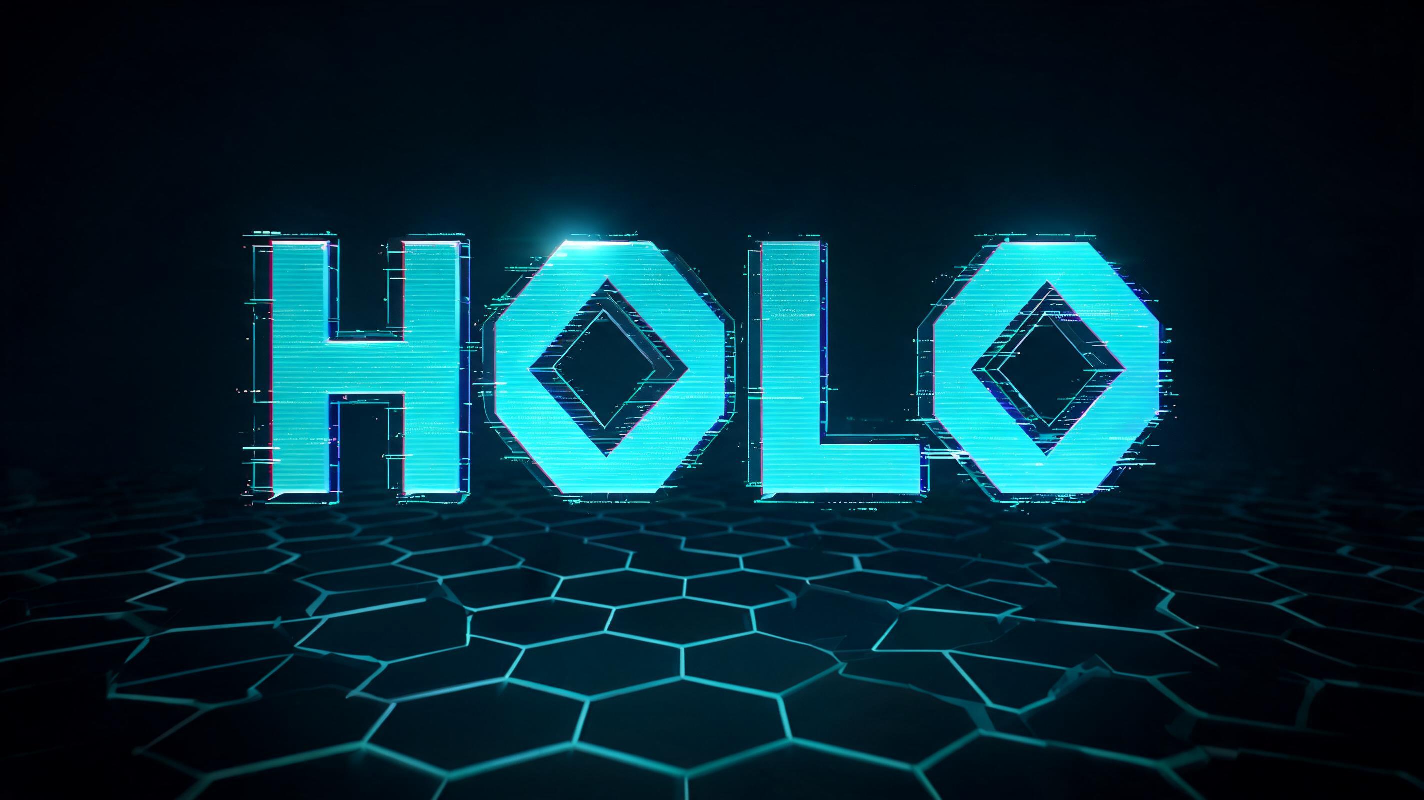

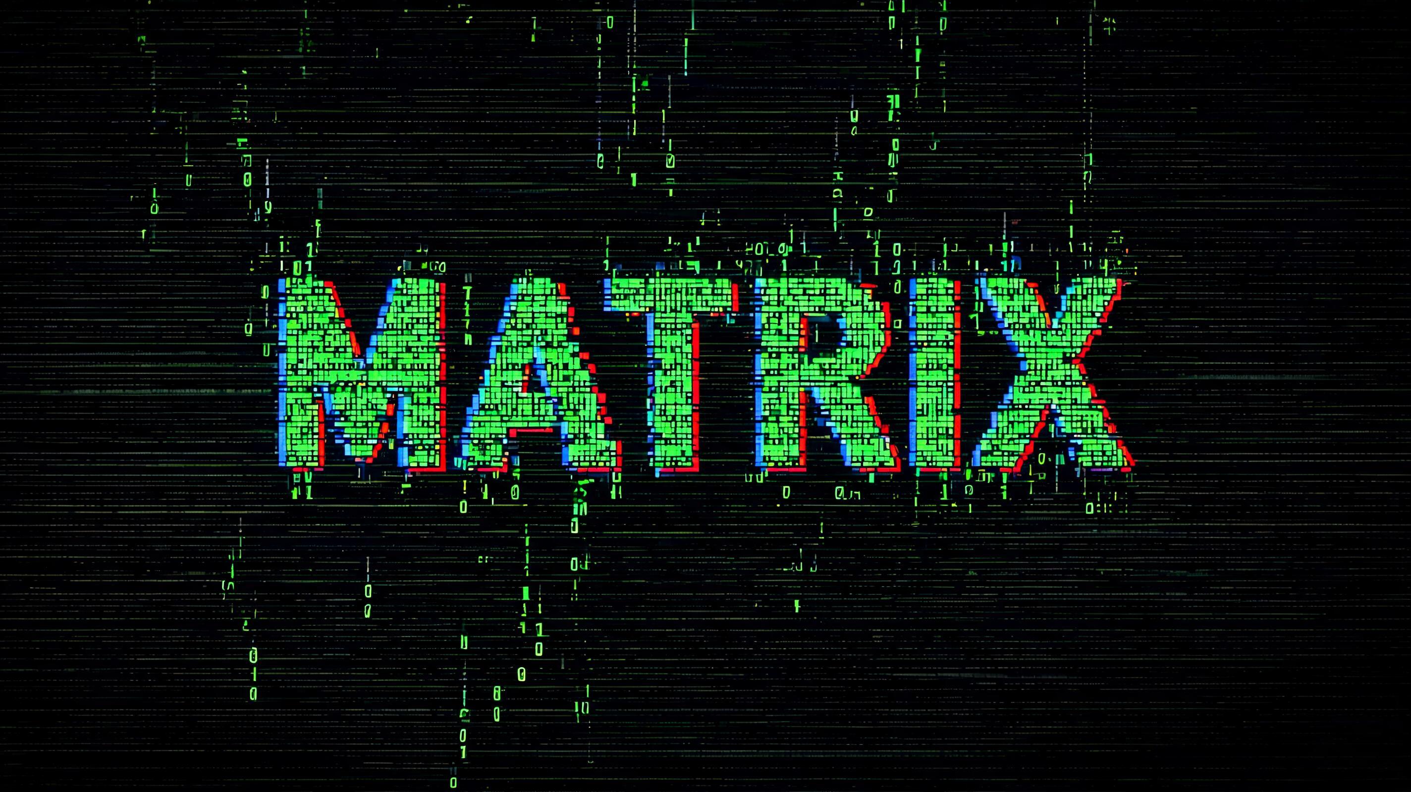


¿Buscas texto elegante para copiar y pegar? Prueba nuestras herramientas de generador de fuentes gratis — cursiva, gótica, burbuja y 30+ estilos.
Perfecto para estos proyectos
Efecto de texto Cyberpunk 2077 — Preguntas frecuentes
¿Qué es el estilo de fuente Cyberpunk 2077?
El estilo de fuente Cyberpunk 2077 es un efecto tipográfico distintivo generado con IA. Inspiradas en la estética icónica de Night City: letras cromadas en amarillo y rojo con cortes angulares y una atmósfera empapada de neón. Con el generador de IA cyberpunk 2077 de FontVibe puedes crear efectos de texto impactantes en segundos — sin Photoshop, sin licencias de fuente, sin experiencia en diseño.
Explora la galería de Cyberpunk 2077 para inspirarte, o explora los más de 135 estilos de efectos de texto IA disponibles en FontVibe.
Cómo crear tipografía Cyberpunk 2077 en FontVibe Estudio
La historia detrás de Cyberpunk 2077
Historia, ADN visual y contexto cultural.
Night City por diseño
Cyberpunk 2077 no es solo un videojuego: es uno de los mundos cyberpunk diseñados de forma más sistemática que se hayan construido jamás. CD Projekt Red pasó casi una década construyendo Night City, partiendo del Cyberpunk original, el juego de rol de mesa de Mike Pondsmith (1988), y de una biblia visual interna detallada desarrollada por el director de arte Jakub Kijowski y su equipo.\n\nLo que hace distintiva la estética del juego dentro de la familia cyberpunk es su carácter deliberadamente estadounidense. Donde el cyberpunk clásico imagina las calles de Tokio y megaciudades asiáticas empapadas de lluvia, Night City es California: autopistas anchas, plazas corporativas, cultura del automóvil, esa desolación particular de una distopía quemada por el sol y no oscurecida por la lluvia. La paleta amarillo-dorada es parte de esa elección: se lee como caliente, árida, saturada de comercio.\n\nEl diseño visual del juego se convirtió en un punto de referencia para toda una generación de diseñadores, hubieran jugado o no. El sistema angular de letras cromadas, el lenguaje de los logos corporativos y la forma en que los elementos holográficos de la interfaz interactúan con el espacio físico han circulado ampliamente en las comunidades de diseño desde el lanzamiento del juego en 2020.
El ADN visual
¿Sabías que?
El lenguaje visual de Cyberpunk 2077 se desarrolló a partir del juego de rol de mesa de Mike Pondsmith de 1988, Cyberpunk 2020. CD Projekt Red trabajó de cerca con Pondsmith para que el mundo se sintiera como una evolución genuina de su universo y no como un reinicio.
La arquitectura de Night City bebe mucho de Los Angeles y Las Vegas, no de Tokio ni Hong Kong. El equipo creativo tomó la decisión deliberada de situar su cyberpunk en la expansión urbana estadounidense: sol, autopistas y plazas corporativas en lugar de lluvia y callejones estrechos.
La paleta amarillo-dorada fue una respuesta directa a la monotonía visual de los juegos cyberpunk oscuros y azules. El equipo de arte quería que Night City se sintiera abrumadora y sobresaturada: un mundo donde hasta la iluminación intenta venderte algo.
Cyberpunk 2077 (2020, CD Projekt Red) se basa en el juego de rol de mesa de Mike Pondsmith de 1988; su logotipo amarillo ácido, atravesado por trazos azules de glitch, se diseñó para parecer pintado con espray en el muro de una ciudad futura.
Crea tu tipografía Cyberpunk 2077 en Estudio
Gratis para empezar. Sin conocimientos de diseño. Tu obra, tus derechos.
AI Cyberpunk Cyberpunk 2077 Generador de efectos de texto
Inspiradas en la estética icónica de Night City: letras cromadas en amarillo y rojo con cortes angulares y una atmósfera empapada de neón. — sin licencia de fuente.
Cyberpunk 2077 con distintas fuentes de IA
¿Qué vas a crear?
Usos reales, resultados reales. Elige tu escena.
Genera tu efecto de texto Cyberpunk 2077
Escribe cualquier palabra — mírala transformarse en segundos. Sin registro.
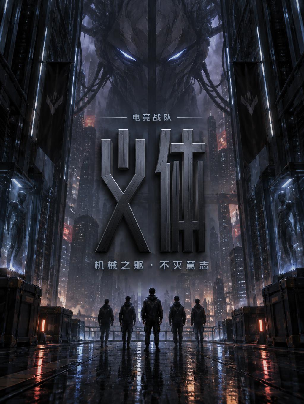
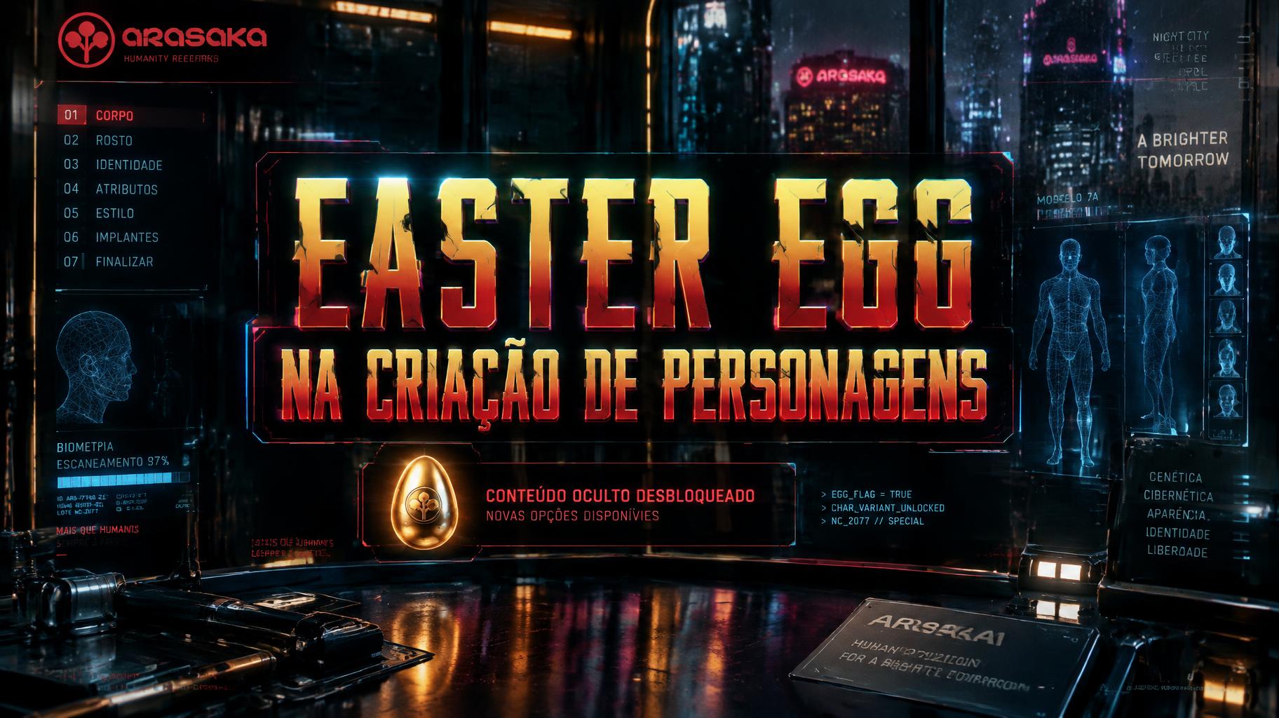
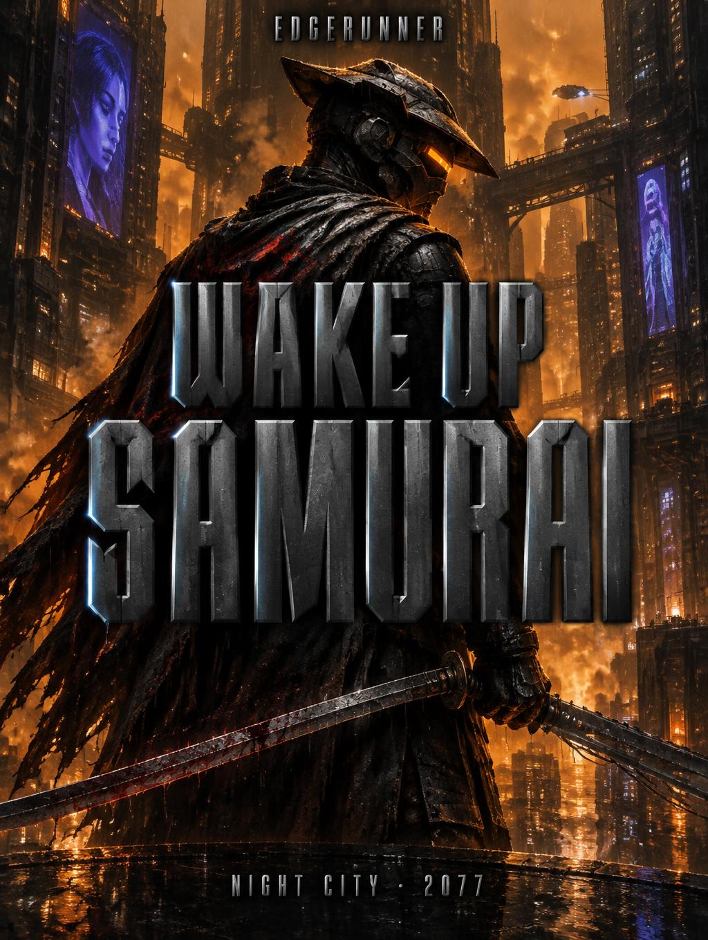
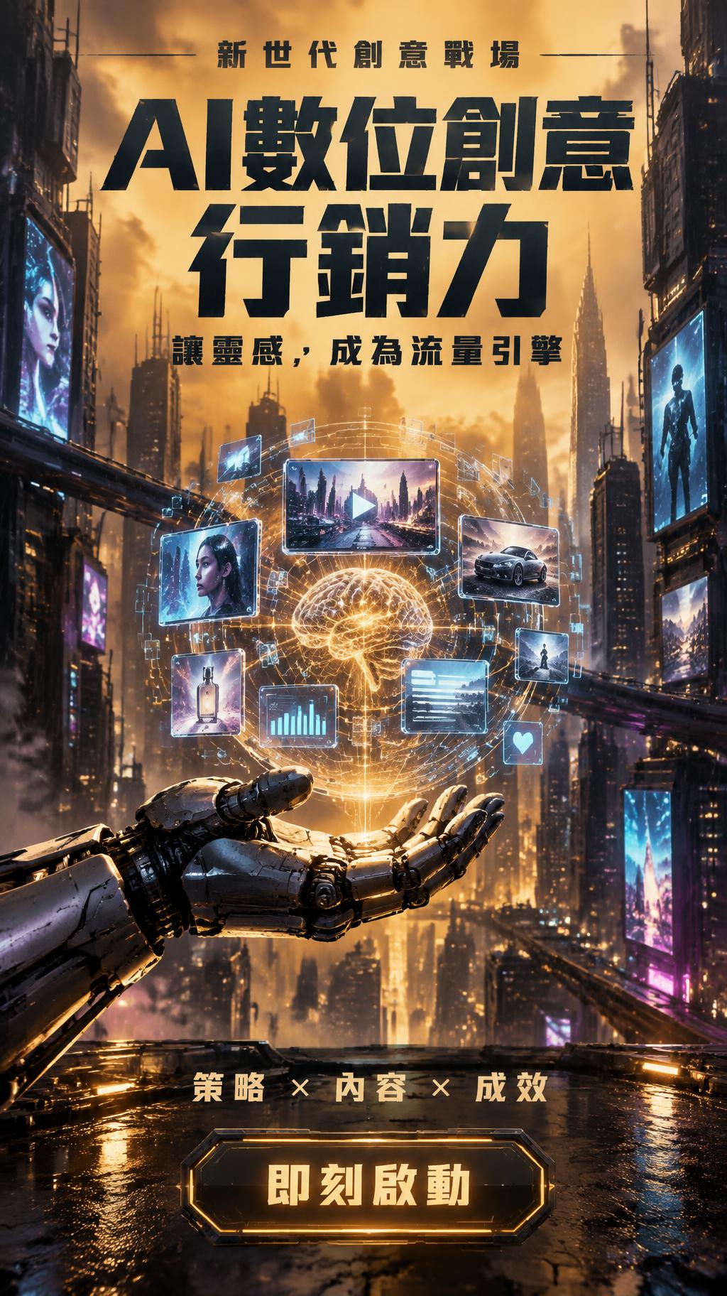
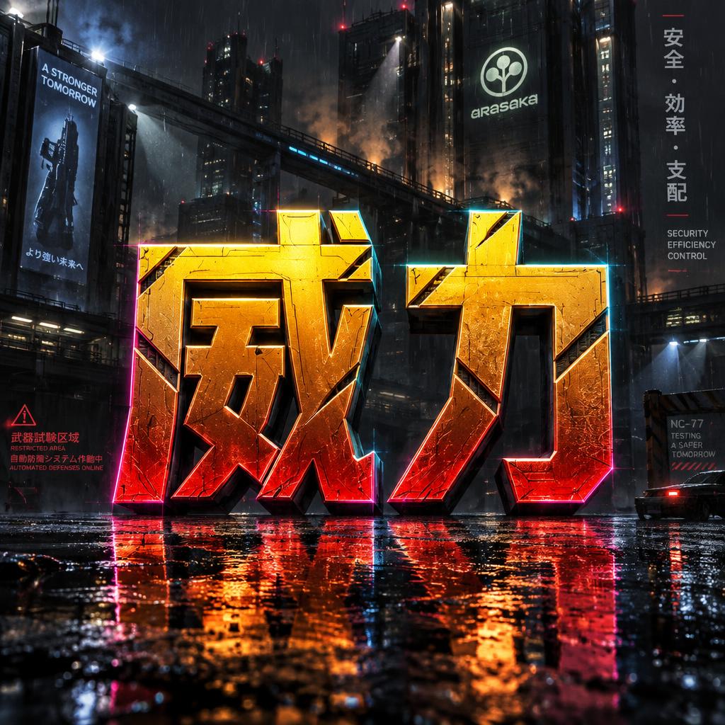
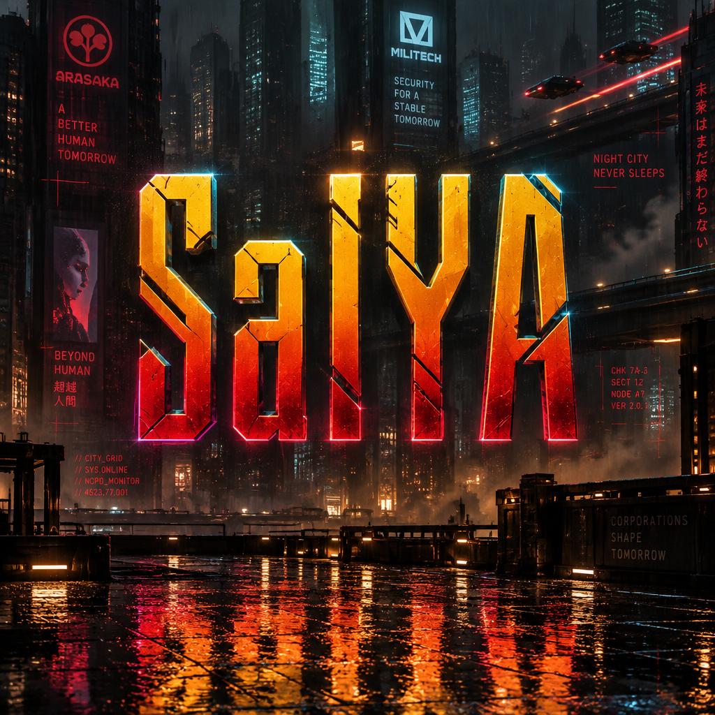
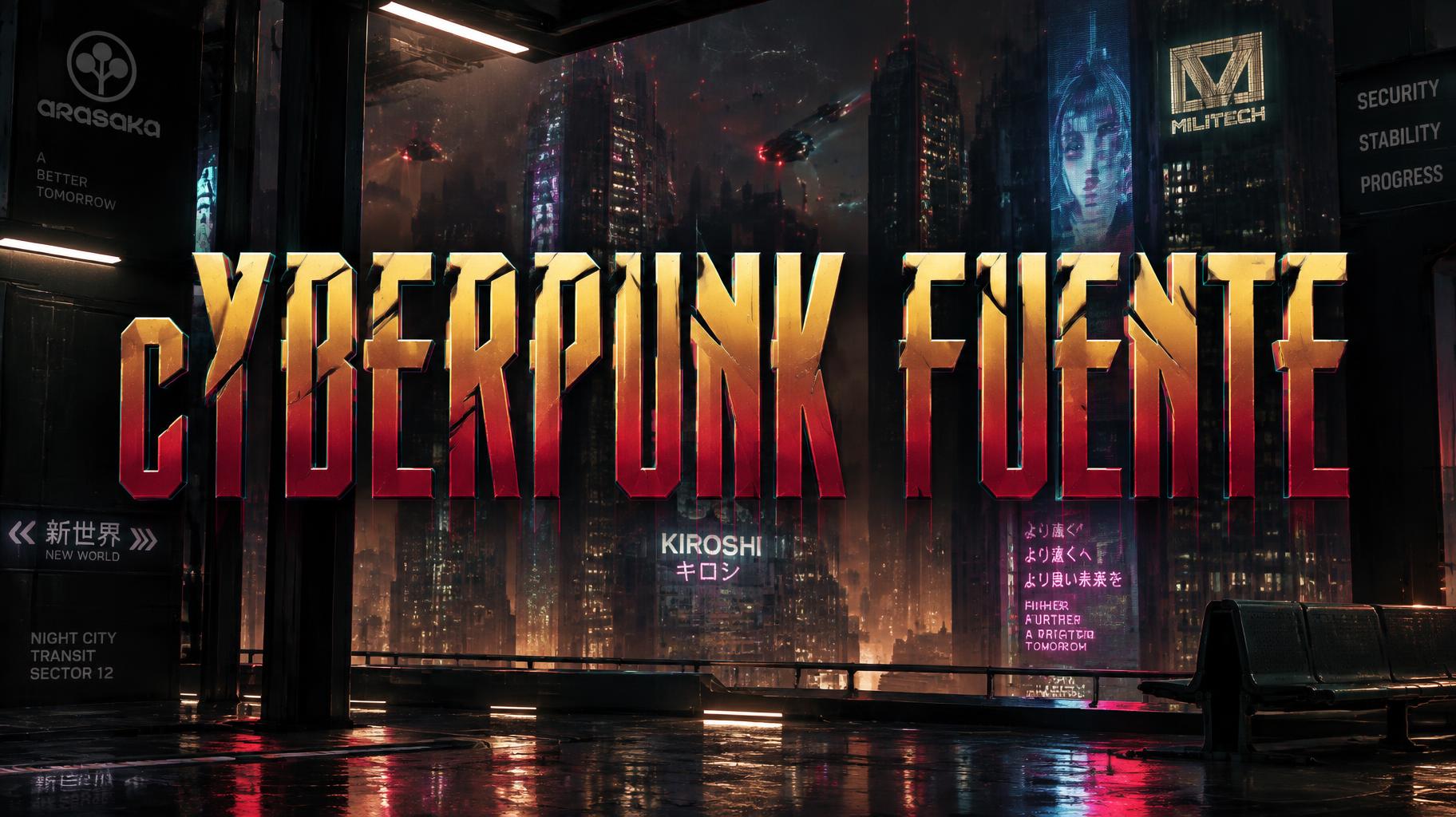
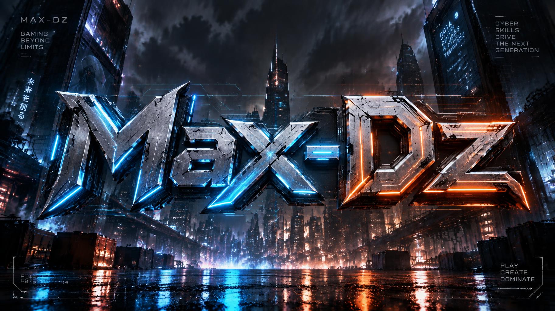
Cyberpunk 2077 — Galería
Resultados reales del estilo Cyberpunk 2077. Haz clic en cualquier imagen para ver detalles.








Estilos de efectos de texto similares
Prueba estos estilos y crea tus propios efectos de texto generados con IA.
¿Buscas texto elegante para copiar y pegar? Prueba nuestras herramientas de generador de fuentes gratis — cursiva, gótica, burbuja y 30+ estilos.
Perfecto para estos proyectos
Los efectos de texto Cyberpunk 2077 son populares para proyectos creativos donde el impacto visual importa.
¿Qué es el estilo de fuente Cyberpunk 2077?
El estilo de fuente Cyberpunk 2077 es un efecto tipográfico distintivo generado con IA. Inspiradas en la estética icónica de Night City: letras cromadas en amarillo y rojo con cortes angulares y una atmósfera empapada de neón.
Con el generador de IA cyberpunk 2077 de FontVibe puedes crear efectos de texto impactantes en segundos — sin Photoshop, sin licencias de fuente, sin experiencia en diseño.
Explora la galería de Cyberpunk 2077 para inspirarte, o explora los más de 135 estilos de efectos de texto IA disponibles en FontVibe.
Cómo crear tipografía Cyberpunk 2077 en FontVibe Estudio
1. Escribe tu texto — Cualquier palabra, frase o nombre de marca. Funciona mejor con texto corto y contundente.
2. Elige Cyberpunk 2077 — Desde la biblioteca de estilos. Opcionalmente, describe un ambiente en el prompt personalizado.
3. Genera y descarga. Tu obra de fuente Cyberpunk 2077 está lista en segundos. PNG, JPG o PNG transparente.
¿Buscas algo diferente? Explora la biblioteca completa de estilos de fuente para más opciones de tipografía IA.
Efecto de texto Cyberpunk 2077 — Preguntas frecuentes
La historia detrás de Cyberpunk 2077
Historia, ADN visual y contexto cultural — todo lo que hace que este estilo sea lo que es.
Night City por diseño
Cyberpunk 2077 no es solo un videojuego: es uno de los mundos cyberpunk diseñados de forma más sistemática que se hayan construido jamás. CD Projekt Red pasó casi una década construyendo Night City, partiendo del Cyberpunk original, el juego de rol de mesa de Mike Pondsmith (1988), y de una biblia visual interna detallada desarrollada por el director de arte Jakub Kijowski y su equipo.\n\nLo que hace distintiva la estética del juego dentro de la familia cyberpunk es su carácter deliberadamente estadounidense. Donde el cyberpunk clásico imagina las calles de Tokio y megaciudades asiáticas empapadas de lluvia, Night City es California: autopistas anchas, plazas corporativas, cultura del automóvil, esa desolación particular de una distopía quemada por el sol y no oscurecida por la lluvia. La paleta amarillo-dorada es parte de esa elección: se lee como caliente, árida, saturada de comercio.\n\nEl diseño visual del juego se convirtió en un punto de referencia para toda una generación de diseñadores, hubieran jugado o no. El sistema angular de letras cromadas, el lenguaje de los logos corporativos y la forma en que los elementos holográficos de la interfaz interactúan con el espacio físico han circulado ampliamente en las comunidades de diseño desde el lanzamiento del juego en 2020.
El ADN visual
¿Sabías que?
El lenguaje visual de Cyberpunk 2077 se desarrolló a partir del juego de rol de mesa de Mike Pondsmith de 1988, Cyberpunk 2020. CD Projekt Red trabajó de cerca con Pondsmith para que el mundo se sintiera como una evolución genuina de su universo y no como un reinicio.
La arquitectura de Night City bebe mucho de Los Angeles y Las Vegas, no de Tokio ni Hong Kong. El equipo creativo tomó la decisión deliberada de situar su cyberpunk en la expansión urbana estadounidense: sol, autopistas y plazas corporativas en lugar de lluvia y callejones estrechos.
La paleta amarillo-dorada fue una respuesta directa a la monotonía visual de los juegos cyberpunk oscuros y azules. El equipo de arte quería que Night City se sintiera abrumadora y sobresaturada: un mundo donde hasta la iluminación intenta venderte algo.
Cyberpunk 2077 (2020, CD Projekt Red) se basa en el juego de rol de mesa de Mike Pondsmith de 1988; su logotipo amarillo ácido, atravesado por trazos azules de glitch, se diseñó para parecer pintado con espray en el muro de una ciudad futura.