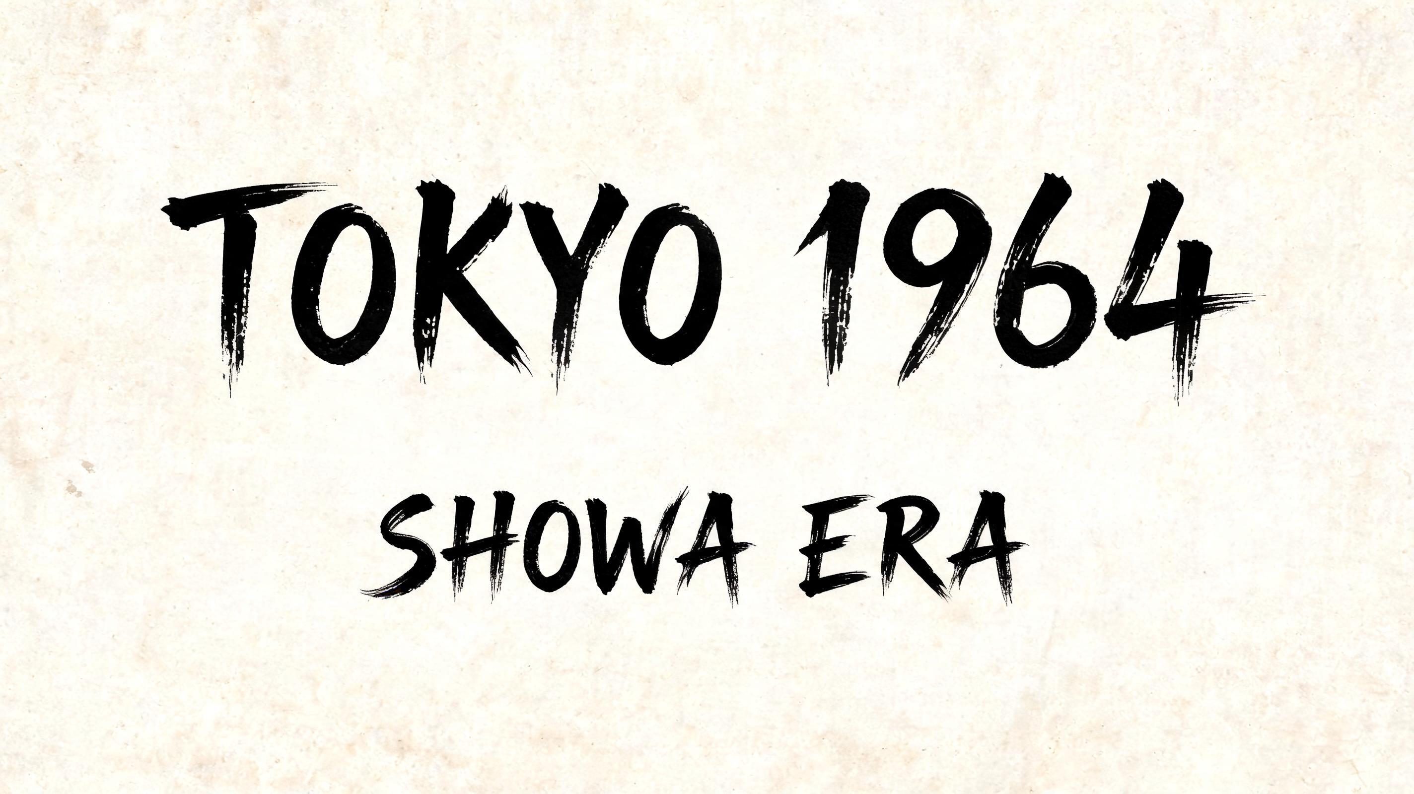
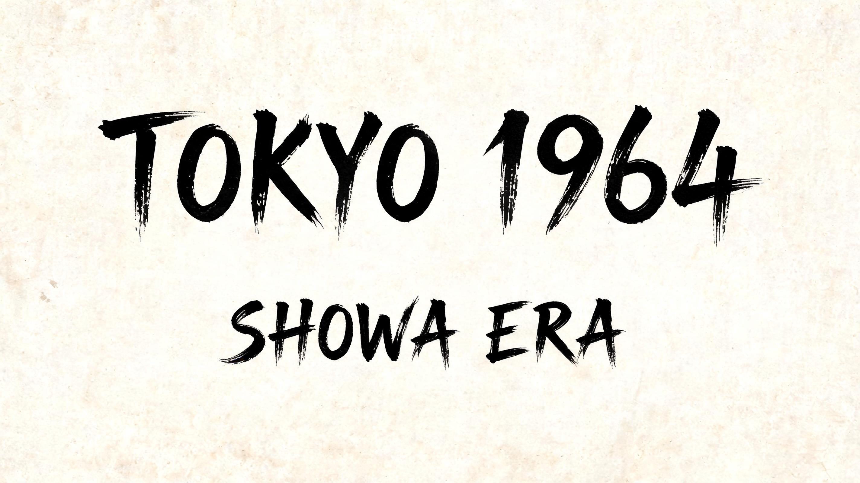
TOKYO 1964 SHOWA ERA - 日本水墨毛笔 Text Effect


用原作的模型 BytePlus Seedream 5.0 · 15 积分











“TOKYO 1964 SHOWA ERA”是使用 FontVibe AI 创作的日本水墨毛笔文字效果。把日本书道的水墨毛笔笔法用到拉丁字母上。浓黑的墨汁配上地道的毛笔笔势、单向可控的运笔,还有和纸的质感。做日料店品牌、纹身设计、动漫、武道和文化类项目都特别合适。
Japanese Shodo ink brush calligraphy in the tradition of mid-century Japanese poster and graphic design. Latin letterforms painted with the bold graphic clarity of Japanese commercial art — fude brush strokes with the decisive precision of designed marks, not spontaneous expression. Each stroke is placed like an element in a composition: intentional, structural, contributing to the whole. Deep sumi black ink, consistent weight throughout. Background: off-white aged paper with slight grain — the texture of a vintage Japanese print or exhibition poster. The aesthetic: the energy of Japanese Olympic, World's Fair, and cultural poster design from the Showa era — where calligraphy and graphic design merged into something entirely new. A mid-century Japanese design exhibition — the National Museum of Modern Art, Tokyo. The exhibition opens with a large centerpiece graphic panel: "TOKYO 1964 / SHOWA ERA" in bold Shodo-graphic calligraphy — the aesthetic of the Tokyo Olympics, World's Fair posters, and Showa-era cultural design. Deep sumi black on off-white exhibition paper, decisive structural marks. Top tier: "TOKYO 1964" — massive dominant poster letters at 65% canvas width, centered — calligraphy with the decisive precision of designed marks, each stroke placed like a composition element. Bottom tier: "SHOWA ERA" — bold secondary letters at 50% canvas width, centered. Vertical spacing ratio approximately 5:3. The composition reads as a prestige Japanese design exhibition piece — Showa era poster mastery, calligraphy elevated to graphic design.
用途: 日式海报字体生成器
生成于 2026年7月21日 · 2848 × 1600 · JPEG · BytePlus Seedream 5.0 · 公开作品 · 可免费商用(CC BY 4.0)


