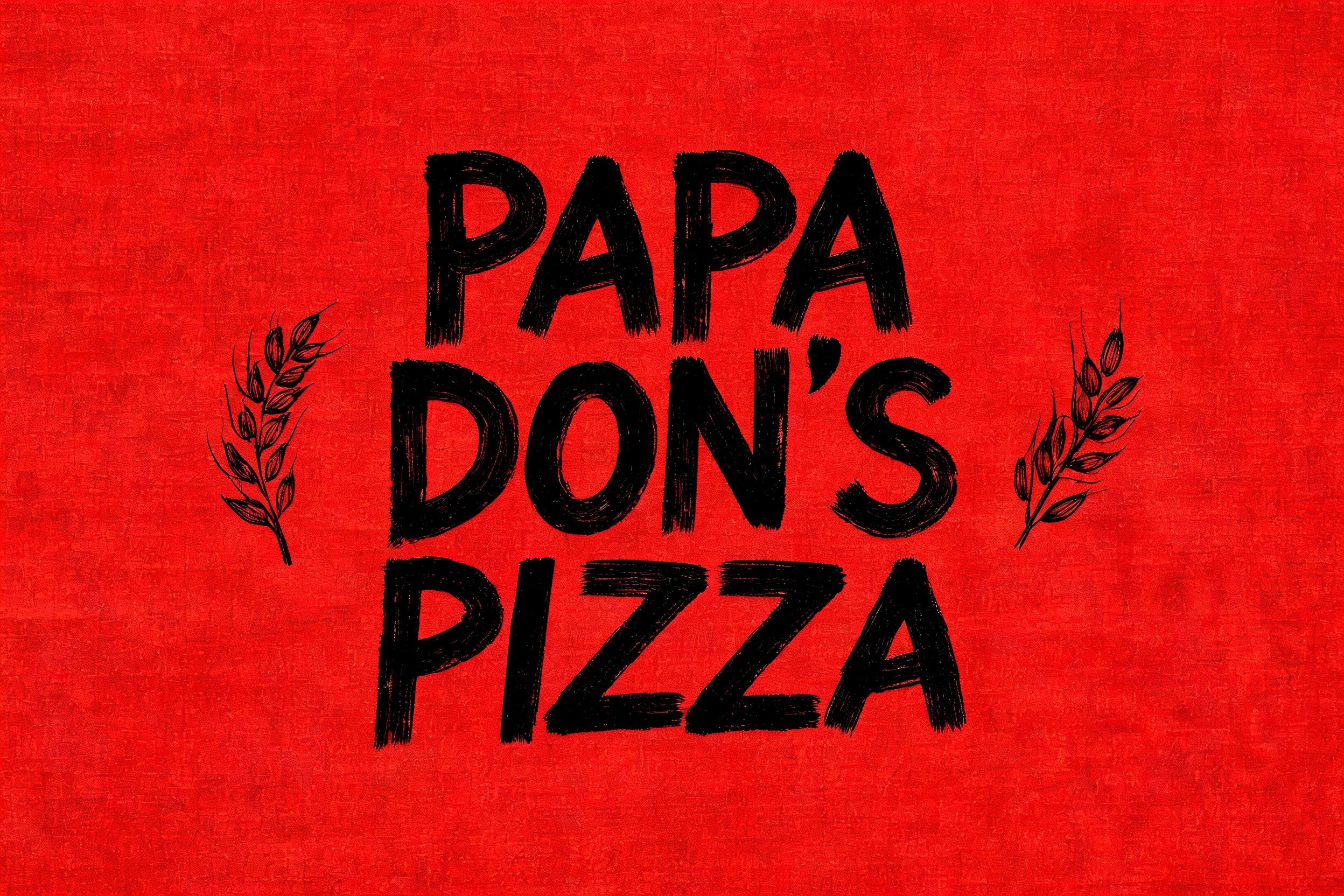
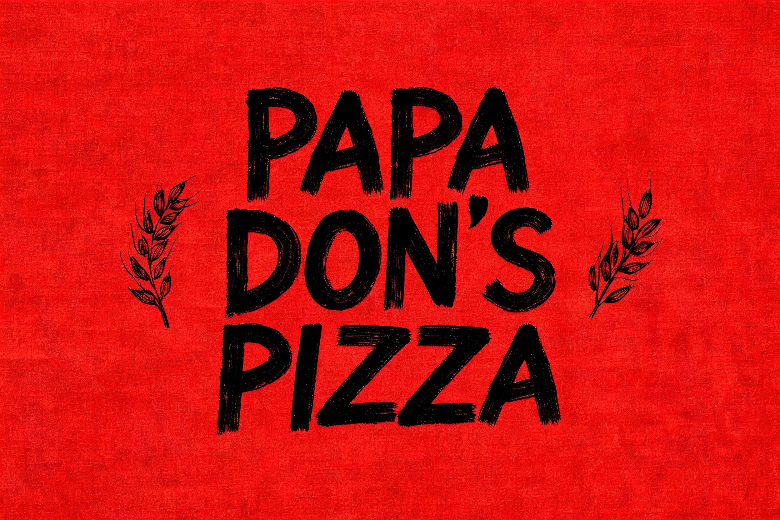
PAPA DON'S PIZZA - 现代手写体 Text Effect


用原作的模型 BytePlus Seedream 5.0 · 15 积分
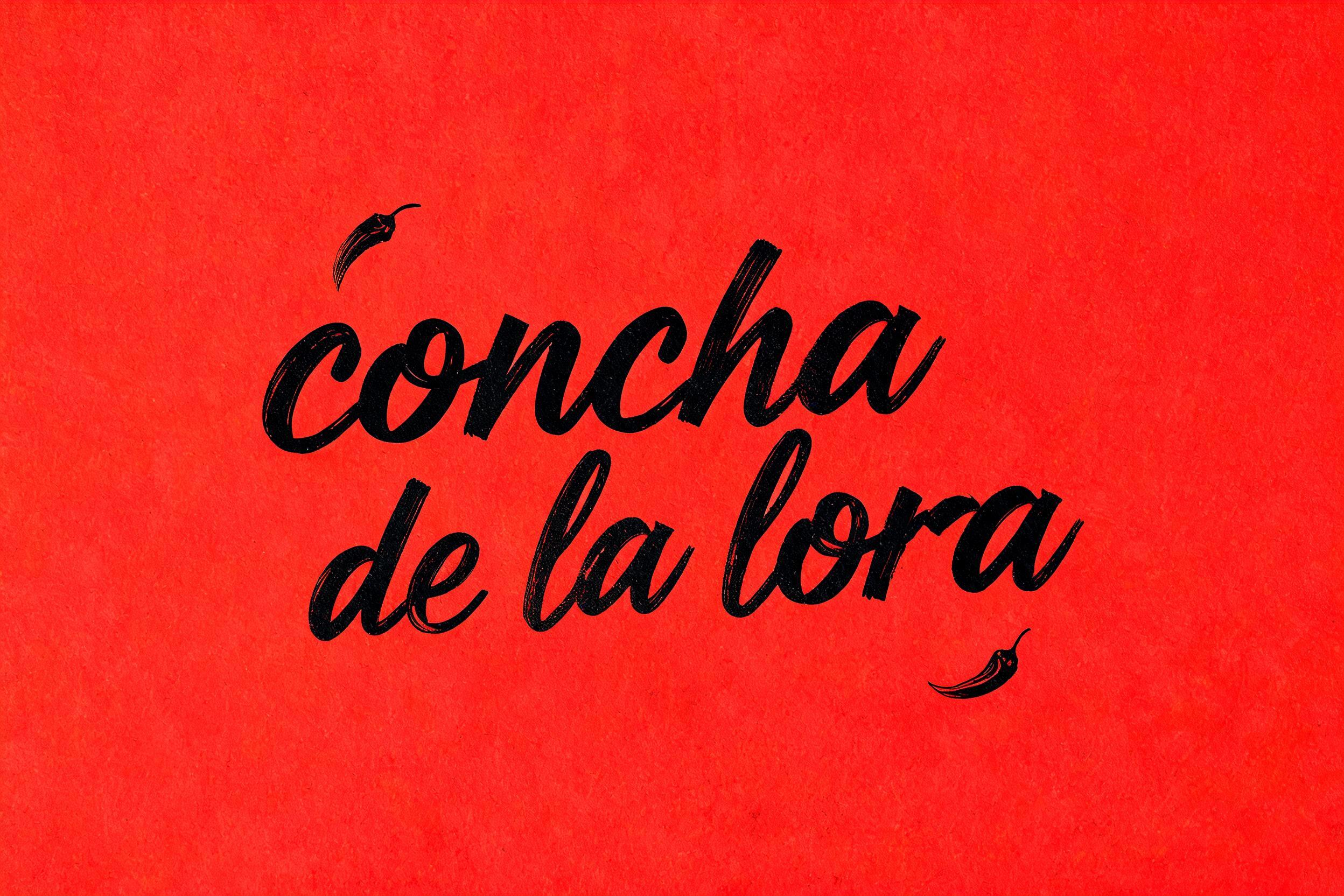
“PAPA DON'S PIZZA” is a Cursive Modern text effect 使用 FontVibe AI 创作的文字效果. 粗壮的现代毛笔手写体:饱蘸墨的粗笔触,基线上下跳动,提笔处带枯笔拖痕,哑光黑墨落在干净浅色底上.
grounded in bold, contemporary brush-lettering ink. SURFACE / INK: rich, confident ink laid down with a loaded brush — mostly matte with a faint fresh-ink sheen, a subtle brushed texture in the strokes and a touch of dry-brush grain where they lift, energetic and hand-made. GROUND: a clean, modern surface — a bright studio backdrop, a soft neutral, a bold flat colour block, or a contemporary branding/packaging context — with generous space so the lettering pops. LIGHT: clean, even, contemporary studio light — punchy and bright, minimal drama. ATMOSPHERE: current, confident and commercial — the look of modern brand lettering, apparel graphics, packaging and social content. LETTERFORM PRIORITY: when the chosen font carries its own treatment, that font's letterform shapes take priority and own the letters; this style governs only the ink surface, ground and light, never the letter shapes. When no specific material is defined by the font: rich confident brush ink, mostly matte with a subtle brushed texture, on the clean modern ground. COLOR: if the font declares its own color keep it; otherwise the lettering reads as a bold contemporary tone — deep black or a single confident colour — on the clean ground. 'PAPA DON'S PIZZA' rendered as bold loaded-brush lettering, the hero text filling the dominant visual field with confident hand-made weight. The lettering sits on a deep tomato-red flat colour block — a rich, saturated matte ground — with generous breathing room on all sides. Ink treatment: dense black brush strokes with a subtle matte sheen, faint bristle-drag texture visible through the thick downstrokes, and a whisper of dry-brush grain at stroke terminals where the brush lifts — energetic, hand-painted, unmistakably artisan. A secondary decorative element: a thin hand-drawn wheat or laurel sprig in the same confident black brush ink flanking or tucking beneath the text, rendered in a lighter-weight gestural stroke for hierarchy contrast. Ground texture: the red field has an almost imperceptible linen-paper grain — not a distress effect, just enough tactile warmth to keep it from reading as pure digital flat. Light: bright, even, punchy studio light — no harsh shadows, no dramatic raking — the kind of clean commercial illumination that makes food packaging leap off a shelf. The overall feel is a bold, contemporary pizzeria brand identity: confident brush-script lettering on a classic Italian-American red, fresh-ink matte surface, strong typographic rhythm between the three words.
生成于 2026年7月24日 · 2496 × 1664 · JPEG · BytePlus Seedream 5.0 · 公开作品 · 可免费商用(CC BY 4.0)


