

THE NEW YORK TIMES · SINCE 1851 - 哥特字体 Text Effect

与原作同款模型 · 40 积分
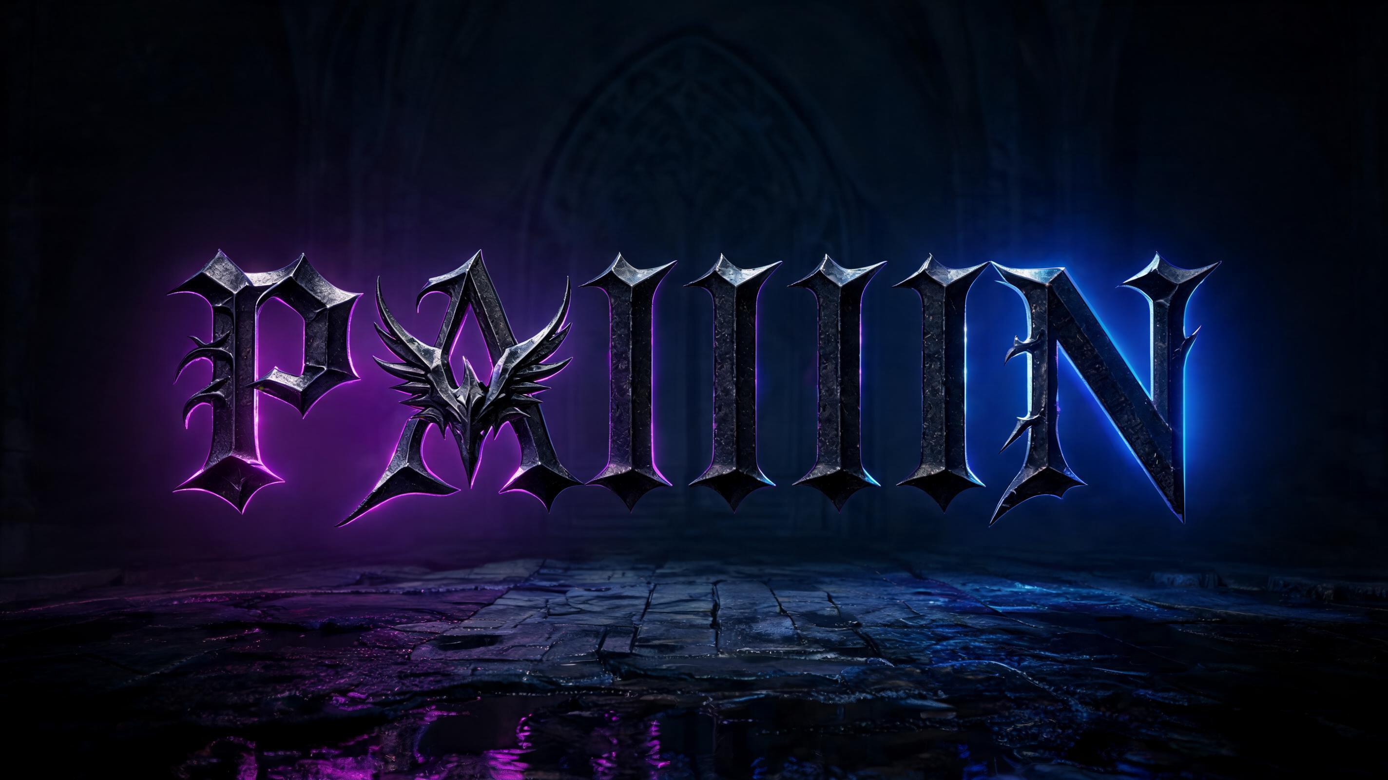

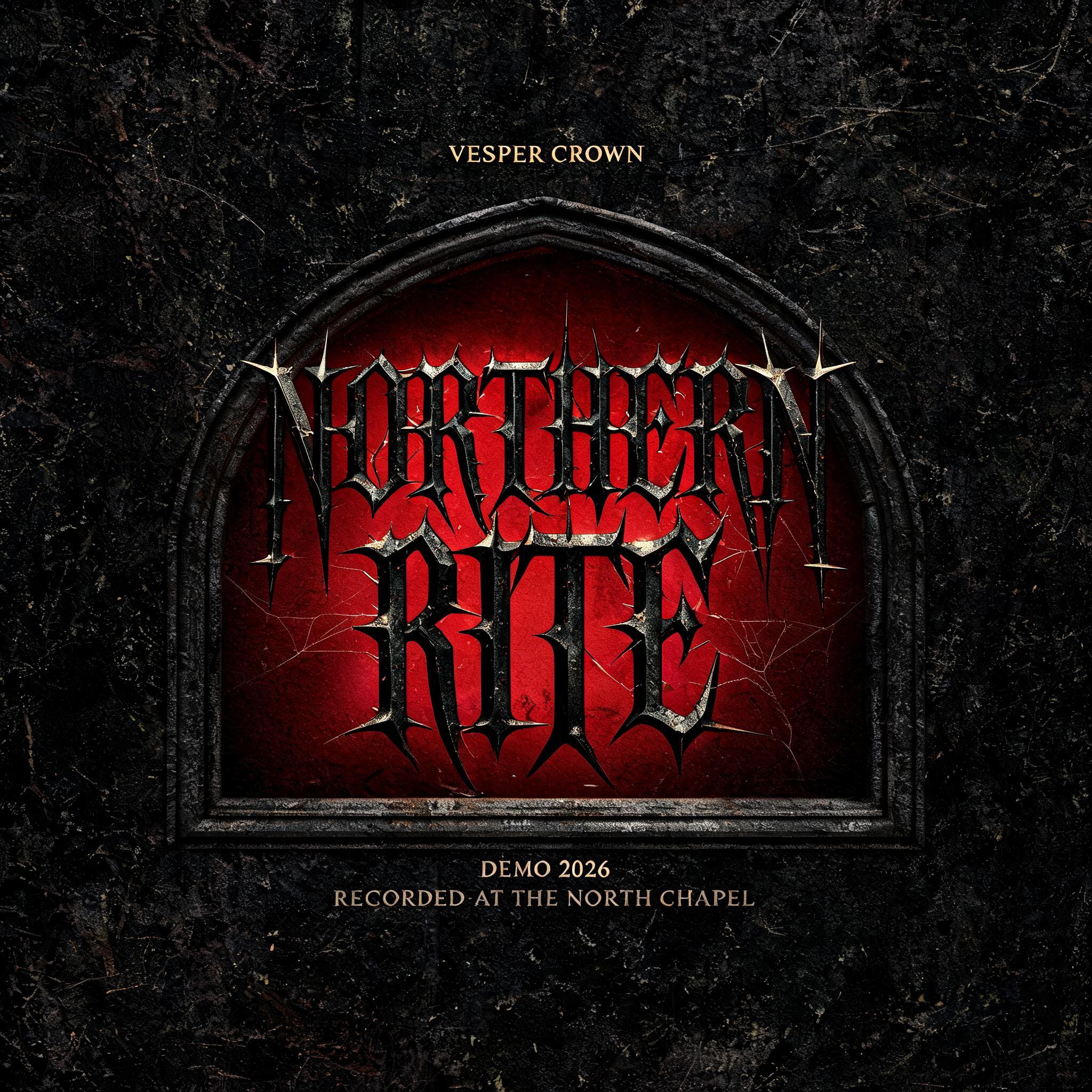

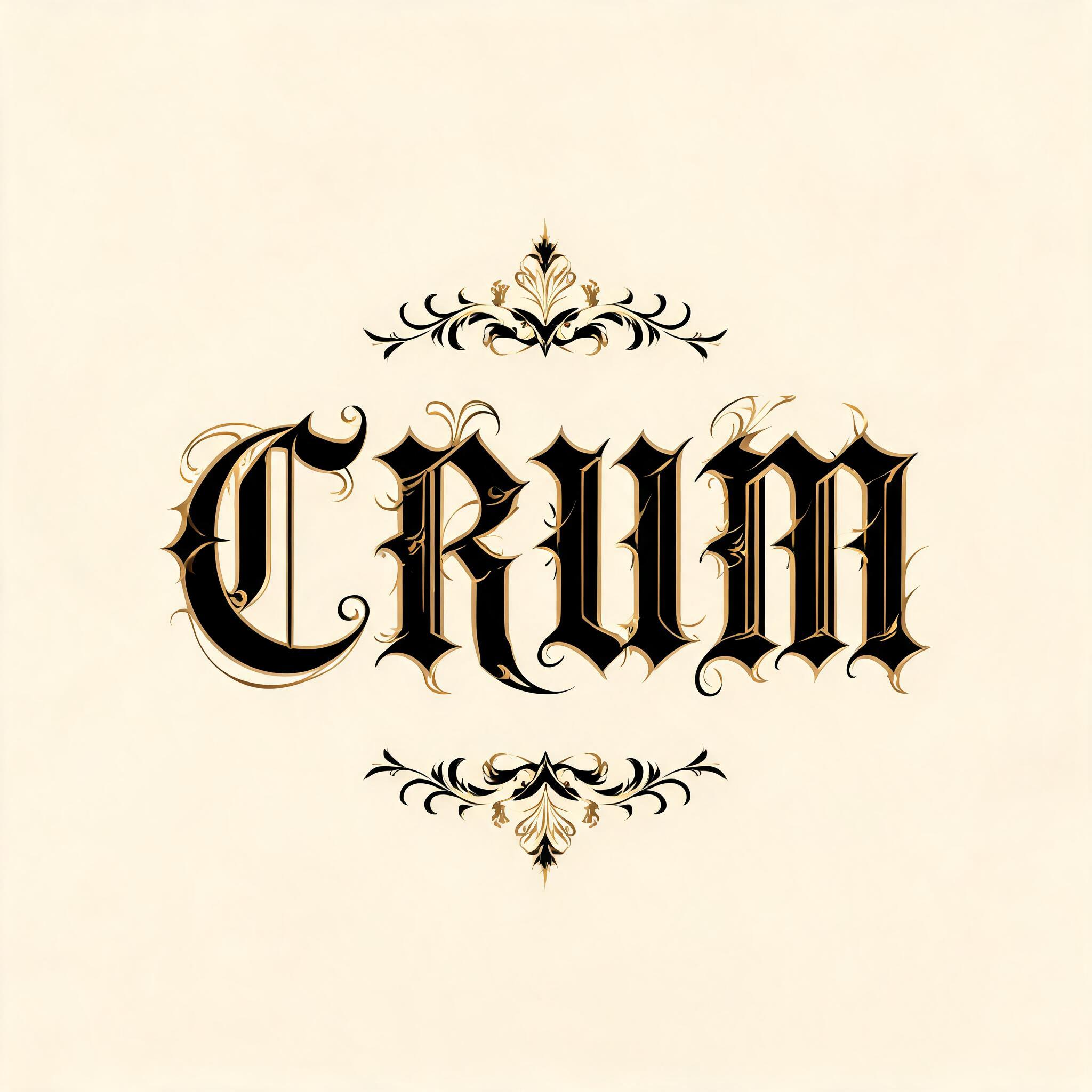

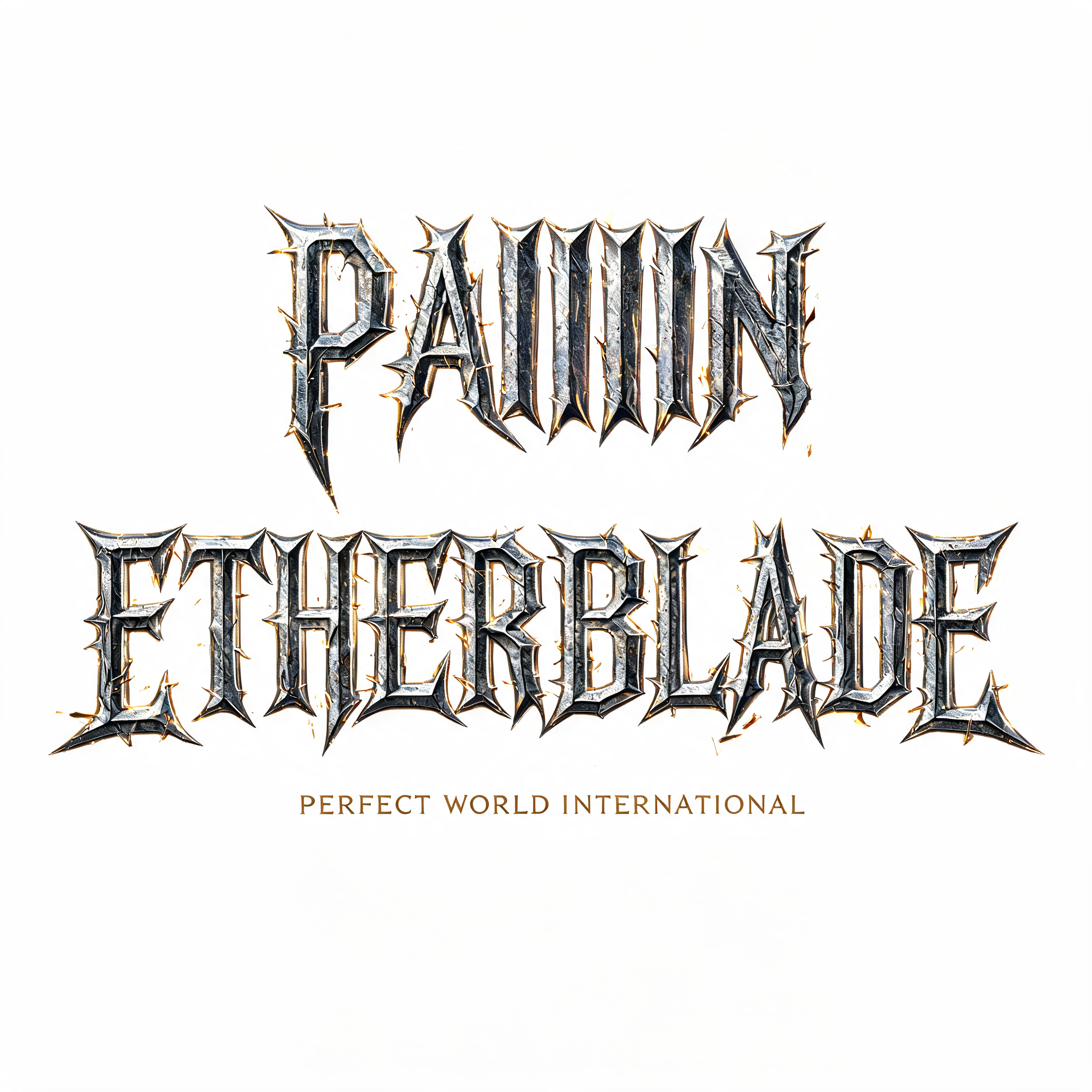


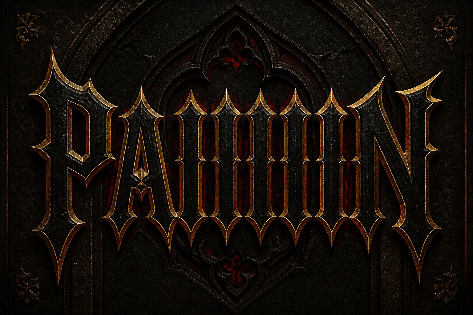




“THE NEW YORK TIMES · SINCE 1851” is a Gothic Font text effect 使用 FontVibe AI 创作的文字效果. 严谨的 Textura 哥特黑体:窄长的折笔、菱形笔端和强烈粗细对比,黑墨带金色描边,写在深色旧羊皮纸上.
rendered in precise Textura Quadrata blackletter — the compressed vertical script of medieval northern European manuscripts. CRITICAL FEATURES: (1) EXTREMELY COMPRESSED narrow letterforms — very tall, very narrow, creating density of woven cloth; (2) DIAMOND-SHAPED LOZENGE COUNTERS — the white internal spaces inside letters must be pointed diamond/rhombus shapes, NOT oval or round; (3) VERTICAL RIBBING DENSITY — words together create almost fence-like vertical bar pattern; (4) CONSISTENT INK WEIGHT — uniform stroke thickness. Academic manuscript ink quality. Not aggressive, not decorative — scholarly precision. Classic broadsheet newspaper texture background, aged newsprint with subtle grey tones, crisp editorial authority, heritage publishing atmosphere. Perfectly centered layout: "THE NEW YORK TIMES" in large classic blackletter filling 65% of frame width. Thin horizontal rule lines above and below. "SINCE 1851" in small refined caps below, about 15% width. Newspaper masthead gravitas, ink on quality newsprint.
用途: 哥特黑体
生成于 2026年4月30日 · 2848 × 1600 · JPEG · 公开作品 · 可免费商用(CC BY 4.0)


