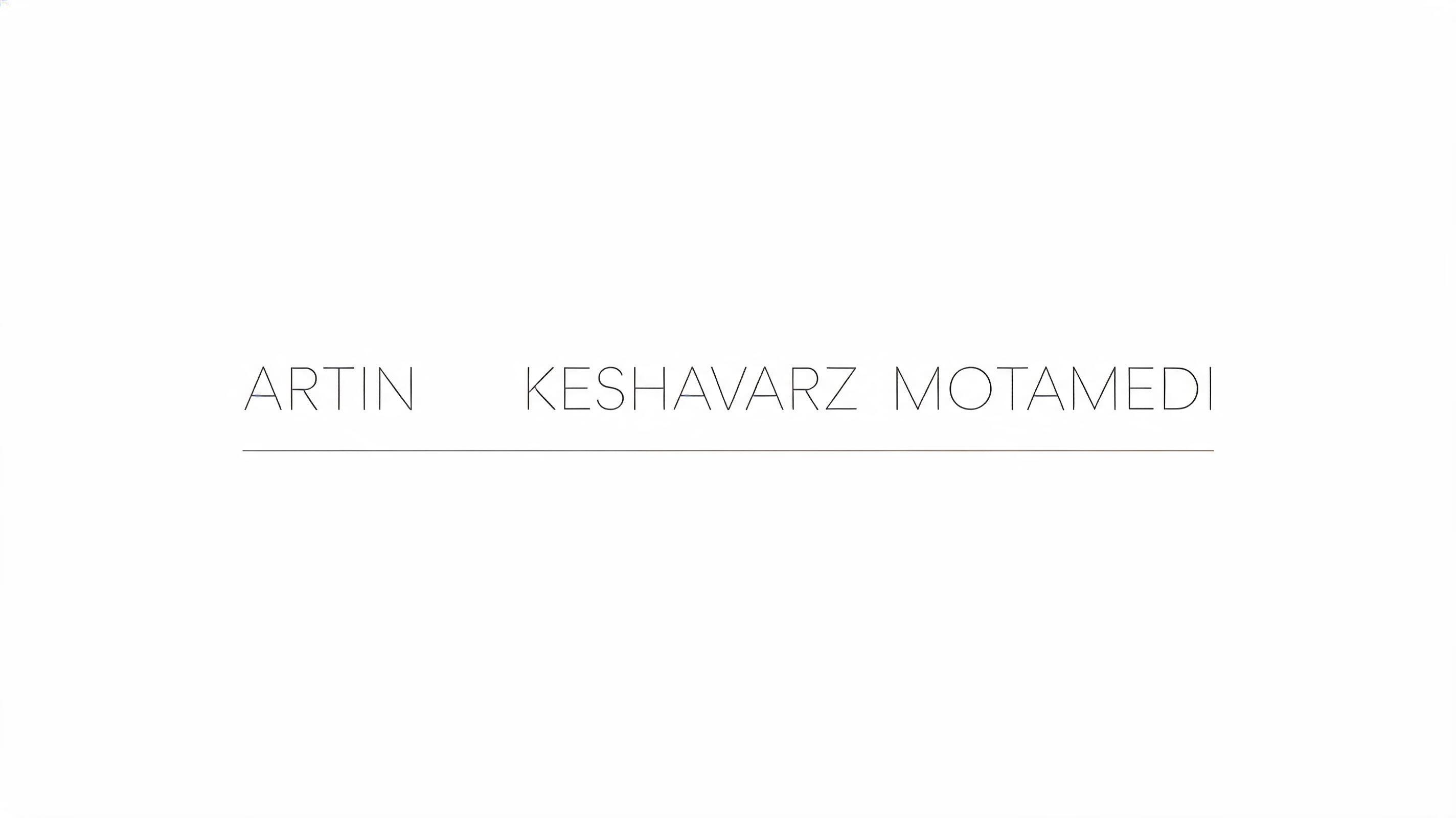
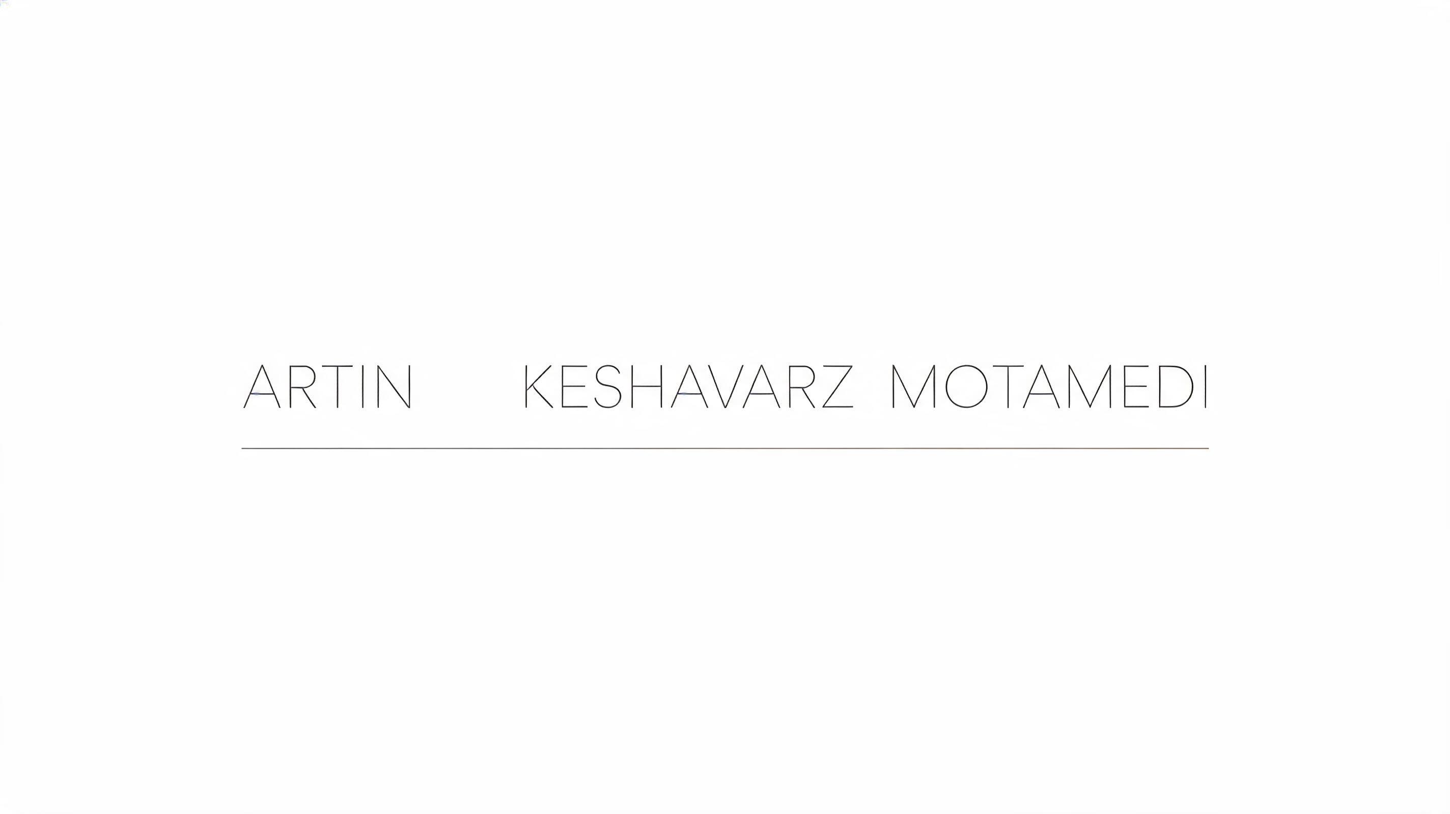
Artin keshavarz motamedi - 极简 Text Effect


用原作的模型 BytePlus Seedream 5.0 · 15 积分



“Artin keshavarz motamedi”是使用 FontVibe AI 创作的极简文字效果。深灰色几何无衬线字,字距宽松,下方一道发丝细线,平涂哑光,置于几乎空白的米白底上。
a clean, minimal, spacious piece — restrained and modern, defined by what is left out. SURFACE / STYLE: refined typography with generous letterspacing and abundant negative space, a flat matte finish and at most a single fine accent rule or hairline detail — no texture, no gloss, no ornament. SCENE ATMOSPHERE: a calm, bright, uncluttered setting — clean white or soft neutral ground, even diffuse light, architectural emptiness, the luxury of breathing room. PALETTE: a sophisticated monochrome — soft white, light warm grey, charcoal and black, with at most a single muted accent — quiet and tonal, never loud. LETTERFORM PRIORITY: when the chosen font carries its own treatment (clean geometric sans, neutral grotesque, condensed sans, zen minimal, fine monoline), that font's letterform takes priority and owns the letters; this style governs the generous spacing, the negative space, the matte monochrome finish and the calm bright scene. FALLBACK MATERIAL: if the font carries no material of its own, render the letters in a clean thin modern sans in soft charcoal on a bright white ground with wide letterspacing, abundant negative space and a single fine accent rule, so the minimal elegance always reads. 'Artin keshavarz motamedi' rendered with generous letterspacing across a clean white ground, the full name given room to breathe with abundant negative space surrounding each letterform — a calm typographic presence with no ornament and no texture. A single fine hairline rule, rendered in light warm grey, sits beneath the text as the sole accent detail, anchoring the composition without weight. The surface is flat matte, the light even and diffuse — no shadows, no gloss, no gradient. Palette is a sophisticated monochrome: soft white ground, letters in soft charcoal, the rule in a quieter mid-grey. The scene reads as an architectural wordmark or personal brand mark — restrained, modern, and precise. The name's three distinct parts carry a gentle typographic rhythm, the longest word 'keshavarz' naturally holding visual gravity at the heart of the composition, flanked by the shorter first and last name elements. Clean editorial emptiness surrounds the text on all sides, the luxury of breathing room defining the entire field.
生成于 2026年7月27日 · 2848 × 1600 · JPEG · BytePlus Seedream 5.0 · 公开作品 · 可免费商用(CC BY 4.0)


