

AS I LAY DYING · 你我皆为墨 - 哥特字体 Text Effect

与原作同款模型 · 40 积分


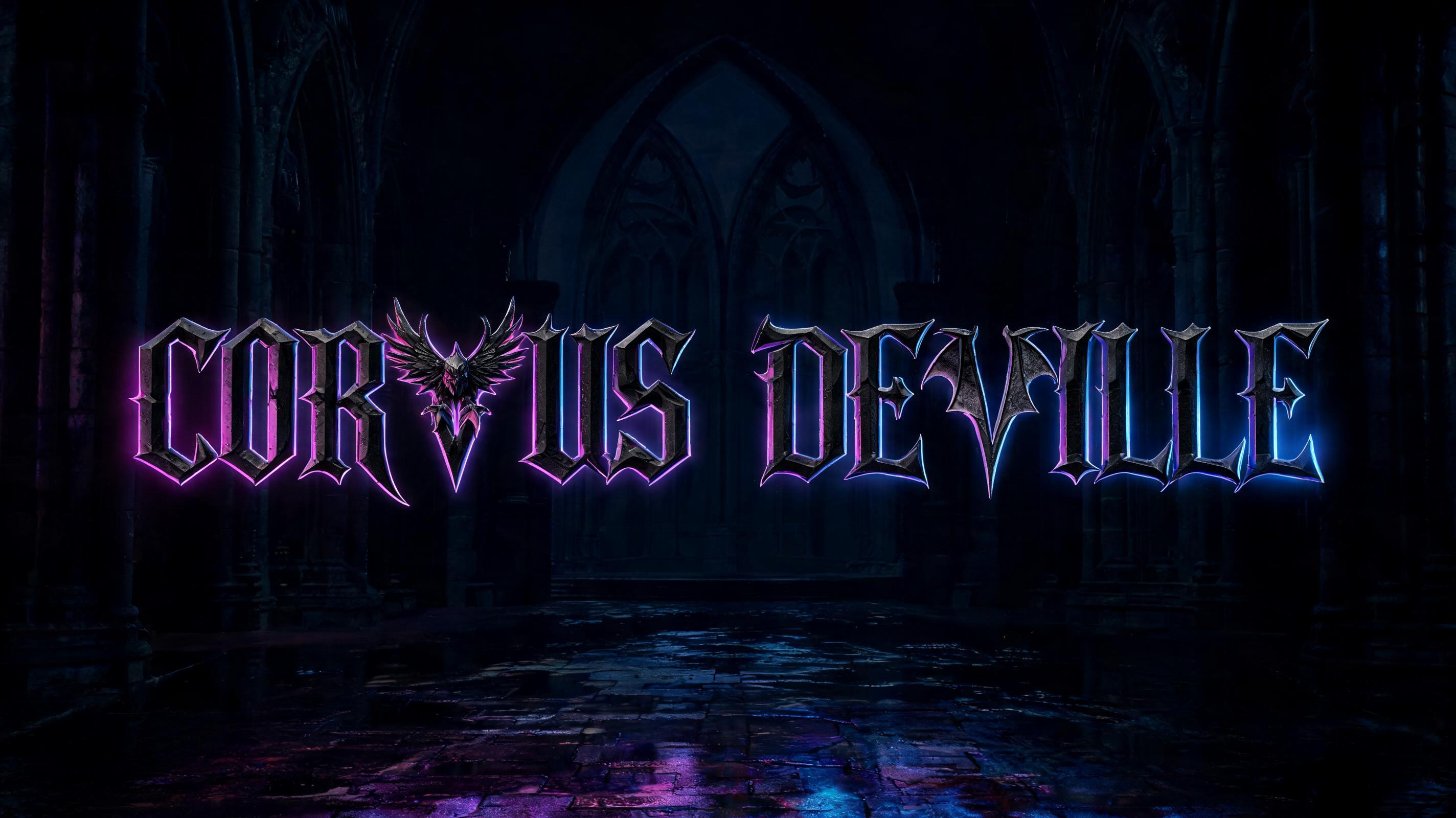


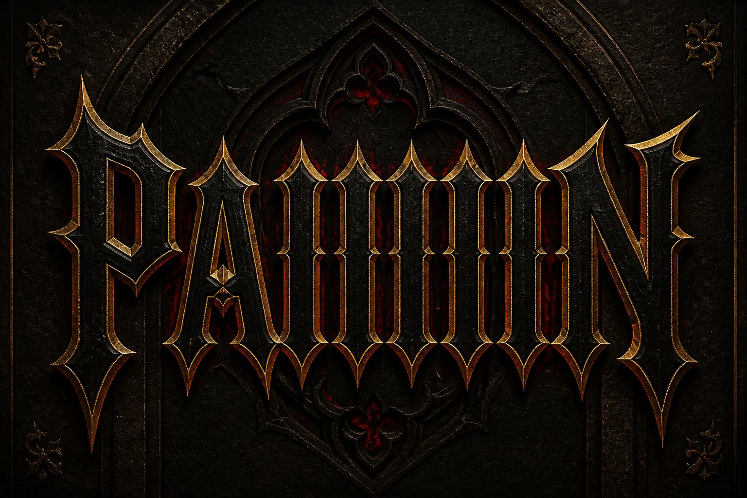
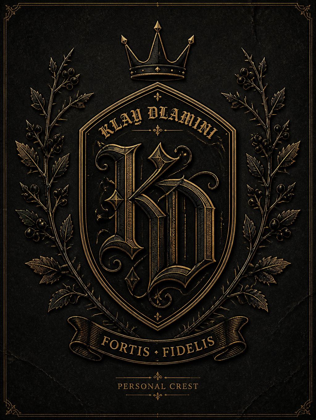



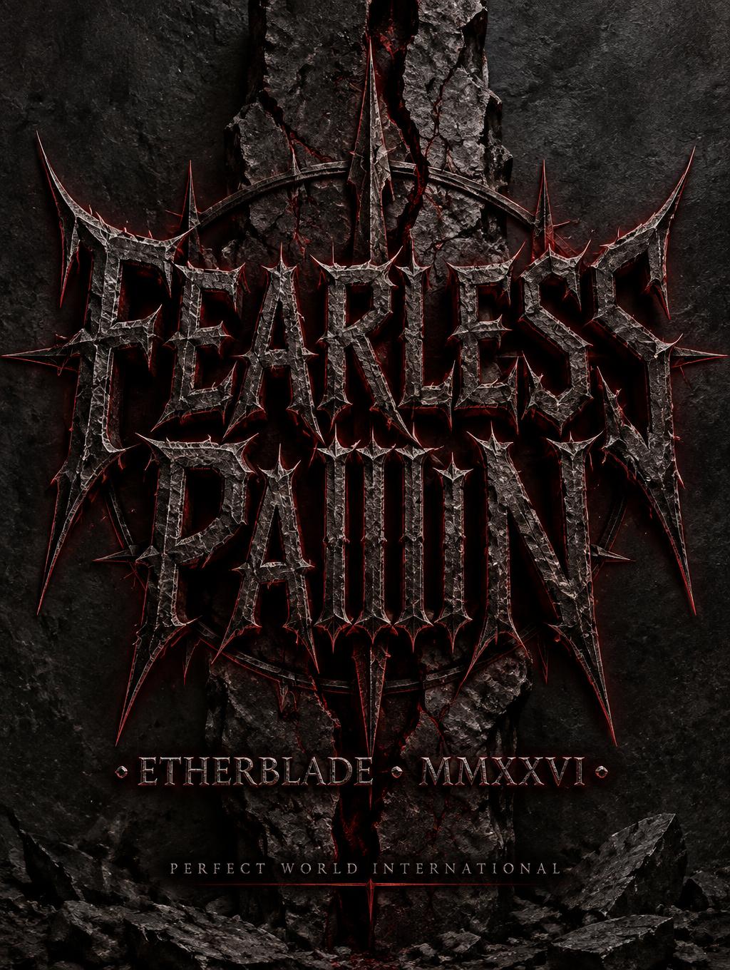
“AS I LAY DYING · 你我皆为墨” is a Gothic Font text effect 使用 FontVibe AI 创作的文字效果. 严谨的 Textura 哥特黑体:窄长的折笔、菱形笔端和强烈粗细对比,黑墨带金色描边,写在深色旧羊皮纸上.
rendered as HAND-LETTERED gothic calligraphy — must look like physically written by skilled calligrapher with broad-nib pen, NOT a digital font. CRITICAL FEATURES: (1) ORGANIC THICK-THIN VARIATION — strokes thick when pen moves one direction, thin when angle changes, fluid and irregular; (2) INK POOLING at terminals — small ink accumulations at ends of strokes, organic teardrop shapes; (3) SLIGHT LETTERFORM WOBBLE — long strokes have microscopic wavering, not perfect straight lines; (4) WARM INK TONE — brown-black Indian ink, not cold pure black; (5) VISIBLE PEN ANGLE — 45-degree pen angle creates consistent thick-thin based on stroke direction. Should look like a master calligrapher spent 20 minutes on this one word. Dual-culture paper surface: left half warm ivory Japanese washi, right half aged European parchment, meeting at center with ink bleed. "AS I LAY DYING" in gothic calligraphy blackletter upper half, English letterforms with organic brush quality. "你我皆为墨" in flowing Chinese ink calligraphy lower half, brush strokes echoing the gothic rhythm above. Cultural dialogue through calligraphy, experimental bilingual composition.
用途: 哥特书法
生成于 2026年4月30日 · 2048 × 2048 · JPEG · 公开作品 · 可免费商用(CC BY 4.0)


