ベジータ - 日本水墨毛笔 Text Effect


用原作的模型 BytePlus Seedream 5.0 · 15 积分











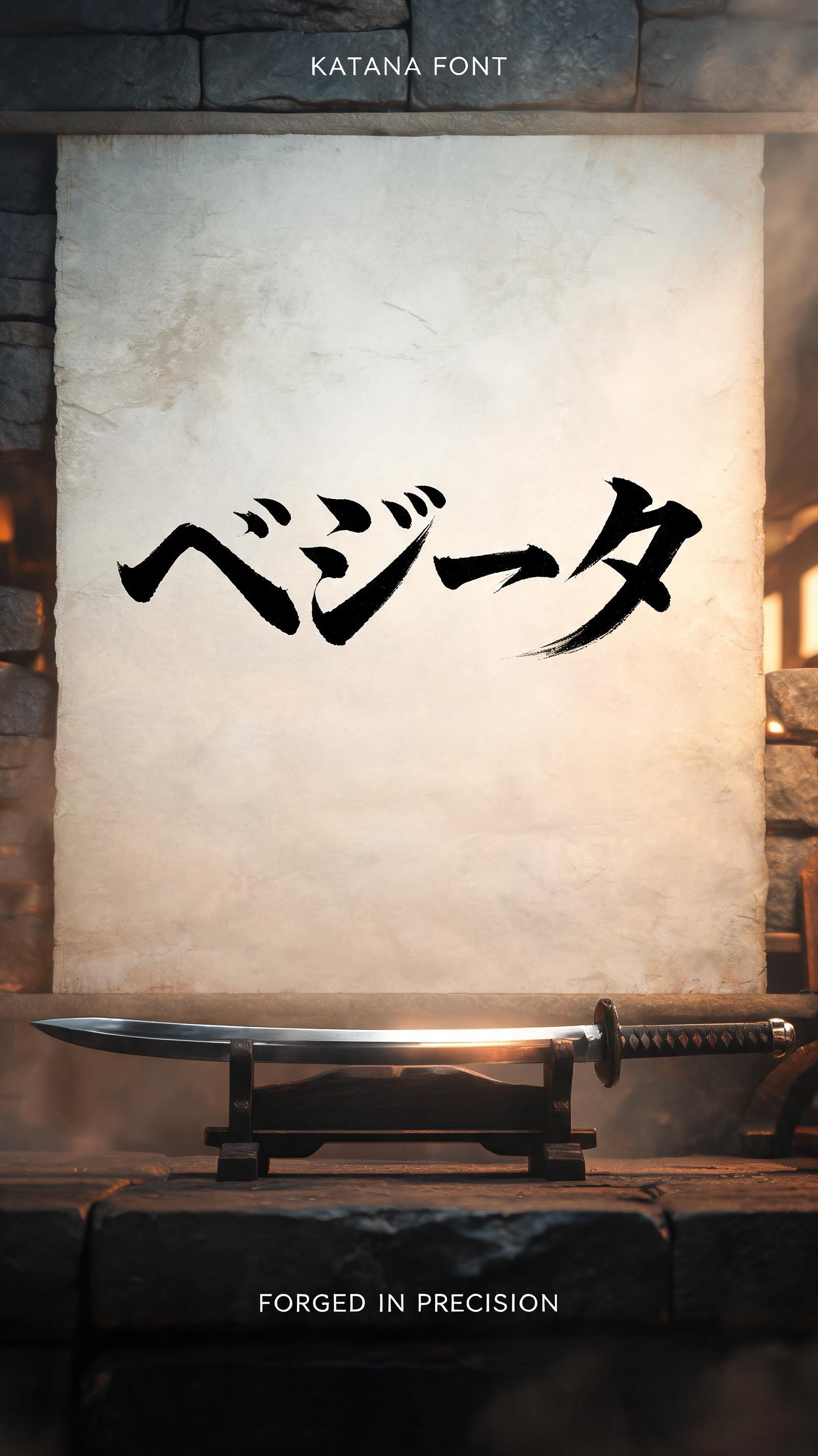
“ベジータ”是使用 FontVibe AI 创作的日本水墨毛笔文字效果。把日本书道的水墨毛笔笔法用到拉丁字母上。浓黑的墨汁配上地道的毛笔笔势、单向可控的运笔,还有和纸的质感。做日料店品牌、纹身设计、动漫、武道和文化类项目都特别合适。
Japanese Shodo ink brush style with katana sword precision. Each stroke executed in a single decisive motion — no hesitation, no correction, like drawing a blade. Letterforms have sword-like sharpness: thin at the entry point, powerful through the middle, clean at the finish. Ink: pure sumi black, maximum density. Background: pale washi with faint sword-path texture. The philosophy of kendo applied to typography — the perfect stroke requires the perfect mind. Ancient Japanese sword workshop (katana forge) — a vertical 9:16 master swordsmith composition. Background: low amber forge light, weathered stone walls, faint smoke haze. A katana blade resting on a wooden stand in the foreground, steel catching the forge glow. The wall behind shows the "ベジータ" calligraphy mounted on aged washi, illuminated by forge light. Top tier: "KATANA FONT" — tiny refined caps at 40% canvas width, upper-center, hairline ink strokes, as precise as a sword-edge. Middle tier: "ベジータ" — massive dominant Shodo brush letters at 65% canvas width, centered — each stroke executed in a single decisive motion, no hesitation, no correction, thin at entry, powerful through the body, clean at the finish, like drawing a blade from its saya. Bottom tier: "FORGED IN PRECISION" — small refined caps at 30% canvas width. Vertical spacing ratio approximately 1:5:1.5. The composition reads as a master swordsmith's signature poster — precision, commitment, permanent craft.
用途: 武士刀字体生成器
生成于 2026年7月31日 · 1600 × 2848 · JPEG · BytePlus Seedream 5.0 · 公开作品 · 可免费商用(CC BY 4.0)


