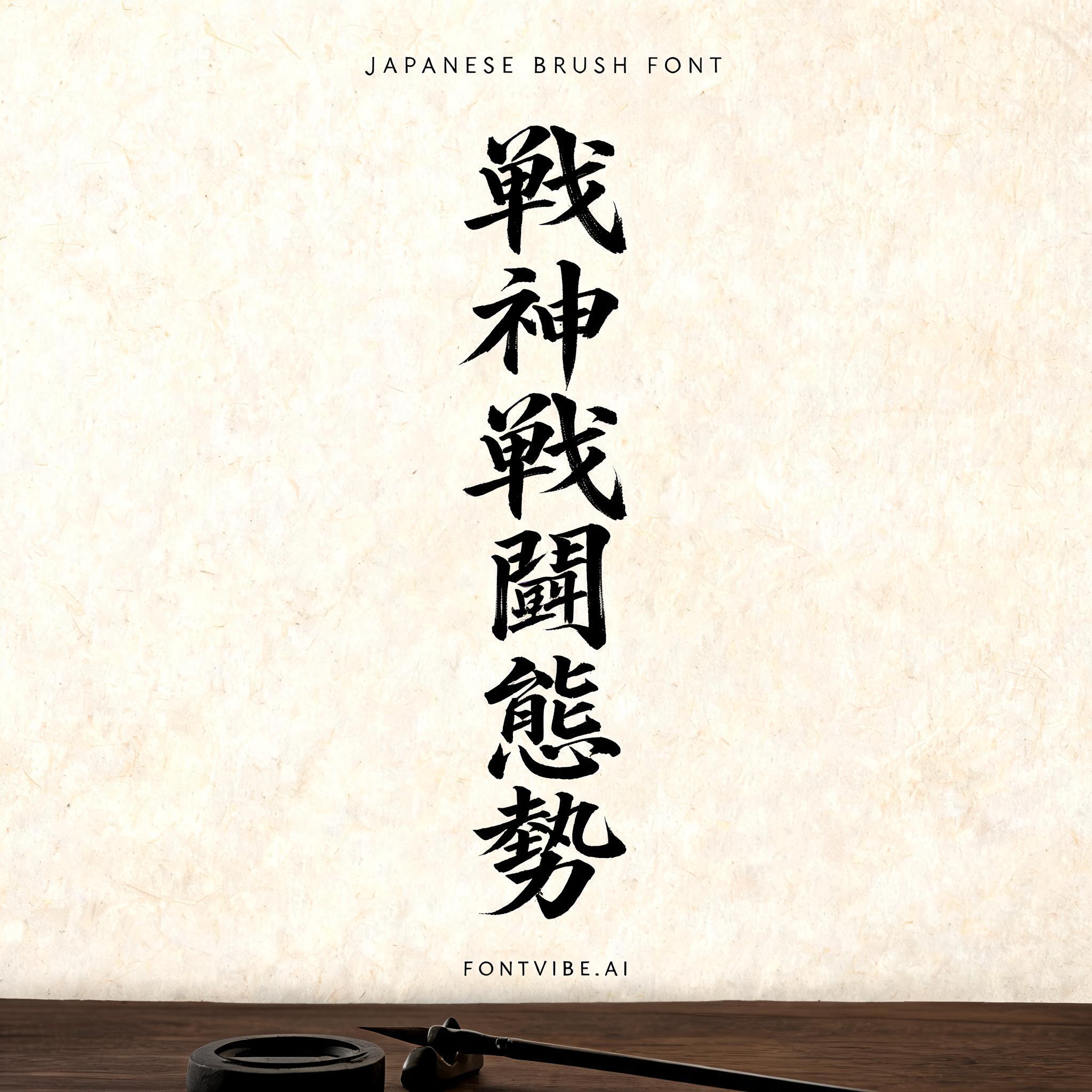
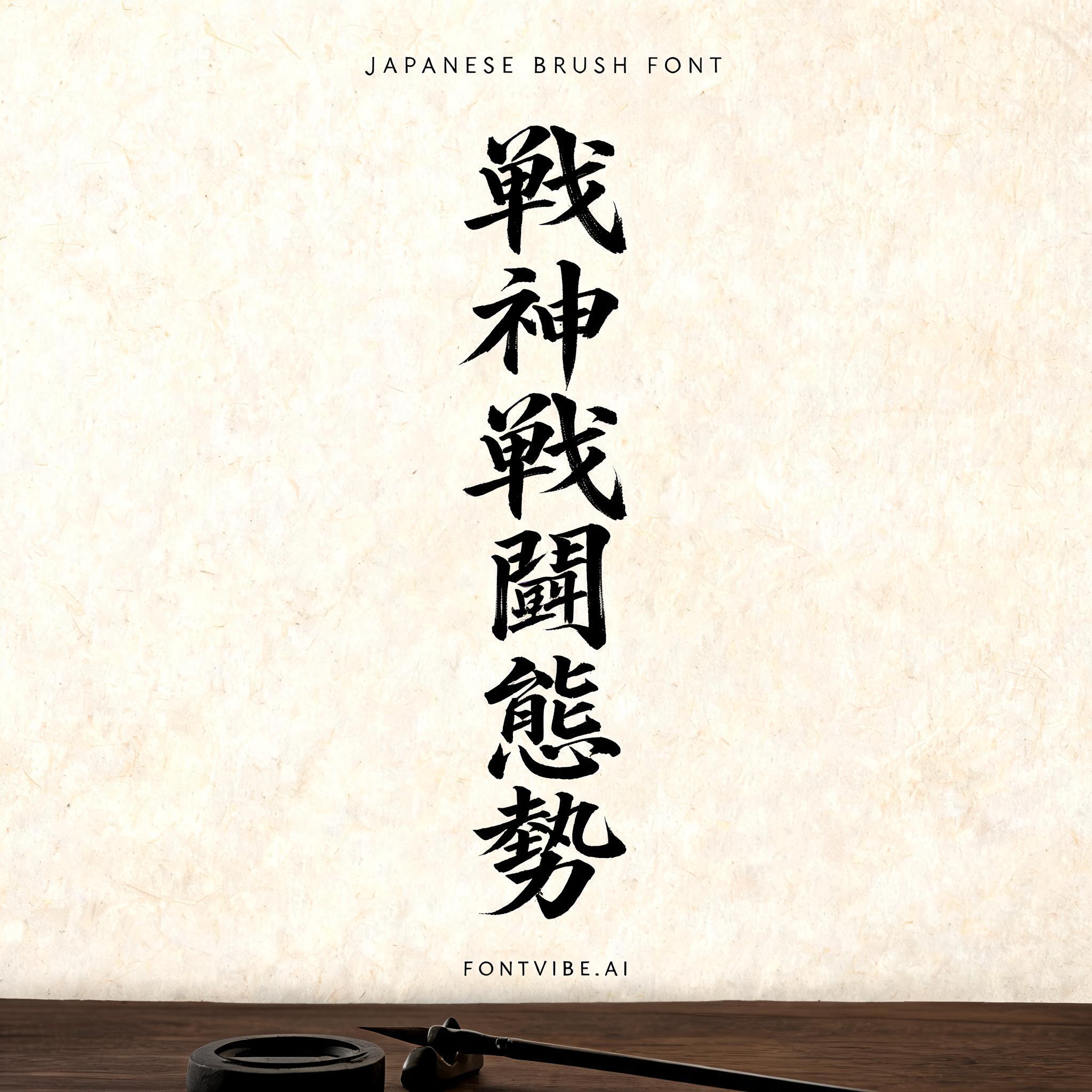
戦 神 戦 闘 態 勢 - 日本水墨毛笔 Text Effect


用原作的模型 BytePlus Seedream 5.0 · 15 积分











“戦 神 戦 闘 態 勢”是使用 FontVibe AI 创作的日本水墨毛笔文字效果。把日本书道的水墨毛笔笔法用到拉丁字母上。浓黑的墨汁配上地道的毛笔笔势、单向可控的运笔,还有和纸的质感。做日料店品牌、纹身设计、动漫、武道和文化类项目都特别合适。
Rendered in Japanese Shodo ink brush style with broad appeal. Letterforms painted with loaded fude brush, deep sumi black ink on warm washi paper texture. Each stroke shows authentic Japanese calligraphy energy — thick decisive downstrokes, expressive brush endings, bristle marks visible in the ink. Generous negative space (ma) surrounds the character. The aesthetic bridges traditional Japanese art with modern Latin typography — elegant, authoritative, unmistakably Japanese. Natural washi paper surface under soft diffused north-facing studio light — warm ivory tone with faint fiber grain visible across the surface, subtle ink absorption halos where brushstrokes meet paper. Quiet calligraphy studio atmosphere: the paper sits on a dark polished wooden table, faint shadow cast by the page edge, a barely-visible ink stone and brush rest at the edge of frame. Top-center: tiny label "JAPANESE BRUSH FONT" at 45% canvas width, hair-thin ink strokes, refined and delicate. Center: a stacked vertical column of massive dominant sumi ink brush characters — "戦" / "神" / "戦" / "闘" / "態" / "勢" — each character set at 30% canvas width, perfectly centered on the vertical axis, each stroke loaded with deep black ink, bristle marks visible at stroke edges, confident single-direction pressure, uniform scale and spacing flowing downward in the traditional tategumi reading direction. Bottom-center: small refined tagline "FONTVIBE.AI" at 20% canvas width, minimal ink weight. Vertical spacing ratio approximately 1:6:1.5. All tiers centered on the same vertical axis. The negative space around the letters breathes — the beauty of ma.
生成于 2026年8月16日 · 2048 × 2048 · JPEG · BytePlus Seedream 5.0 · 公开作品 · 可免费商用(CC BY 4.0)


