ZAFURA - 日本水墨毛笔 Text Effect


用原作的模型 BytePlus Seedream 5.0 · 15 积分











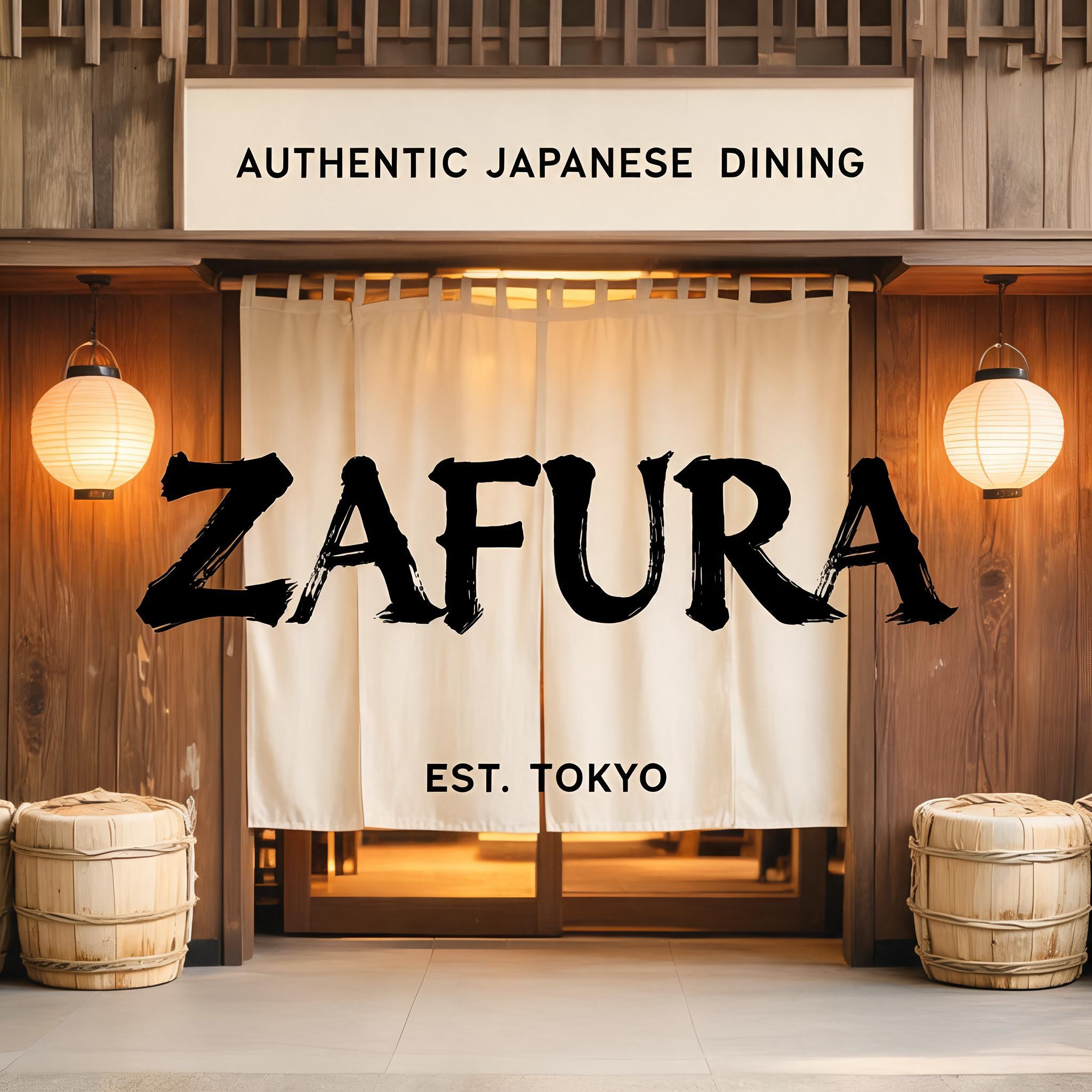
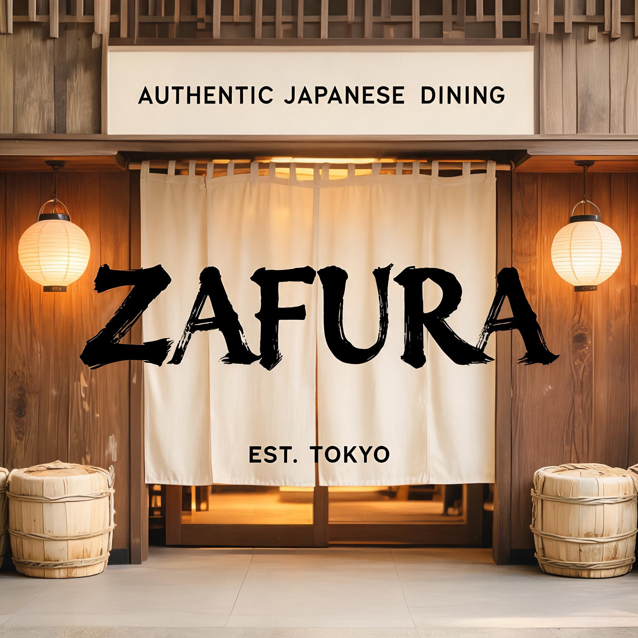
“ZAFURA”是使用 FontVibe AI 创作的日本水墨毛笔文字效果。把日本书道的水墨毛笔笔法用到拉丁字母上。浓黑的墨汁配上地道的毛笔笔势、单向可控的运笔,还有和纸的质感。做日料店品牌、纹身设计、动漫、武道和文化类项目都特别合适。
Japanese Shodo ink brush style optimized for restaurant and commercial hospitality branding. Letterforms balanced between traditional dignity and modern commercial legibility — not as heavy as warrior styles, not as delicate as geisha. Strokes confident and clear, ink consistent and professional, with just enough brush texture to feel authentic rather than digital. Background: neutral warm white or pale cream, clean enough for professional use. The aesthetic: the typographic equivalent of a respected Japanese restaurant's facade — welcoming, quality-signaling, trustworthy. Formal enough for a high-end kaiseki restaurant; approachable enough for a neighborhood sushi bar. Premium Japanese izakaya entrance — a welcoming noren curtain doorway, warm interior glow behind. Aged wood paneling, paper lanterns on either side, subtle sake barrel decorations. The restaurant name "ZAFURA" rendered in the commercial hospitality ink brush style — balanced between traditional dignity and modern commercial legibility. Top-center: tiny restaurant category label "AUTHENTIC JAPANESE DINING" at 45% canvas width, clean commercial caps, inviting. Center: "ZAFURA" as massive dominant brush letters at 65% canvas width, centered — strokes confident and clear, ink balances brush authenticity with commercial readability, the kind of brushwork seen on a premium Tokyo restaurant signboard. Bottom-center: "EST. TOKYO" at 20% canvas width, small establishment marker. Vertical spacing ratio approximately 1:5:1.5. The composition reads as the exterior signage of a premium Japanese restaurant — authentic, commercial, warm, welcoming.
用途: 日式餐厅字体
生成于 2026年8月21日 · 2048 × 2048 · JPEG · BytePlus Seedream 5.0 · 公开作品 · 可免费商用(CC BY 4.0)


