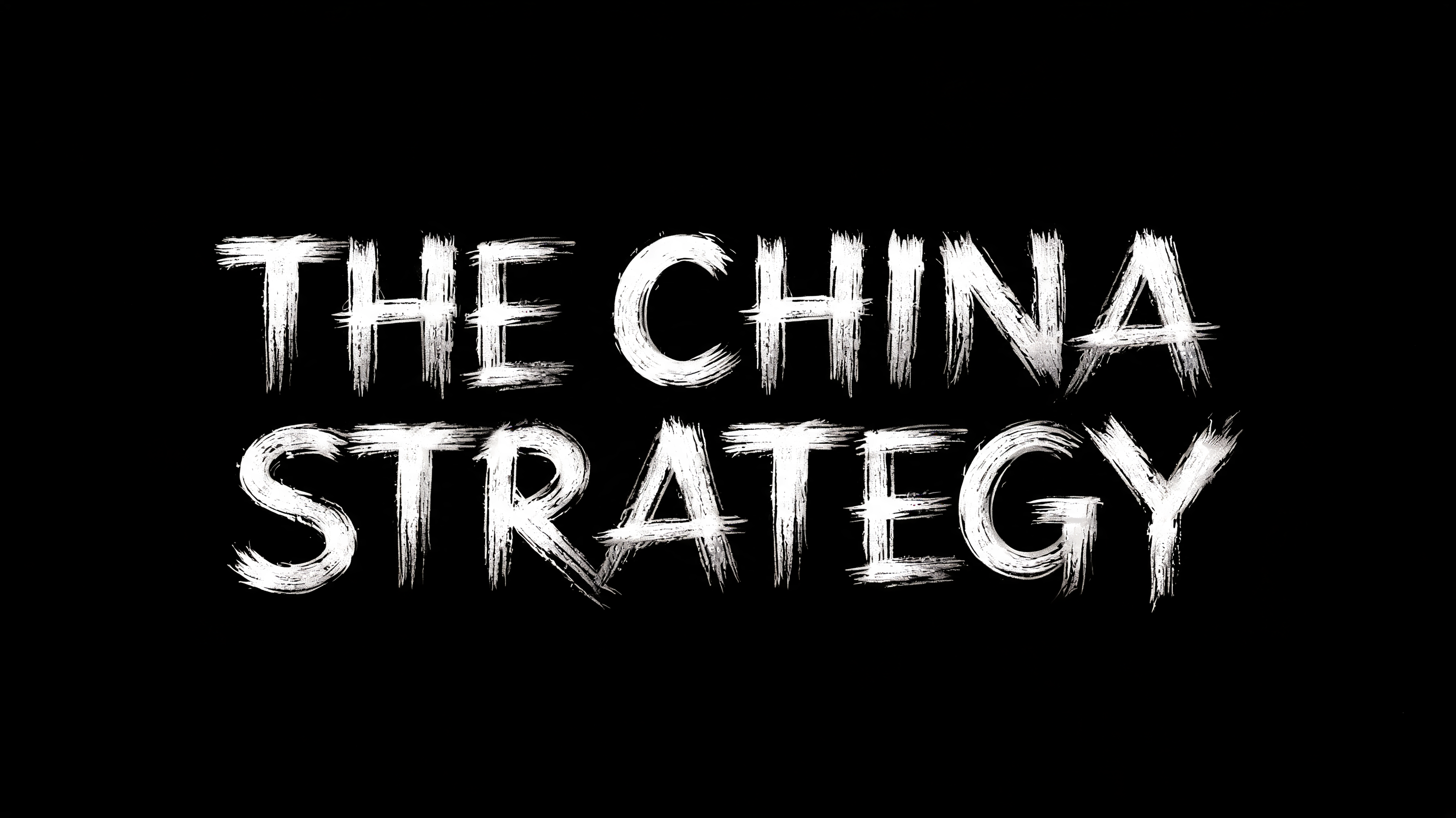
THE CHINA STRATEGY - 中国水墨毛笔 Text Effect


用原作的模型 BytePlus Seedream 5.0 · 15 积分
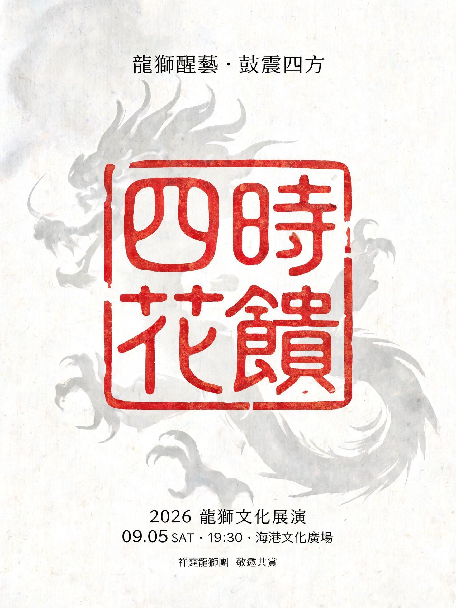
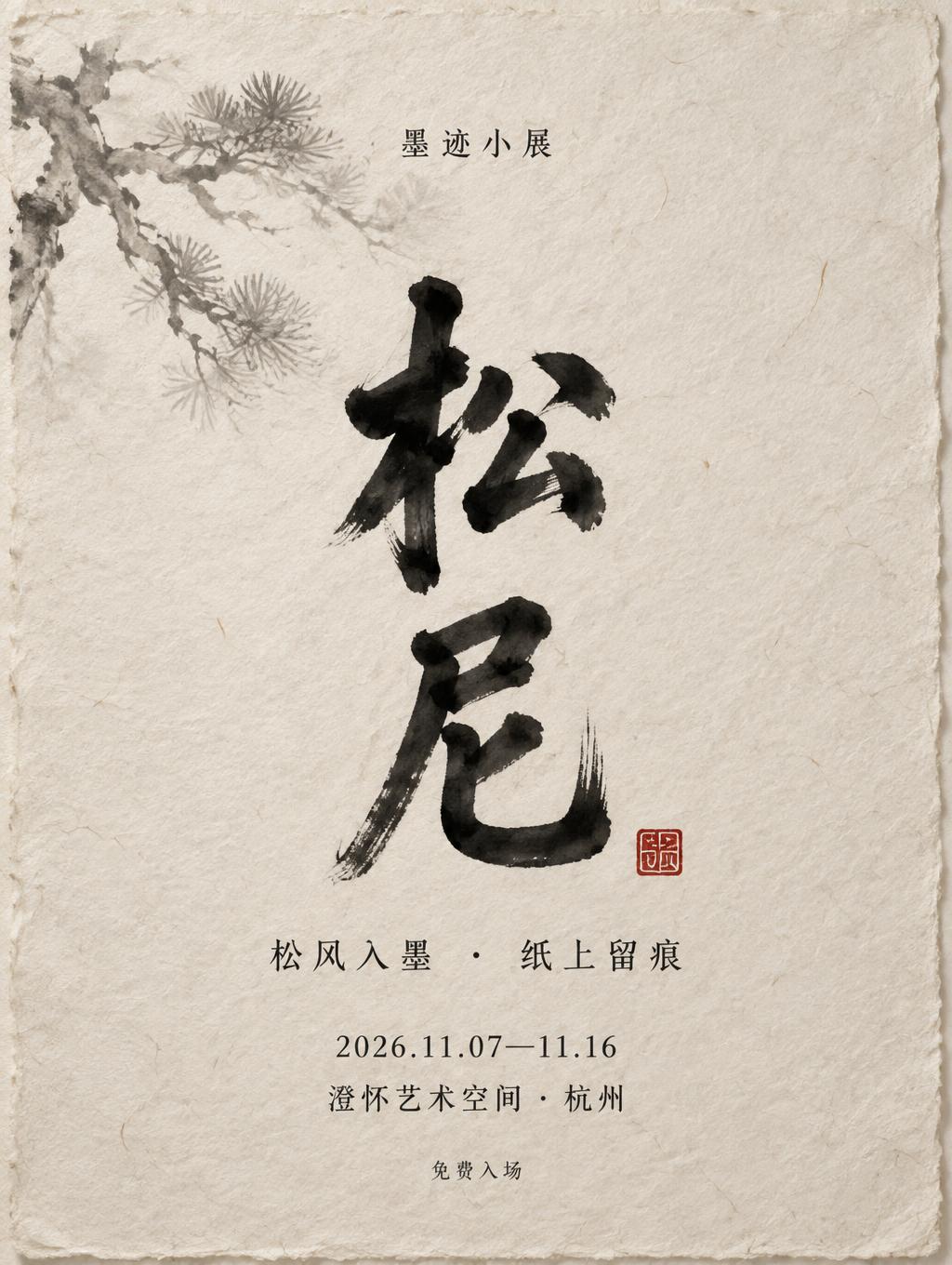
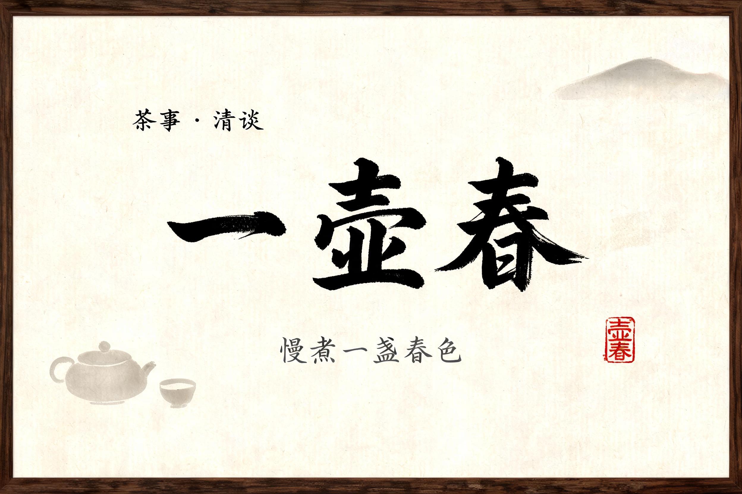



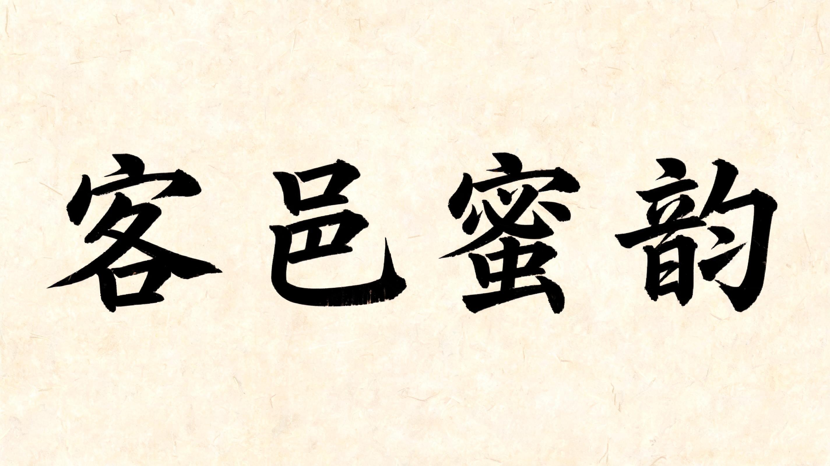

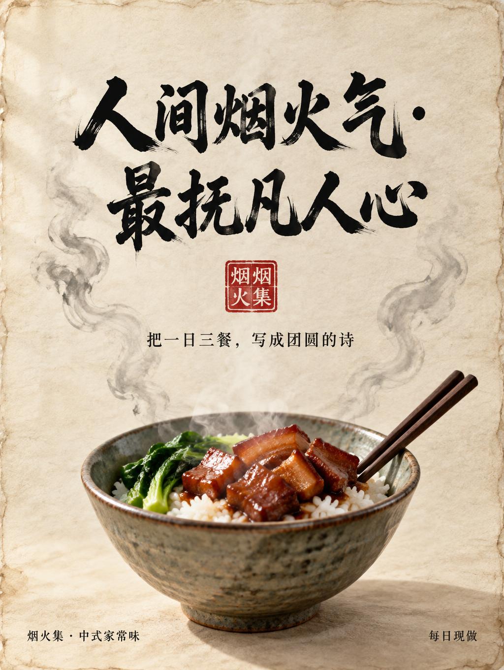
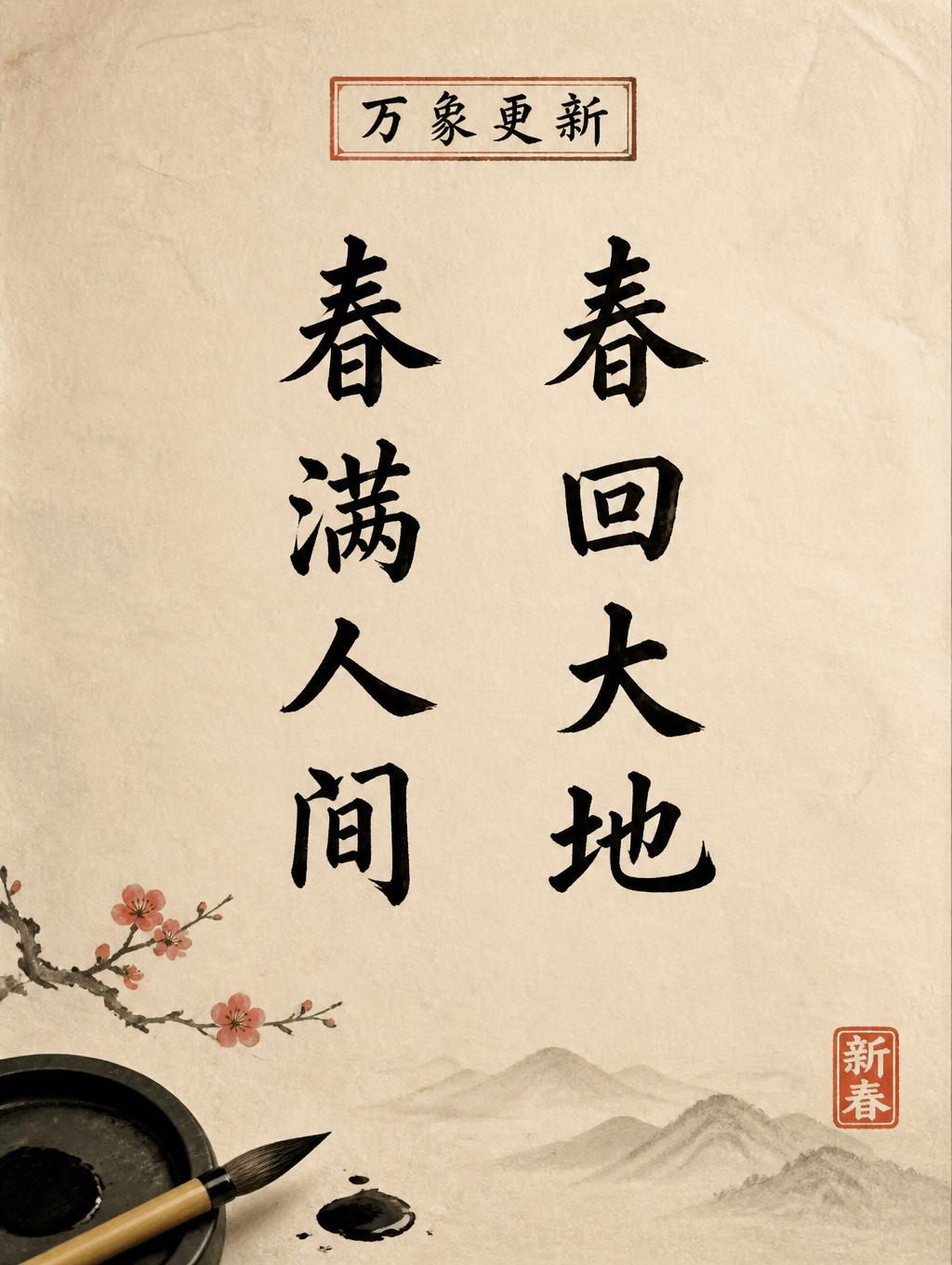
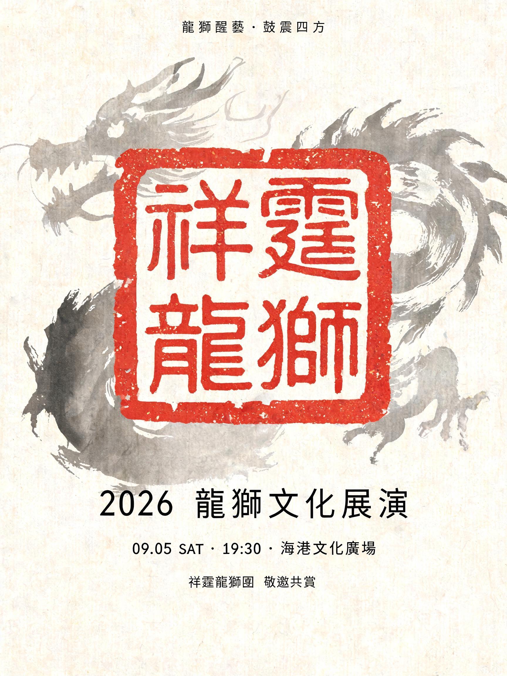


“THE CHINA STRATEGY”是使用 FontVibe AI 创作的中国水墨毛笔文字效果。把中国水墨毛笔书法的笔意用到拉丁字母上。浓黑墨色,真实的笔锋纹理,粗细变化的运笔,还有宣纸的气息。特别适合中餐品牌、武术、养生和文化类设计。
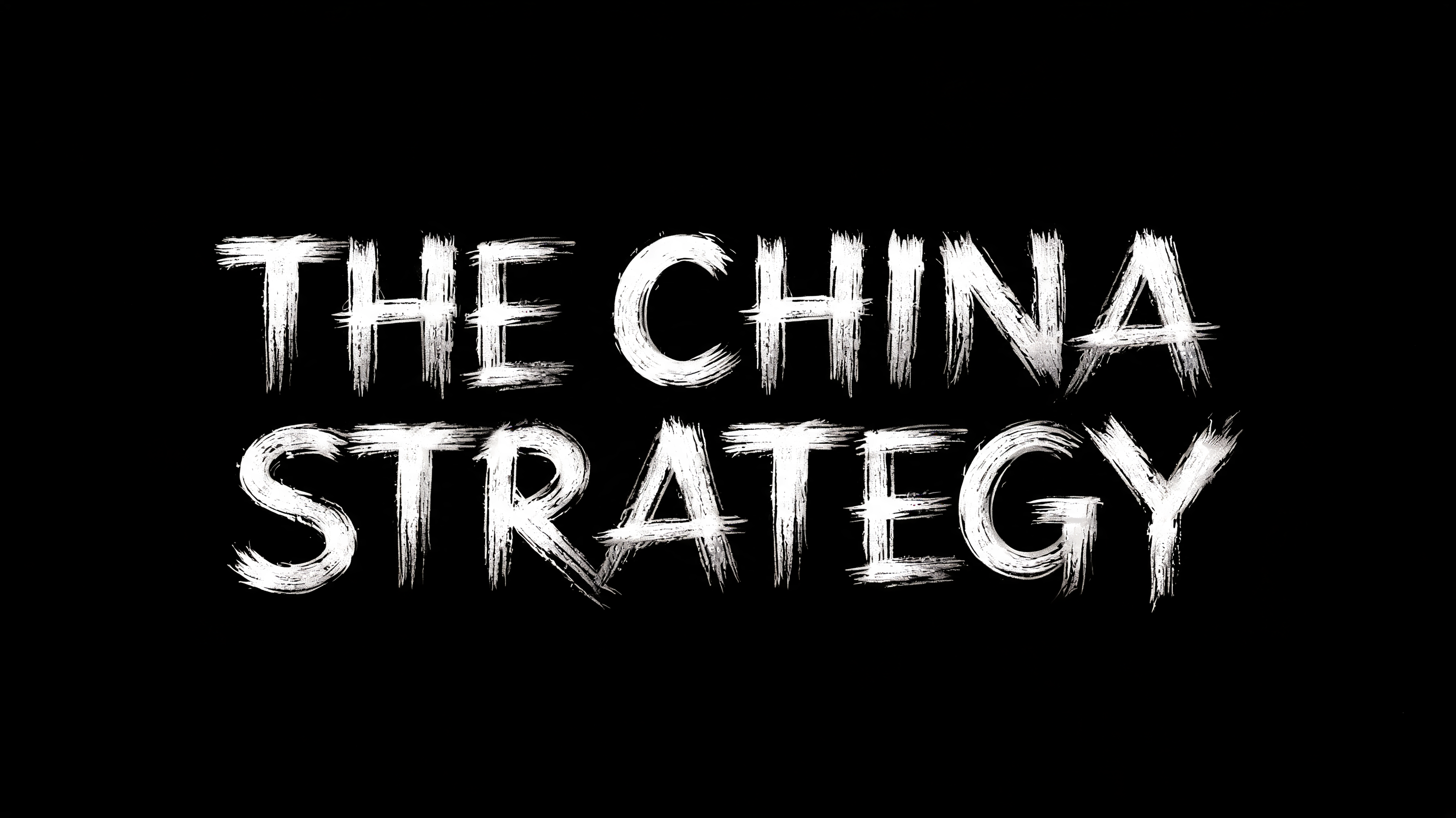
Create a wide 16:9 cut-out travel title with only two centered lines of text, no other copy. Render the exact text: top line “THE CHINA”; bottom line “STRATEGY”. Both lines are exactly the same cap height, same visual weight, same width-driven scale; “THE CHINA” sits directly above “STRATEGY” with a narrow, deliberate gap. Build custom upright, slightly condensed East Asian commercial brush-display capitals: controlled solid mid-strokes, approximately 3:1 thick-to-thin contrast, balanced letter construction, clean decisive terminal landings, compact professional signage spacing. The lettering is weathered sumi-brush material rendered in bright ash white and pale silver-grey only: dense luminous white stroke cores, charcoal-grey dry-brush abrasion converted to light grey, individual bristle striations, broken fibre-like gaps, slight pooled bright ink at stroke starts, restrained feathered dry terminal ends. Keep every edge crisp enough for a title card; no extreme gestural swashes, no Western serif or sans-serif typography. All weathering, tiny detached brush fibres, and subtle ink flecks must physically touch or sit immediately against the letterforms. Isolated centered composition with generous empty margins; no scenery, objects, shadows, paper, texture field, haze, glow cast, or extra graphic elements. Background is a perfectly flat pure BLACK #000000 void with nothing else.
用途: 丝绸之路字体生成器
生成于 2026年8月30日 · 2848 × 1600 · PNG · 透明 PNG · BytePlus Seedream 5.0 · 公开作品 · 可免费商用(CC BY 4.0)