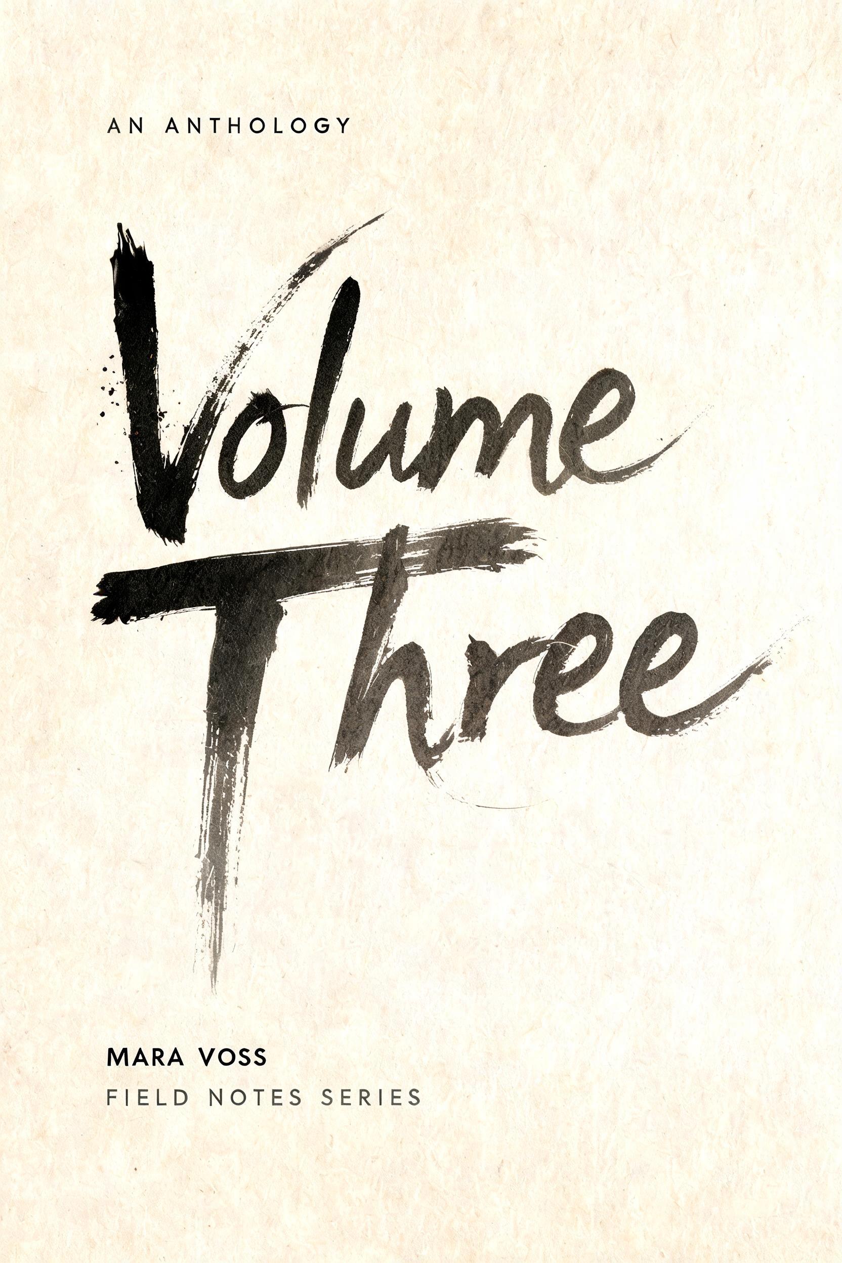
Volume Three AN ANTHOLOGY MARA VOSS FIELD NOTES SERIES - 日本水墨毛笔 Text Effect


用原作的模型 BytePlus Seedream 5.0 · 15 积分











“Volume Three AN ANTHOLOGY MARA VOSS FIELD NOTES SERIES”是使用 FontVibe AI 创作的日本水墨毛笔文字效果。把日本书道的水墨毛笔笔法用到拉丁字母上。浓黑的墨汁配上地道的毛笔笔势、单向可控的运笔,还有和纸的质感。做日料店品牌、纹身设计、动漫、武道和文化类项目都特别合适。
Create a portrait 2:3 literary cover, print-ready flat artwork, viewed straight-on. Warm cream Japanese washi paper fills the frame, with fine visible fibers and subtle absorbent texture. Use soft diffuse north-facing studio light only; no cast shadows, no objects, no frame, no digital glow. At upper left, set the small label exactly: “AN ANTHOLOGY” in restrained narrow charcoal-gray uppercase lettering, widely tracked, clean and quiet. The central title must read exactly: “Volume” on the first line and “Three” on the second. It occupies roughly 70% of the cover height, left aligned with a generous 11% paper margin. Custom hand-painted Western display lettering based on full-body avant-garde ink calligraphy: each letter built from radically broad, sweeping sumi strokes substantially wider than its underlying letter structure. Dense near-black pigment pools at forceful stroke entries; pigment thins through charcoal and transparent cool gray along long pull-away tails. Ragged torn edges show individual separated bristles. Dry-brush streaks, paper absorption, and thick wet pigment ridges are visible. Make the V’s descending entry stroke and the final e’s exit trail particularly long and asymmetric. Keep every letter legible. The two title lines overlap slightly through brush tails, not through illegible collision. No uniform black fills, no vector-clean edges, no ornamental flourishes beyond the actual brush motion. A small constellation of authentic ink flecks appears only near the entry points of the V and T, then dissipates into blank paper. Preserve broad untouched cream negative space at right and below the headline. At bottom left, set exactly: “MARA VOSS” in small black uppercase letters, crisp but slightly softened by the paper surface; beneath it, exactly: “FIELD NOTES SERIES” in smaller spaced charcoal uppercase. Strict hierarchy: title dominates, anthology label is quiet, author and series line anchor the lower edge. Deep sumi black, charcoal gray, warm washi cream; tactile ink-on-paper realism, high-resolution editorial book-cover composition.
用途: 漫画字体生成器
生成于 2026年9月6日 · 1664 × 2496 · JPEG · BytePlus Seedream 5.0 · 公开作品 · 可免费商用(CC BY 4.0)


