Nah, it ain't the first time, but it feels like the last - 复古 Text Effect


用原作的模型 BytePlus Seedream 5.0 · 15 积分

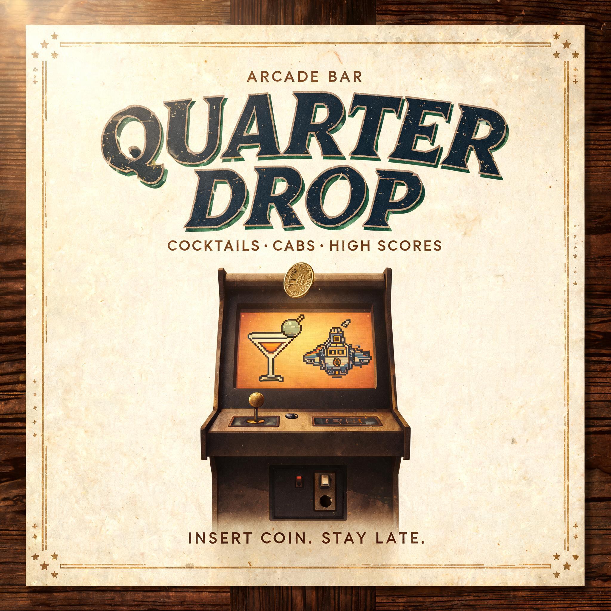
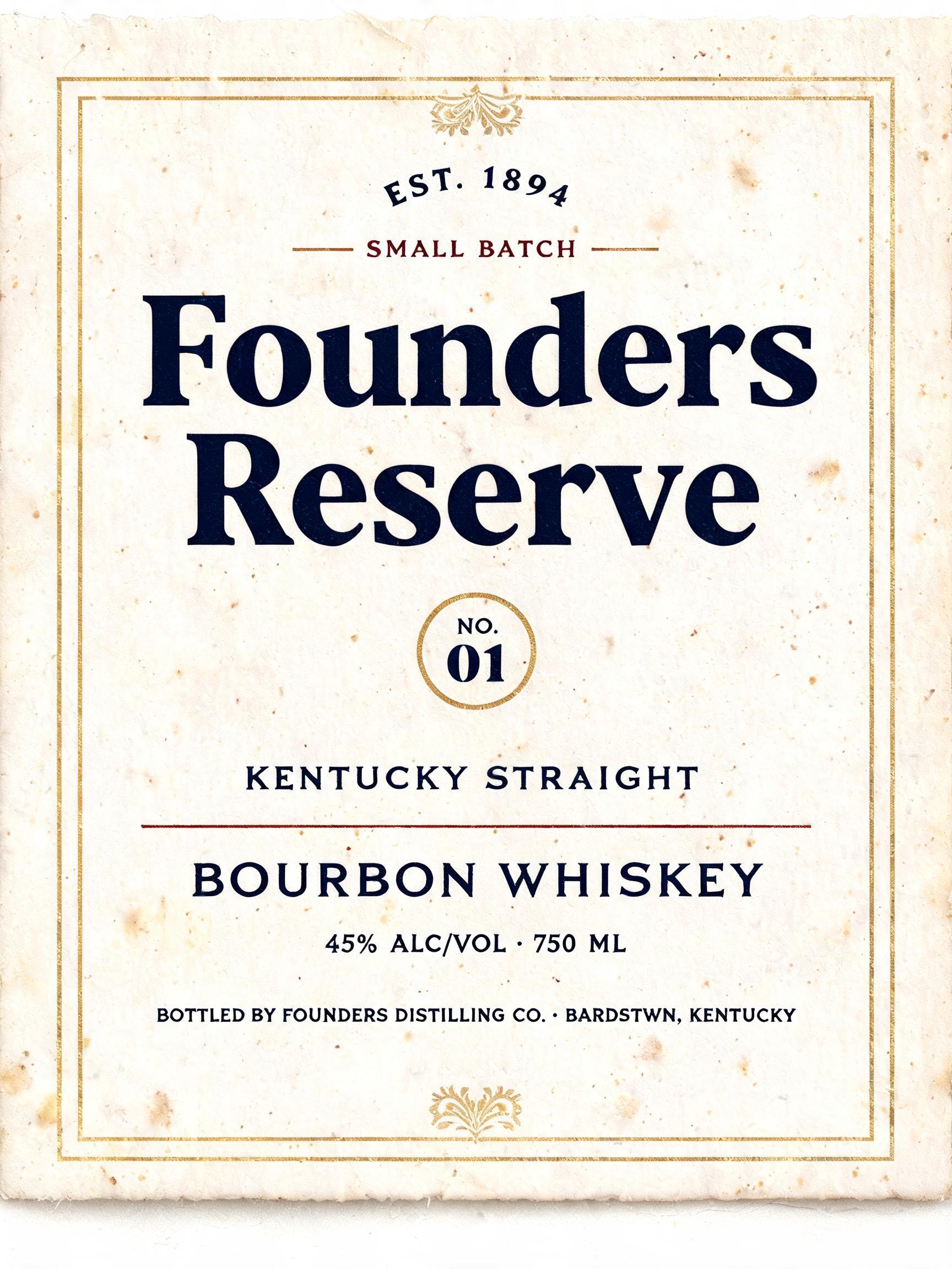
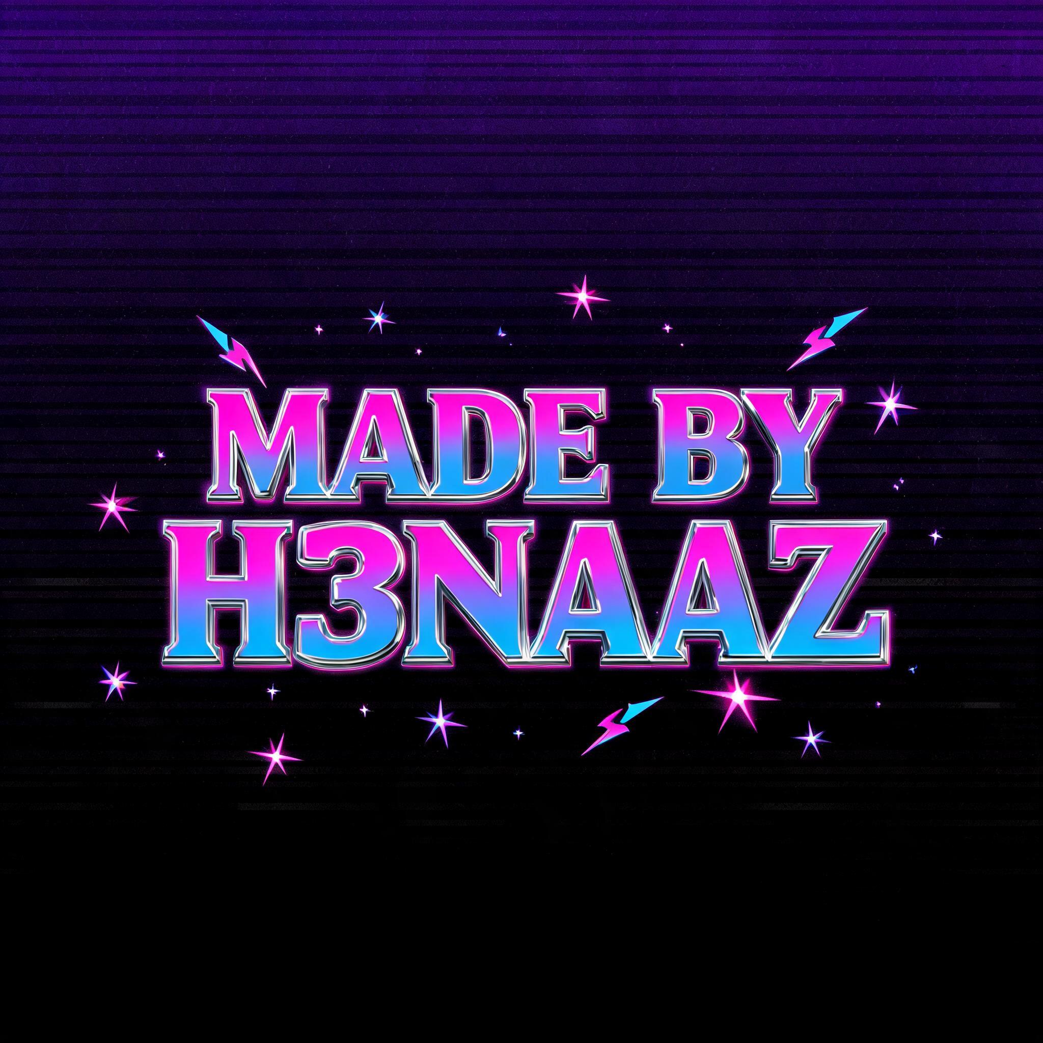
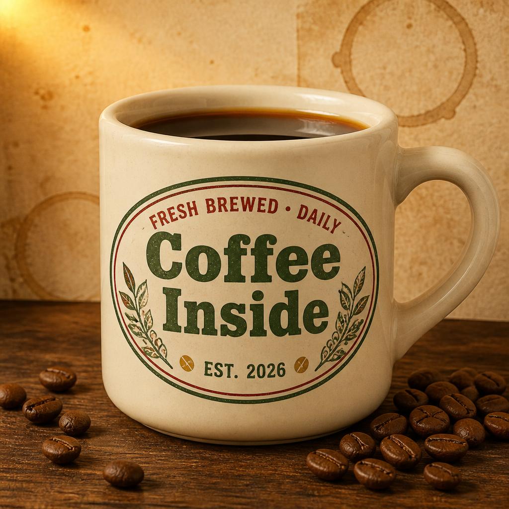
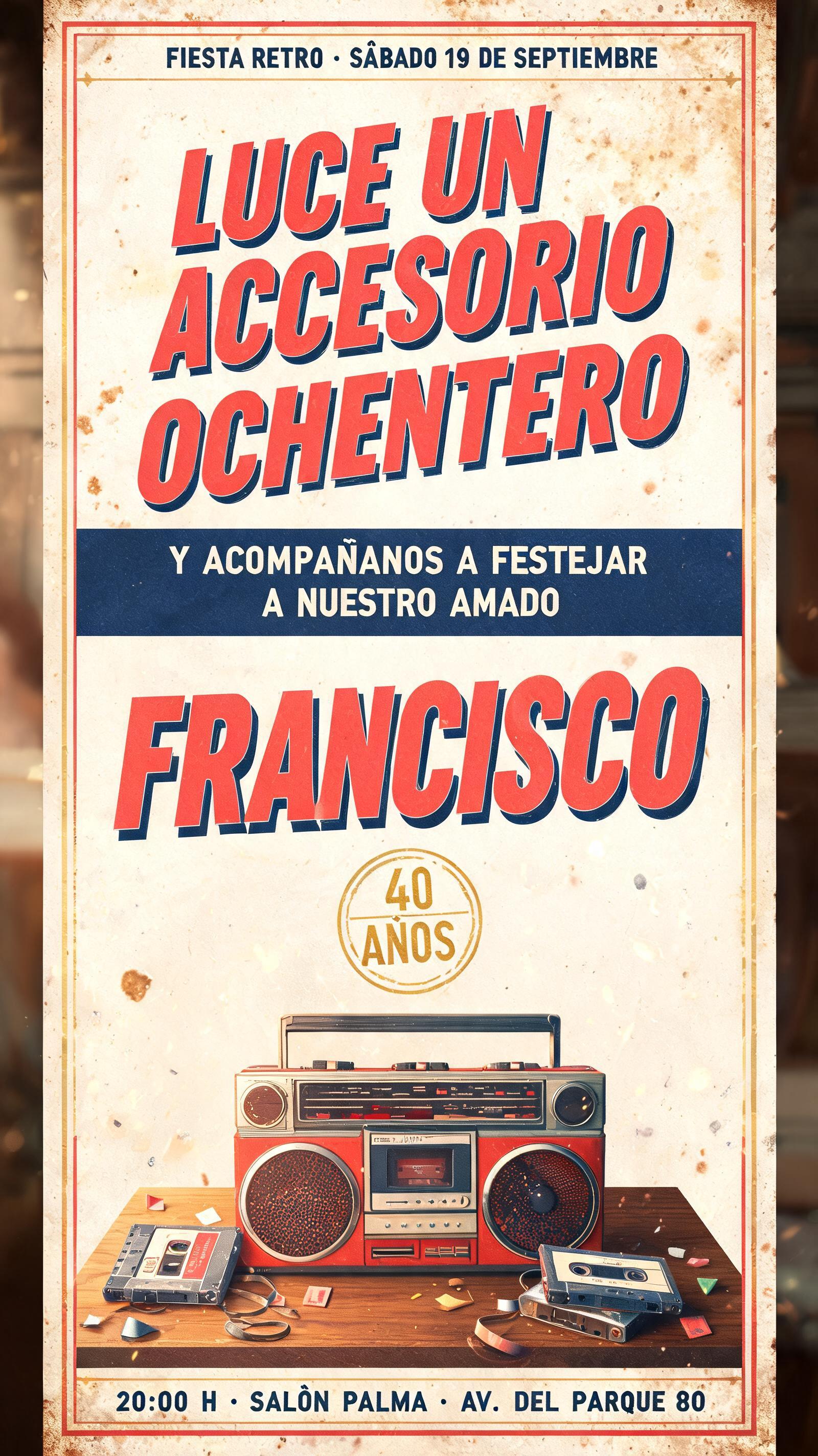
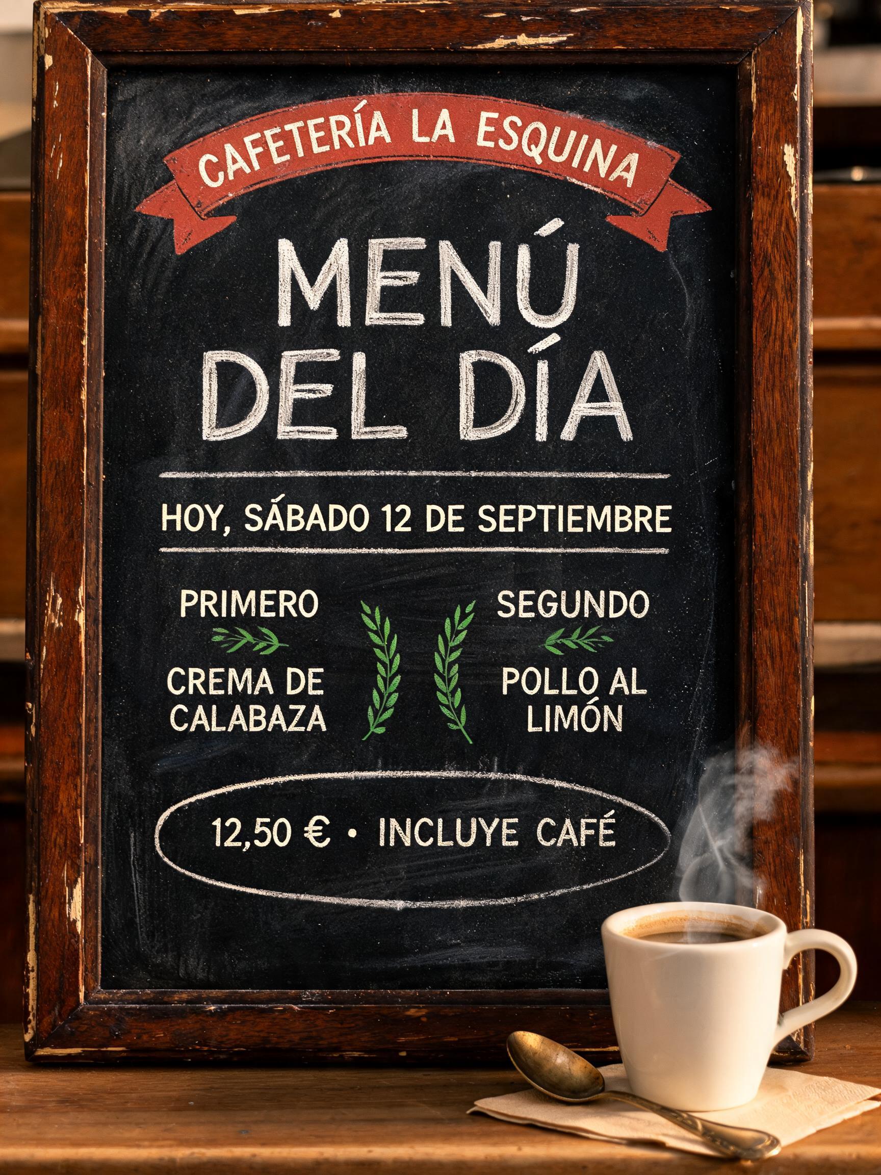
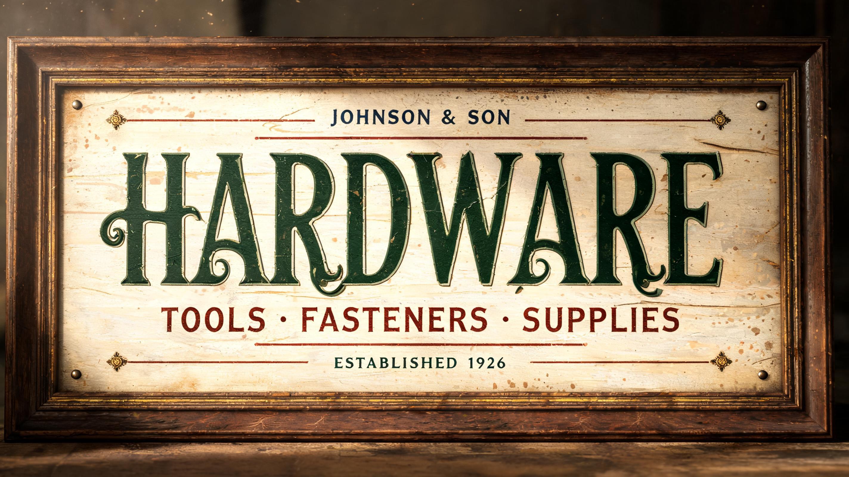
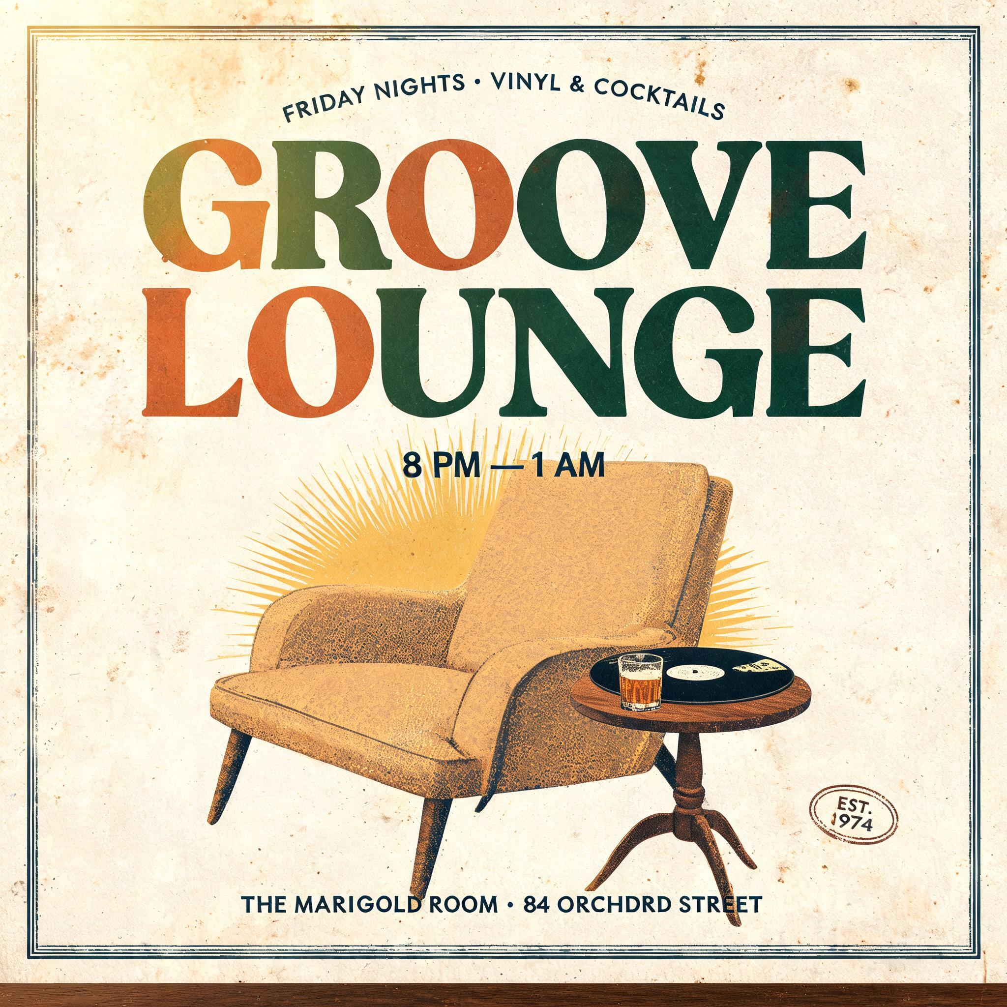
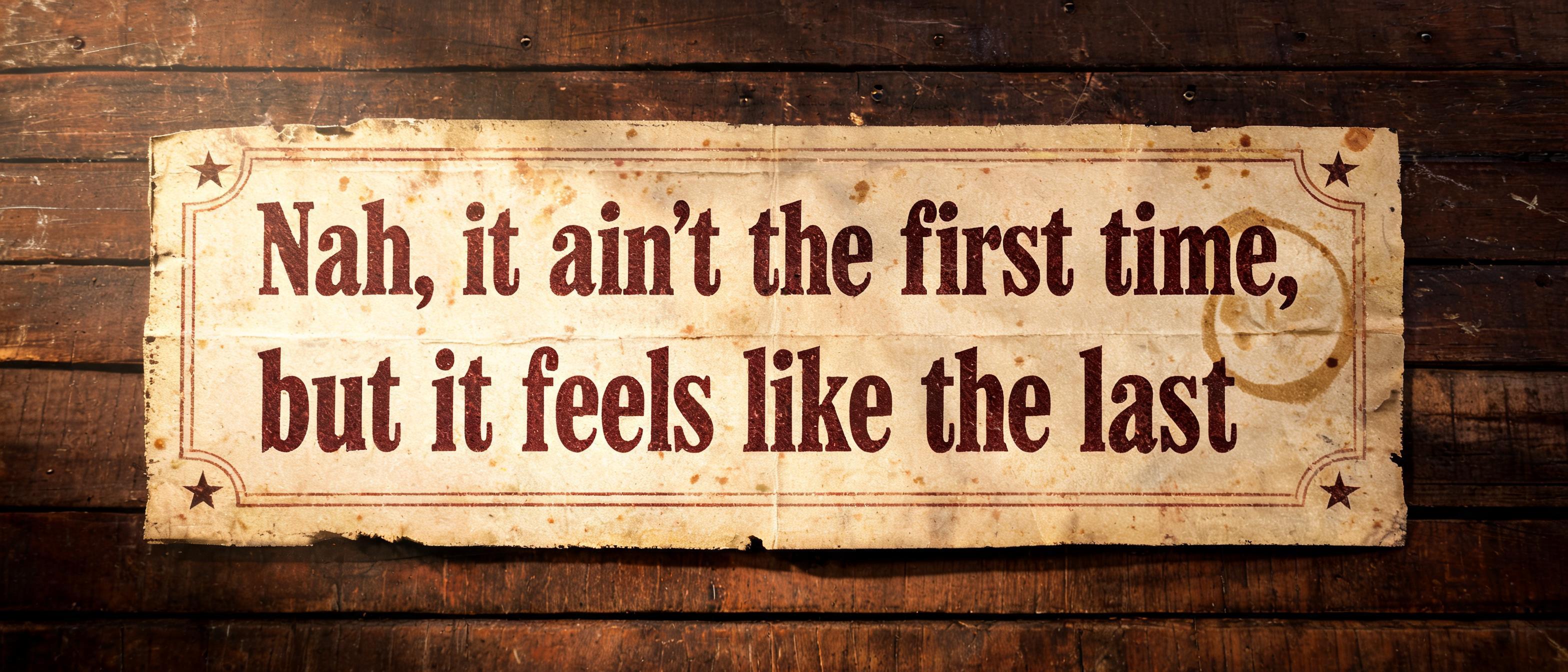
“Nah, it ain't the first time, but it feels like the last”是使用 FontVibe AI 创作的复古文字效果。衬线大写字母凸版压印进米色棉卡纸,墨色略有破损,放在旧印刷机台面上,周围散落金属活字。
a timeless vintage piece carrying the physical evidence of an older making — warm, aged and classic. SURFACE / STYLE: the lettering looks produced by a heritage craft and softened by time — a letterpress impression bitten into cotton paper with ink slightly broken up, weathered paint on aged metal or wood, a worn rubber-stamp or postal imprint, or warm gold leaf — carrying patina, foxing, grain and gentle wear. SCENE ATMOSPHERE: a warm nostalgic setting — aged cream or kraft paper, dark wood, soft amber light, faint dust and a faded heritage feel. PALETTE: warm aged tones — cream, kraft, sepia, faded red, forest green, navy, tan and antique gold — muted and time-softened, never neon-bright. LETTERFORM PRIORITY: when the chosen font carries its own treatment (western slab, art deco, art nouveau, letterpress, postal or rubber stamp, gold leaf, typewriter, hand-lettered script, grunge chalk), that font treatment takes absolute priority and owns the letters; this style supplies the warm aged tone, the time-worn surface and the nostalgic heritage scene. FALLBACK MATERIAL: if the font carries no material of its own, render the letters as a classic serif printed in warm faded ink on aged cream paper with a soft letterpress impression and gentle wear, so the timeless vintage feel always reads. A weathered 1970s roadside bar poster on thick yellowed cream stock, carrying the exact text: “Nah, it ain't the first time, but it feels like the last”. The words dominate the printed composition with a strong size hierarchy and measured line breaks, pressed in faded charcoal-black and oxidized burgundy ink. Deep letterpress bite, uneven ink coverage, softened edges, tiny paper fibers visible inside the impressions, scattered brown foxing, fold creases, rubbed corners, and a faint water ring near the outer paper field. A narrow, worn border rule and small distressed star ornaments frame the typography without competing with it. Behind the paper, dark walnut planks show scratches, old nail holes, and a thin veil of dust. Low amber tungsten light falls across the stock at an oblique angle, revealing the compressed paper texture and casting restrained shadows into the letterpress grooves. Restrained palette of nicotine cream, sepia tan, faded burgundy, charcoal, and dark brown; no neon, no modern objects, no people, no extra readable words. High-resolution tactile print photography, visible grain, aged heritage ephemera.
用途: 西部牛仔字体生成器
生成于 2026年9月10日 · 3136 × 1344 · JPEG · BytePlus Seedream 5.0 · 公开作品 · 可免费商用(CC BY 4.0)


