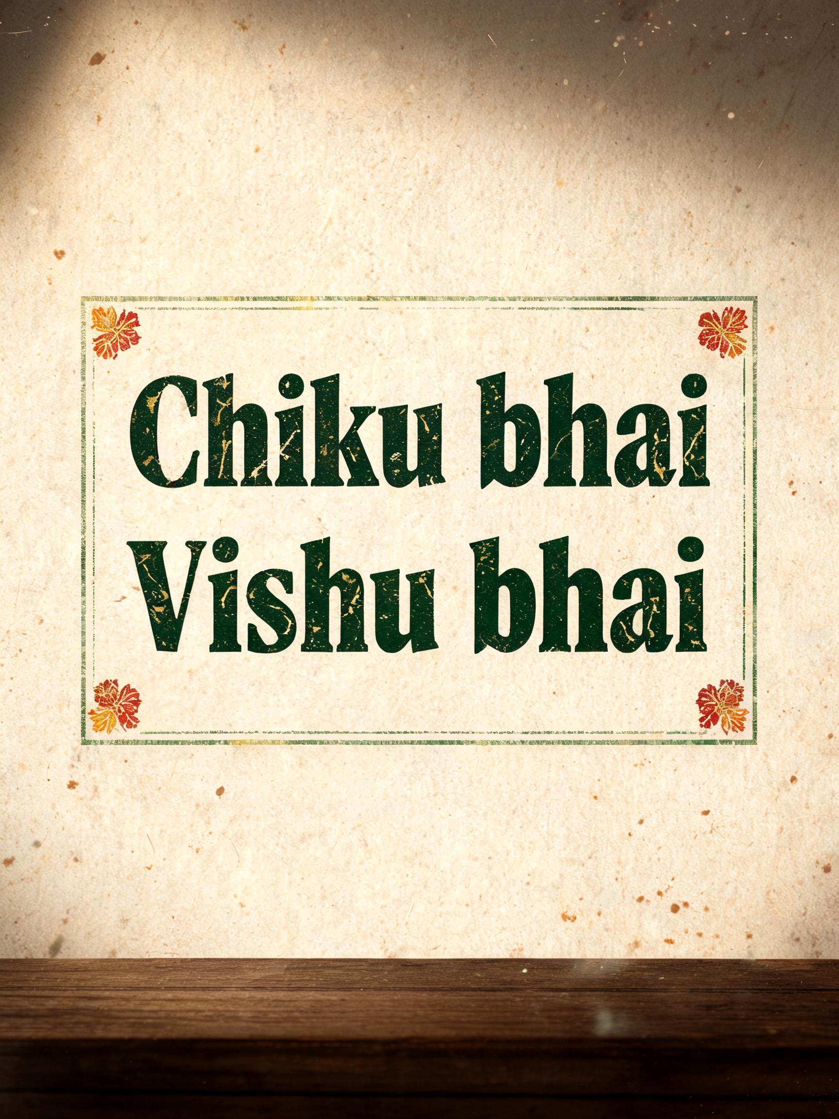
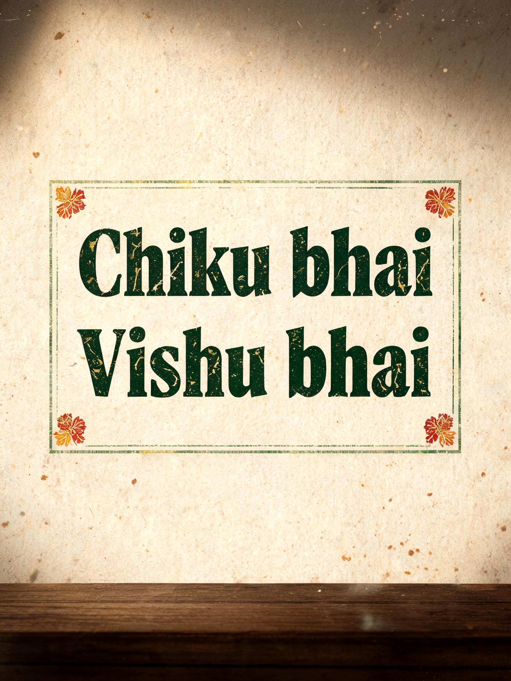
Chiku bhai Vishu bhai - 复古 Text Effect


用原作的模型 BytePlus Seedream 5.0 · 15 积分




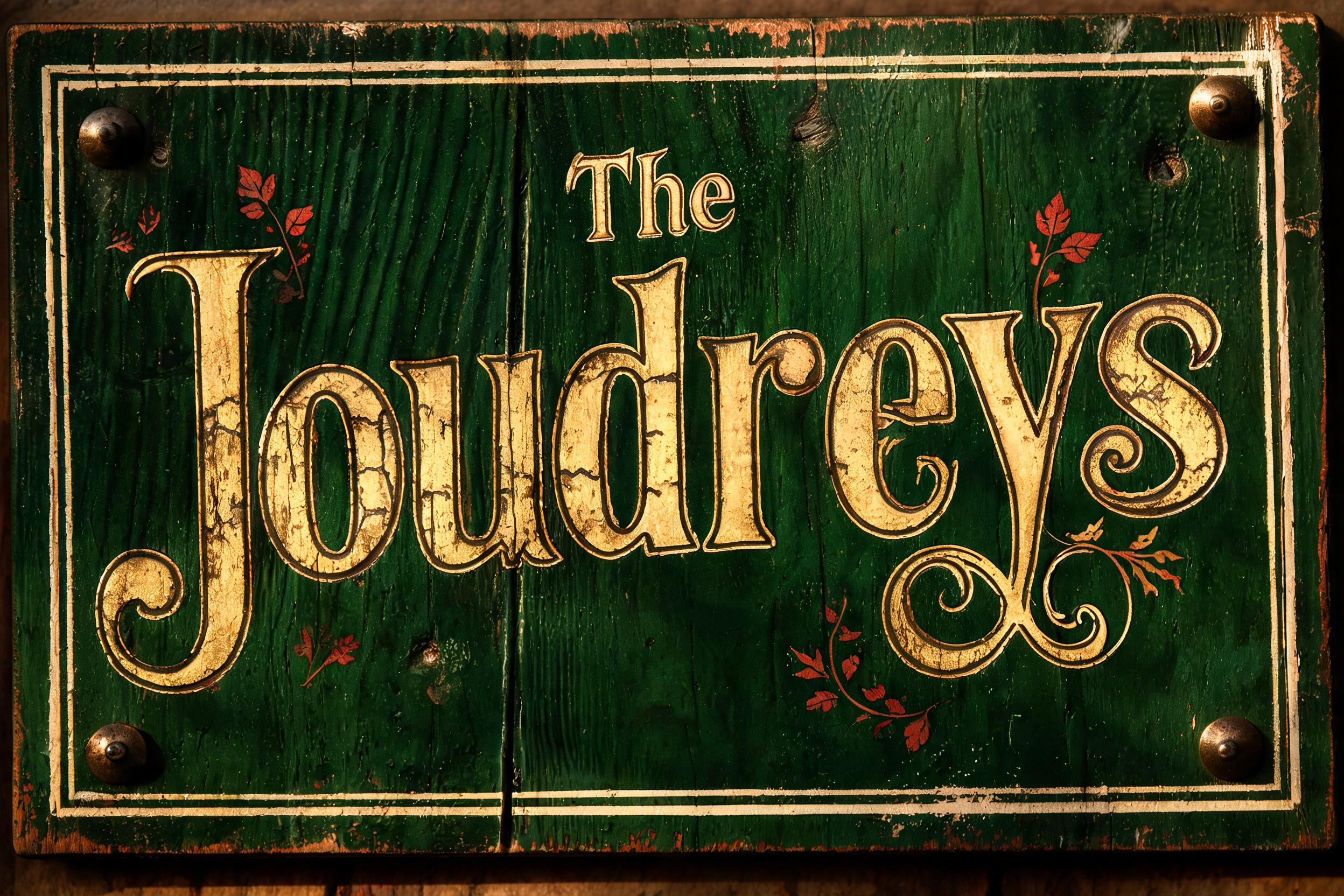




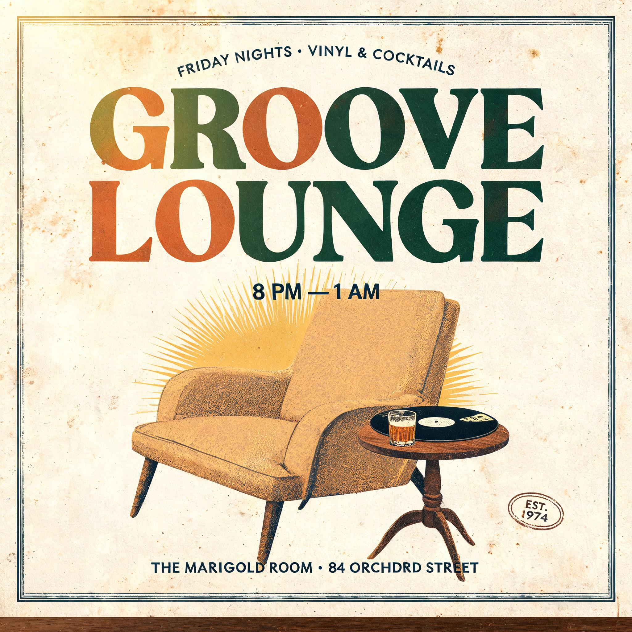
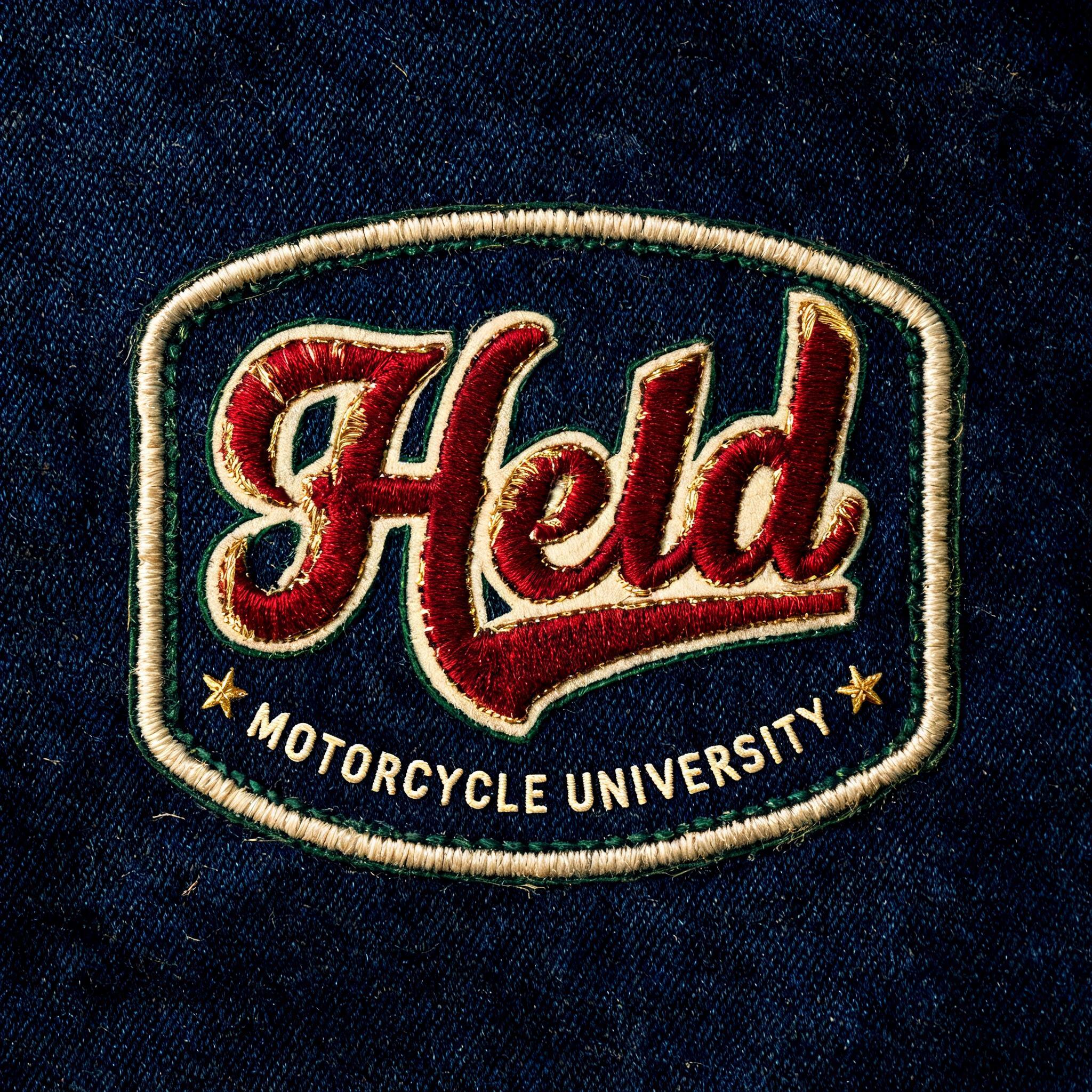
“Chiku bhai Vishu bhai”是使用 FontVibe AI 创作的复古文字效果。衬线大写字母凸版压印进米色棉卡纸,墨色略有破损,放在旧印刷机台面上,周围散落金属活字。
a timeless vintage piece carrying the physical evidence of an older making — warm, aged and classic. SURFACE / STYLE: the lettering looks produced by a heritage craft and softened by time — a letterpress impression bitten into cotton paper with ink slightly broken up, weathered paint on aged metal or wood, a worn rubber-stamp or postal imprint, or warm gold leaf — carrying patina, foxing, grain and gentle wear. SCENE ATMOSPHERE: a warm nostalgic setting — aged cream or kraft paper, dark wood, soft amber light, faint dust and a faded heritage feel. PALETTE: warm aged tones — cream, kraft, sepia, faded red, forest green, navy, tan and antique gold — muted and time-softened, never neon-bright. LETTERFORM PRIORITY: when the chosen font carries its own treatment (western slab, art deco, art nouveau, letterpress, postal or rubber stamp, gold leaf, typewriter, hand-lettered script, grunge chalk), that font treatment takes absolute priority and owns the letters; this style supplies the warm aged tone, the time-worn surface and the nostalgic heritage scene. FALLBACK MATERIAL: if the font carries no material of its own, render the letters as a classic serif printed in warm faded ink on aged cream paper with a soft letterpress impression and gentle wear, so the timeless vintage feel always reads. A warm vintage Gujarati community invitation card rendered on thick aged cream cotton paper, with the exact text 'Chiku bhai\nVishu bhai' as the dominant inked imprint. The letters carry a deep hand-fed letterpress deboss, muted forest-green and faded vermilion ink with softly broken edges, tiny ink skips, paper fibers visible inside the impressions, and restrained antique-gold foil accents catching warm amber raking light. Surrounding ornament uses thin worn border rules, small marigold-like floral stamp motifs, faded postal marks, and sparse speckles of foxing, all printed with imperfect registration and gentle age wear. A dark teak tabletop edge, kraft-paper shadows, loose dust motes, and a softly vignetted sepia field create physical depth without competing with the names. Keep the names highly legible, with generous visual prominence and a balanced paired hierarchy. Muted cream, tan, forest green, faded red, sepia, and antique gold only; no neon, no modern glossy surfaces, no devices, no extra readable words. Fine paper grain, embossed fibers, authentic analog print texture, warm low-angle studio illumination, archival heritage stationery finish.
用途: 90年代字体生成器
生成于 2026年9月13日 · 1728 × 2304 · JPEG · BytePlus Seedream 5.0 · 公开作品 · 可免费商用(CC BY 4.0)


