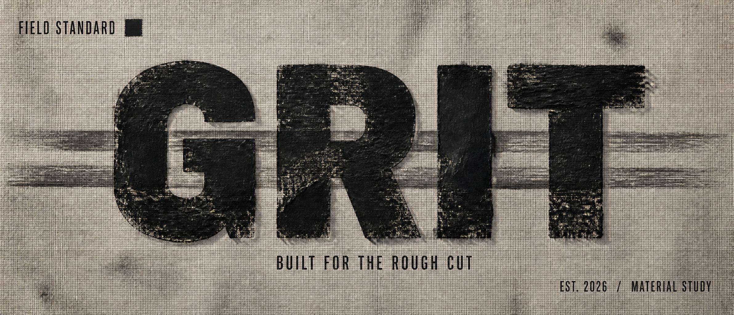
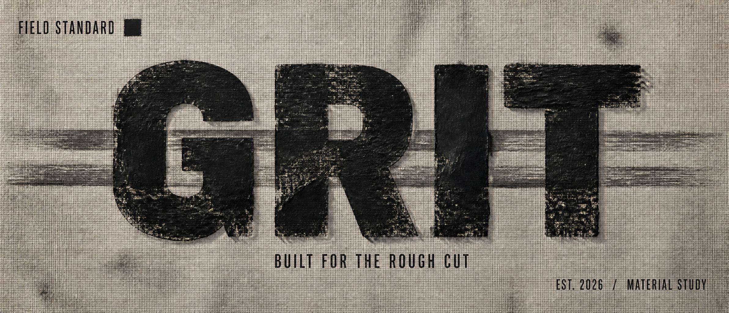
GRIT FIELD STANDARD BUILT FOR THE ROUGH CUT EST. 2026 / MATERIAL STUDY - 干笔刷 Text Effect


用原作的模型 OpenAI GPT-Image-2 · 15 积分



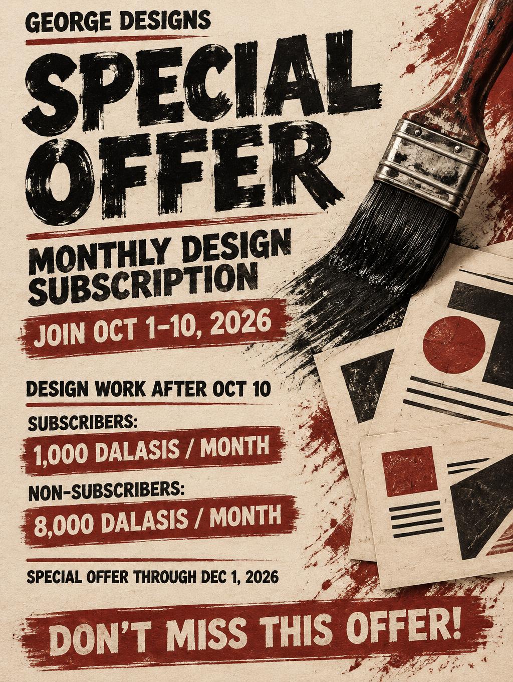
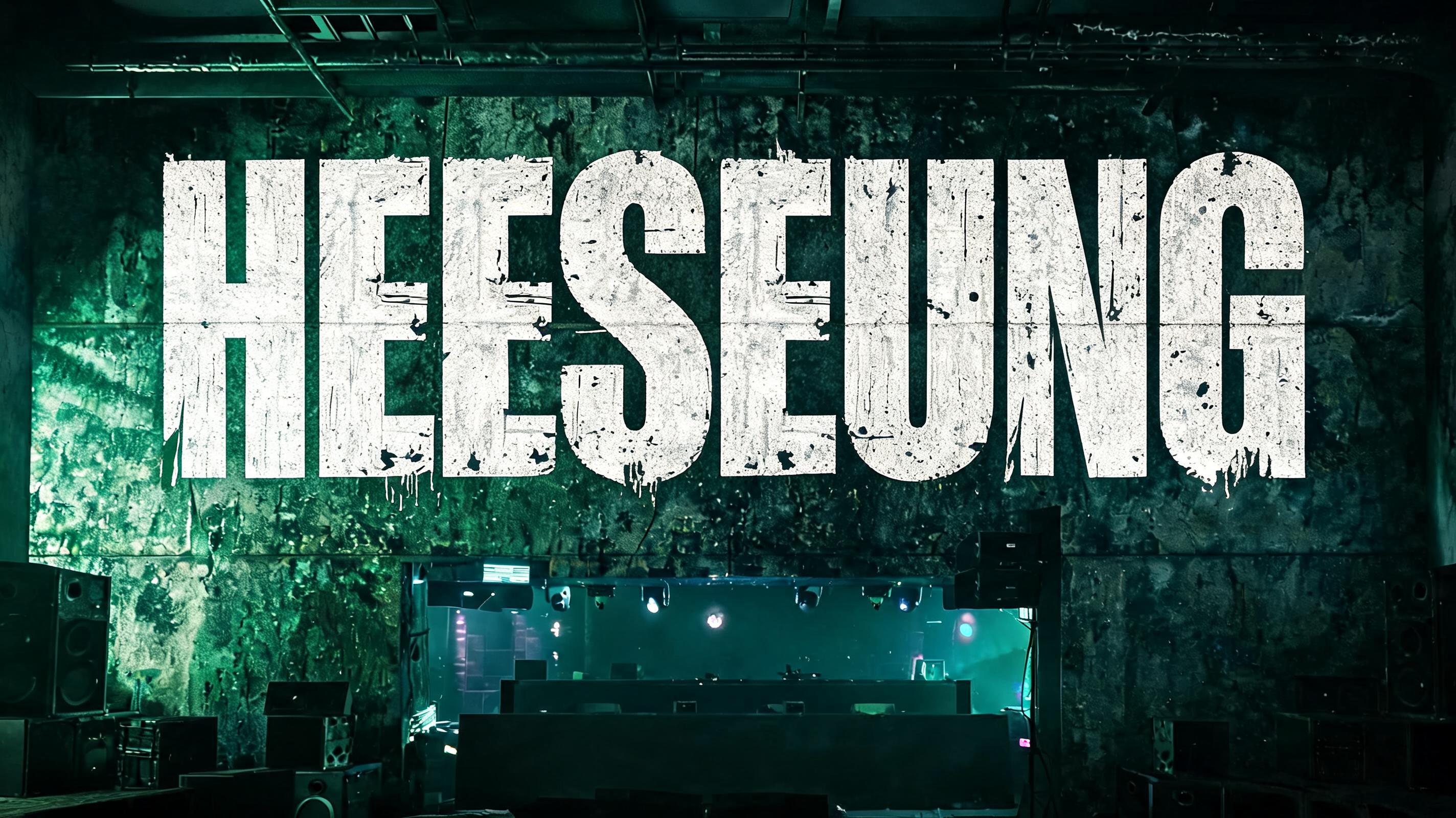
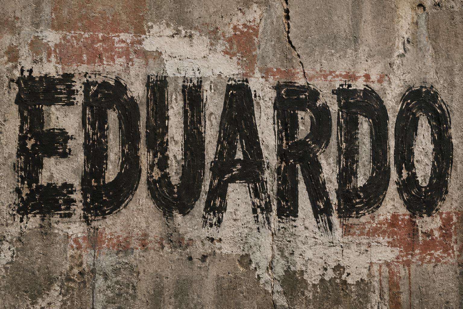
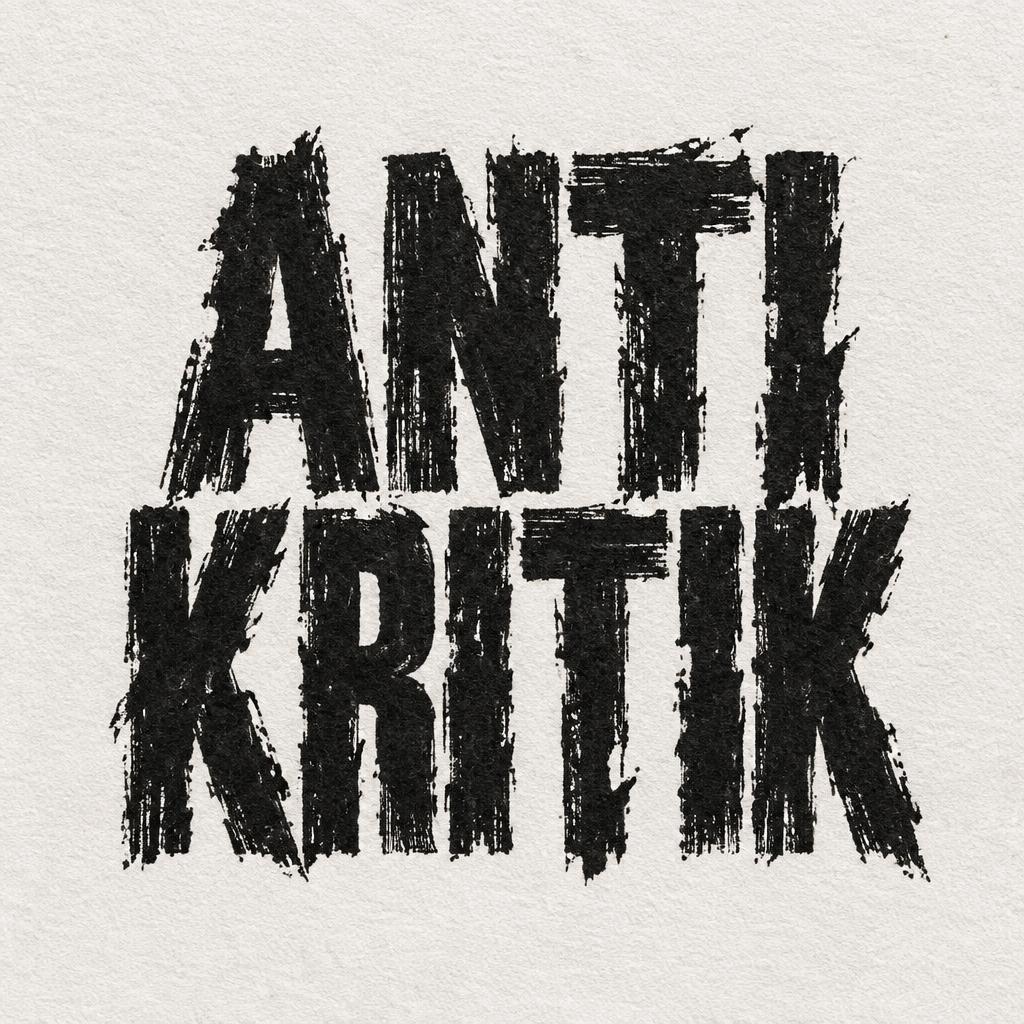


“GRIT FIELD STANDARD BUILT FOR THE ROUGH CUT EST. 2026 / MATERIAL STUDY”是使用 FontVibe AI 创作的干笔刷文字效果。原始的干笔刷、油漆刷字体,带着浓重的纹理、刷毛散开的痕迹和不完美的颗粒感。饱蘸颜料的粗犷笔触、做旧磨损的边缘,还有地道的手绘能量。街头潮牌、音乐品牌、运动、包装,以及任何需要原始触感冲击力的项目都很搭。
Create a finished panoramic website header graphic, 21:9. Rough warm-gray cotton canvas fills the frame, with visible woven fibres, faint charcoal smudges, and three sparse horizontal dry-brush swipes that run behind the title without reducing legibility. Set the exact text “GRIT” as the dominant central headline, spanning 62% of the canvas width and 48% of its height. Use wide, heavy, tightly spaced uppercase display letterforms. Construct every letter from loaded off-black dry-brush paint: thick impasto ridges at stroke centers, individually visible stiff bristle tracks, uneven paint coverage, ragged torn stroke edges, thin skipped passages exposing the canvas, paint peel cracks, diagonal ink scratches, and irregular edge erosion. About 40% of each letter surface is distressed, but each letter remains instantly legible. No smooth fills, gradients, calligraphic strokes, or clean vector edges. Hard directional top-left light catches the raised paint ridges and casts short dark relief shadows onto the canvas. Typography hierarchy and placement: upper-left small condensed uppercase text, exact wording “FIELD STANDARD”; centered huge headline “GRIT”; directly below it, small uppercase text “BUILT FOR THE ROUGH CUT”; lower-right narrow uppercase utility line “EST. 2026 / MATERIAL STUDY”. Keep broad negative space at both panoramic edges. Add one small solid off-black brush-stroke square beside the eyebrow as a registration-mark detail. Flat frontal composition, tactile print-poster finish, high-detail paint and canvas microtexture.
用途: 干笔刷字体
生成于 2026年9月17日 · 2384 × 1024 · JPEG · OpenAI GPT-Image-2 · 版式:Wide Header Strike · 公开作品 · 可免费商用(CC BY 4.0)


