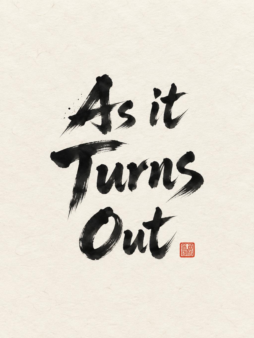
As it Turns Out - 日本水墨毛笔 Text Effect


用原作的模型 OpenAI GPT-Image-2.5 Sunburst · 15 积分











“As it Turns Out”是使用 FontVibe AI 创作的日本水墨毛笔文字效果。把日本书道的水墨毛笔笔法用到拉丁字母上。浓黑的墨汁配上地道的毛笔笔势、单向可控的运笔,还有和纸的质感。做日料店品牌、纹身设计、动漫、武道和文化类项目都特别合适。
Create a finished vertical Japanese calligraphy art print, 3:4 ratio. Set the exact headline text “As it Turns Out” as three centered lines: “As it” / “Turns” / “Out”. This is lettering-led artwork, with no extra wording. Render the Western letters as definitive classical Japanese shodo brush calligraphy by a master: upright harmonious posture, bold 5:1 thick-to-thin stroke contrast, each stroke made once. Use visibly compressed loaded-brush entries, dense near-black sumi at stroke cores, controlled mid-stroke pressure, sharply executed harai pull-away tapers, and occasional upward hane hooks. Keep small dry-brush breakup only along outer stroke edges; do not use uniform black, hesitant marks, digital outlines, decorative flourishes, or Latin serif type. Composition: place the stacked headline in the central 46% of the canvas, with “Turns” largest. Leave at least 55% breathing room around it. A small square vermilion hanko seal with abstract non-legible carved mark sits at the lower-right edge of the lettering block; it is the only accent. Stage it on warm cream-white handmade washi paper with fine visible fibers and subtle absorbent ink feathering at every brush edge. Ink ranges from opaque deep sumi black through charcoal gray where brush load thins. Add only a few tiny ink flecks near one decisive entry stroke, never as a border. Soft diffuse north-facing studio illumination, even and shadowless, showing paper texture and every tonal transition. Flat overhead art-print view, no frame, no desk, no objects, no photorealistic props.
用途: 日文毛笔字体
生成于 2026年9月19日 · 1024 × 1360 · JPEG · OpenAI GPT-Image-2.5 Sunburst · 版式:禅意 · 公开作品 · 可免费商用(CC BY 4.0)


