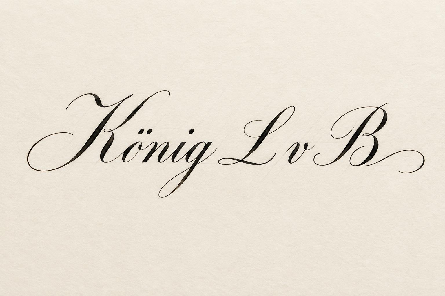
König L v B - 书法手写体 Text Effect


用原作的模型 OpenAI GPT-Image-2.5 Sunburst · 15 积分

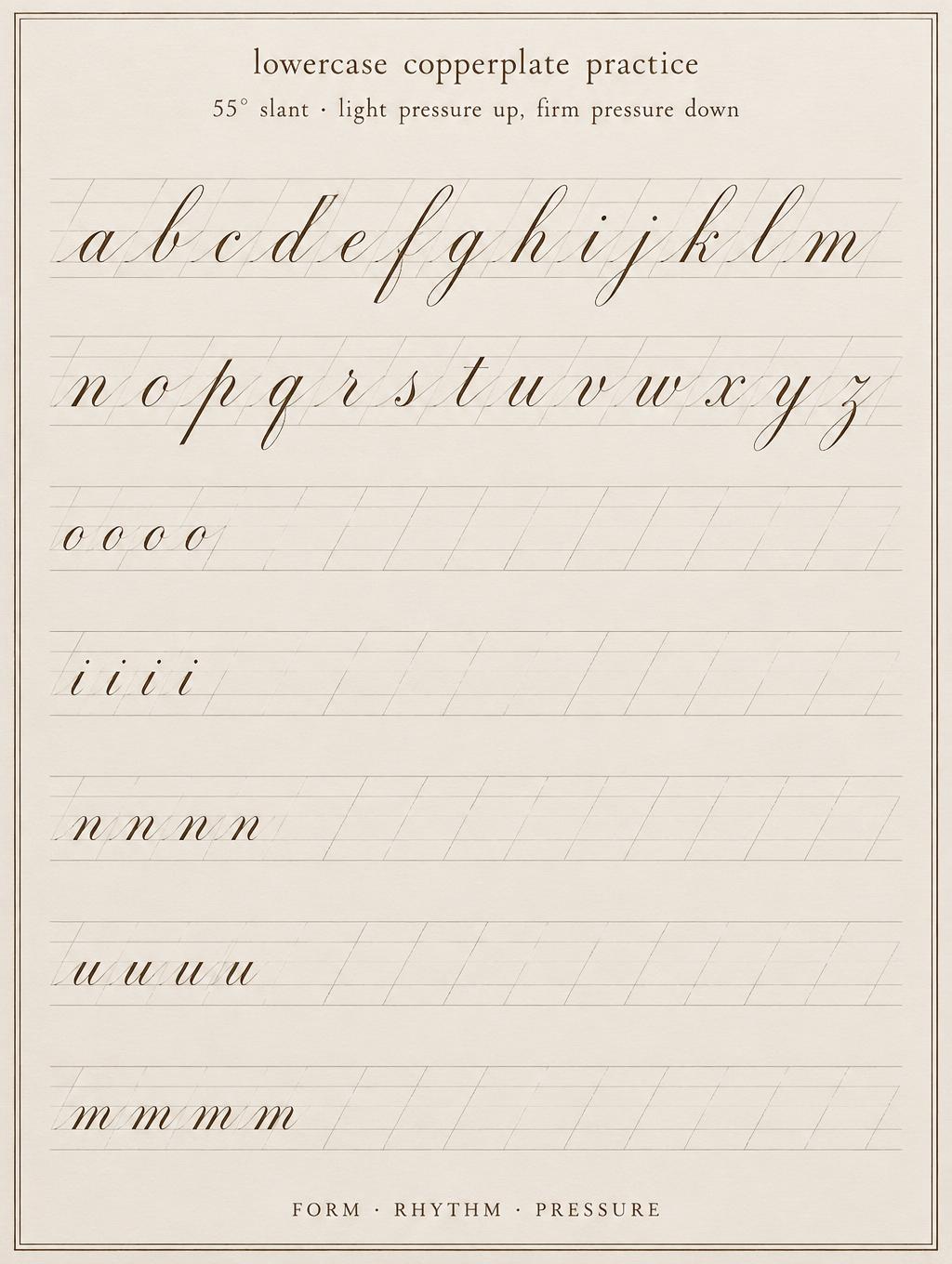
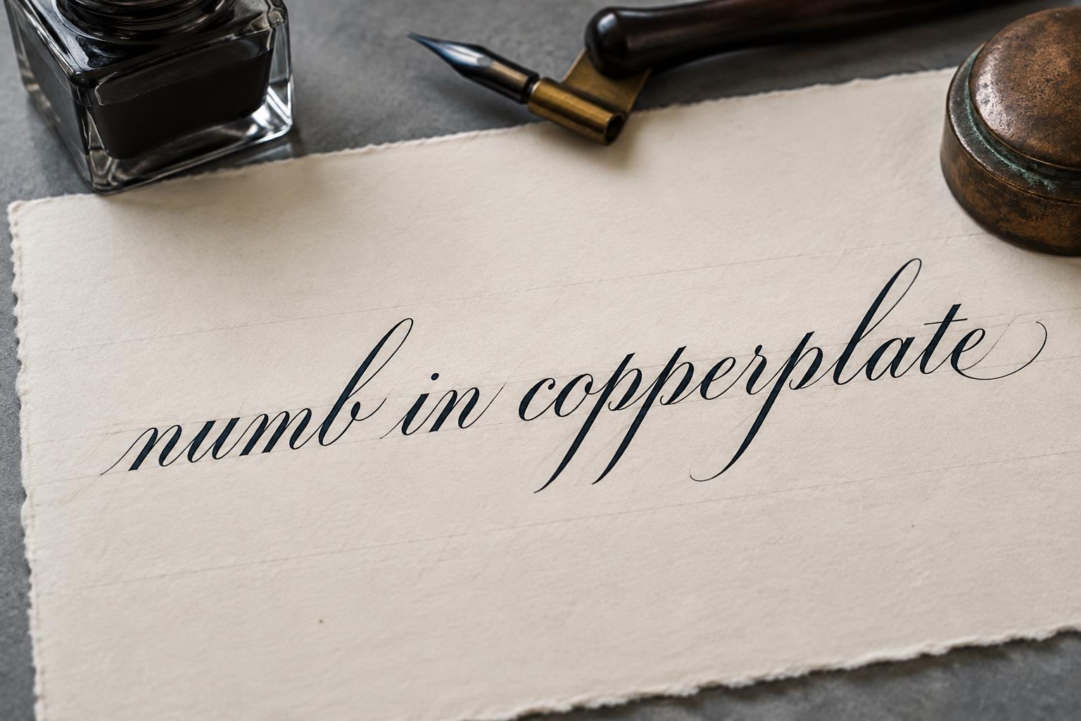
“König L v B” is a Cursive Calligraphy text effect 使用 FontVibe AI 创作的文字效果. 正式的尖头笔铜版体:粗细对比强烈,倾斜的椭圆字形和花饰大写,清晰黑墨写在带淡色格线的米色纸上.
Create a finished formal calligraphy specimen in a 3:2 horizontal composition. Render the exact text “König L v B” as the single focal inscription, centered and spanning 72% of the canvas width. Use individually drawn, exacting Copperplate pointed-pen lettering: consistent 55-degree oval slant, dramatic contrast between whisper-thin hairline upstrokes and broad pressure-shaded downstrokes, rhythmic open spacing, crisp connectors, and controlled restrained flourishes. Give the capital K a long hairline entry curve and the final B a balanced low exit flourish; keep “L v B” smaller but optically integrated on the same baseline. The ink is deep black, with clean wet-ink edges and tiny satin highlights only along the broad downstrokes. Set it on uncoated warm ivory hot-press cotton calligraphy paper, visible fine paper fibre, with extremely faint graphite-gray 55-degree slant guides beneath the lettering. No ornate border, no wax seal, no pen, no extra words, no monogram, no decorative objects. Keep at least 45% of the frame as unmarked paper around the inscription. Use even soft studio illumination from above, low shadow, sharply resolved ink contours, flat archival document presentation, straight-on camera view. Prioritize accurate umlaut dots over the ö: two small precise ink ovals aligned with the calligraphic slant. High-resolution macro paper and ink detail.
用途: 铜版体书法
生成于 2026年9月21日 · 1536 × 1024 · JPEG · OpenAI GPT-Image-2.5 Sunburst · 版式:Zentrierte Schriftprobe · 公开作品 · 可免费商用(CC BY 4.0)


