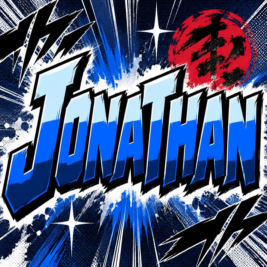
Jonathan - Anime Text Effect


用原作的模型 OpenAI GPT-Image-2.5 Sunburst · 15 积分
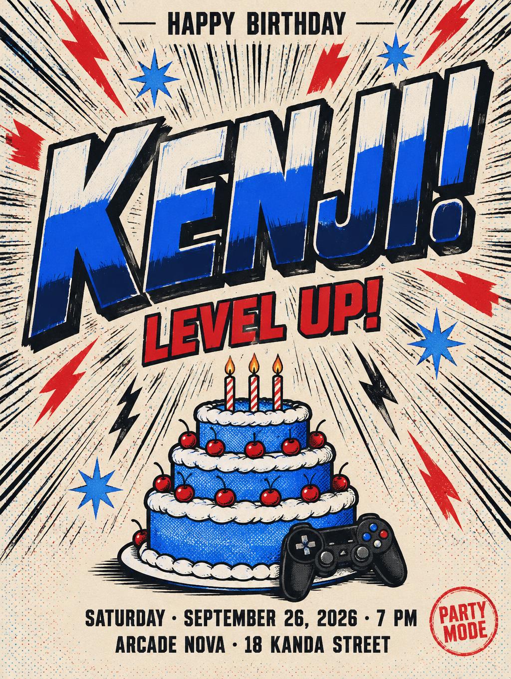
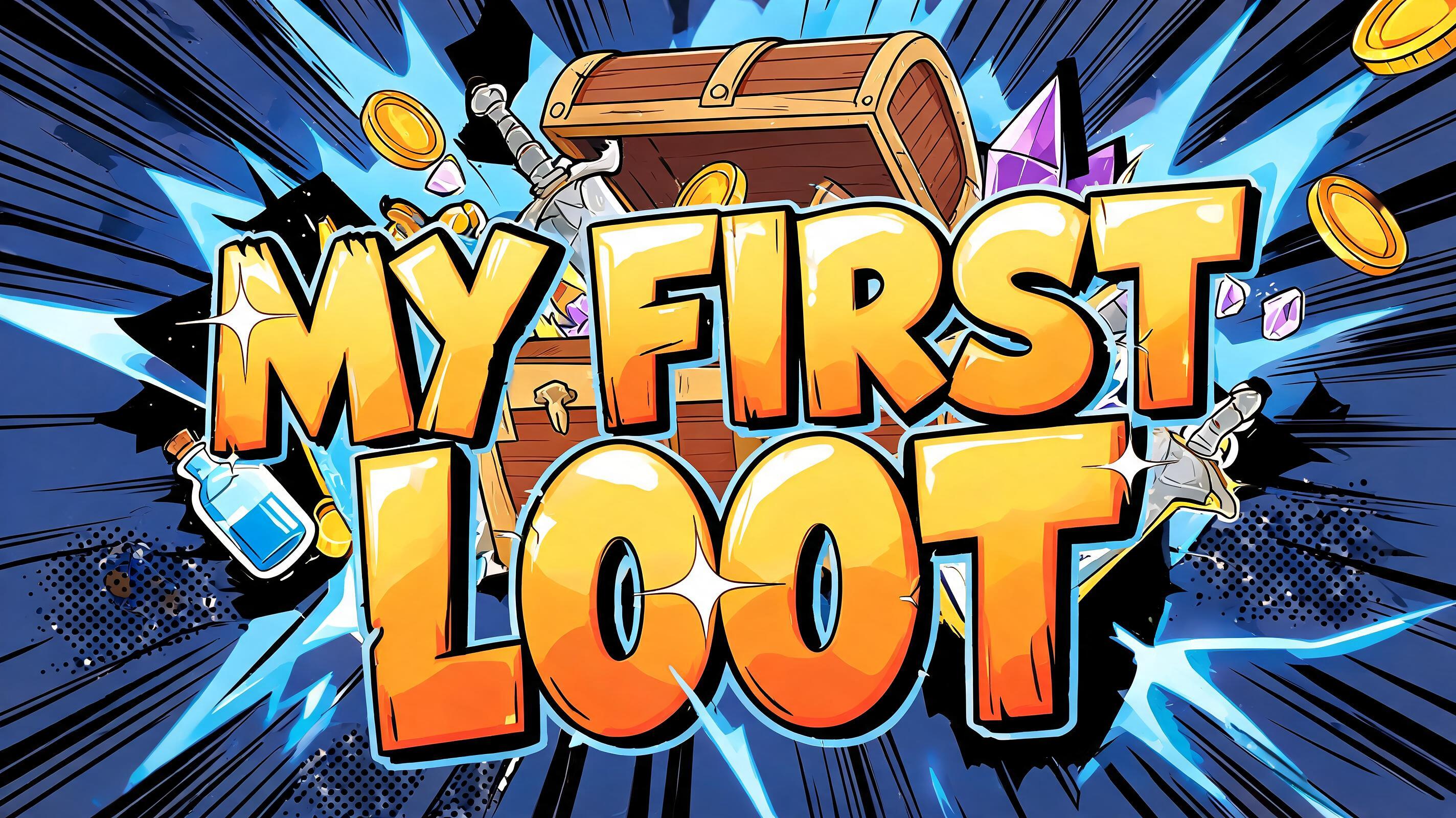
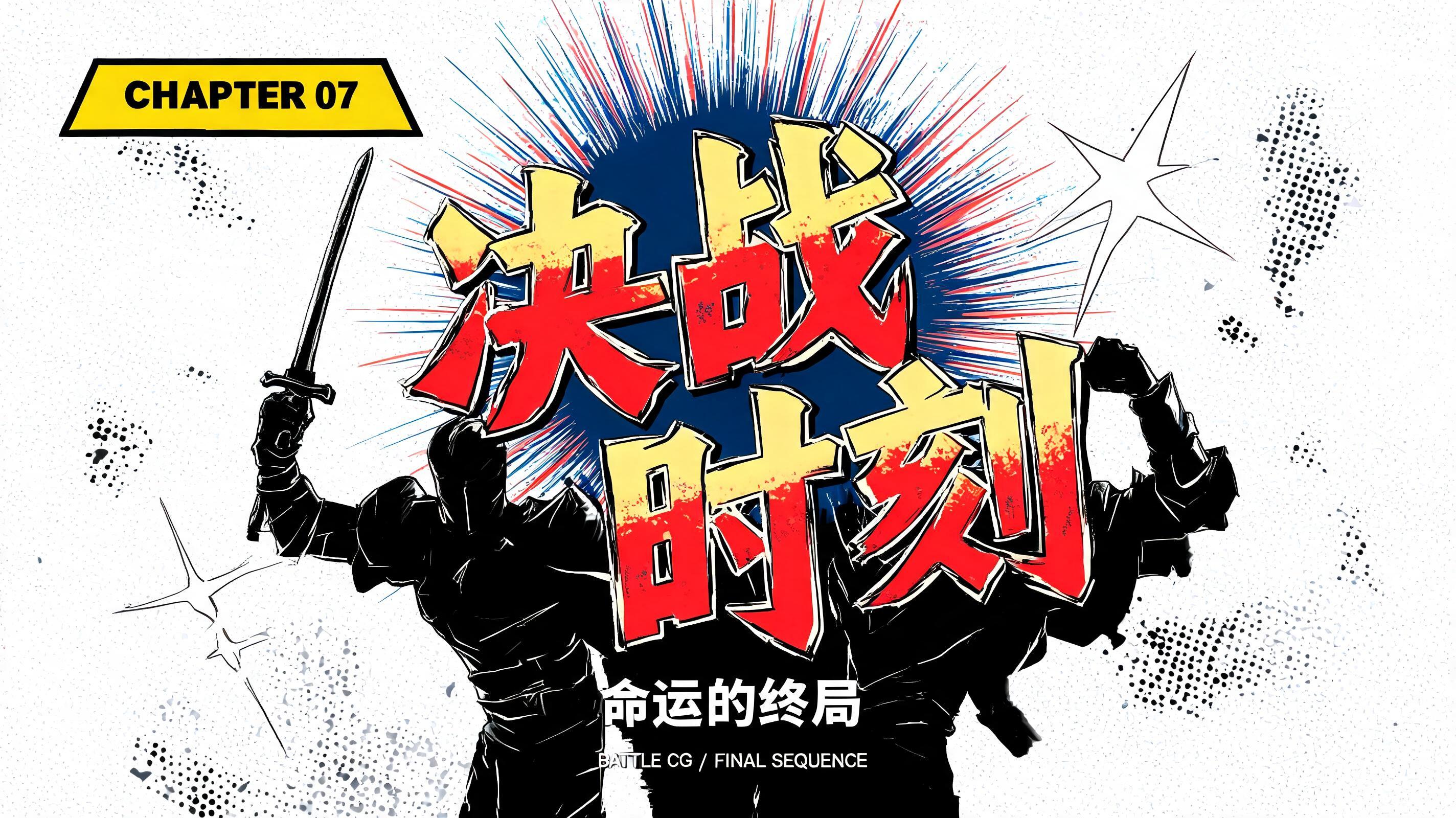
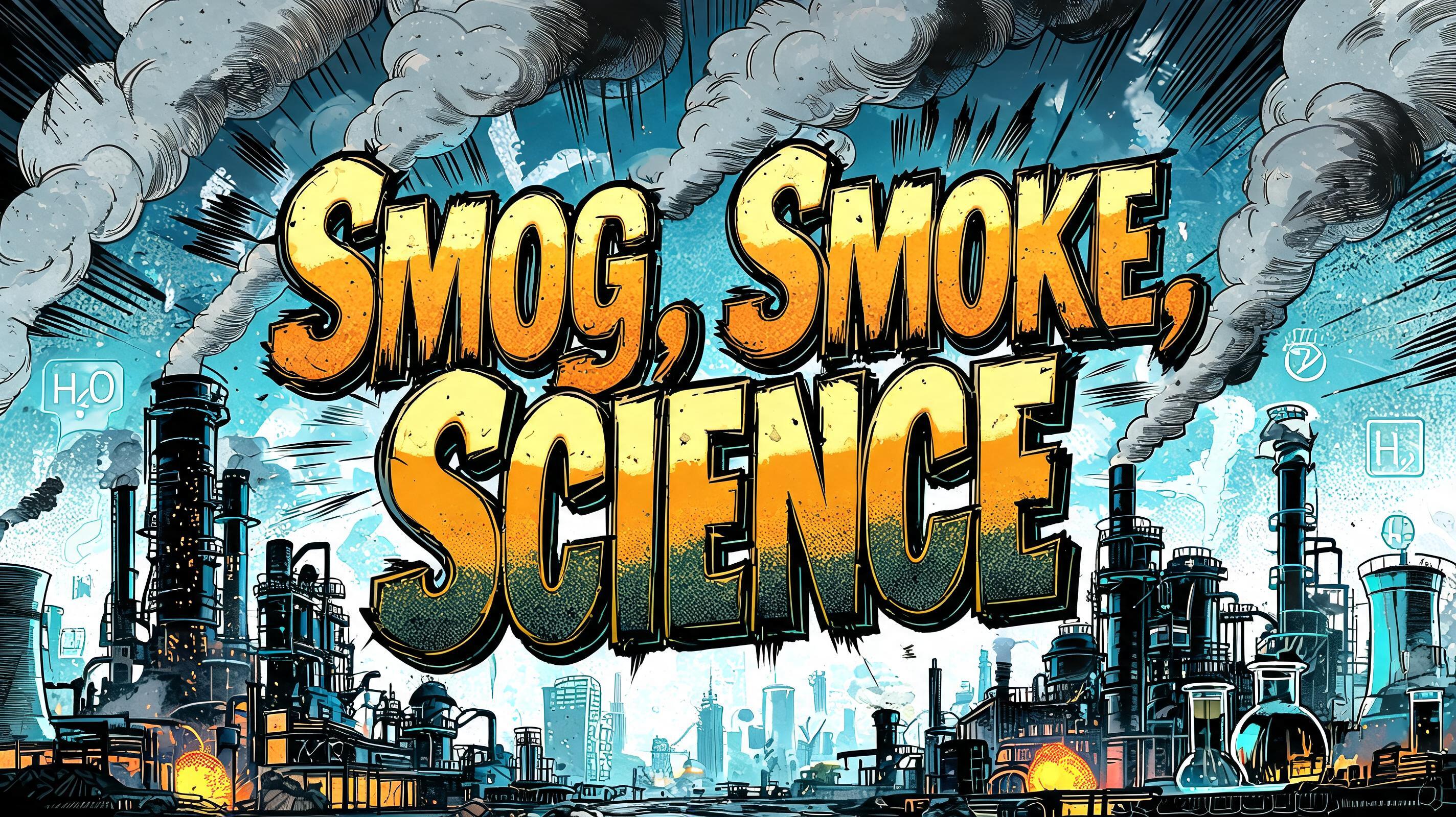

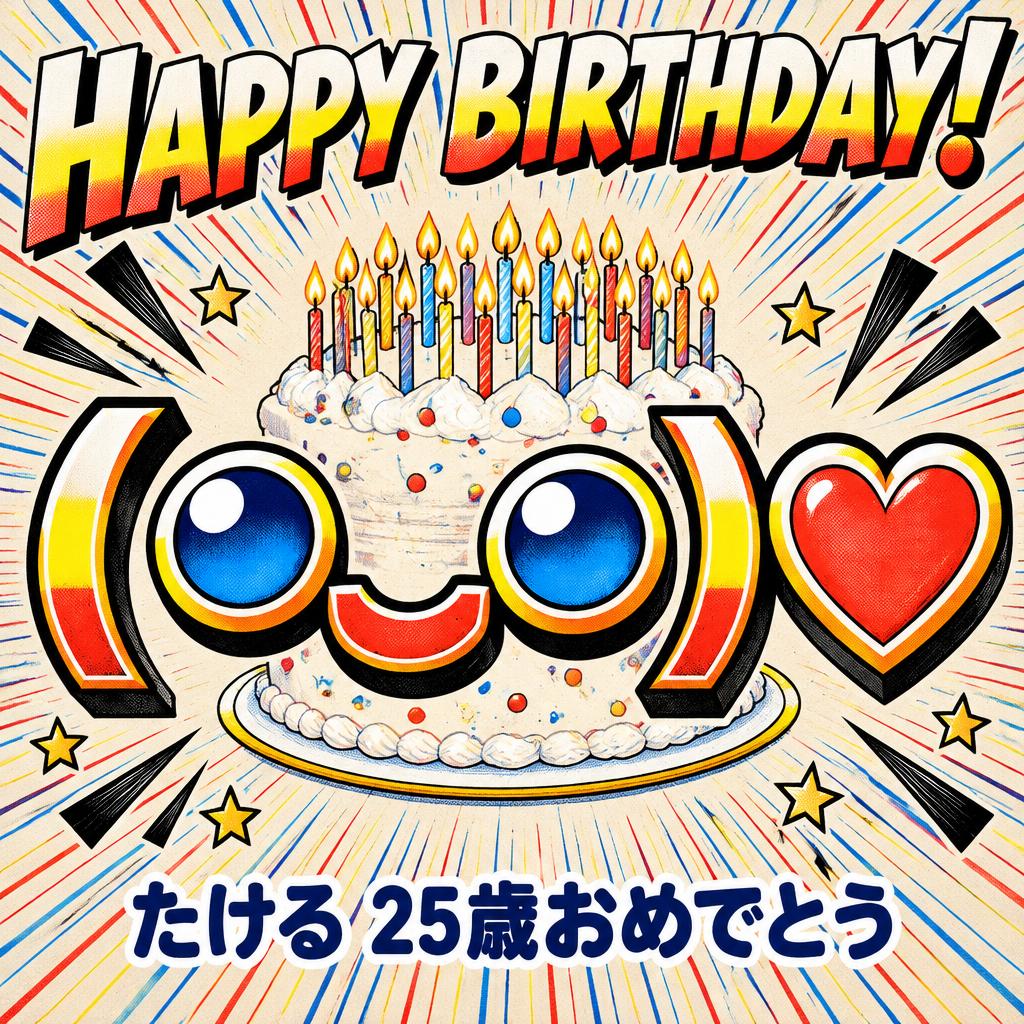
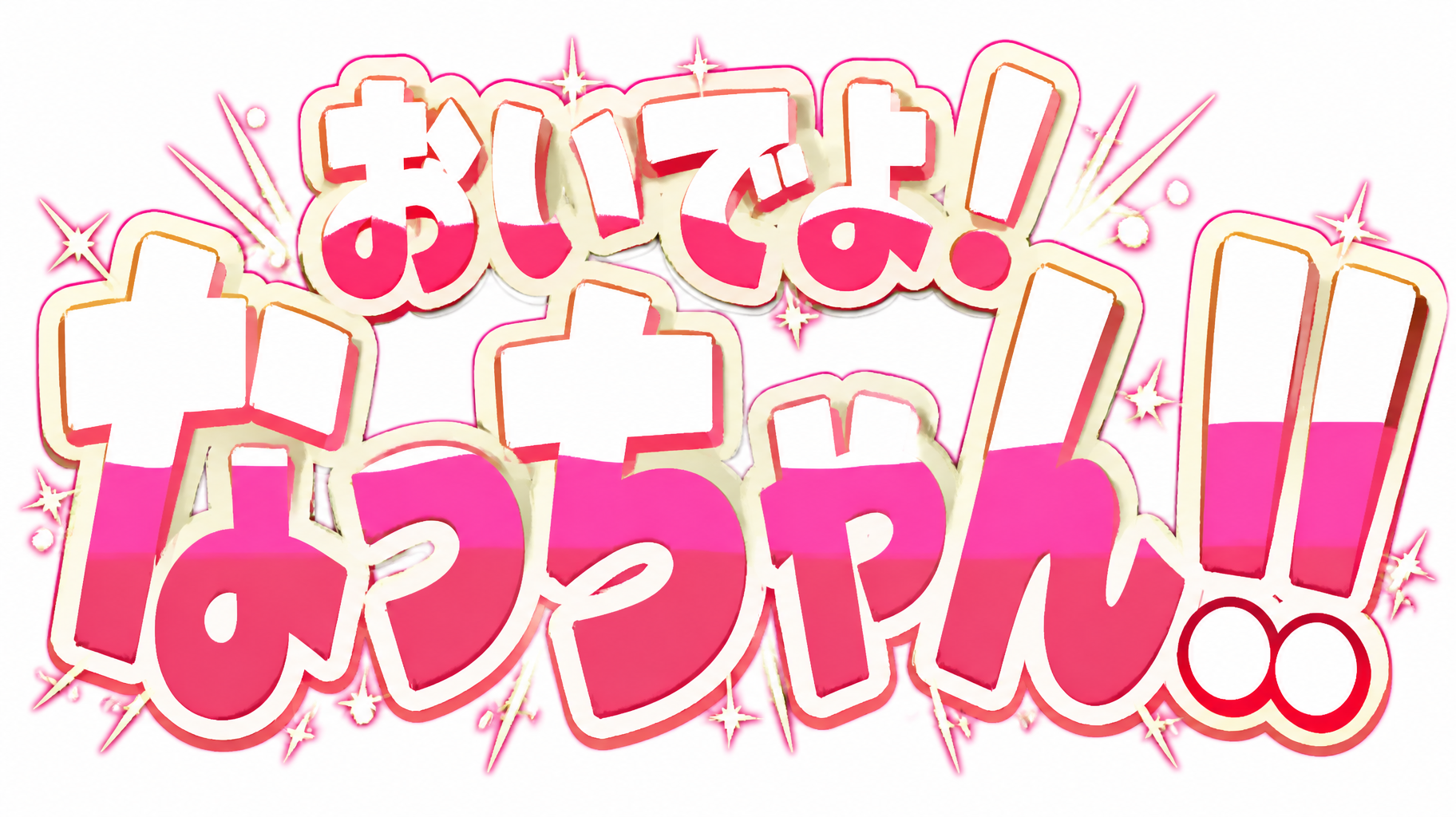
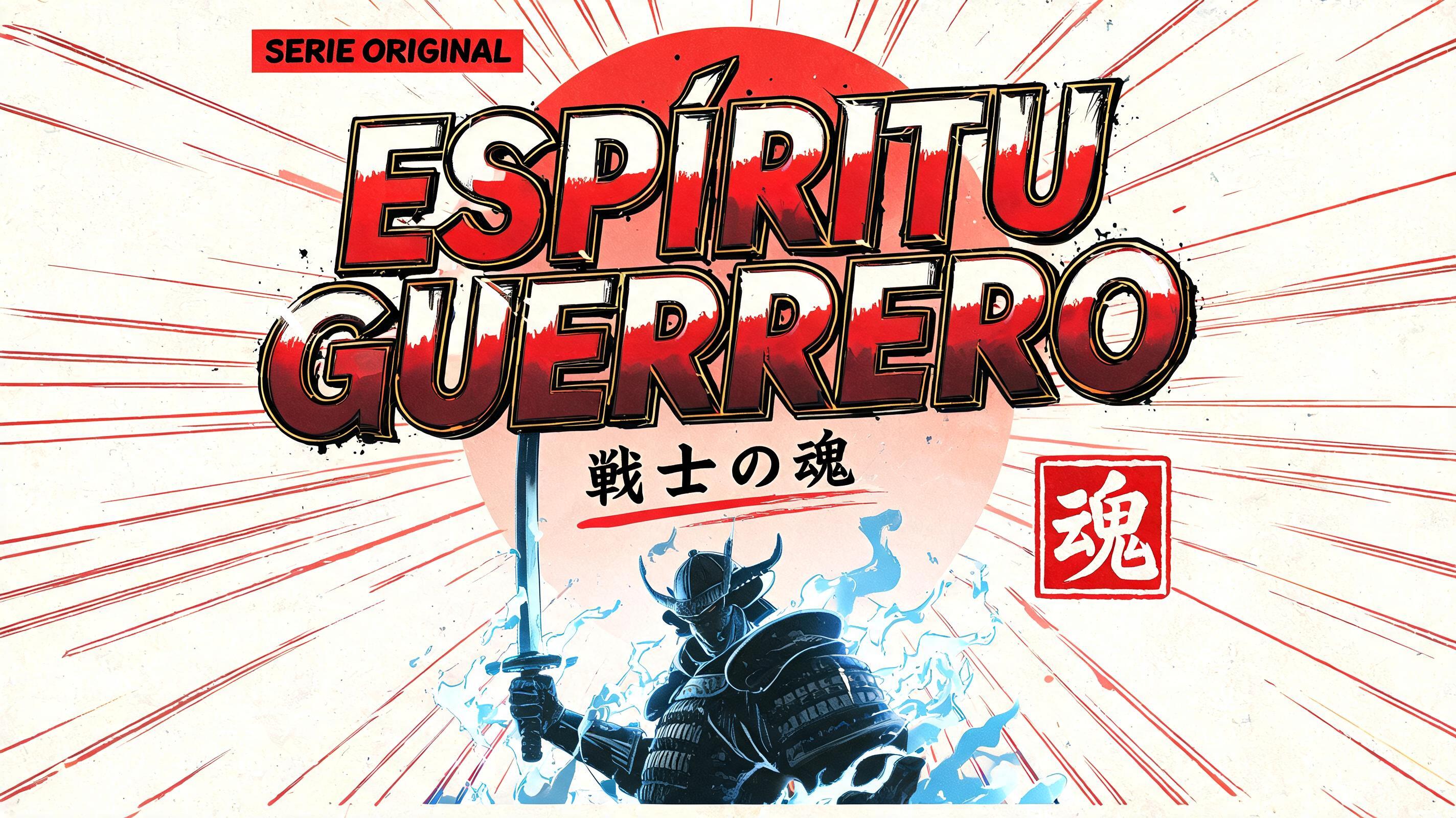
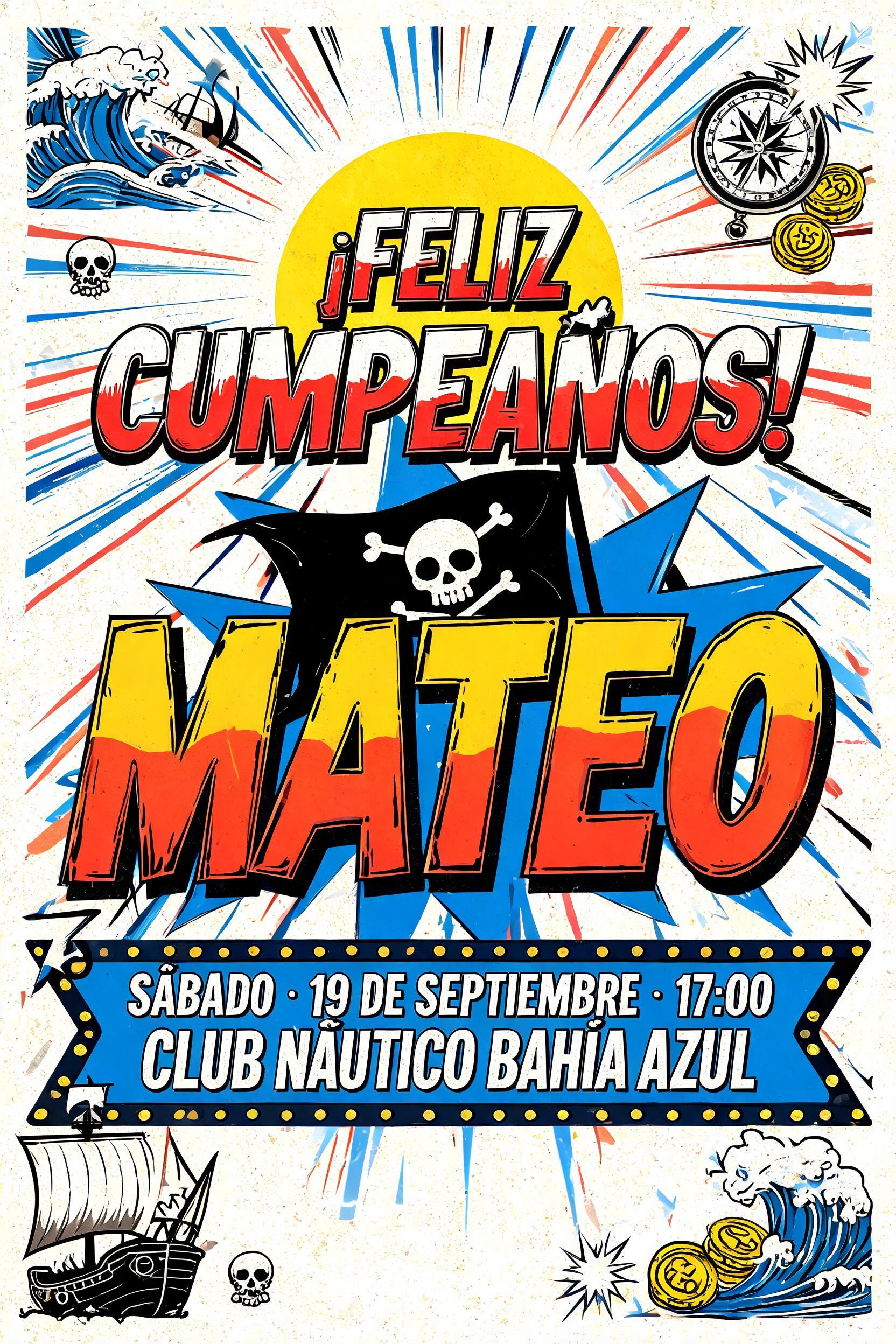
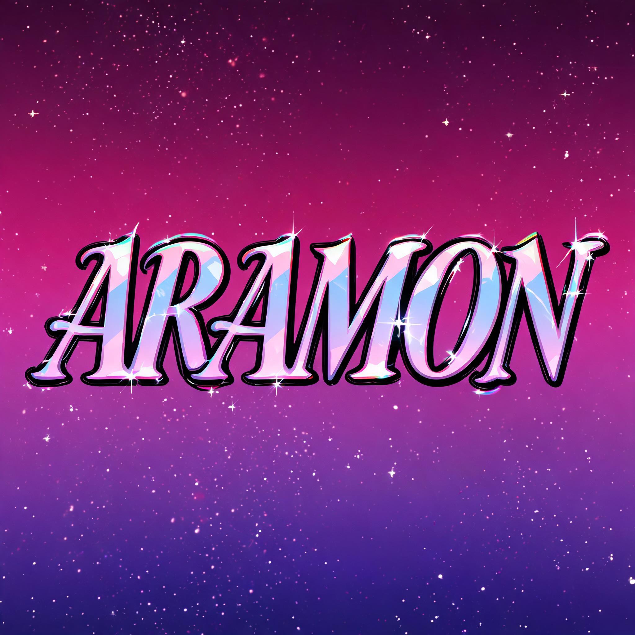
“Jonathan”是使用 FontVibe AI 创作的Anime文字效果。少年漫画标题字:粗重手绘黑描边,赛璐璐平涂分出硬边高光与阴影,字母倾斜有冲劲,白底上放射速度线。
rendered as Japanese shounen anime title treatment — bold hand-inked manga lettering with authentic cel-shaded visual energy. Letter construction follows classic Shonen Jump title card standards: thick black ink outline with natural brush-weight variation defining each letter boundary; flat cel-shading fill with three hard-edge zones — bright highlight zone on upper letter face, highly saturated primary color zone at center, deep shadow zone at lower edge; all zone boundaries knife-edge hard, zero gradient blur, pure flat offset-print ink physics. Energy signature: high-contrast color + thick ink outline = letters that look physically printed on manga paper. The typographic language of Dragon Ball, Naruto, One Piece, Demon Slayer, Jujutsu Kaisen title cards — maximum manga kinetic energy, iconic and immediately recognizable as Japanese anime title typography. LETTERFORM PRIORITY: when the chosen font carries its own treatment, that font's letterform shapes take priority and own the letters; this style governs the inked manga outline, the three-zone cel-shading and the kinetic energy. FALLBACK MATERIAL: if the font carries no material of its own, render the letters as bold hand-inked shounen title lettering with a thick black brush outline and hard three-zone cel-shading. COLOR PRIORITY: keep the font's own colors if specified; otherwise a high-saturation primary fill with hard highlight and shadow zones. JONATHAN rendered as a shounen anime character-introduction title card, with the name dominating the composition in dense hand-inked manga treatment. Preserve the supplied letterform silhouette while applying a thick uneven black ink contour, tiny dry-brush breaks, and offset-print edge texture. The letter faces use three razor-hard cel-shaded zones: pale electric-blue highlights across upper planes, saturated cobalt-blue midtone fields, and deep indigo lower shadows; no gradients, every color boundary sharply cut like screen-printed animation cels. Add narrow white specular slashes, small black hatching wedges, and a few chipped ink flecks around outer contours. Behind the word, a midnight navy manga panel erupts with radial white speed lines, cobalt impact bursts, angular black action strokes, and scattered four-point star glints. A compact red circular seal with abstract kanji-like brush marks sits as a non-readable decorative graphic element, surrounded by halftone dot texture and torn-paper panel edges. Strong white backlight halo separates the title from the dark field. Crisp cel animation rendering, high-contrast offset ink colors, clean chapter-title graphic, no additional readable words.
用途: 动漫字体生成器
生成于 2026年9月23日 · 1024 × 1024 · JPEG · OpenAI GPT-Image-2.5 Sunburst · 公开作品 · 可免费商用(CC BY 4.0)


