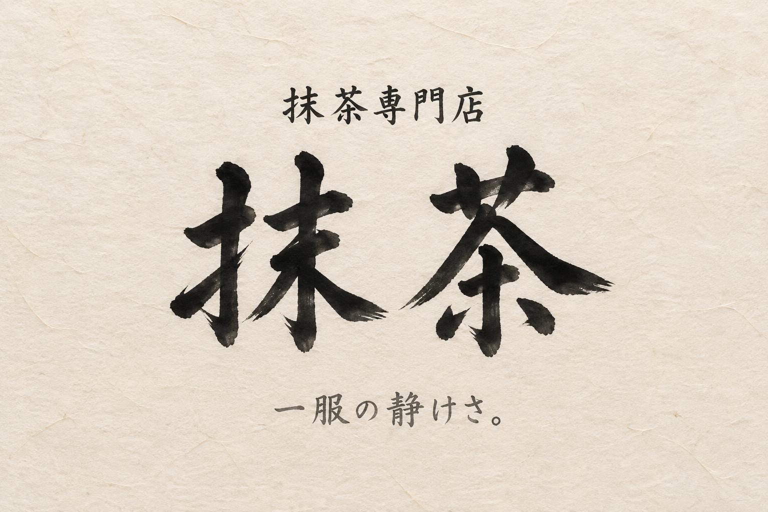
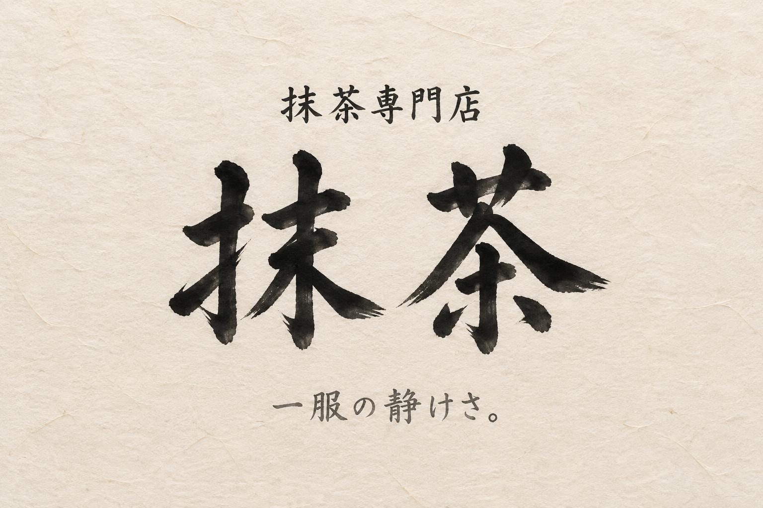
抹茶 抹茶専門店 一服の静けさ。 - 日本水墨毛笔 Text Effect


用原作的模型 OpenAI GPT-Image-2.5 Sunburst · 15 积分











“抹茶 抹茶専門店 一服の静けさ。”是使用 FontVibe AI 创作的日本水墨毛笔文字效果。把日本书道的水墨毛笔笔法用到拉丁字母上。浓黑的墨汁配上地道的毛笔笔势、单向可控的运笔,还有和纸的质感。做日料店品牌、纹身设计、动漫、武道和文化类项目都特别合适。
Create a finished horizontal 3:2 Japanese shop-sign poster for a matcha store, rendered as authentic sumi calligraphy on warm cream handmade washi. Visible long paper fibers, subtle deckled-paper variation, no frame, no objects, no ornamental graphics; the paper and brush lettering are the complete scene. Soft diffuse north-facing studio light, completely shadowless. Exact rendered Japanese text, with precise hierarchy: - Small descriptor at upper center: “抹茶専門店” - Dominant central store name: “抹茶” - Small line at lower center: “一服の静けさ。” The headline “抹茶” occupies about 55% of the canvas height. Each kanji is a definitive classical shodo calligraphy form made in one committed pass: upright balanced structure, generous spacing between the two characters, bold 5:1 thick-to-thin stroke contrast, compressed loaded-brush entrances, near-black pigment at each stroke core, controlled mid-stroke energy, exact fine harai pull-away tips and subtle hane hooks. Ink is fully matte and absorbed into the washi; dense black transitions through charcoal to faint cool-gray only at tapered outer edges, with minimal dry-brush grain at a few stroke boundaries. No uniform digital black, no hesitant or doubled strokes. Set “抹茶専門店” in smaller restrained hand-brushed kana/kanji, centered above with wide clear separation. Set “一服の静けさ。” in a fine diluted-gray brush hand near the lower center. Preserve at least 55% open paper area, especially left and right of the headline. Clean central vertical axis, quiet margins, precise Japanese print composition. High-resolution scanned-washi realism, crisp legible Japanese characters, no Latin letters, no logos, no seals, no extra text.
用途: 日文艺术字生成器
生成于 2026年9月23日 · 1536 × 1024 · JPEG · OpenAI GPT-Image-2.5 Sunburst · 版式:禅意 · 公开作品 · 可免费商用(CC BY 4.0)


