Cheap vs Expensive WHICH ONE WINS? - YouTube 创作者 Text Effect


用原作的模型 OpenAI GPT-Image-2.5 Sunburst · 15 积分



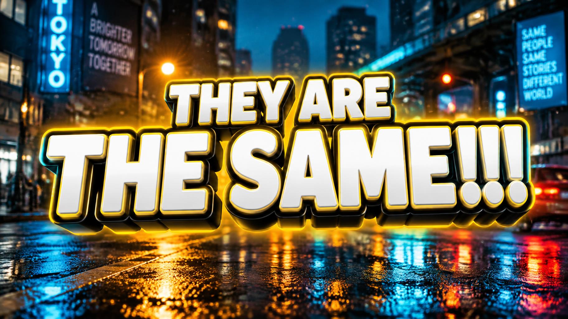

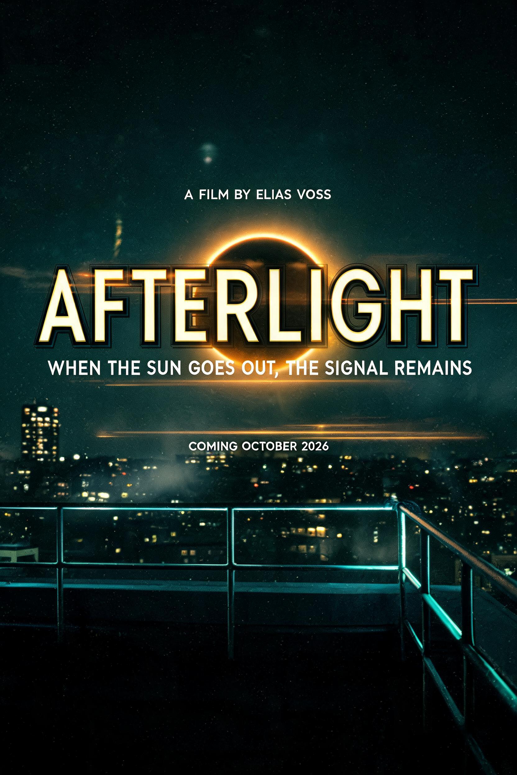

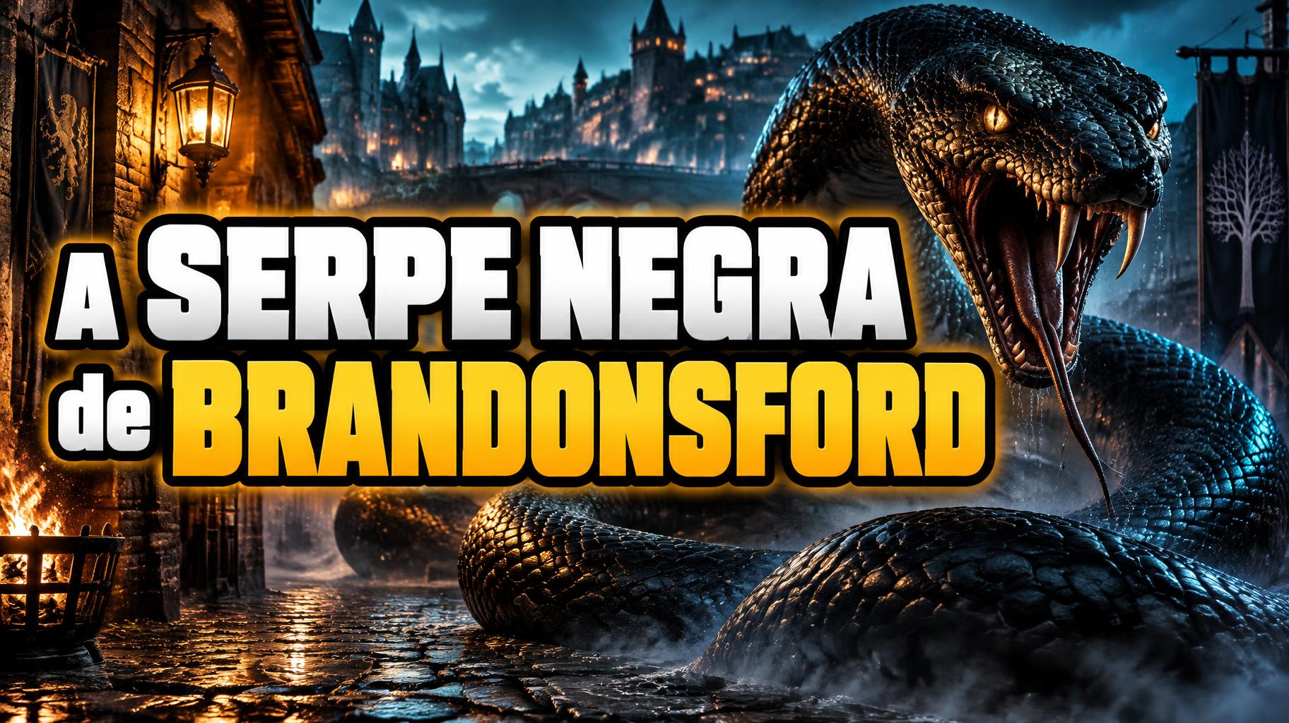

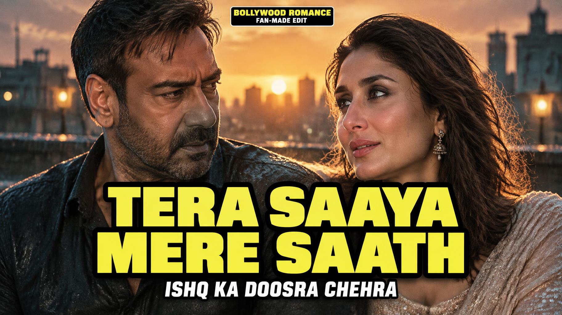
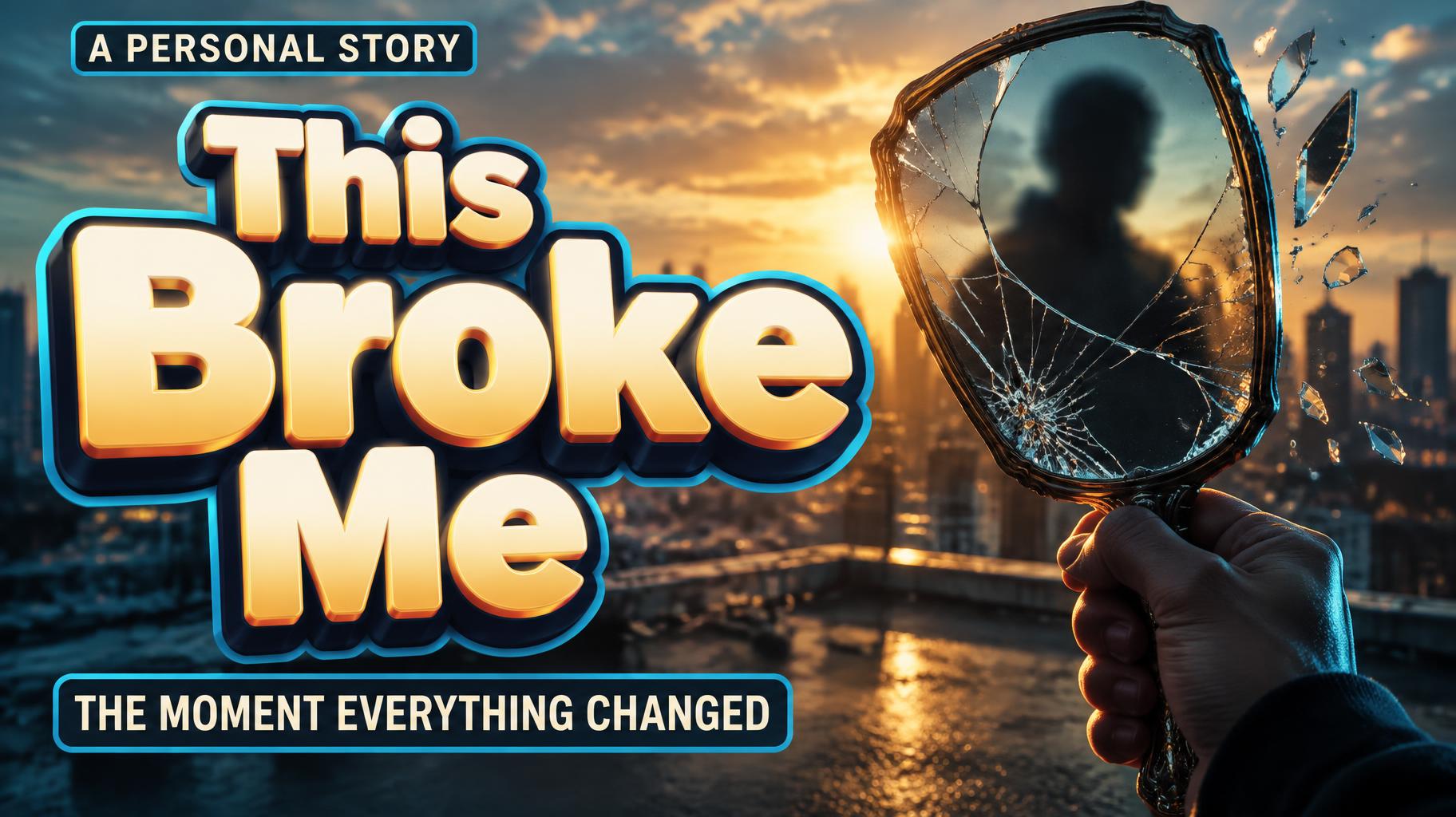
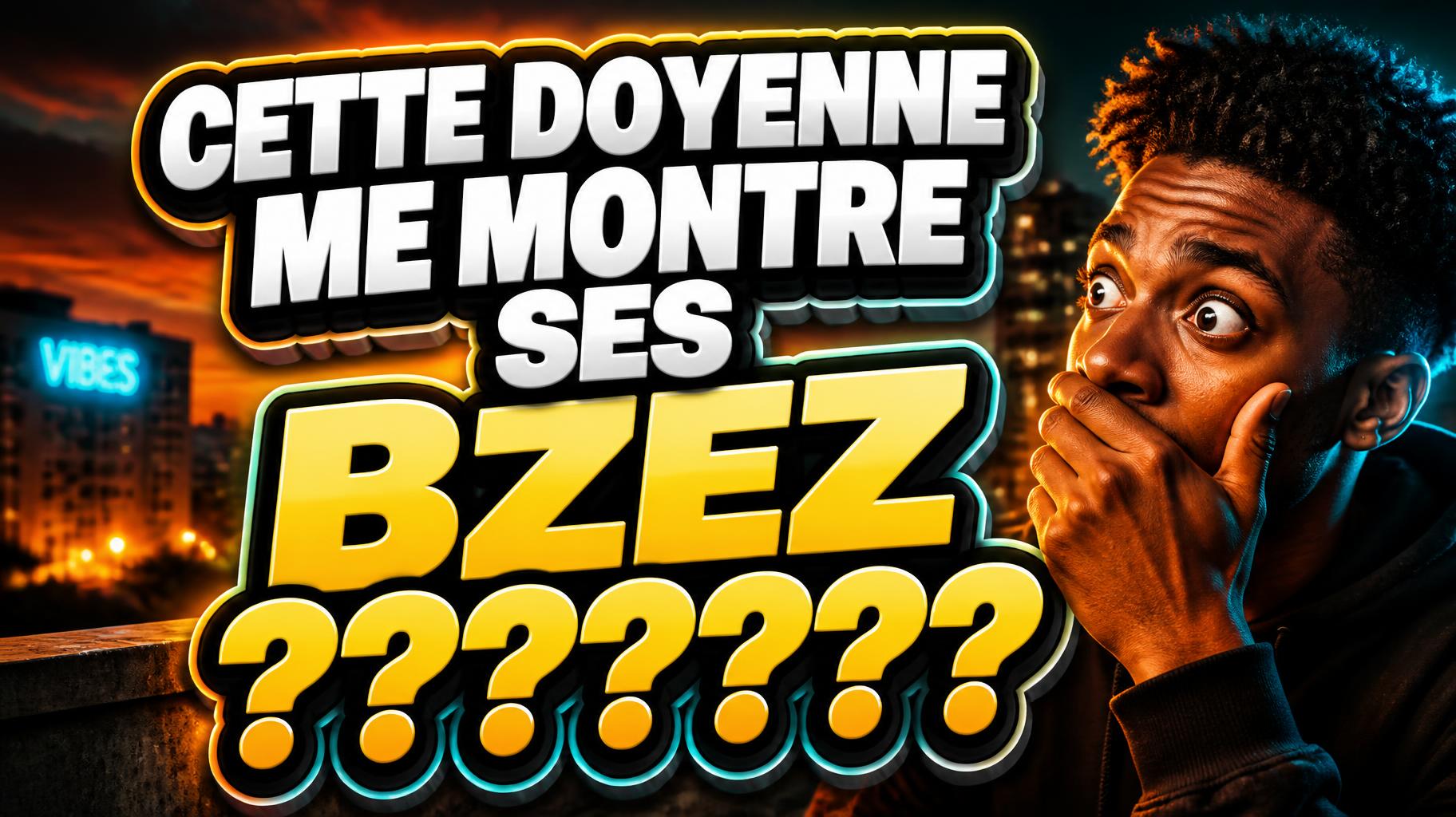
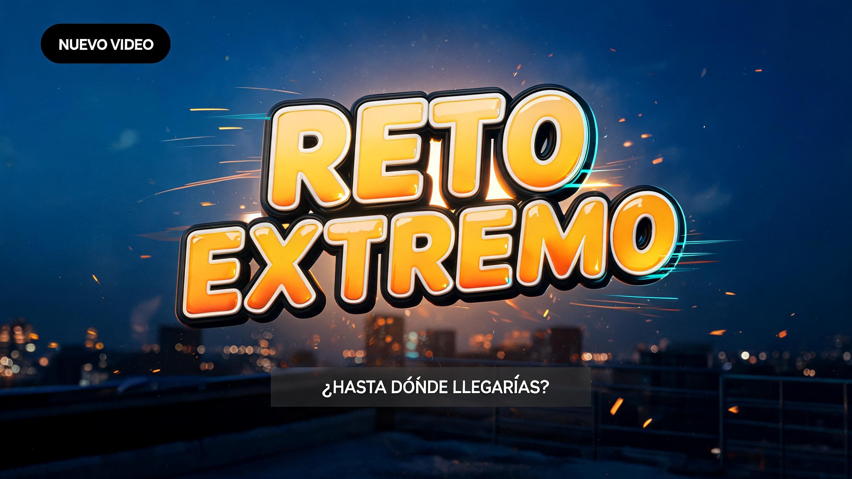




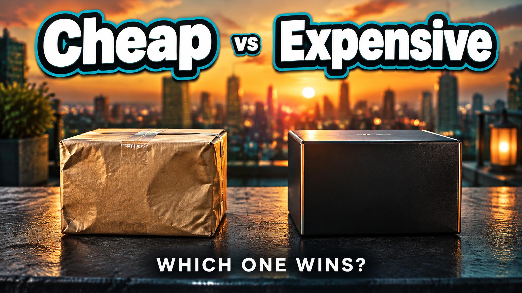
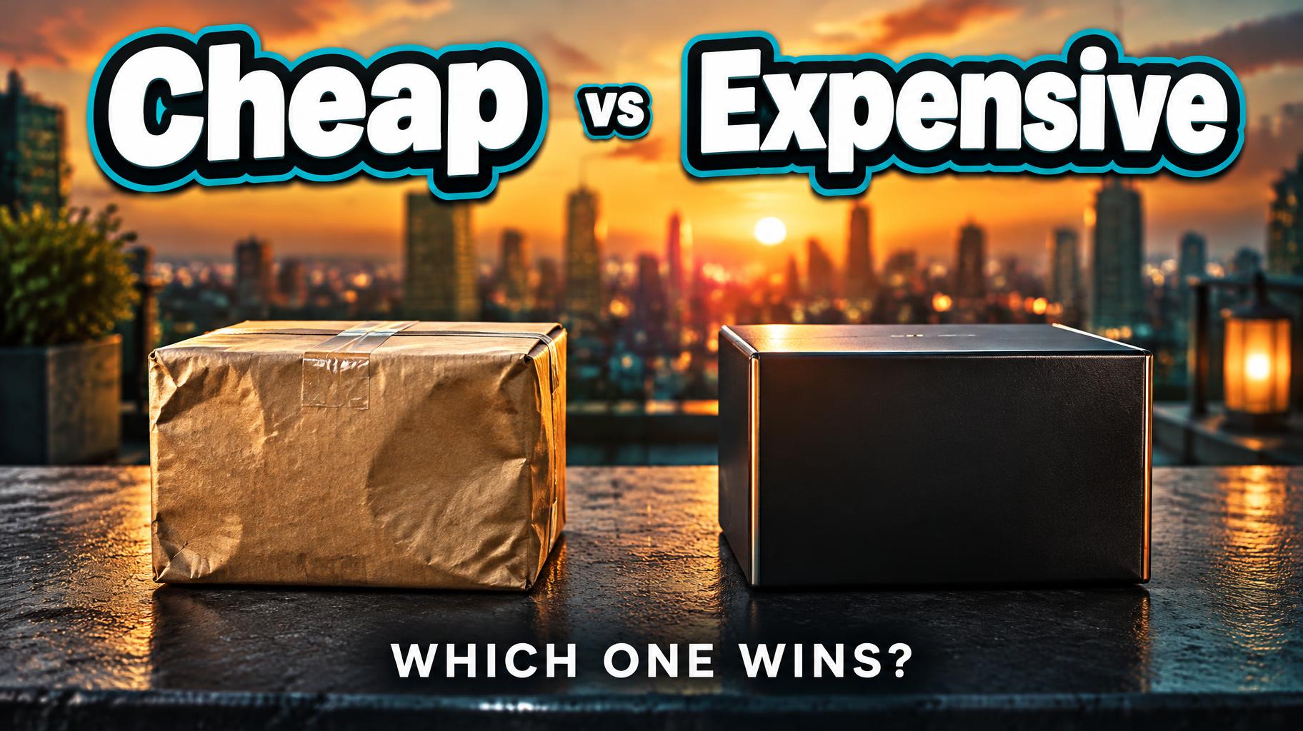
“Cheap vs Expensive WHICH ONE WINS?”是使用 FontVibe AI 创作的YouTube 创作者文字效果。高窄无衬线大写字母,暖黄色配深色描边与辉光,上方一行小字集数,背景是黄金时刻的城市楼顶。
Create a finished 16:9 YouTube video thumbnail for a side-by-side price comparison test. Render only these exact text strings: “Cheap” and “Expensive” as the two dominant headline words, with “vs” much smaller between them; add “WHICH ONE WINS?” as a small supporting line near the bottom. Preserve this wording and spelling; add no other text, numbers, logos, or labels. Build a clear left-right comparison scene: a plain, slightly dented kraft-paper package on the left and a precisely finished matte-black package with a narrow metallic edge on the right, both unbranded and similar in size. Place them on a dark rooftop counter. Behind them, use a softly blurred urban skyline at golden hour with city-light bokeh. Keep the background subdued so the lettering and comparison read instantly at thumbnail size. Set “Cheap” over the left half and “Expensive” over the right, both large and bold; place the small “vs” in the gap between them. Use chunky, rounded, compact sticker-outline display lettering with heavy uniform strokes, rounded terminals, and wide proportions. Give each letter a bright white face, thick dark outer contour, and a second narrow cyan contour; add a deep, controlled drop shadow to make the forms read as dimensional die-cut stickers. Use warm amber backlight behind the words and a crisp cyan edge light, with teal shadows in the scene. The supporting line “WHICH ONE WINS?” sits centered at the bottom in clean bold white sans serif, with generous spacing and high contrast. Strong focal hierarchy, sharp lettering, restrained film grain, clean margins, thumbnail legibility.
用途: YouTube 缩略图文字制作器
生成于 2026年9月26日 · 1824 × 1024 · JPEG · OpenAI GPT-Image-2.5 Sunburst · 版式:分割 · 公开作品 · 可免费商用(CC BY 4.0)