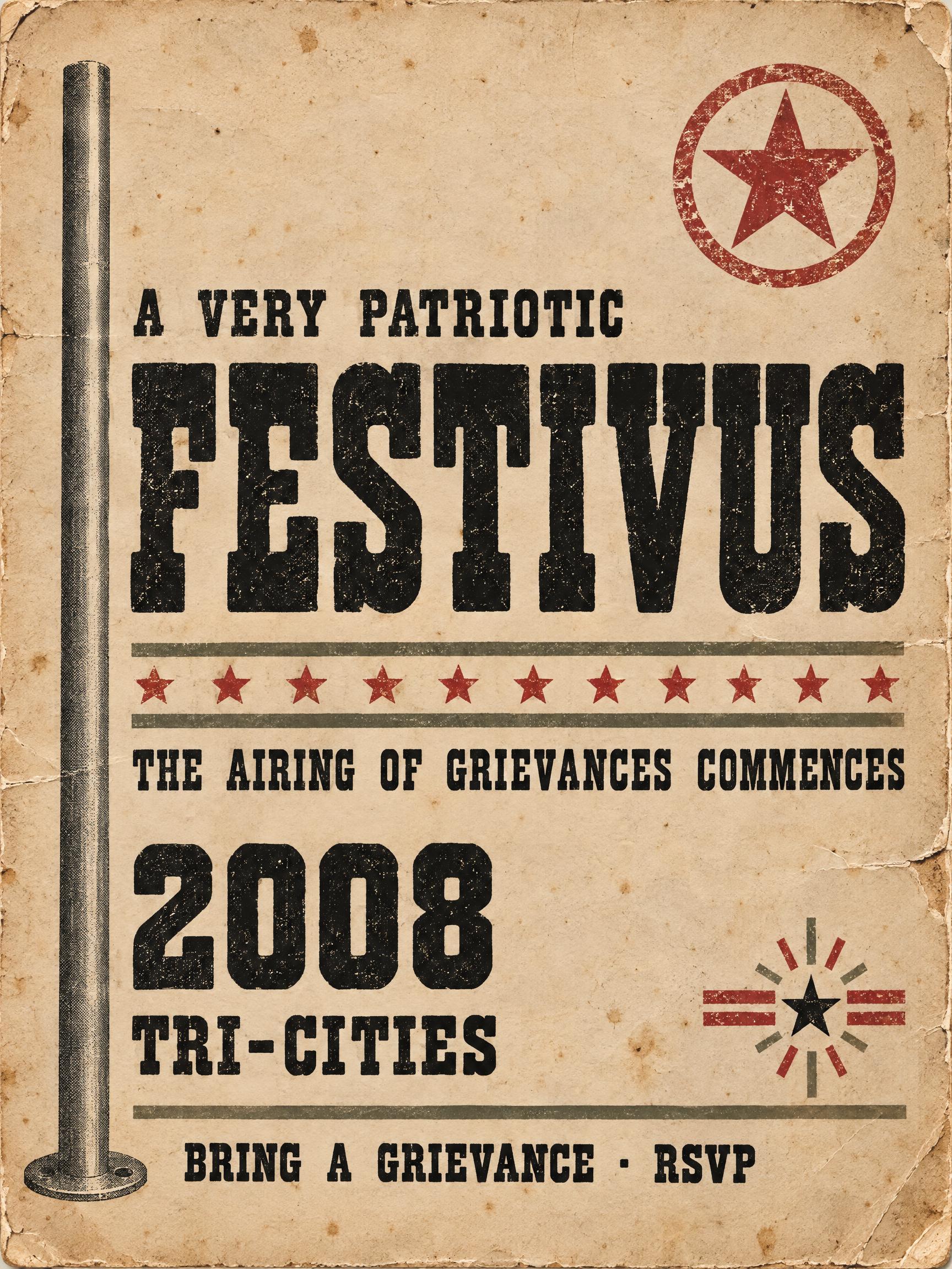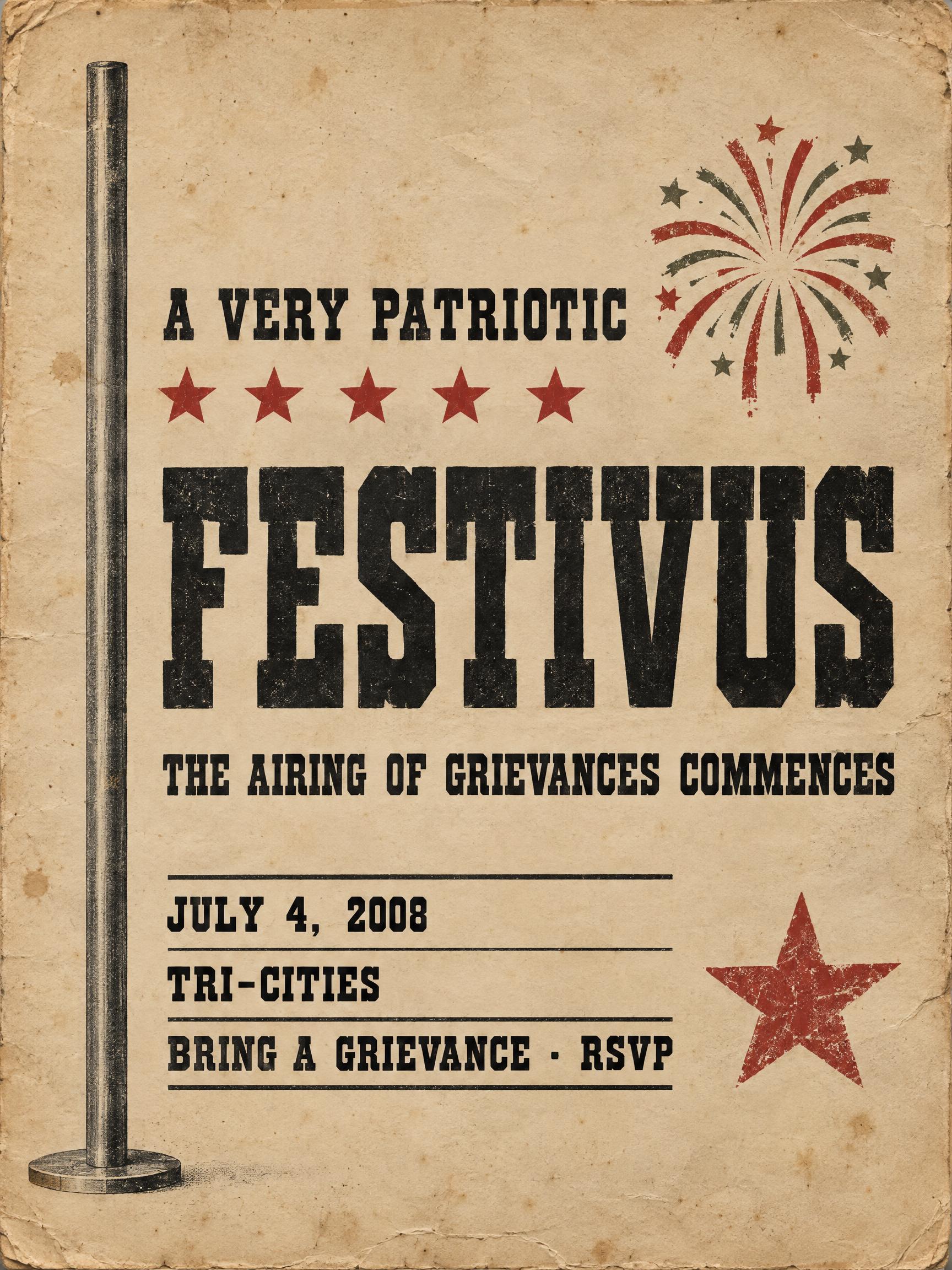
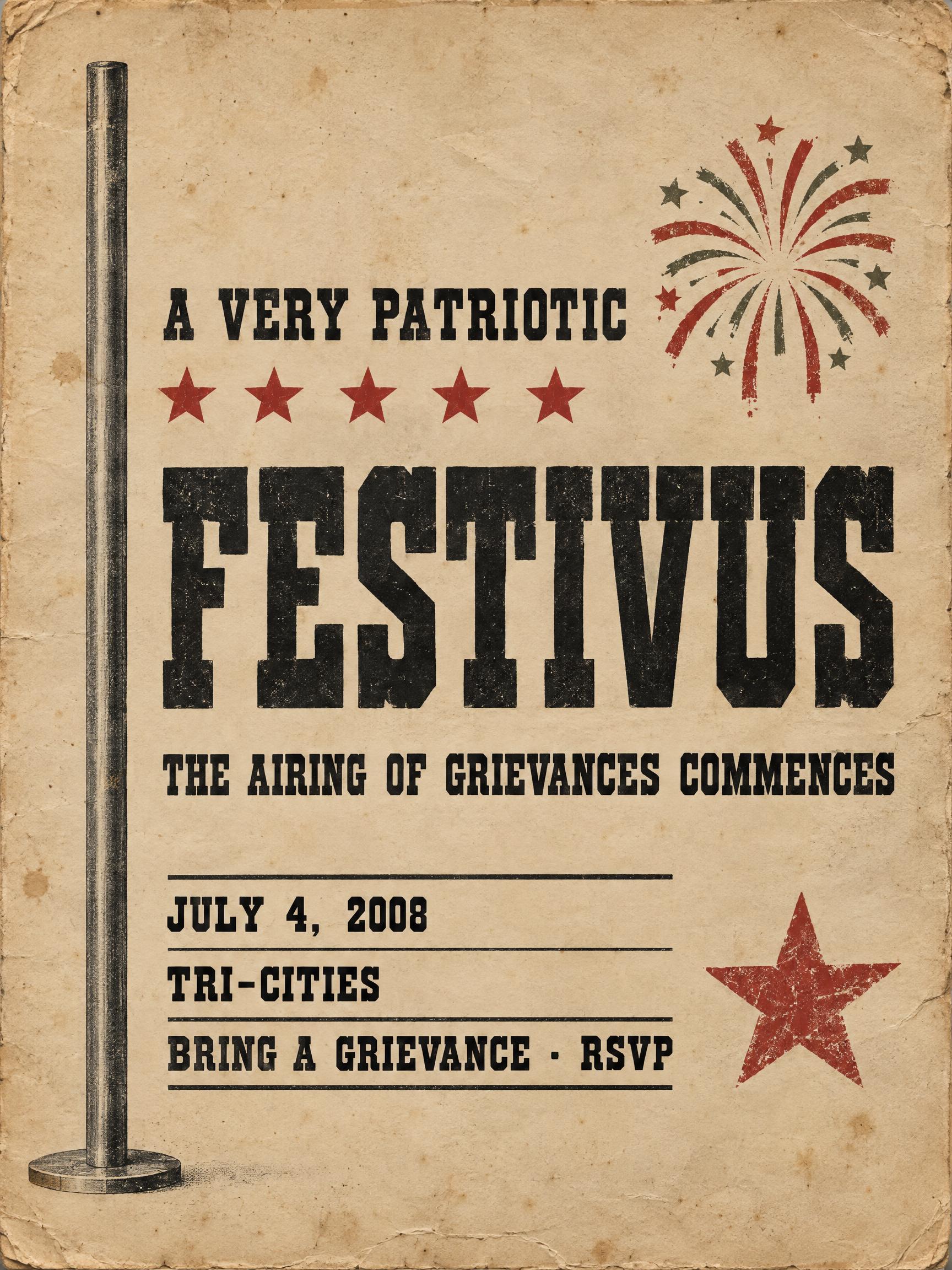
A VERY PATRIOTIC FESTIVUS THE AIRING OF GRIEVANCES COMMENCES JULY 4, 2008 TRI-CITIES BRING A GRIEVANCE · RSVP - 复古 Text Effect


用原作的模型 OpenAI GPT-Image-2.5 Sunburst · 40 积分



“A VERY PATRIOTIC FESTIVUS THE AIRING OF GRIEVANCES COMMENCES JULY 4, 2008 TRI-CITIES BRING A GRIEVANCE · RSVP”是使用 FontVibe AI 创作的复古文字效果。衬线大写字母凸版压印进米色棉卡纸,墨色略有破损,放在旧印刷机台面上,周围散落金属活字。
Create a complete retro event poster for a humorous Fourth of July–themed Festivus gathering, portrait 3:4. Print-shop broadside meets unofficial neighborhood bulletin, with a straight-faced, restrained red-and-ink treatment. Use aged newsprint tan paper, printer-black ink and brick-red stamp accents, with muted olive-gray details. Show tactile cotton-paper fibers, faint foxing, softened edges, and subtle age wear; warm amber light falls across the sheet with gentle shadows. The poster should look physically printed, not like a digital interface. Follow a generous, carefully balanced portrait layout with substantial open paper around the central copy. Keep a narrow, tall aluminum pole graphic near the left edge, extending through most of the poster; it is purely decorative. Align the text blocks to a shared left edge in the left-center of the sheet, keeping them moderately narrow rather than spanning the full width. Place the small kicker high, the dominant headline in the middle, then the supporting announcement and three compact detail lines in a lower ruled block with clear breathing room between tiers. Add two small, text-free graphic accents on the right: one near the upper copy and one beside the lower details. Use simple faded-red starburst or stamp-like marks, with no extra lettering. Preserve the sketch’s vertical order and horizontal alignment. Set all copy exactly as quoted, with no additions, omissions, or corrections: Small kicker: "A VERY PATRIOTIC" Dominant headline: "FESTIVUS" Supporting line: "THE AIRING OF GRIEVANCES COMMENCES" Detail lines: "JULY 4, 2008"; "TRI-CITIES"; "BRING A GRIEVANCE · RSVP " Render every line in bold display typewriter lettering: monospaced construction, uniform heavy strokes, flat geometric slab serifs, mechanically even spacing, dense near-black ink, and slight ink spread at corners from a firm letterpress impression. Keep the headline much larger than the other lines; size the long supporting line to fit its block without changing its wording. Set the details clearly readable at poster viewing distance. Add thin rules to organize the lower details. No other readable text, numbers, or lettering.
生成于 2026年9月28日 · 1728 × 2304 · JPEG · OpenAI GPT-Image-2.5 Sunburst · 版式:Margin Pole Broadside · 公开作品 · 可免费商用(CC BY 4.0)