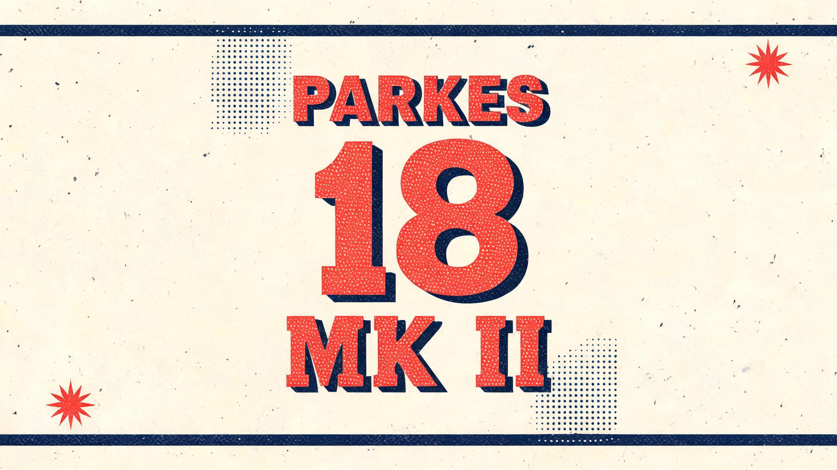
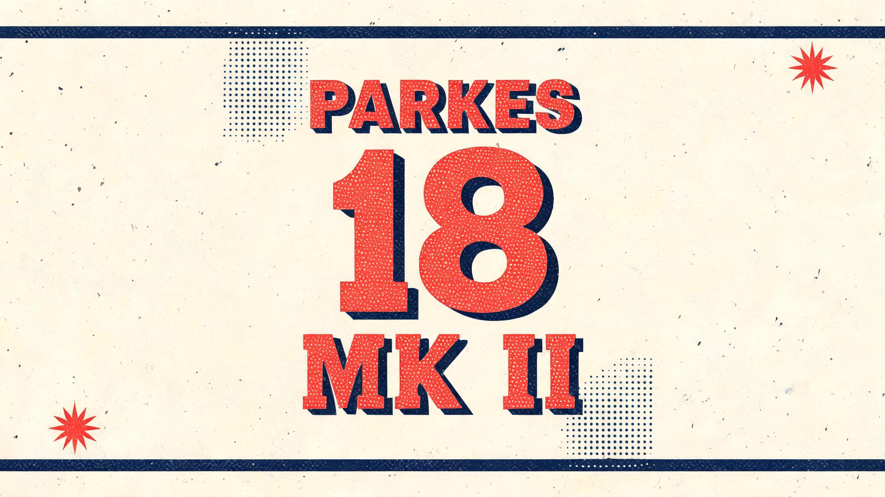
PARKES 18 MK II - Duotone 双色调 Text Effect


用原作的模型 ByteDance Seedream 5.0 · 15 积分

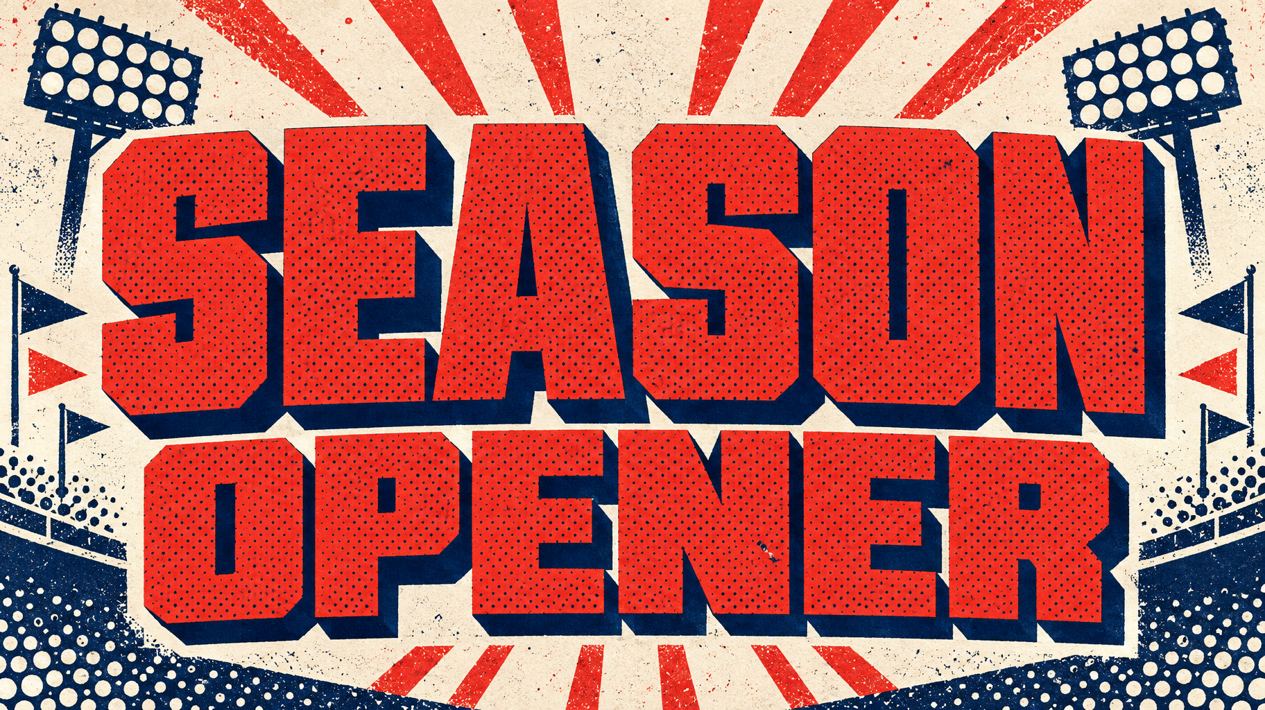

“PARKES 18 MK II” is a Duotone text effect 使用 FontVibe AI 创作的文字效果. 粗壮窄长的板衬线大写字母,一种亮色带半调网点纹理,另一种颜色做实心错位阴影,置于对比色平涂底上.
a bold duotone piece — graphic, punchy and print-like. SURFACE / STYLE: the lettering is rendered in a striking two-color treatment — one bright color dominating the letter face, a second deep contrasting color filling the drop shadow, bevel inset or offset layer — with a visible halftone screen-dot pattern in the dominant color and a crisp hard-edged graphic finish. SCENE ATMOSPHERE: a flat bold poster setting — clean two-tone ground, simple geometric or halftone accents, high-contrast graphic energy. PALETTE: any high-contrast two-color pair — vermillion red + midnight navy, electric blue + hot pink, black + bright accent — flat, saturated and bold, never gradient-soft or muddy. LETTERFORM PRIORITY: when the chosen font carries its own treatment (retro or Clarendon slab, condensed or geo sans, halftone comic, 3D shadow, sticker outline), that font's letterform takes priority and owns the letters; this style governs the two-color split, the halftone dots and the graphic poster finish. FALLBACK MATERIAL: if the font carries no material of its own, render the letters in a bold duotone — bright face with a deep contrasting offset shadow and a halftone dot pattern — so the punchy two-color graphic always reads. Create a hard-edged two-color graphic print built around the exact text “PARKES 18 MK II”. Render the text as the dominant mark with a vermillion-red letter face and a midnight-navy offset depth layer, using sharp stepped edges and dense visible halftone screen dots across selected red surfaces. Give “18” stronger scale emphasis within the hierarchy, while “PARKES” and “MK II” read as precise model-name details. Use flat saturated ink coverage, slight vintage offset-registration texture, crisp screen-print boundaries, and no gradients. Surround the lettering with a clean cream paper ground interrupted by navy geometric bars, small red starburst fragments, and restrained halftone-dot fields that echo the type treatment. Add subtle speckled uncoated-paper grain and tiny imperfect ink gaps for authentic two-ink poster production. Maintain strong contrast between the red, navy, and cream, with ample clear negative space and an assertive roadside-sign / mid-century motorsport graphic language. No objects, no mockup, no devices, no photographic scene; only a print-ready duotone typographic poster composition.
生成于 2026年10月4日 · 2848 × 1600 · JPEG · ByteDance Seedream 5.0 · 公开作品 · 可免费商用(CC BY 4.0)


