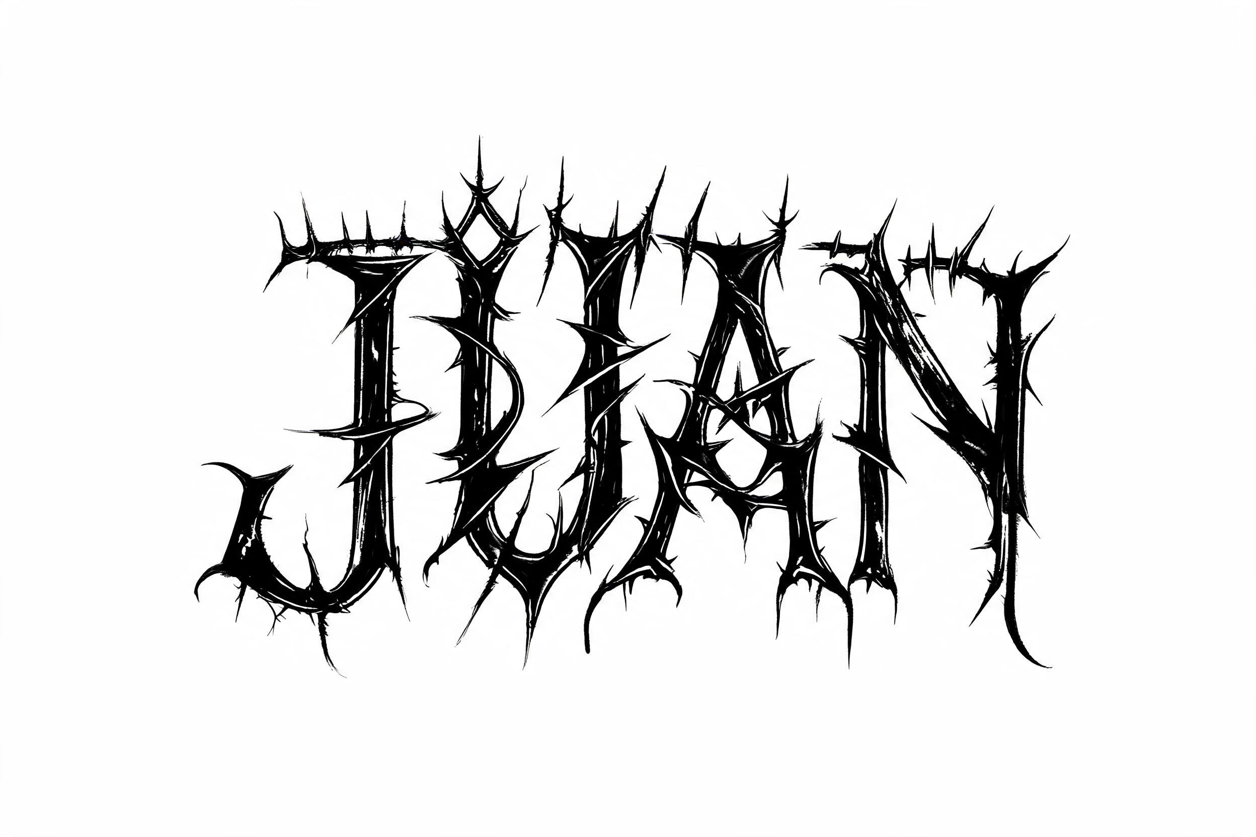
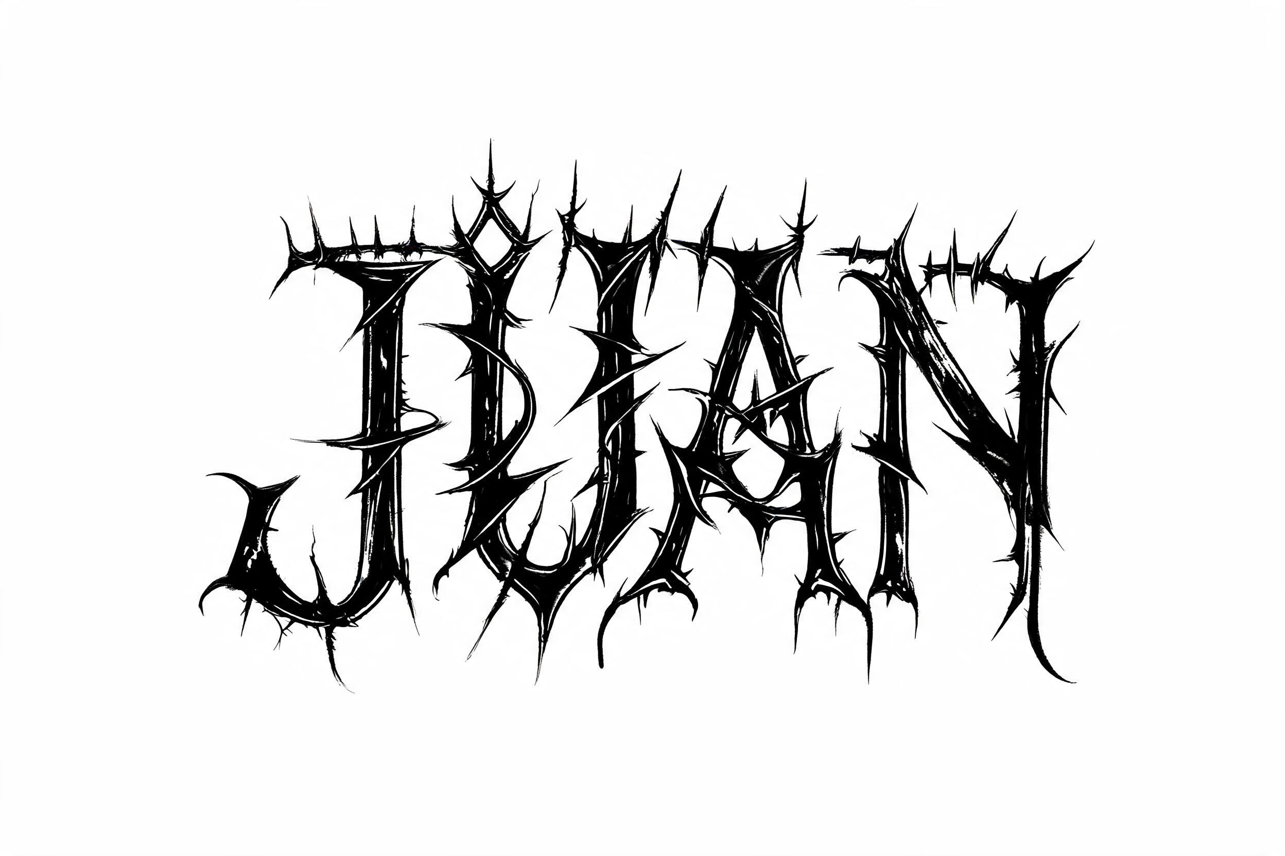
JUAN - 哥特字体 Text Effect

用原作的模型 BytePlus Seedream 5.0 · 15 积分


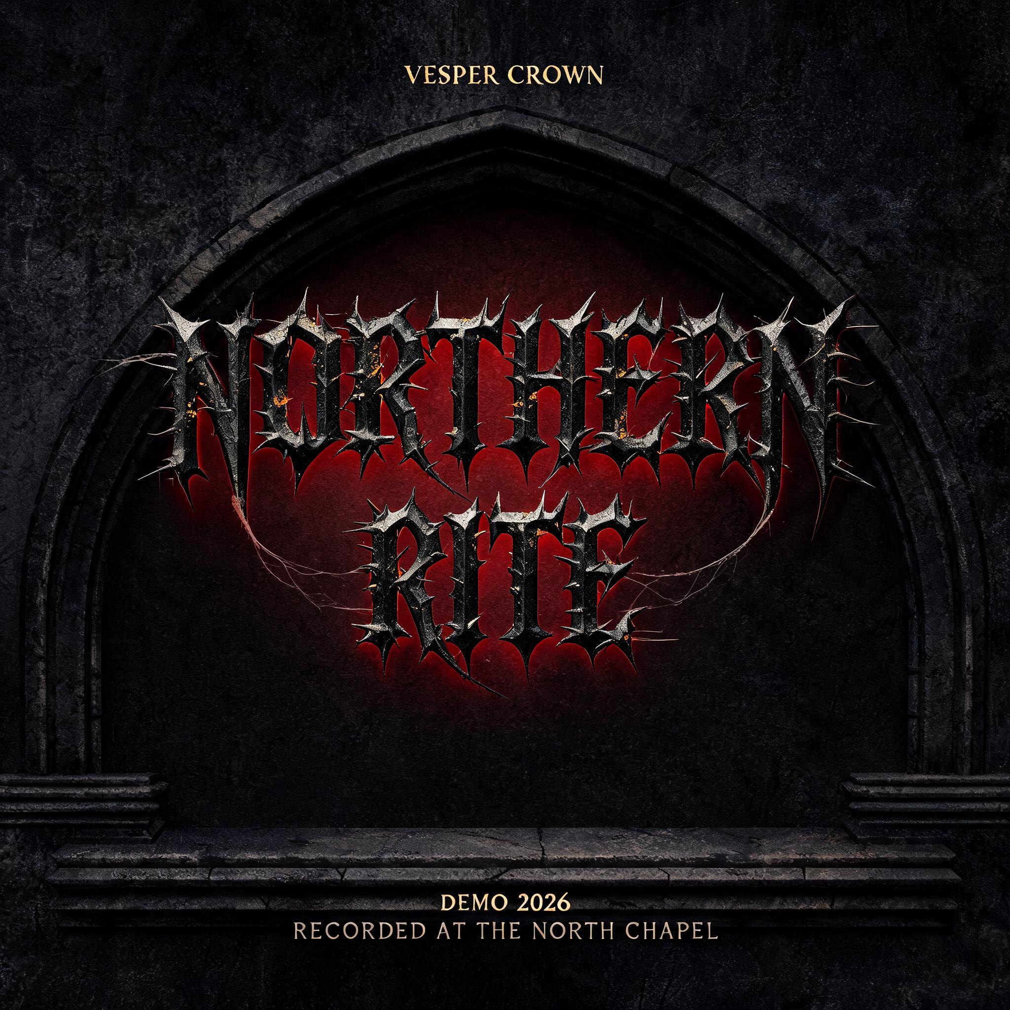
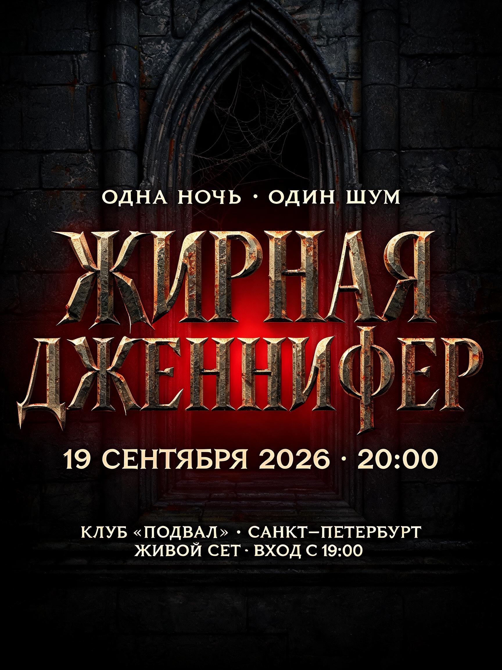
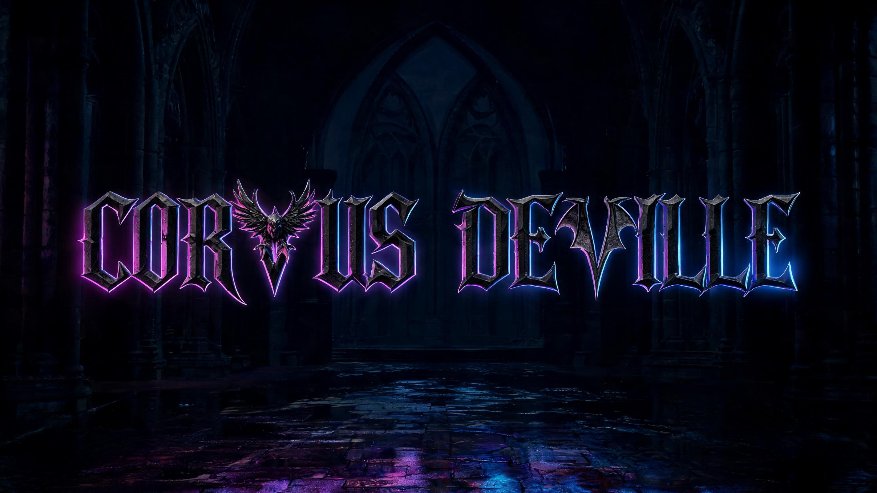


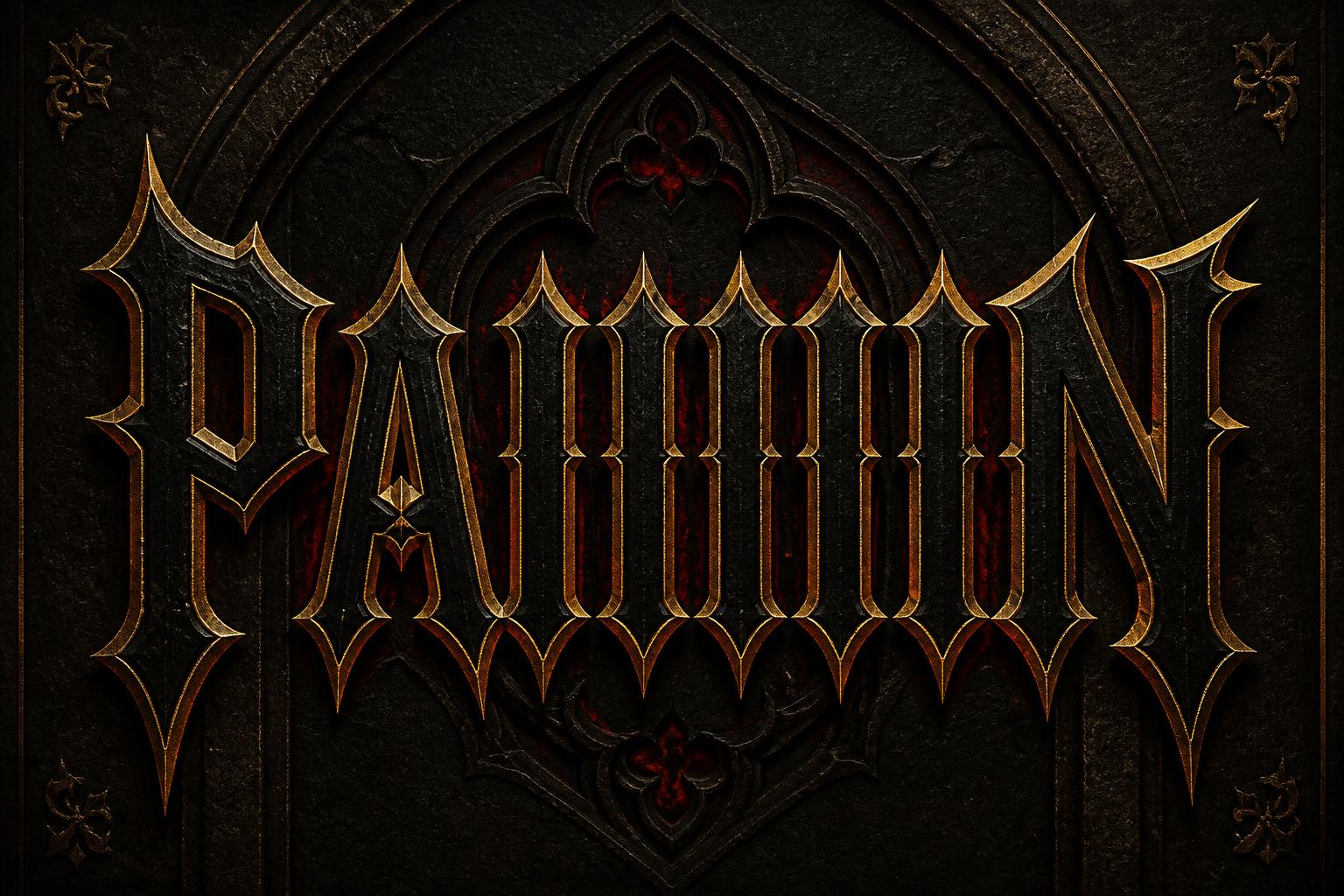


“JUAN” is a Gothic Font text effect 使用 FontVibe AI 创作的文字效果. 严谨的 Textura 哥特黑体:窄长的折笔、菱形笔端和强烈粗细对比,黑墨带金色描边,写在深色旧羊皮纸上.
Create an original horizontal black-metal band logo, isolated on a completely pure white field. Render exactly one text string: “JUAN”. No other text. The logo occupies 82% of the canvas width and 48% of its height, centered with generous unmarked white space around it. Build the word as a single dense, hand-drawn black India-ink organism: compressed medieval/occult-inspired letter skeletons, uneven vertical rhythm, pointed arch counters, fractured diamond cuts, narrow apertures, and irregular thick-to-thin strokes. Keep the word decipherable on close inspection: J-U-A-N must remain structurally present, with the first J and final N providing clear outer anchors. From letter joints, serifs, and ascenders, grow tangled thorn branches, hooked root-like tendrils, needle spikes, and torn ink filaments. Interlock extensions between neighboring letters so the central “UA” becomes a dense knot; keep a few clean white channels between strokes to prevent the silhouette becoming a solid black blob. Make every branch asymmetrical and manually drawn, never mirrored, never vector-perfect. Use dry-brush feathering, split nib scratches, blotched ink deposits, slight paper-edge bleed, and interrupted black strokes; retain hard black pigment with no gray shading. The top edge forms a crown of crooked thorns, while shorter downward hooks create an uneven lower fringe. Flat scanned-ink appearance only: matte near-black #050505 on pure white #FFFFFF, crisp high-resolution linework with slight analog wobble. No gradients, no shadows, no 3D, no metallic surfaces, no color, no texture behind the logo, no symbols, no frames, no decorative background, no polished digital typography, and no resemblance to any existing band logo.
生成于 2026年10月5日 · 2496 × 1664 · JPEG · BytePlus Seedream 5.0 · 公开作品 · 可免费商用(CC BY 4.0)


