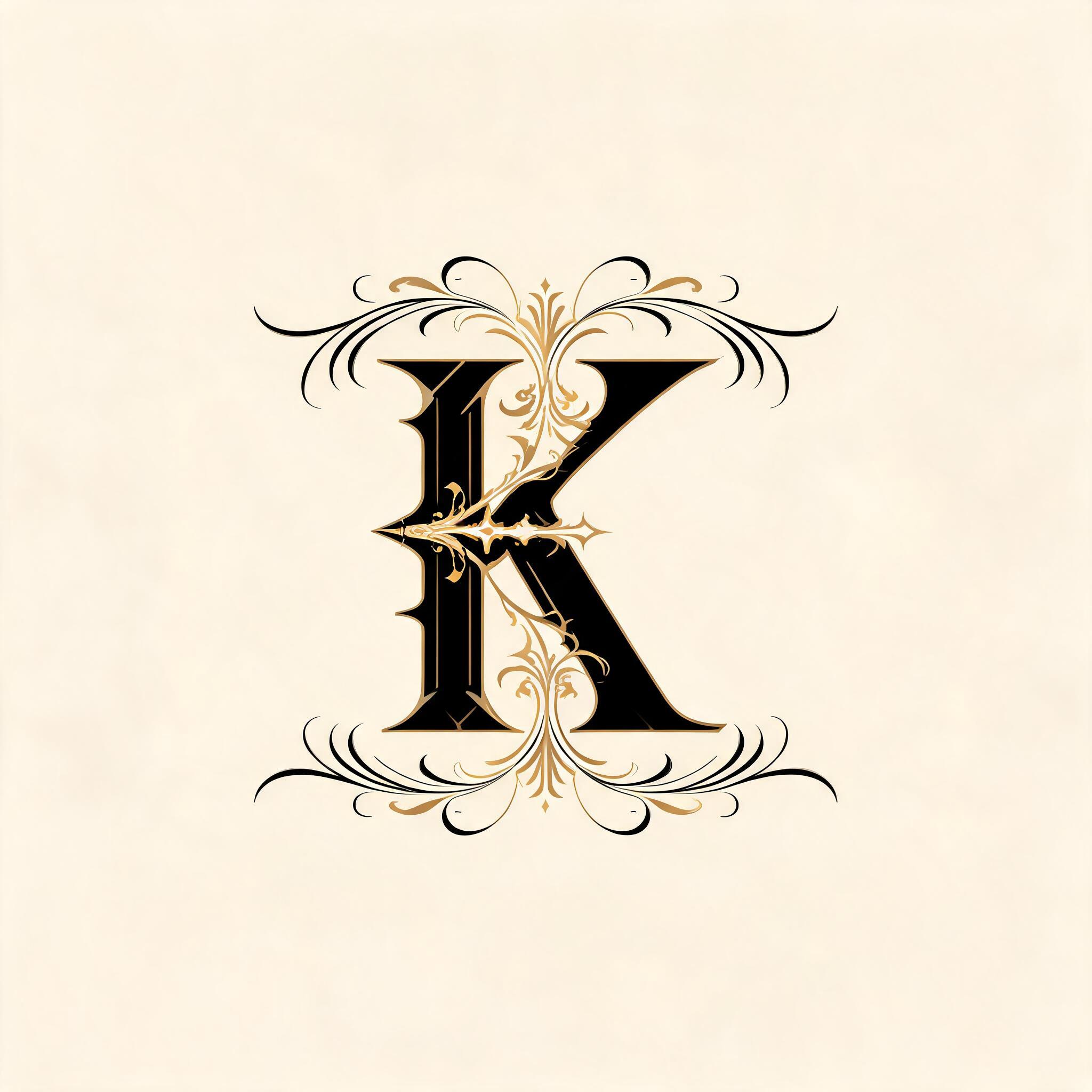
K - 哥特字体 Text Effect

用原作的模型 BytePlus Seedream 5.0 · 15 积分



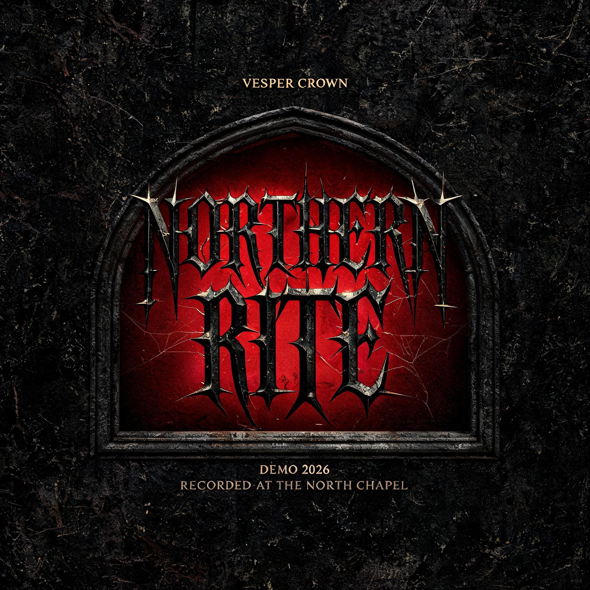

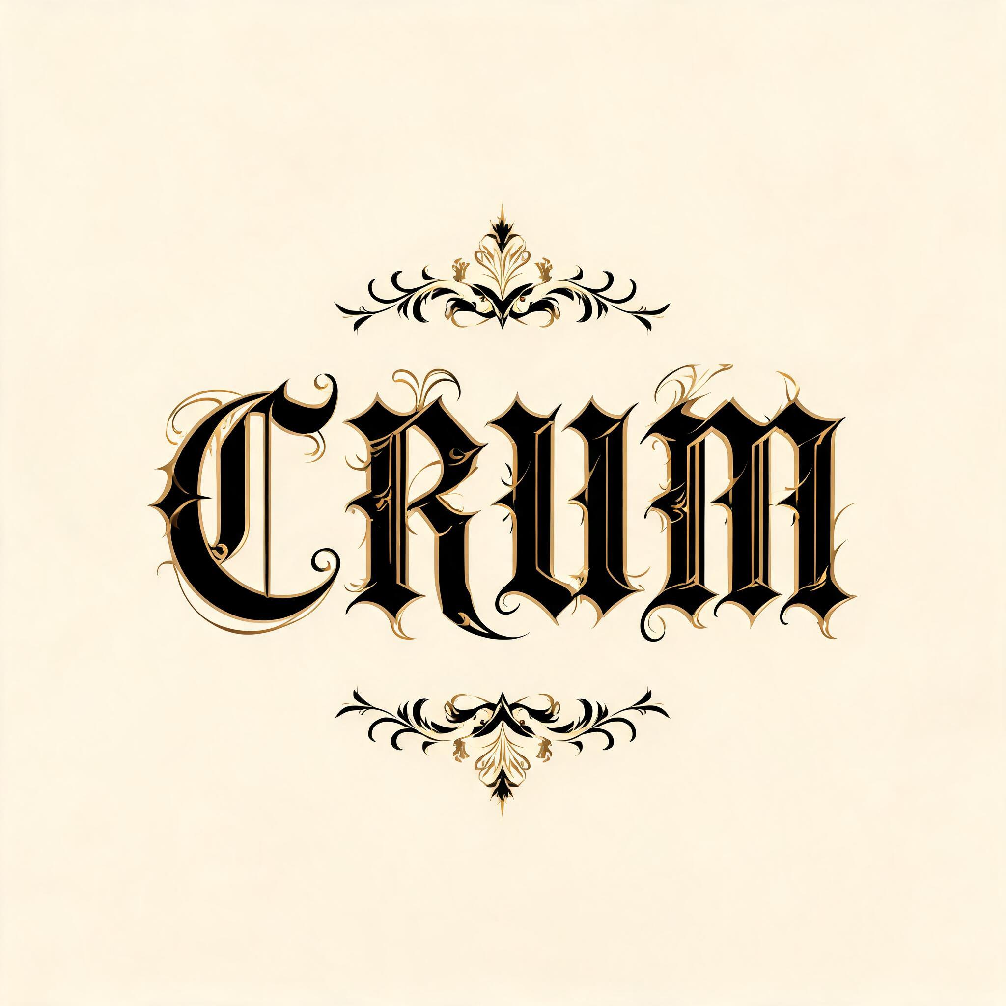

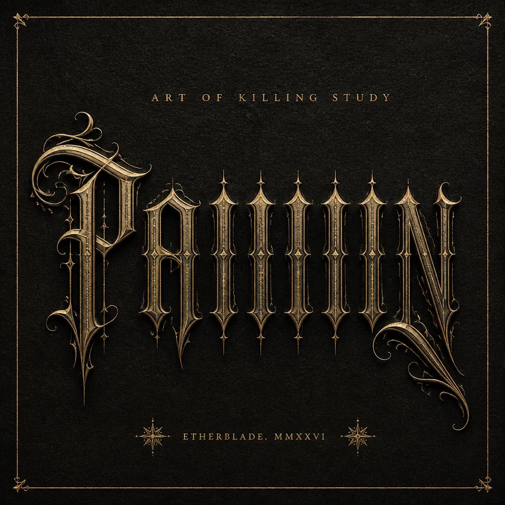
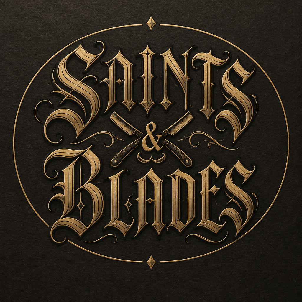
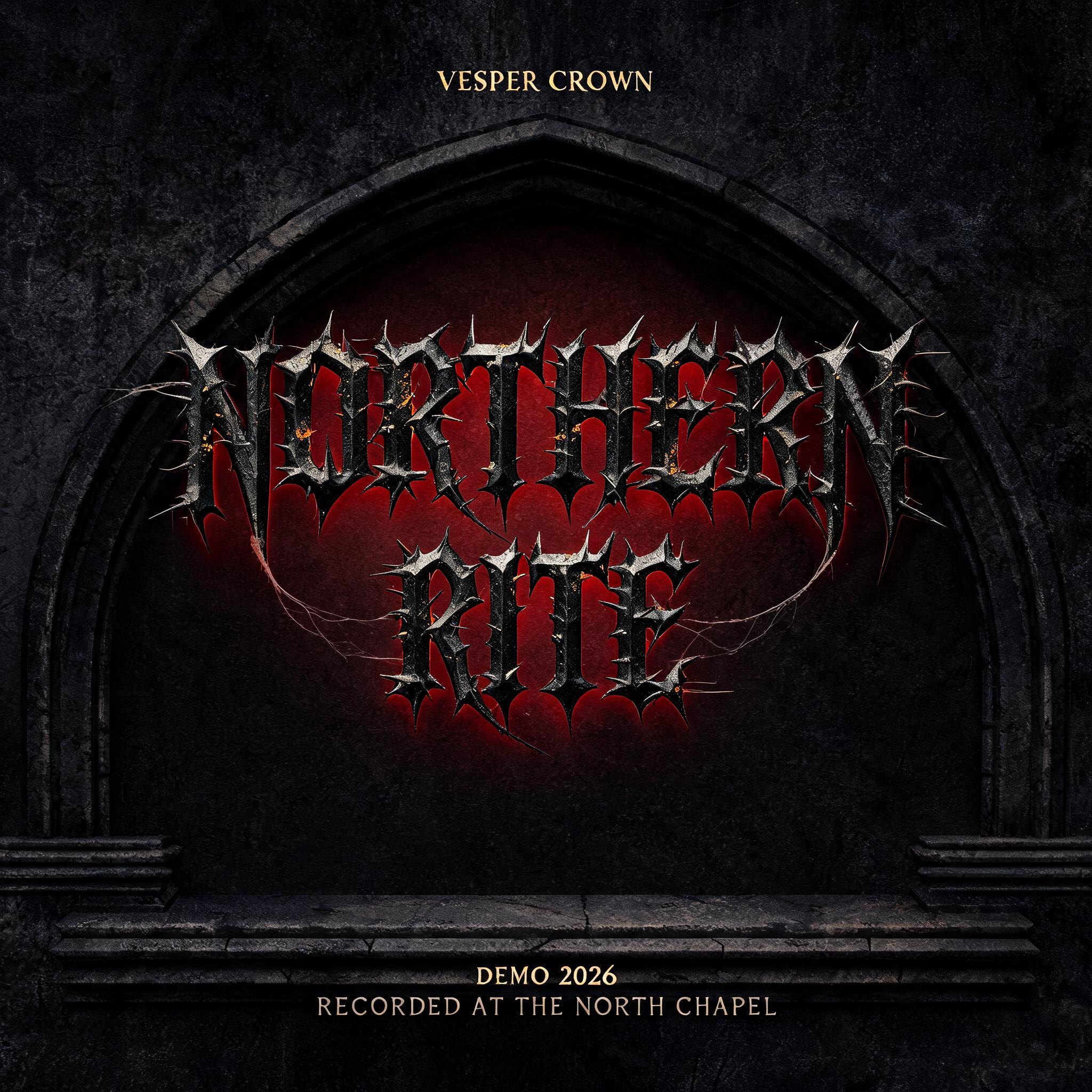
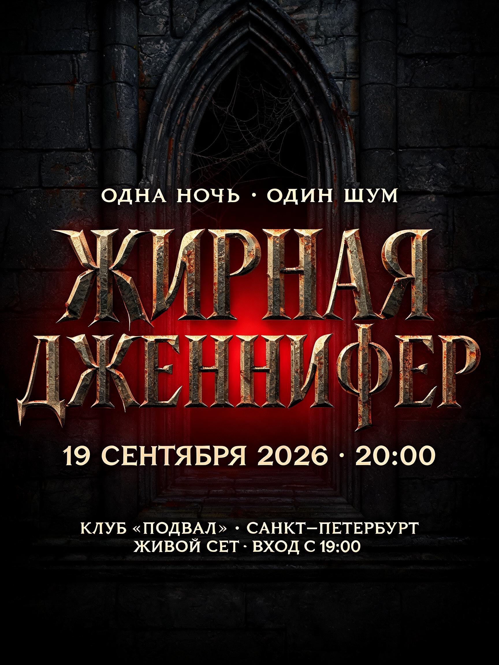
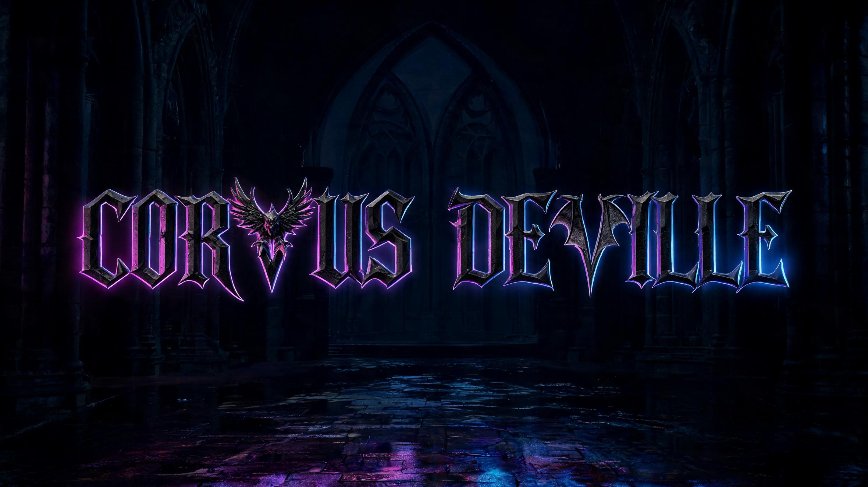


“K”是使用 FontVibe AI 创作的哥特字体文字效果。严谨的 Textura 哥特黑体:窄长的折笔、菱形笔端和强烈粗细对比,黑墨带金色描边,写在深色旧羊皮纸上。
rendered in ornate Victorian gothic letterforms — the maximalist typography of 19th-century British commercial printing, combining blackletter structural authority with Victorian ornamental excess. Characteristic features: blackletter skeleton with additional decorative layers — swash capitals with elaborate hairline flourishes and curved ornamental strokes extending beyond letterforms, decorative crossbars and additional ligature marks, hairline embellishments at ascenders and descenders that exist purely for beauty. Rich black ink with gold accent details. The quality of a luxury wedding invitation, a theater poster from 1880, or a Victorian-era gazette masthead. K as ornate Victorian gothic blackletter, centered composition. Single-tier layout: "K" as one commanding letter. Elaborate decorative flourishes on the capital — swash elements on ascenders, hairline embellishments at letter ends. Additional ornamental swash lines above and below text block. Background: deep cream or warm ivory — elegant, restrained luxury. Rich black ink with gold accent details. The quality of a luxury wedding invitation's centerpiece typography — ceremonial, authoritative, beautifully excessive.
生成于 2026年10月10日 · 2048 × 2048 · JPEG · BytePlus Seedream 5.0 · 公开作品 · 可免费商用(CC BY 4.0)


