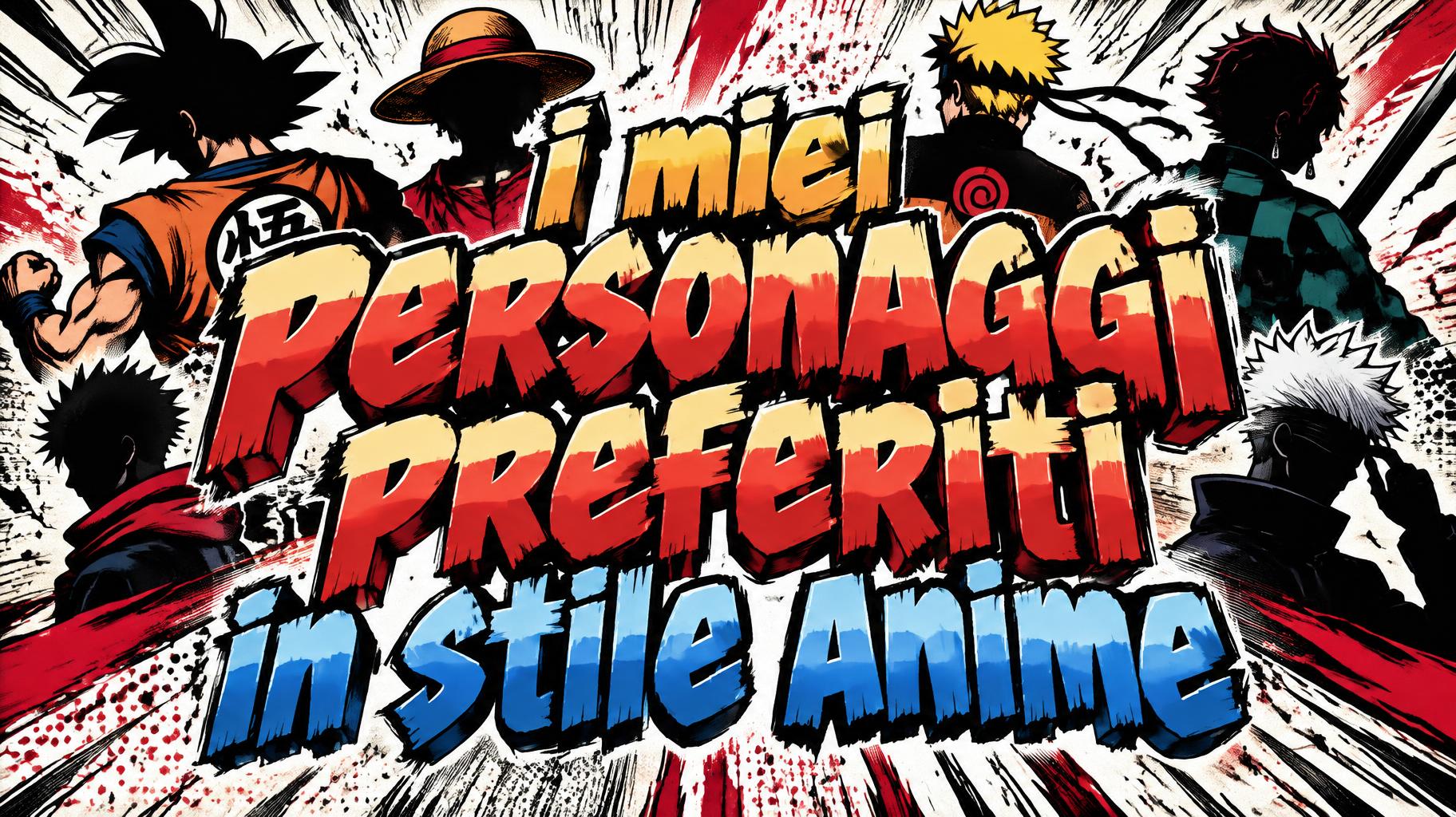
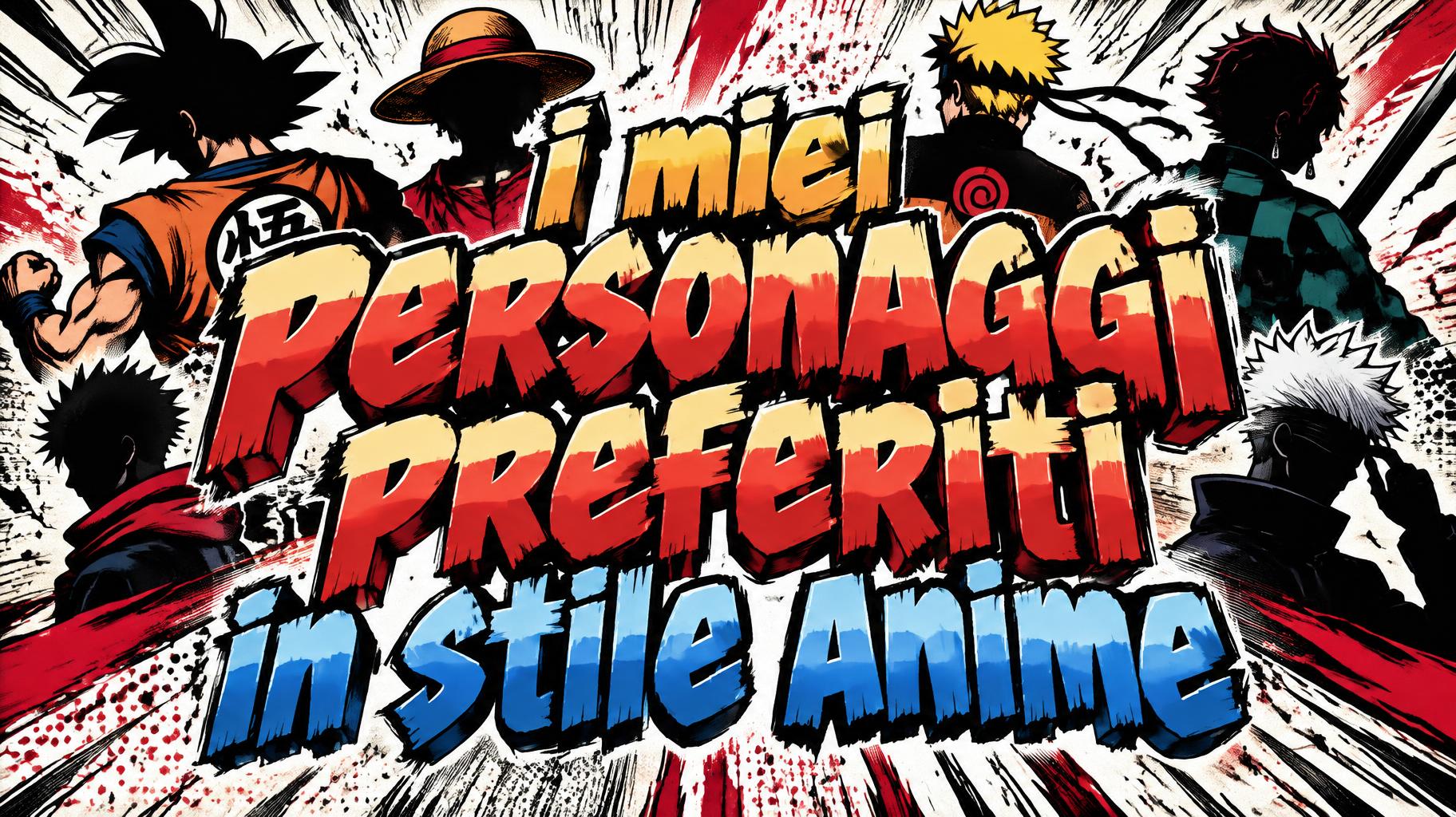
i miei personaggi preferiti in stile anime - Anime Text Effect


用原作的模型 OpenAI GPT-Image-2.5 Sunburst · 15 积分
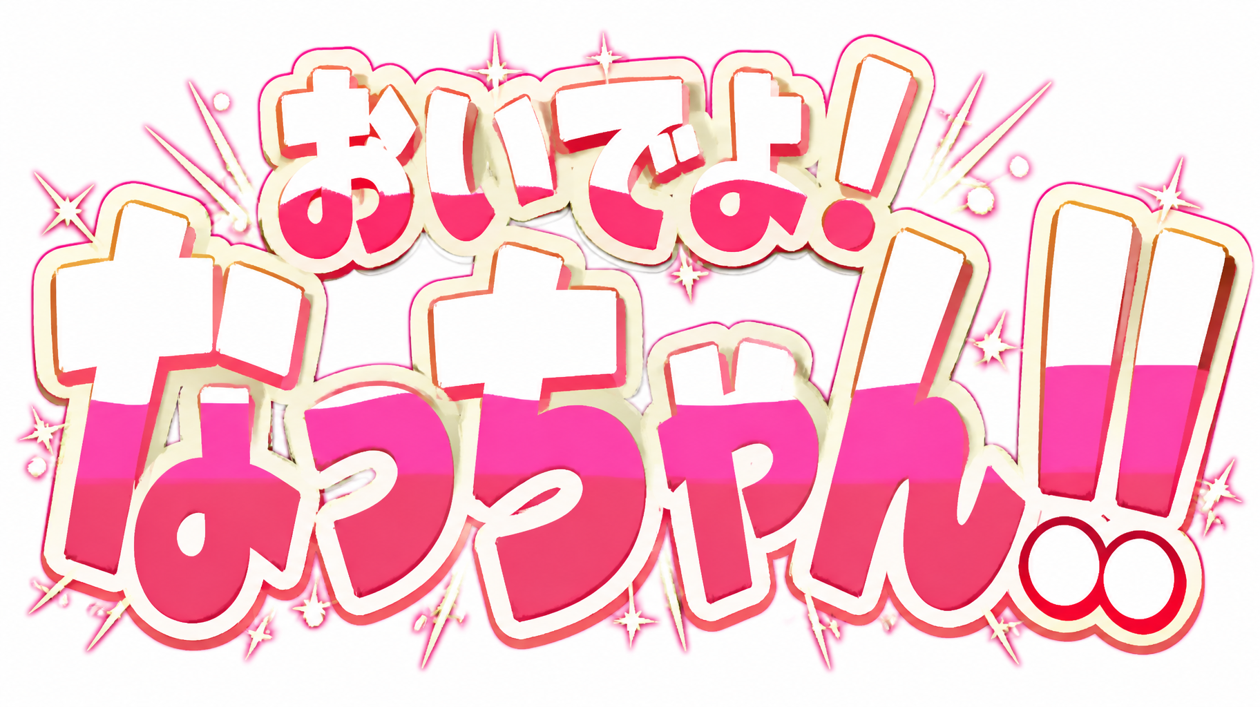
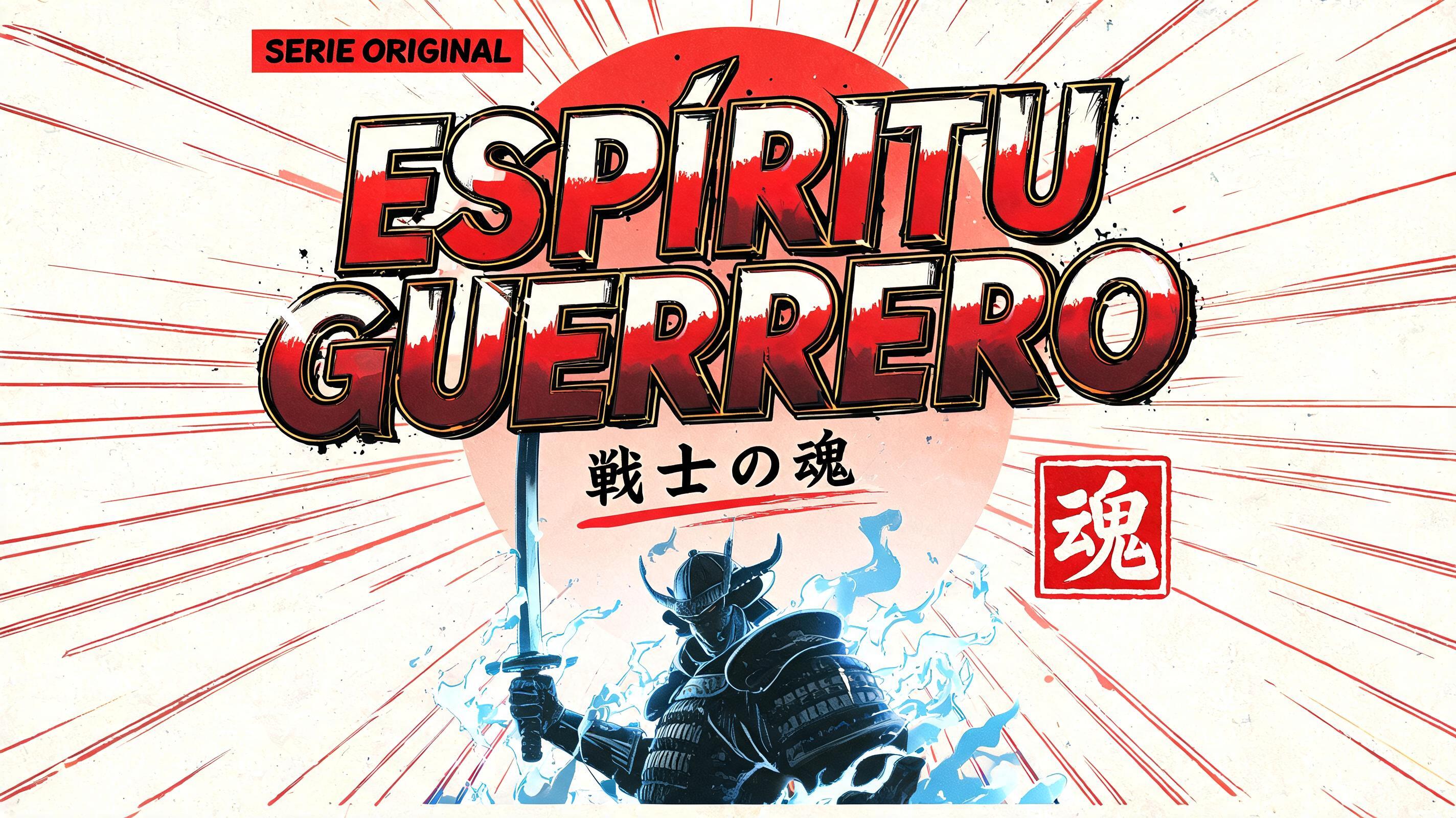
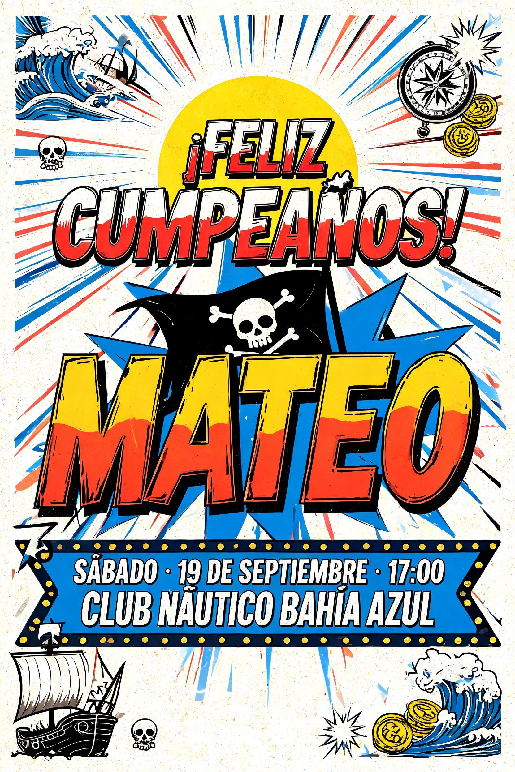
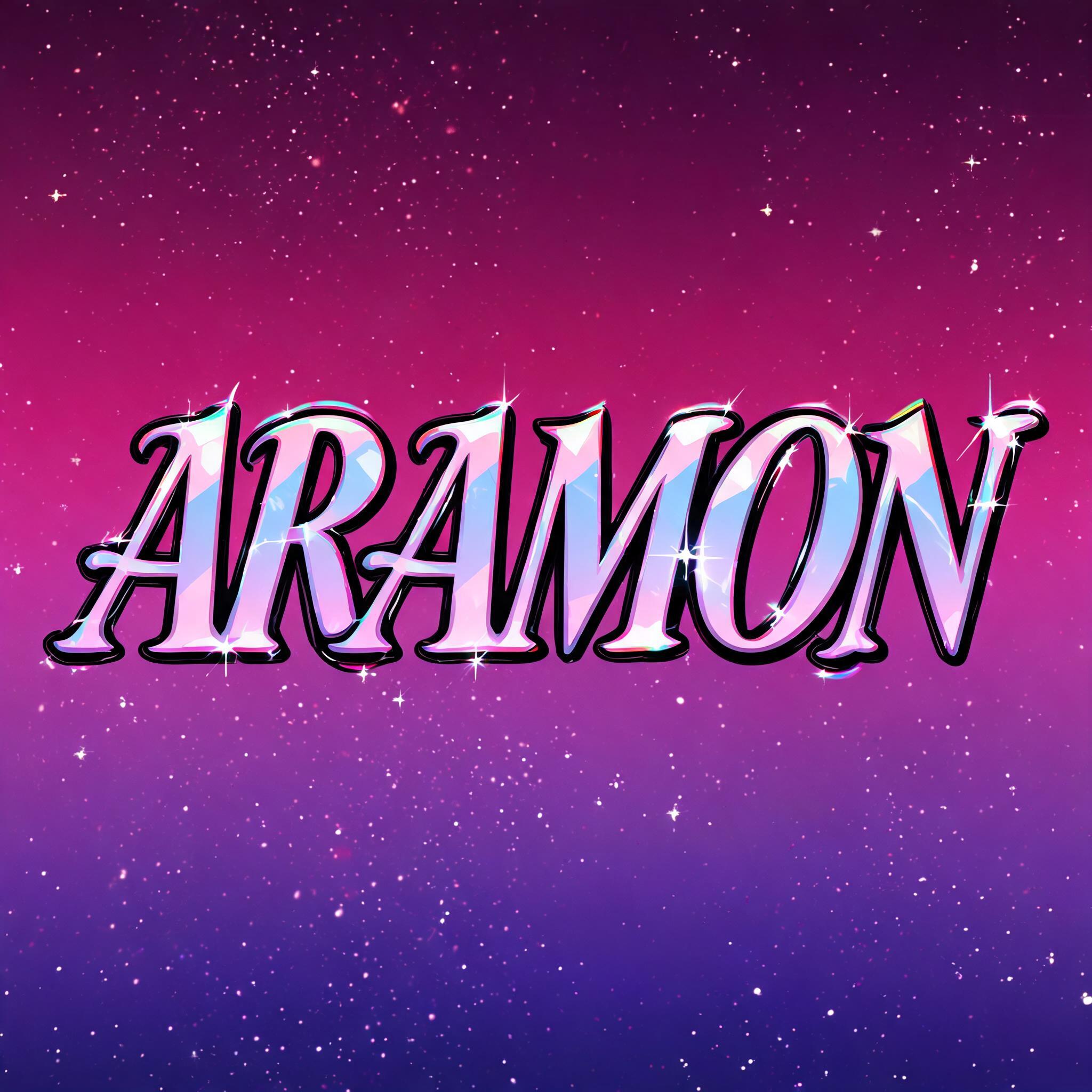

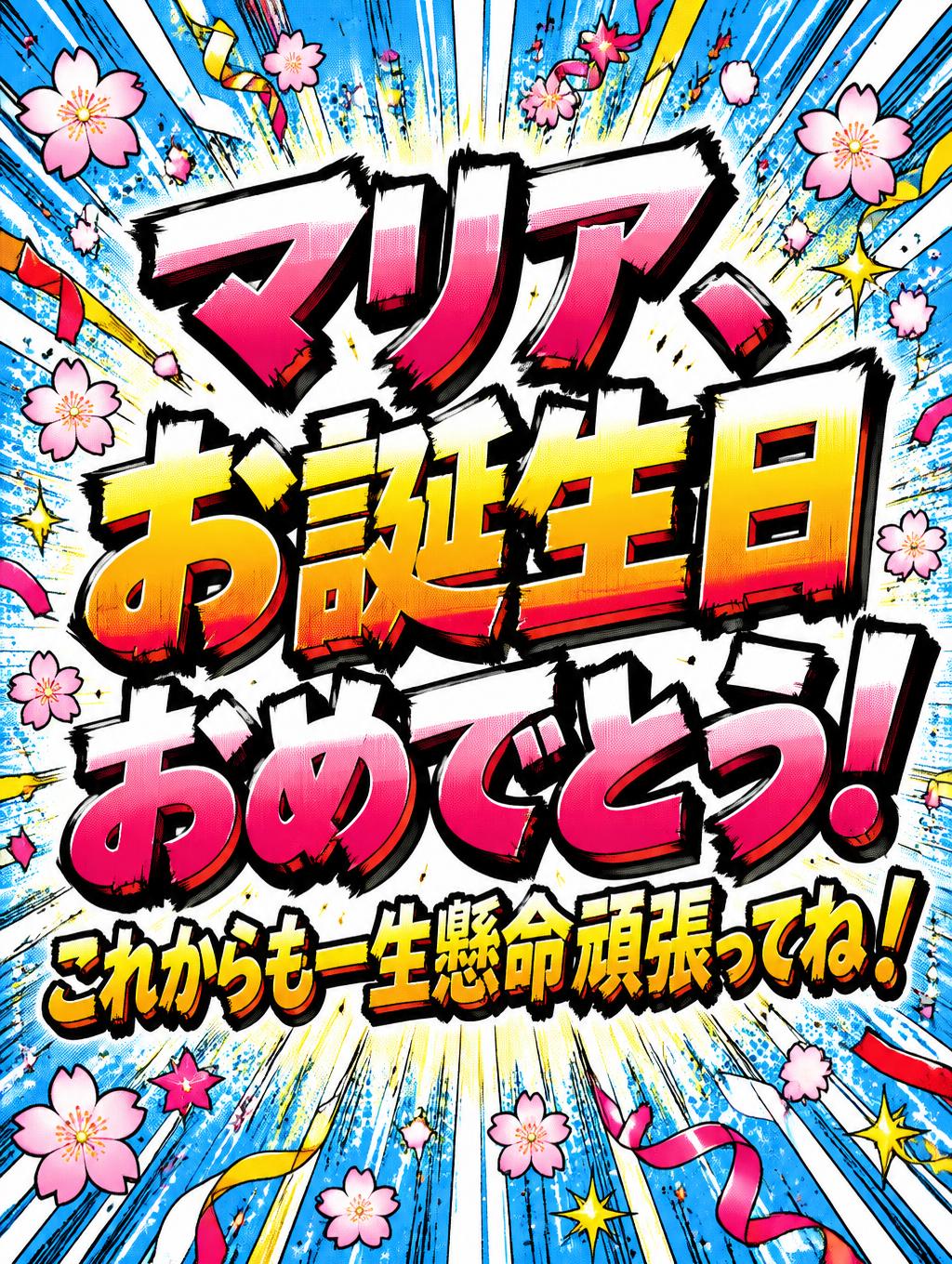
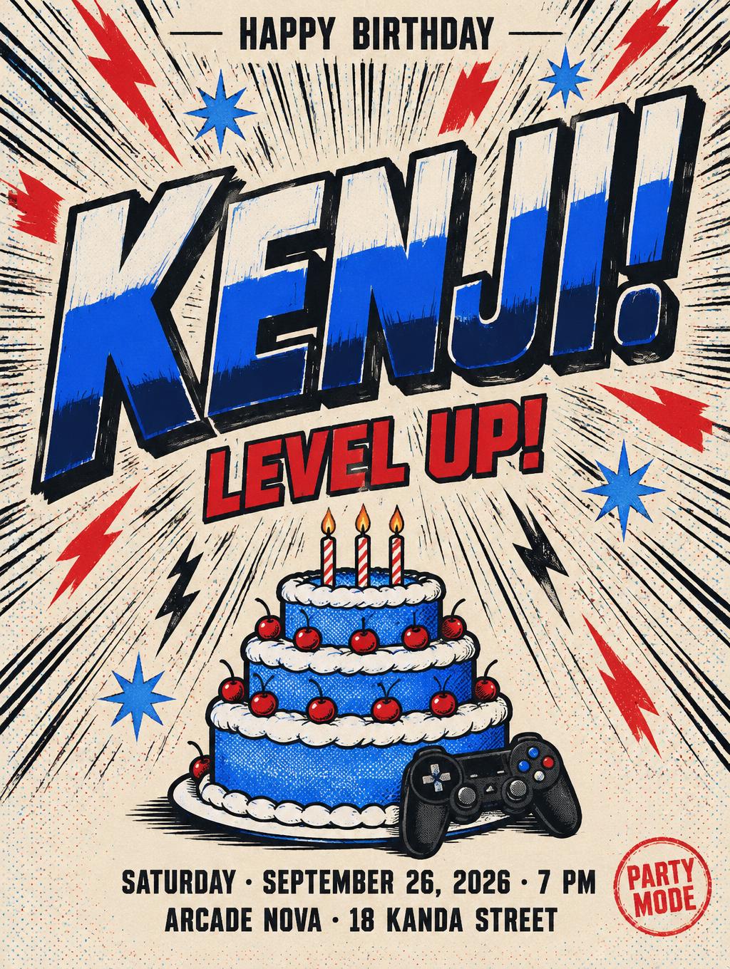
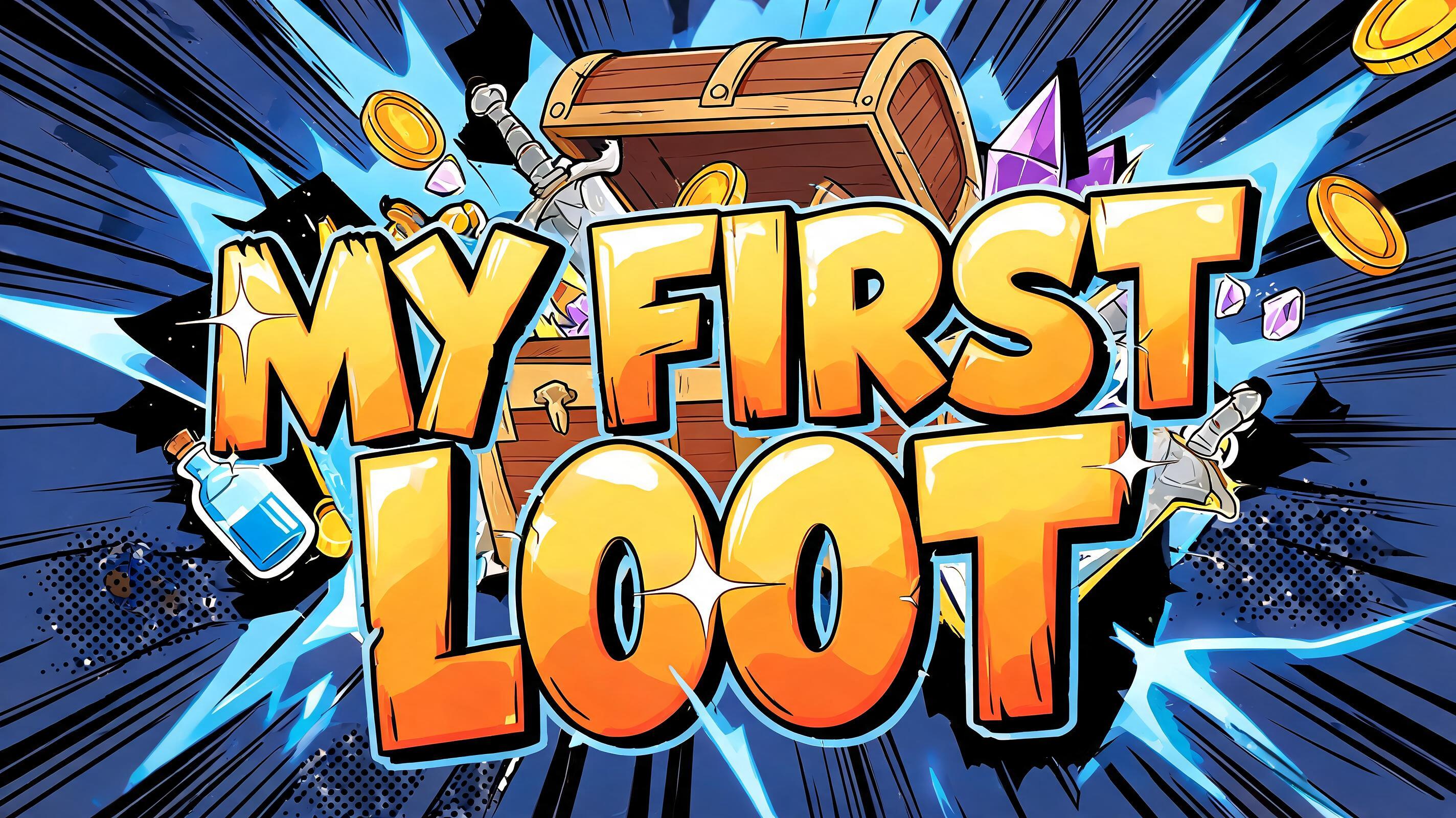
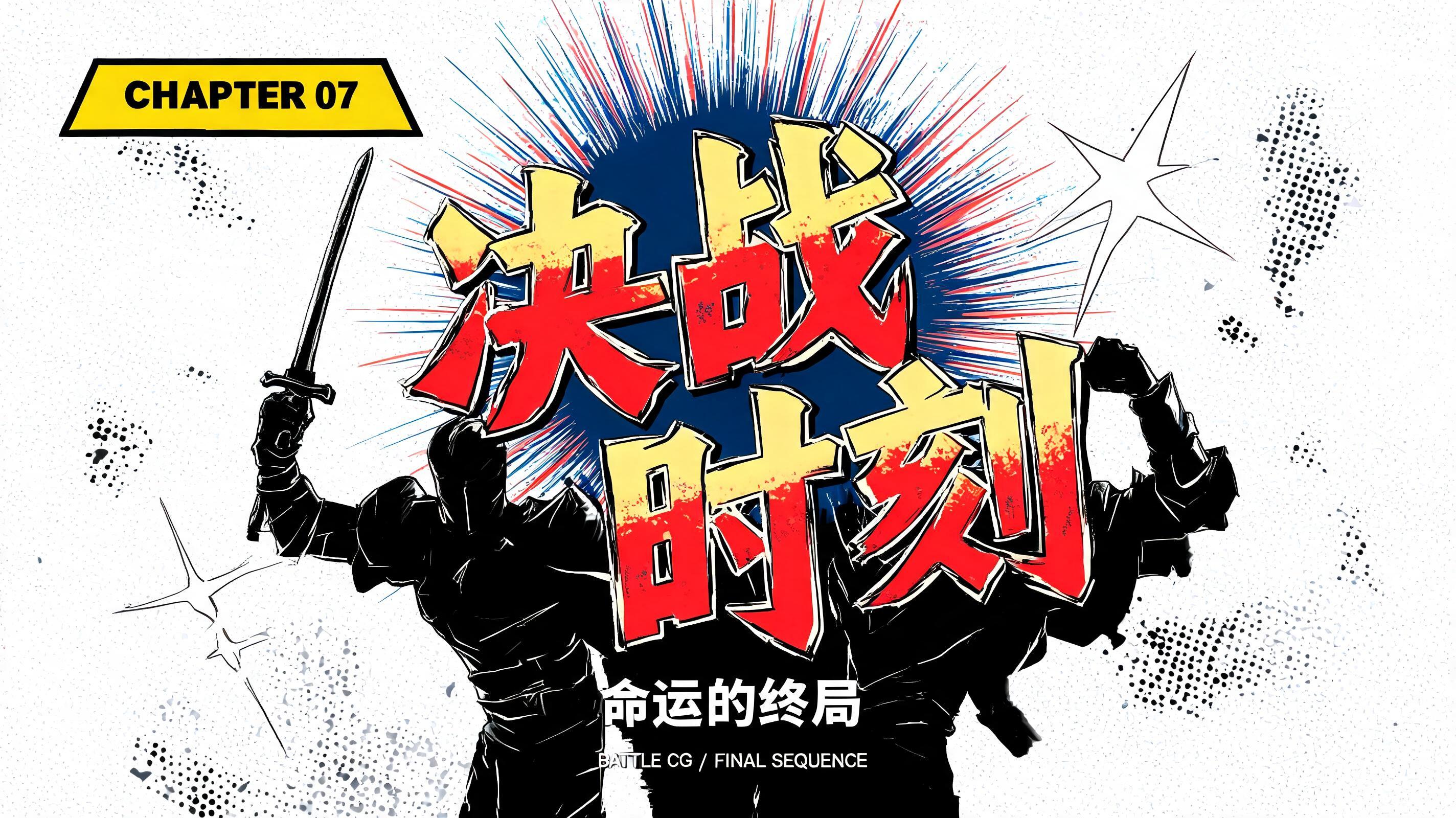
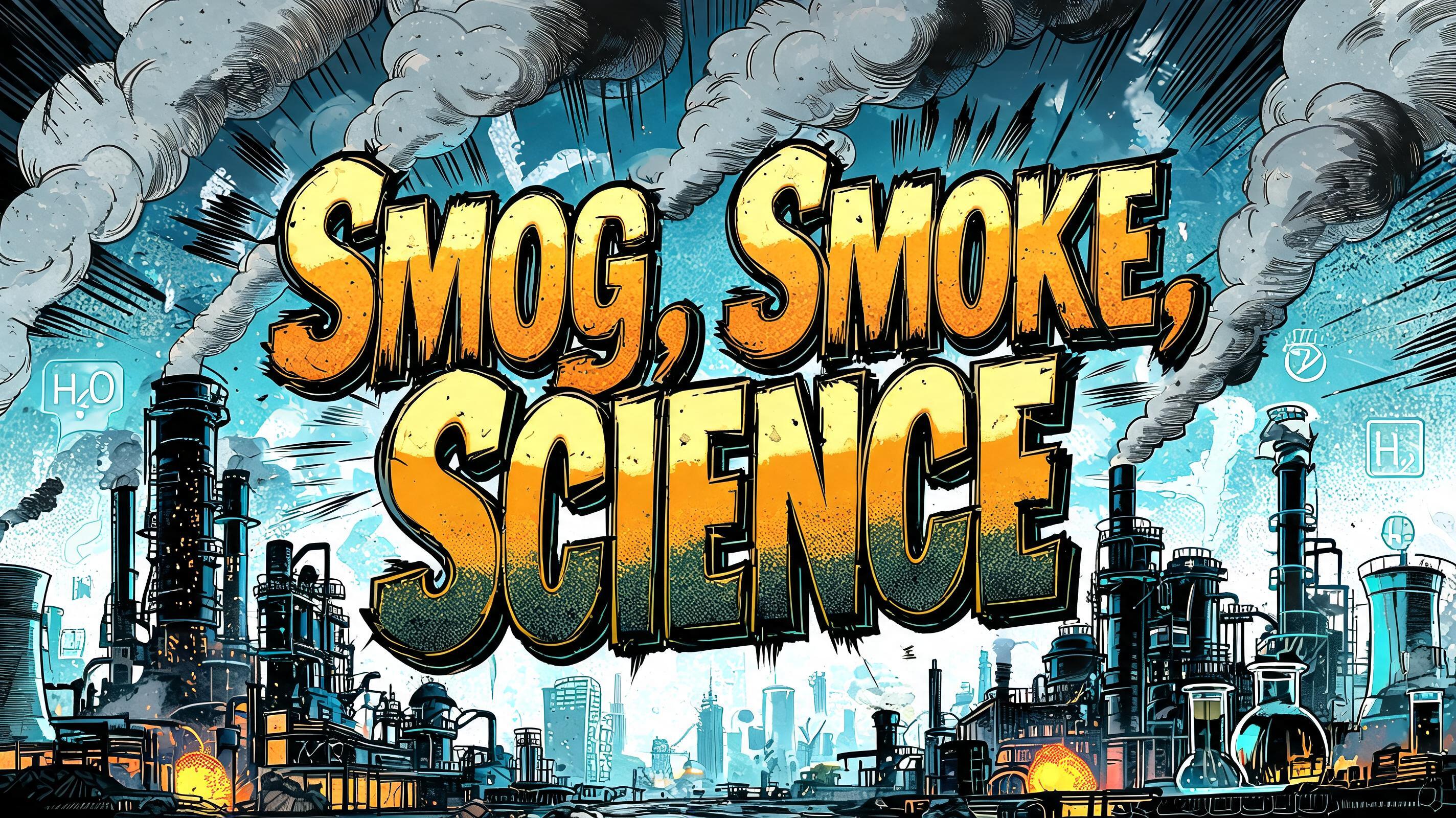

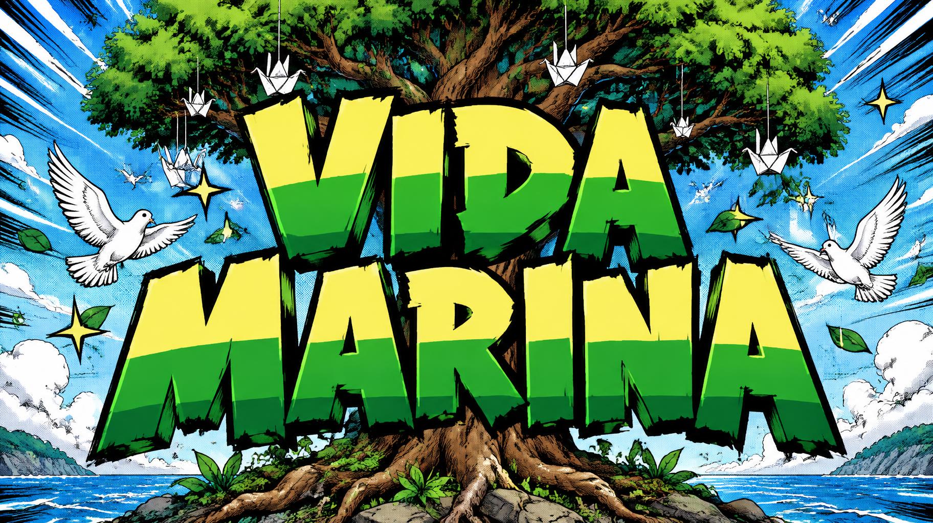
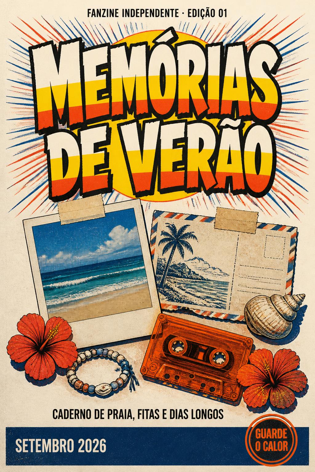
“i miei personaggi preferiti in stile anime”是使用 FontVibe AI 创作的Anime文字效果。少年漫画标题字:粗重手绘黑描边,赛璐璐平涂分出硬边高光与阴影,字母倾斜有冲劲,白底上放射速度线。
rendered as Japanese shounen anime title treatment — bold hand-inked manga lettering with authentic cel-shaded visual energy. Letter construction follows classic Shonen Jump title card standards: thick black ink outline with natural brush-weight variation defining each letter boundary; flat cel-shading fill with three hard-edge zones — bright highlight zone on upper letter face, highly saturated primary color zone at center, deep shadow zone at lower edge; all zone boundaries knife-edge hard, zero gradient blur, pure flat offset-print ink physics. Energy signature: high-contrast color + thick ink outline = letters that look physically printed on manga paper. The typographic language of Dragon Ball, Naruto, One Piece, Demon Slayer, Jujutsu Kaisen title cards — maximum manga kinetic energy, iconic and immediately recognizable as Japanese anime title typography. LETTERFORM PRIORITY: when the chosen font carries its own treatment, that font's letterform shapes take priority and own the letters; this style governs the inked manga outline, the three-zone cel-shading and the kinetic energy. FALLBACK MATERIAL: if the font carries no material of its own, render the letters as bold hand-inked shounen title lettering with a thick black brush outline and hard three-zone cel-shading. COLOR PRIORITY: keep the font's own colors if specified; otherwise a high-saturation primary fill with hard highlight and shadow zones. Japanese shounen anime title card featuring the exact text “i miei personaggi preferiti in stile anime” as the dominant graphic element, broken into energetic phrase groups with clear scale contrast between “personaggi preferiti” and the surrounding words. Every character carries a thick, irregular black brush-ink contour, tiny dry-brush breaks, and flat three-zone cel shading: pale lemon-white highlights across upper planes, saturated scarlet and cobalt primary ink fields, and dense indigo shadow planes along lower edges. All color boundaries are sharply cut, with zero airbrushing or soft gradients. Surround the lettering with a fan-art action-panel environment: radial black manga speed lines, white impact bursts, red halftone-dot clusters, angled ink slashes, small four-point spark marks, and scattered paper-texture flecks. Behind the words, silhouettes of several original anime hero figures with spiky hair, capes, swords, and raised fists appear as simplified cel-shaded shapes, kept secondary and partially obscured by the title. Bright white manga-paper background, offset-print texture, high-contrast black ink, crisp screen-print registration, dense chapter-title energy, clean readable word spacing, suitable for an anime fan video banner or illustrated social cover.
生成于 2026年10月11日 · 1824 × 1024 · JPEG · OpenAI GPT-Image-2.5 Sunburst · 公开作品 · 可免费商用(CC BY 4.0)


