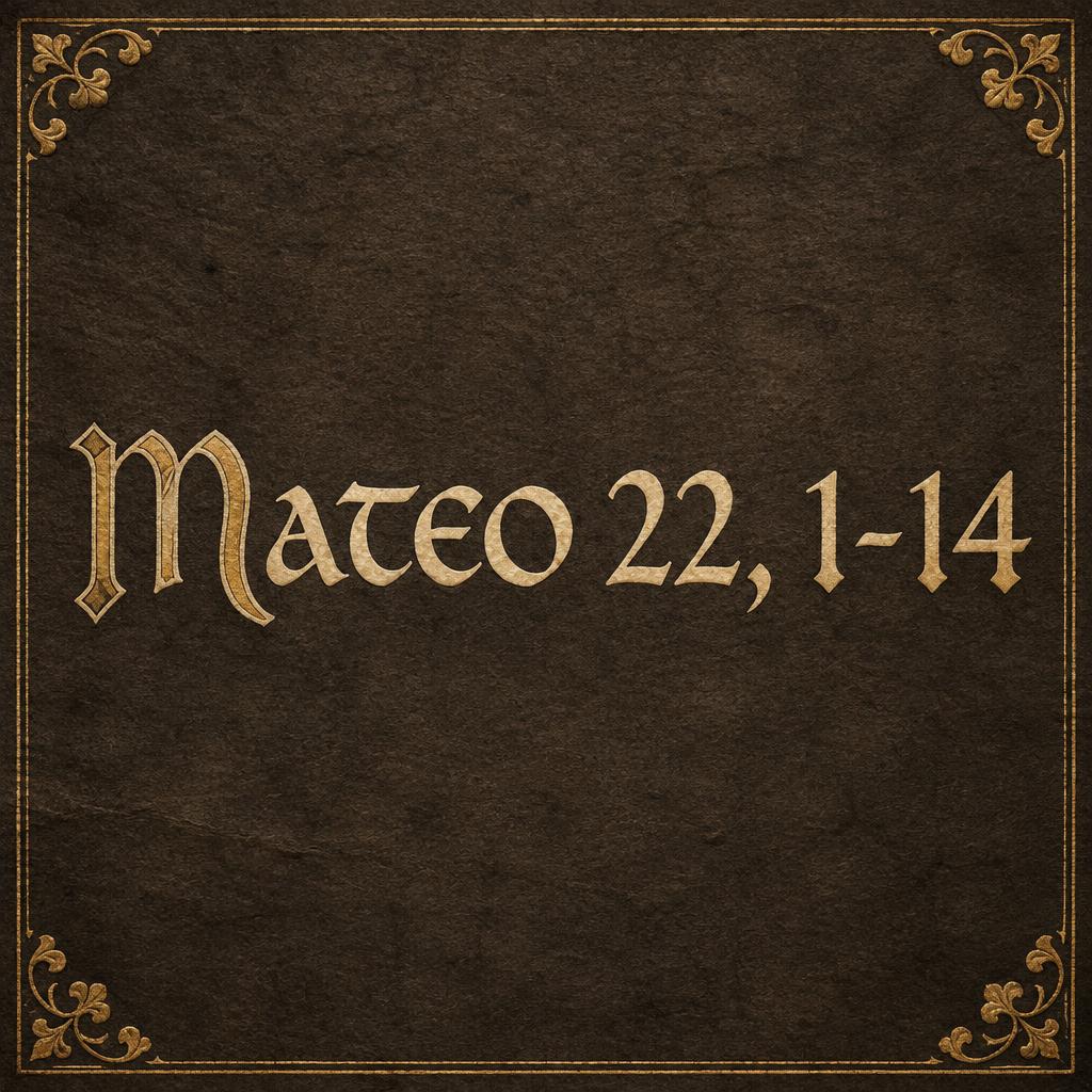
Mateo 22, 1-14 - 哥特字体 Text Effect


用原作的模型 OpenAI GPT-Image-2.5 Sunburst · 15 积分





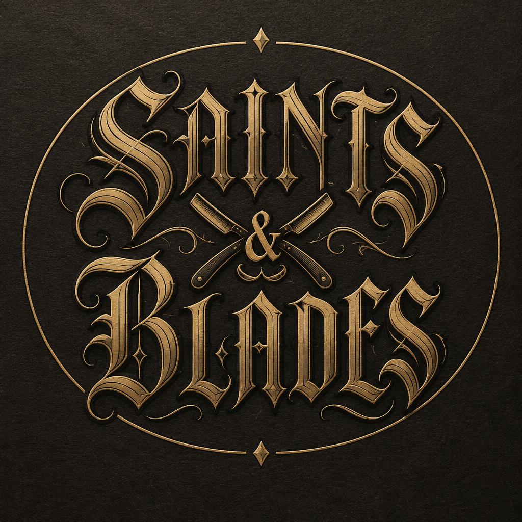
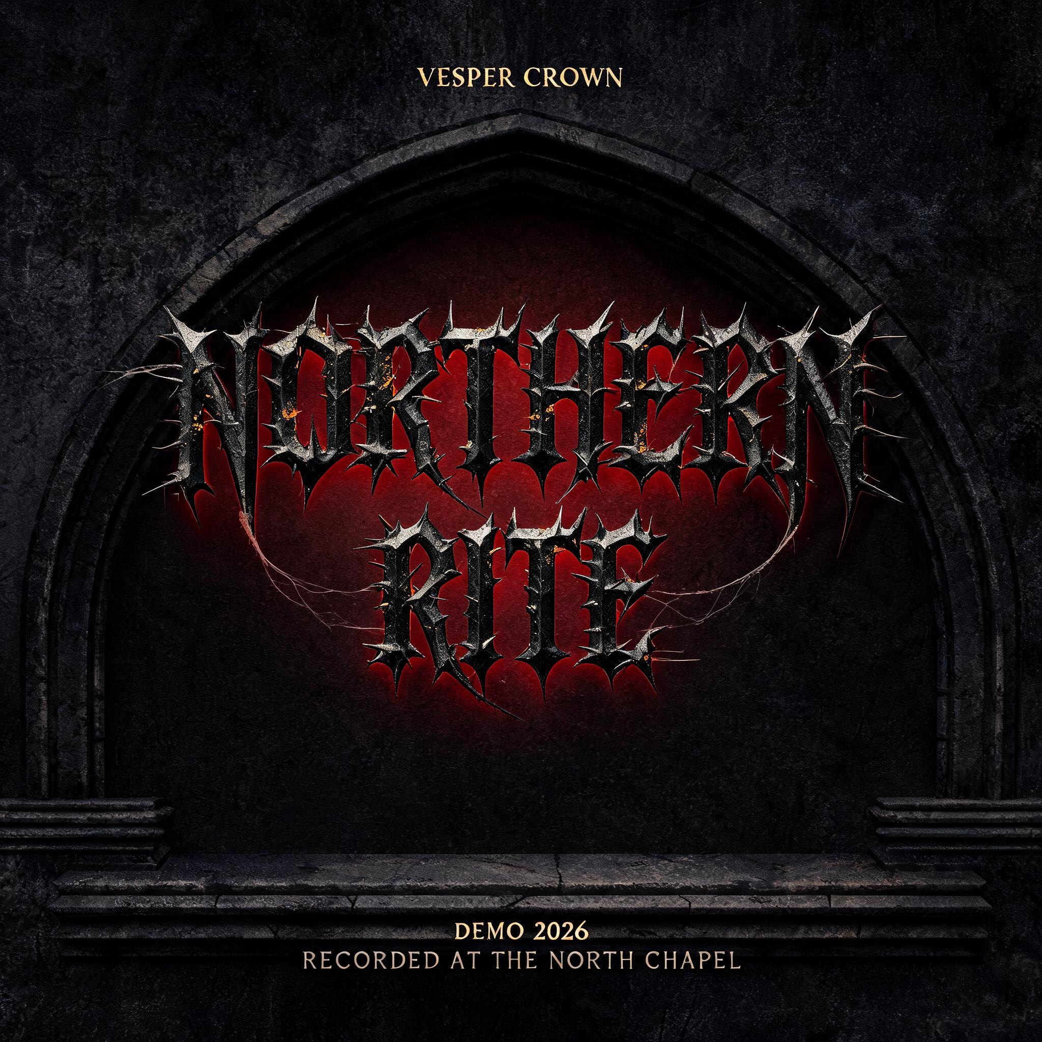
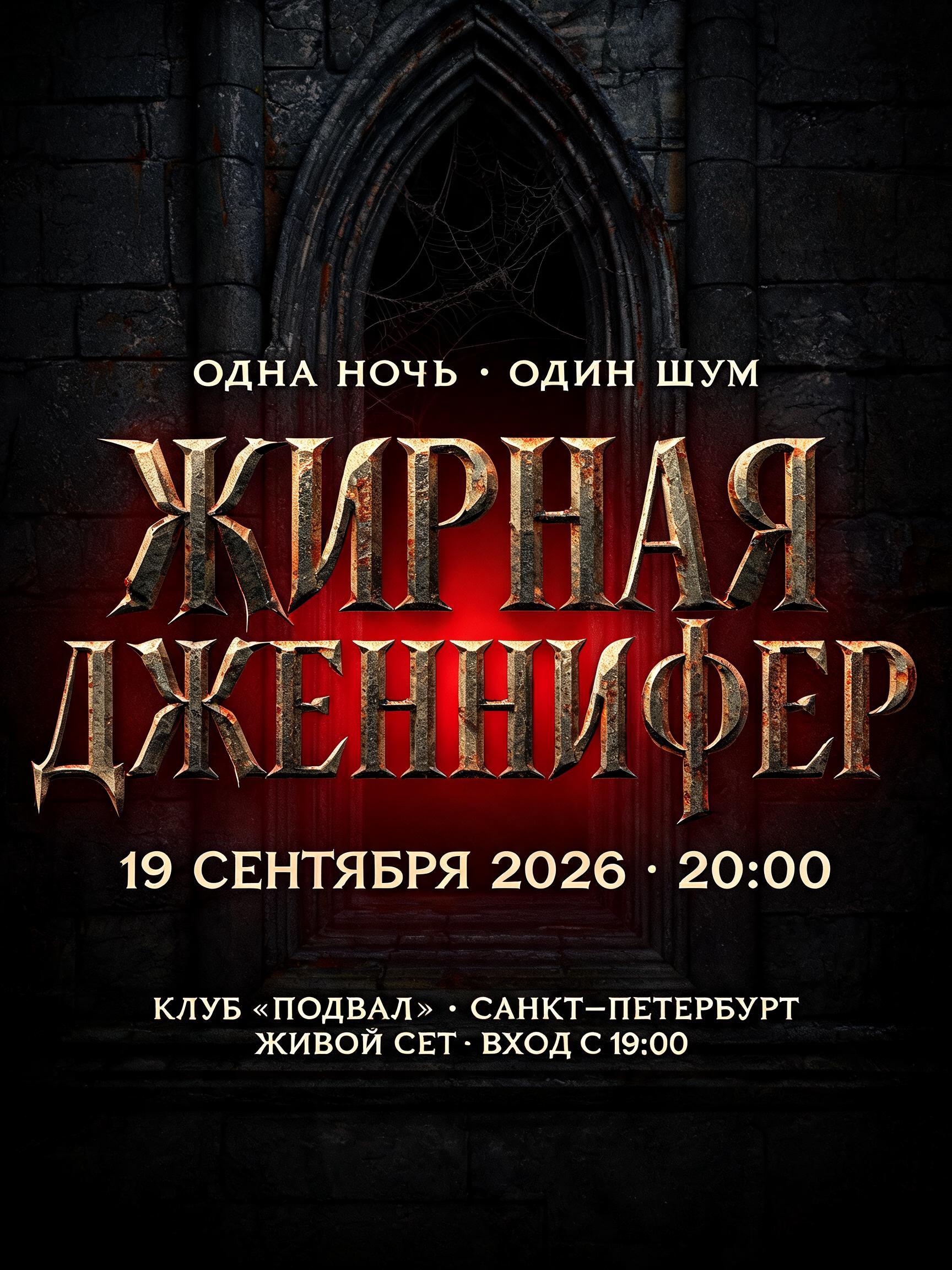
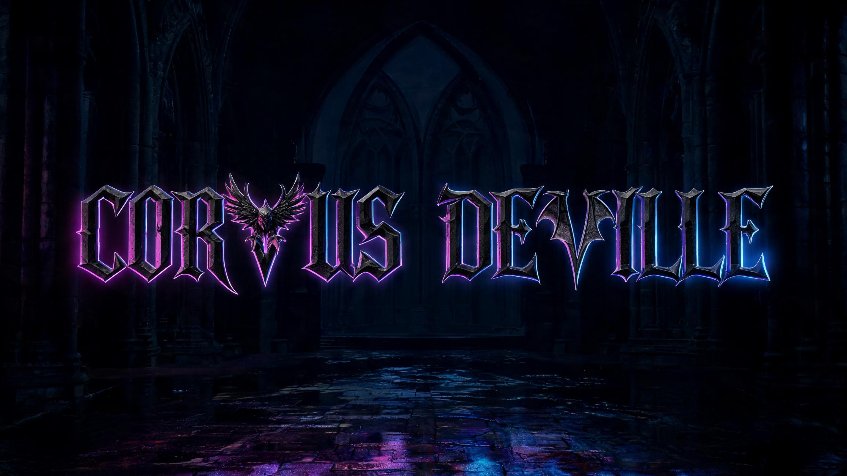


“Mateo 22, 1-14”是使用 FontVibe AI 创作的哥特字体文字效果。严谨的 Textura 哥特黑体:窄长的折笔、菱形笔端和强烈粗细对比,黑墨带金色描边,写在深色旧羊皮纸上。
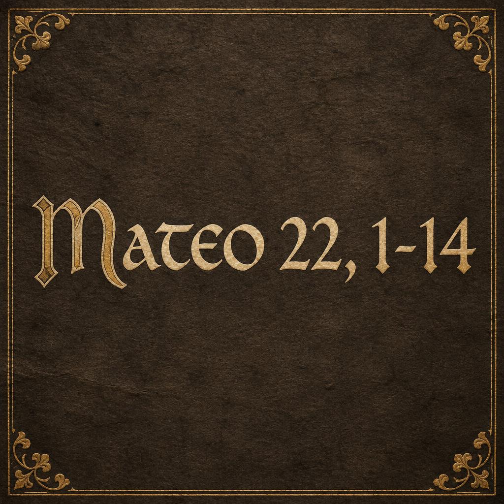
Create a square 1:1 typographic manuscript plate, an intentionally minimal lettering specimen. Render exactly this text, centered on one line and with the spacing shown: “Mateo 22, 1-14”. Make the lettering the clear focal point: large, broad Insular half-uncial forms with rounded arches, generous proportions, tall x-height, and flowing broad-nib stroke modulation. Give the capitals restrained Gothic character through carefully drawn diamond-shaped stroke ends and fine pointed-arch accents, while preserving the uncial rounded construction. Set the glyphs in dense warm-black ink on dark charcoal-brown parchment; add restrained antique-gold ink highlights along a few capitals and stroke edges. Show subtle parchment grain, precise hand-inked contours, and a thin illuminated manuscript border with small gold leaf curls in the corners. Keep the text exceptionally legible, evenly spaced, and unobstructed. Center it with generous breathing room; border and corner ornaments remain secondary. Soft, low-intensity warm side lighting reveals paper fibers and gold leaf without a glow or metallic lettering. No rust, cobwebs, fog, iron, extra text, symbols, or additional words. High-resolution editorial artwork.
用途: 安色尔哥特
生成于 2026年10月12日 · 1024 × 1024 · JPEG · OpenAI GPT-Image-2.5 Sunburst · 版式:居中 · 公开作品 · 可免费商用(CC BY 4.0)