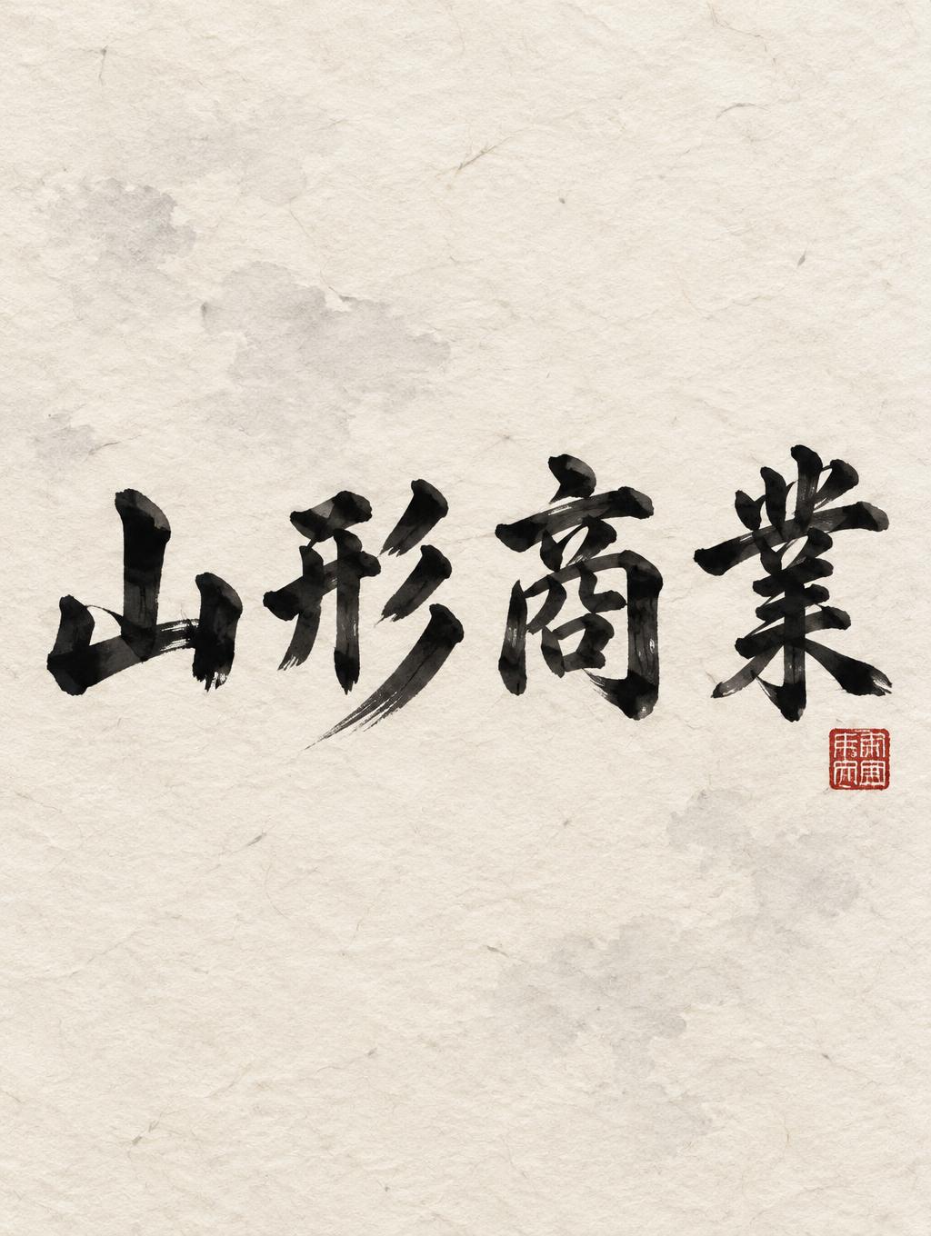
山形商業 - 日本水墨毛笔 Text Effect


用原作的模型 OpenAI GPT-Image-2.5 Sunburst · 15 积分











“山形商業”是使用 FontVibe AI 创作的日本水墨毛笔文字效果。把日本书道的水墨毛笔笔法用到拉丁字母上。浓黑的墨汁配上地道的毛笔笔势、单向可控的运笔,还有和纸的质感。做日料店品牌、纹身设计、动漫、武道和文化类项目都特别合适。
Japanese ink brush aesthetic — the visual language of sumi calligraphy on washi paper. INK MEDIUM: sumi pigment in deep black to charcoal range — richest density at mark centers, naturally transitioning outward as ink supply depletes. Fully matte, absorbed into paper surface, producing a tonal range from dense opaque black to transparent grey depending on dilution and brush load. PAPER SURFACE: natural washi — warm cream-white base with visible paper fiber structure giving slight texture. The absorbent surface creates the characteristic soft border quality of East Asian brush work at all mark edges. LIGHT ATMOSPHERE: soft diffuse north-facing studio light — the traditional calligrapher's light source. Even, shadowless, allowing the full tonal range of ink marks to read clearly. Warm cream paper tone contrasts against deep sumi black. AESTHETIC REGISTER: the ma principle — the space between and around marks is as considered as the marks themselves. Compositions have breathing room and deliberate quietness. When no specific material is defined by the font: default environment — deep sumi black marks on warm cream washi paper, soft diffuse overhead light, meditative studio atmosphere. Japanese sumi calligraphy rendering of the exact text "山形商業" on a warm cream-white sheet of handmade washi, with visible long paper fibers, small deckled grain variations, and softly absorbent texture. Deep near-black sumi ink pools at the pressure-heavy origins of the characters, opening into charcoal gradients and translucent smoke-gray dry-brush passages where the brush lifts. The marks show controlled ink bleed into individual paper fibers, irregular feathered edges, bristle streaks, and tapering pull-away tails; no uniform digital fill or glossy surface. A restrained ink-wash haze sits faintly behind the calligraphy, built from diluted gray pigment with uneven water marks, leaving broad areas of untouched paper as deliberate ma. Add a single small vermilion cinnabar hanko seal as a quiet accent, with slightly imperfect stamped edges and absorbed pigment. Soft diffuse north-facing studio light reveals the matte ink density and paper texture without cast shadows. The composition carries disciplined commercial-school resolve through decisive entry pressure, measured rhythm, and clear tonal separation between dense black anchors and pale gray release.
用途: 书道字体
生成于 2026年10月12日 · 1024 × 1360 · JPEG · OpenAI GPT-Image-2.5 Sunburst · 公开作品 · 可免费商用(CC BY 4.0)


