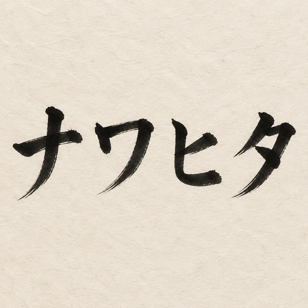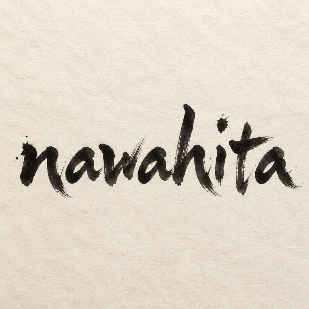
nawahita - 日本水墨毛笔 Text Effect


用原作的模型 OpenAI GPT-Image-2.5 Sunburst · 15 积分











“nawahita”是使用 FontVibe AI 创作的日本水墨毛笔文字效果。把日本书道的水墨毛笔笔法用到拉丁字母上。浓黑的墨汁配上地道的毛笔笔势、单向可控的运笔,还有和纸的质感。做日料店品牌、纹身设计、动漫、武道和文化类项目都特别合适。
Japanese ink brush aesthetic — the visual language of sumi calligraphy on washi paper. INK MEDIUM: sumi pigment in deep black to charcoal range — richest density at mark centers, naturally transitioning outward as ink supply depletes. Fully matte, absorbed into paper surface, producing a tonal range from dense opaque black to transparent grey depending on dilution and brush load. PAPER SURFACE: natural washi — warm cream-white base with visible paper fiber structure giving slight texture. The absorbent surface creates the characteristic soft border quality of East Asian brush work at all mark edges. LIGHT ATMOSPHERE: soft diffuse north-facing studio light — the traditional calligrapher's light source. Even, shadowless, allowing the full tonal range of ink marks to read clearly. Warm cream paper tone contrasts against deep sumi black. AESTHETIC REGISTER: the ma principle — the space between and around marks is as considered as the marks themselves. Compositions have breathing room and deliberate quietness. When no specific material is defined by the font: default environment — deep sumi black marks on warm cream washi paper, soft diffuse overhead light, meditative studio atmosphere. Render the exact text “nawahita” as the sole hero inscription in deep sumi ink on warm cream handmade washi paper. The lettering is formed from decisive loaded brush passes, with dense matte near-black pigment at the first contact points and pressure-weighted pools within the broadest marks. Each stroke pulls into dry-brush charcoal-gray streaks and broken feathered tails, revealing the absorbent paper fibers beneath. Allow irregular capillary bleed along selected edges, soft gray halos where diluted ink enters the washi grain, and tiny natural bristle separations at swift directional changes. Keep the ink fully absorbed and non-reflective, never glossy or digitally smooth. Surround the word with expansive unmarked paper and quiet negative space, preserving the ma principle. Add only a few restrained micro-splashes and faint ink dust near the most forceful stroke entries; no ornamental patterns, no additional words, no seals. Paper surface shows long pale fibers, slight uneven pulp density, and subtle deckled tonal variation. Soft diffuse north-facing studio illumination, shadowless and even, reveals the full transition from opaque black through smoky gray to nearly transparent wash. High-resolution editorial photograph of traditional Japanese calligraphy materials, tactile paper grain, authentic sumi pigment behavior.
用途: 日本书法字体
生成于 2026年10月12日 · 1024 × 1024 · JPEG · OpenAI GPT-Image-2.5 Sunburst · 公开作品 · 可免费商用(CC BY 4.0)