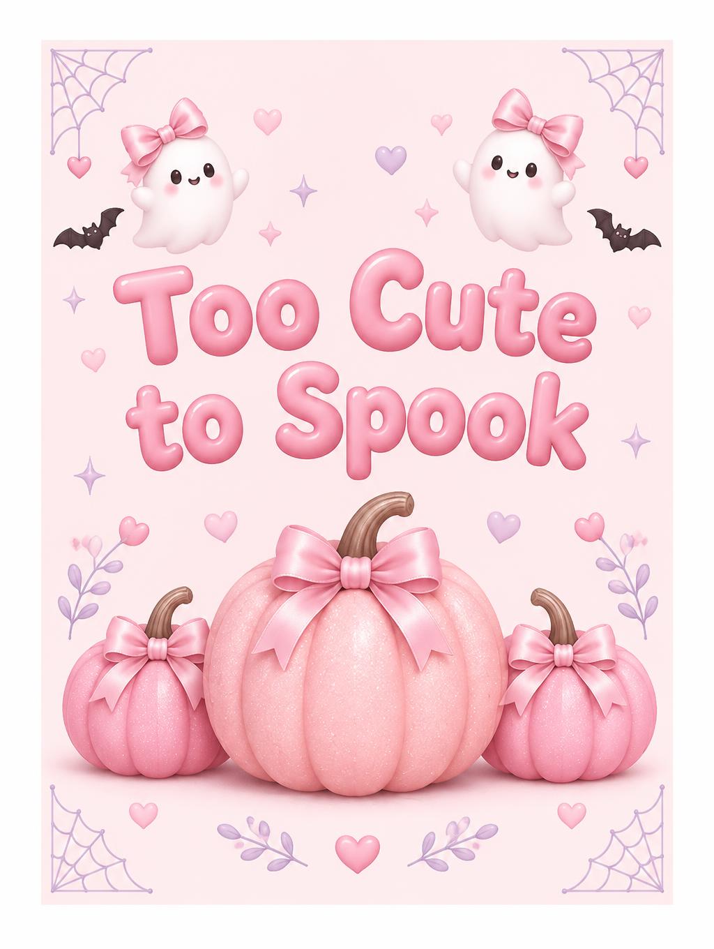
Too Cute to Spook - 粉色万圣节 Text Effect


用原作的模型 OpenAI GPT-Image-2.5 Sunburst · 15 积分
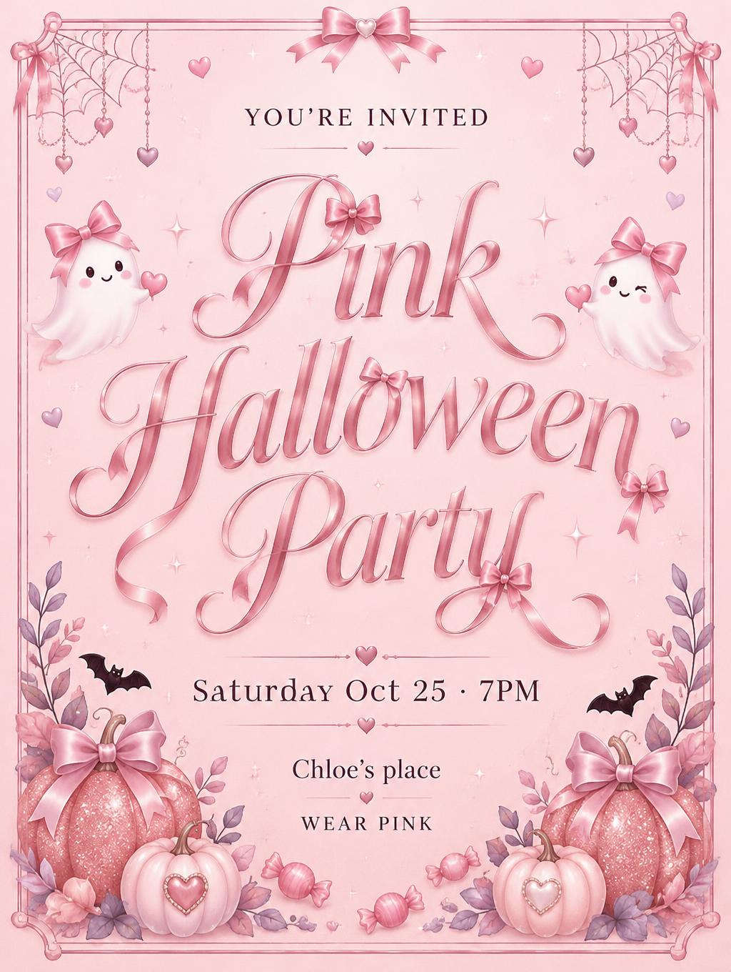
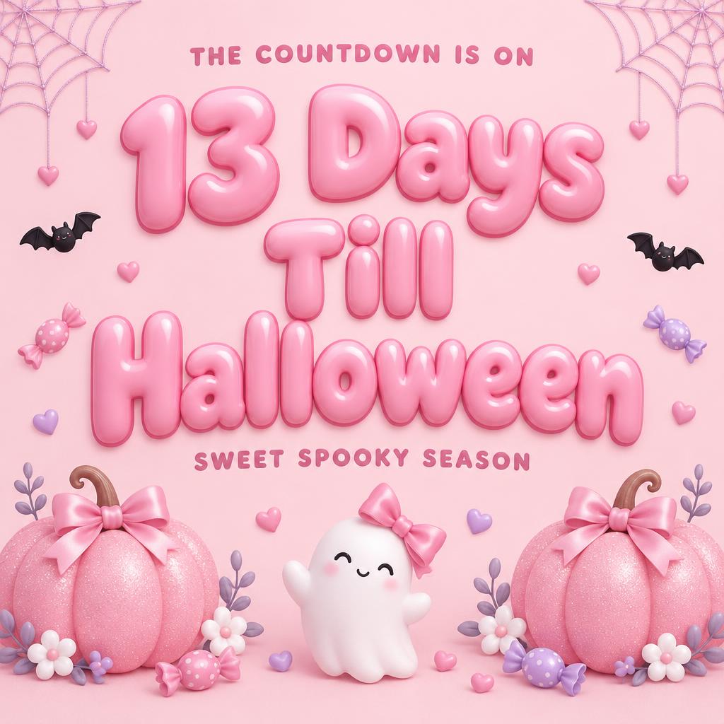
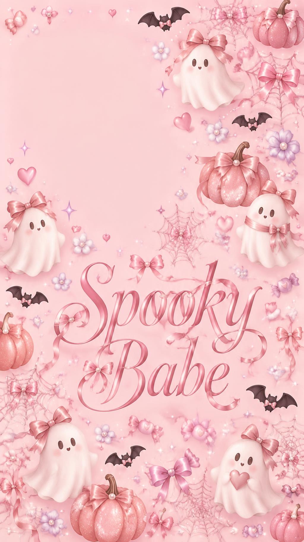
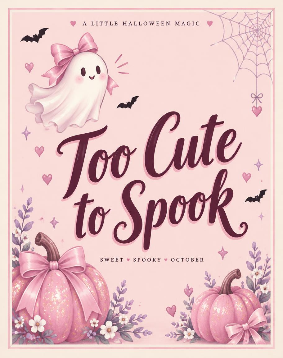
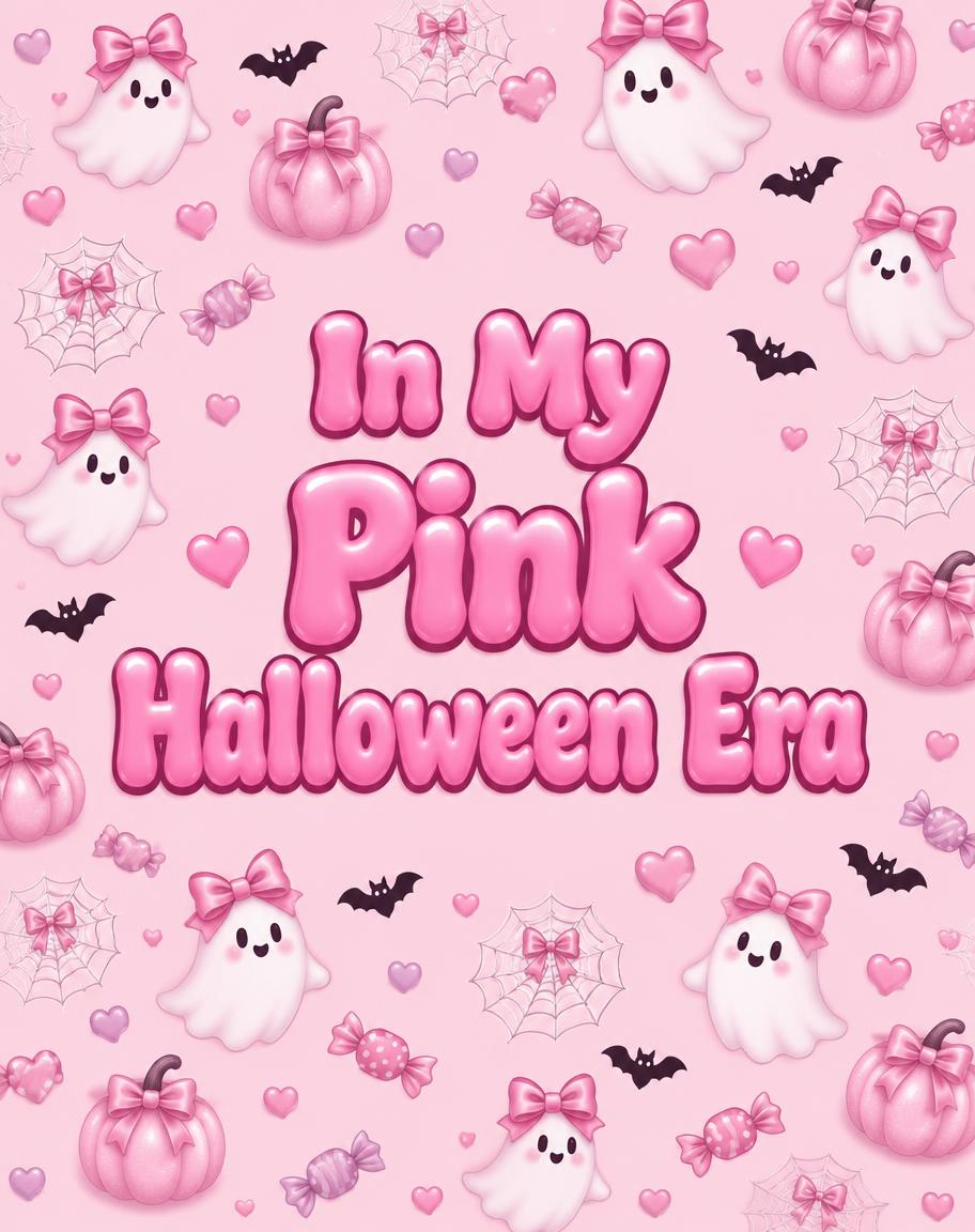
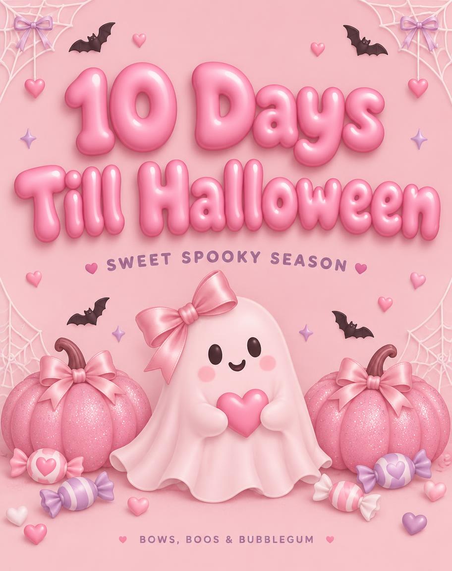
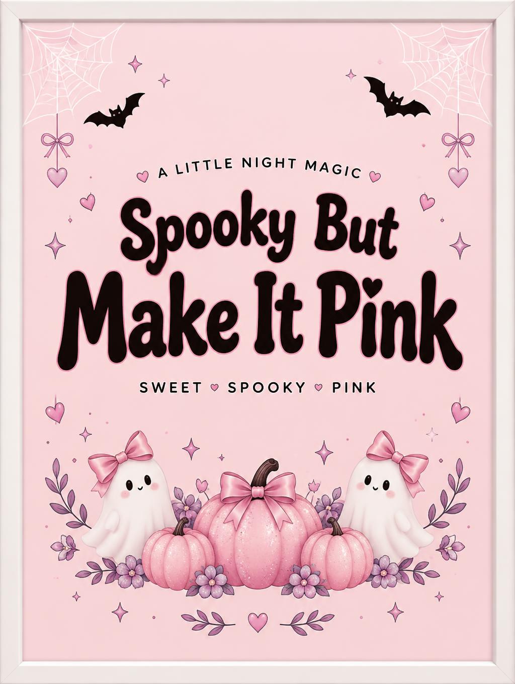
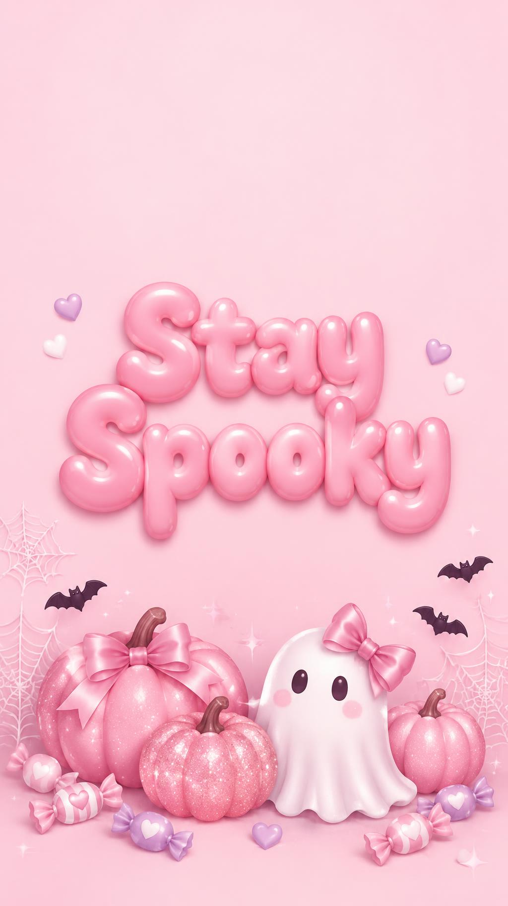

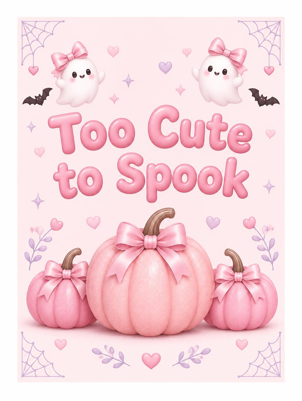
"Too Cute to Spook" 是一张柔和粉色、卡哇伊与 coquette 风格的万圣节海报。光亮的粉色泡泡字分两行排列,位于两只戴蝴蝶结的微笑幽灵之间,下方是三颗闪粉粉色南瓜,背景为淡粉色。你可以把标题换成自己的文字,或更改颜色和图案,用于其他派对。
Create a finished portrait wall-art print for a girl's bedroom, designed to sit inside a frame. Keep generous, crisp white paper margins around the artwork; no room scene and no visible frame. Center the exact headline “Too Cute to Spook” in the calm open middle, split into two balanced lines: “Too Cute” above “to Spook.” Make it large, clear, and easy to read. Use cute kawaii rounded display letterforms with soft single-weight strokes, wide short proportions, large open counters, generous spacing, and maximally rounded terminals. Give the letters a smooth, gently glossy pink finish with soft highlights; keep their contours clean and legible. Below the words, make a prominent cluster of three rounded pink pumpkins the visual subject: one large blush-pink pumpkin centered, flanked by two smaller bubblegum-pink pumpkins, softly matte with a little fine glitter, curved stems, and tiny satin bows. Surround the title and pumpkins with a few small sweet Halloween motifs—two little white ghosts wearing satin bows, delicate corner cobwebs, tiny black bats, small hearts, and restrained lilac accents. Keep the motifs near the corners and lower edge so they frame rather than crowd the words. Use a pale blush field inside the white margins, soft even light, a faint sweet-pink glow, and only soft shadows. The mood is charming and gentle, never scary; no orange-and-black Halloween palette, no extra words, no clutter.
作品标签
生成于 2026年10月19日 · 1024 × 1360 · JPEG · OpenAI GPT-Image-2.5 Sunburst · 版式:Framed Sweet Print · 公开作品 · 可免费商用(CC BY 4.0)