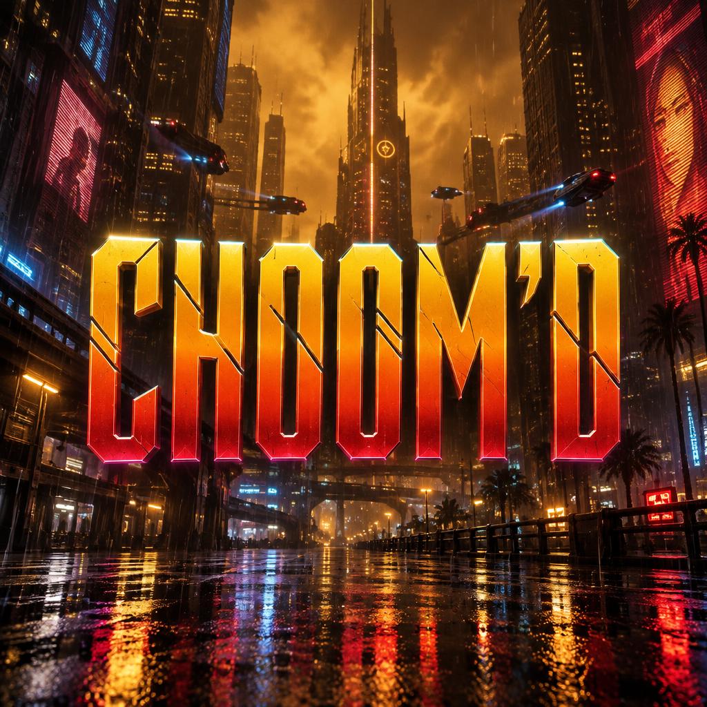
CHOOM'D - Cyberpunk 2077 Text Effect


用原作的模型 OpenAI GPT-Image-2.5 Sunburst · 15 积分
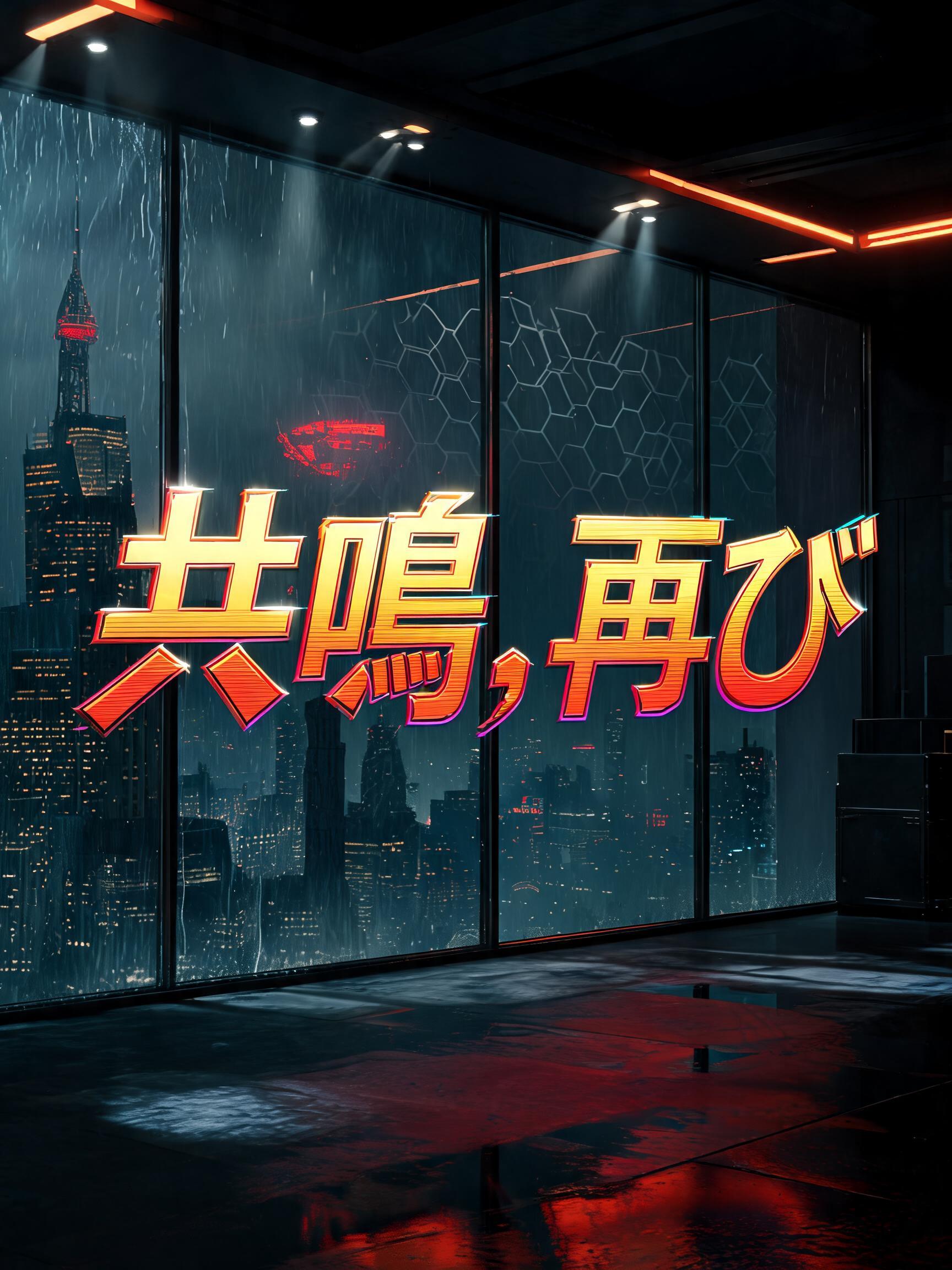


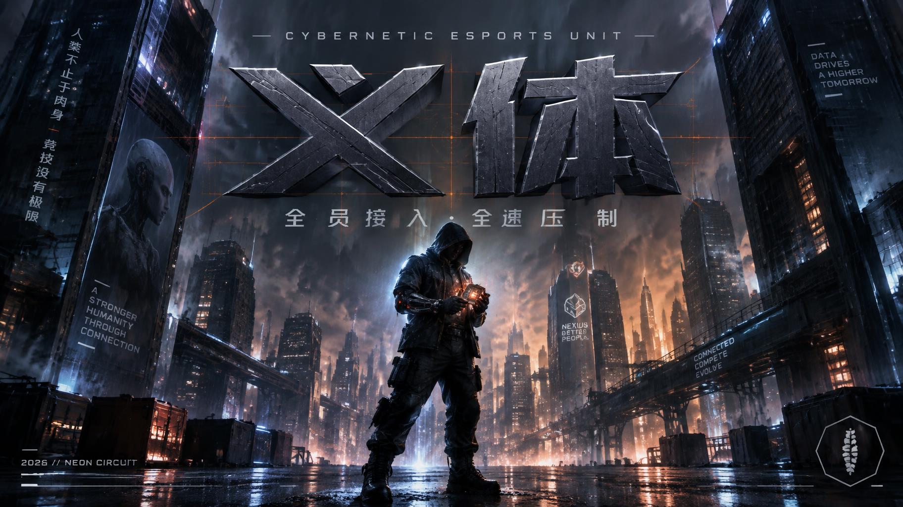
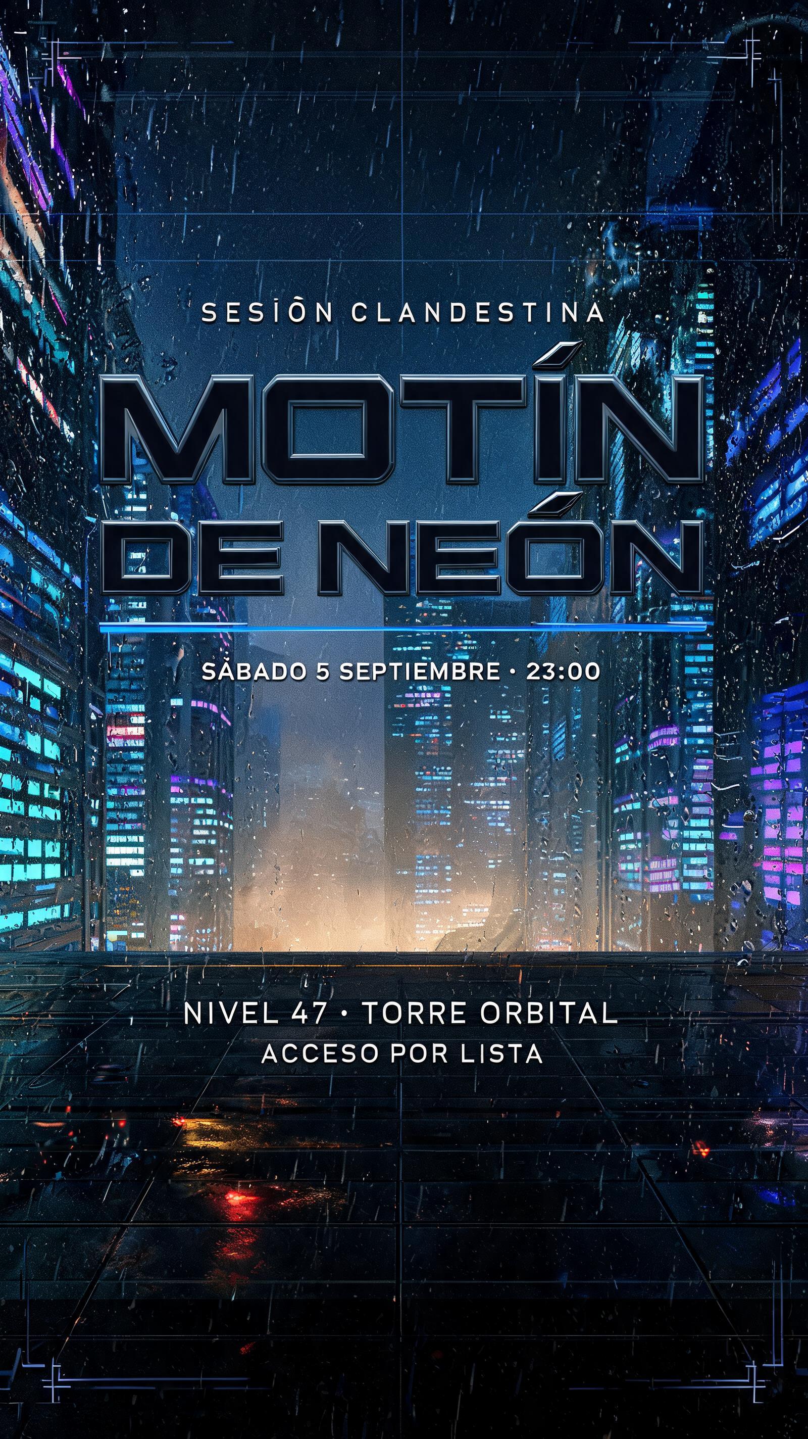
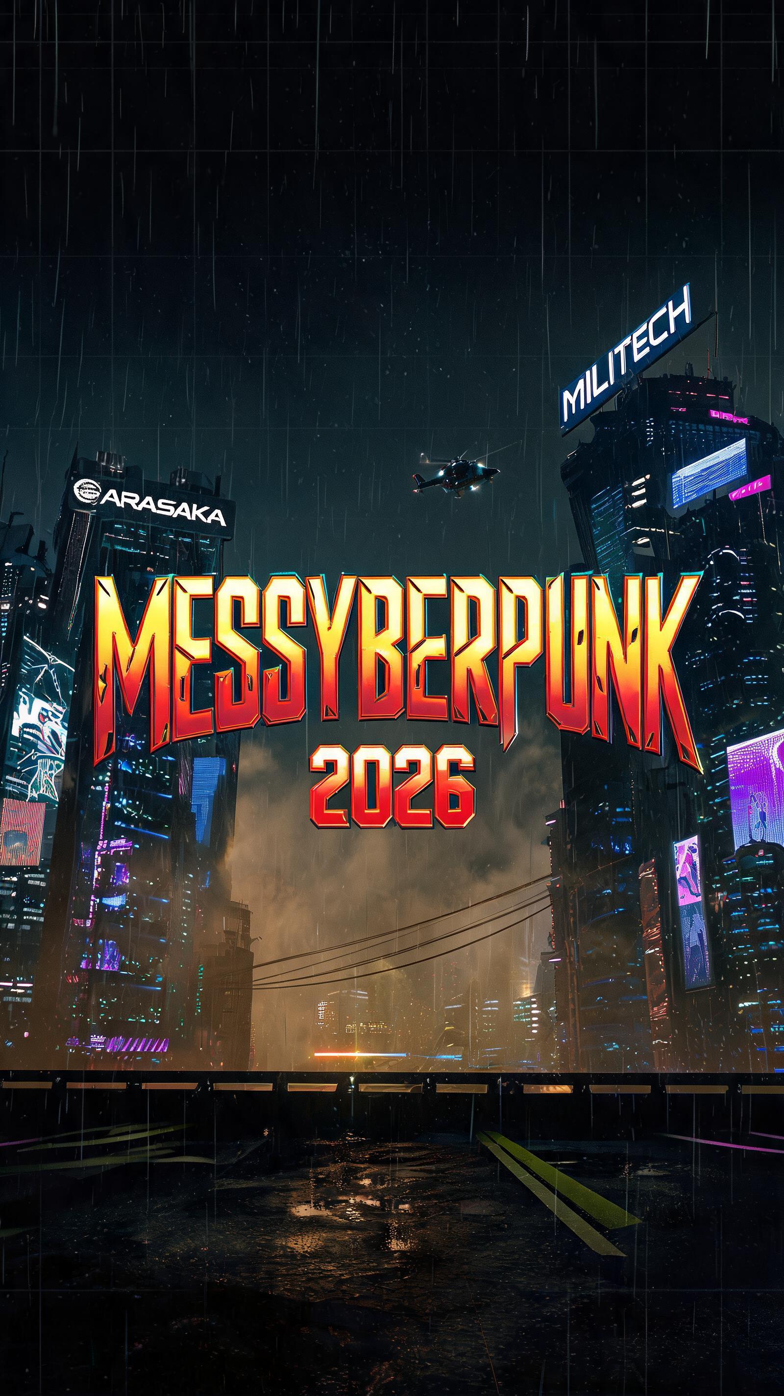


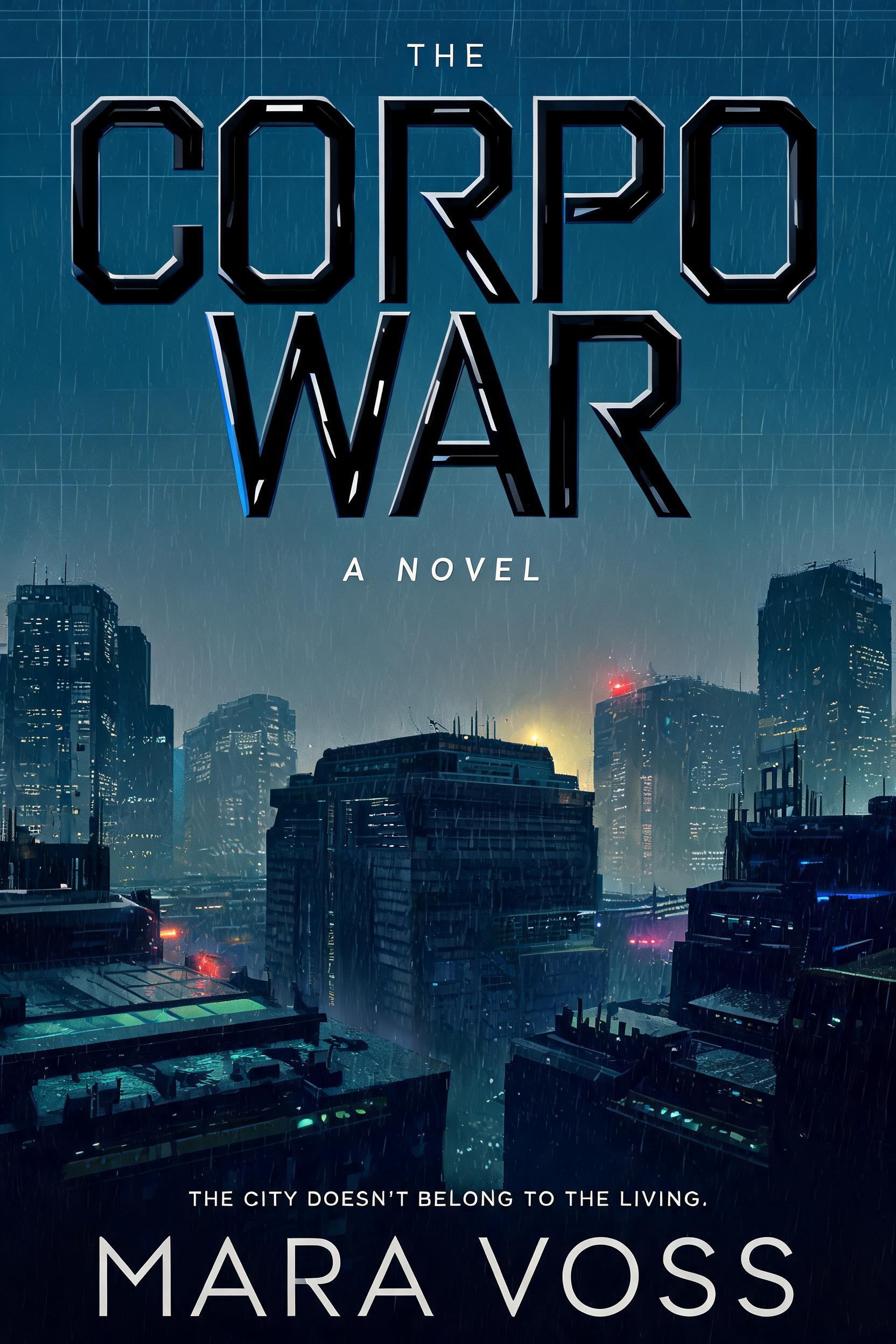
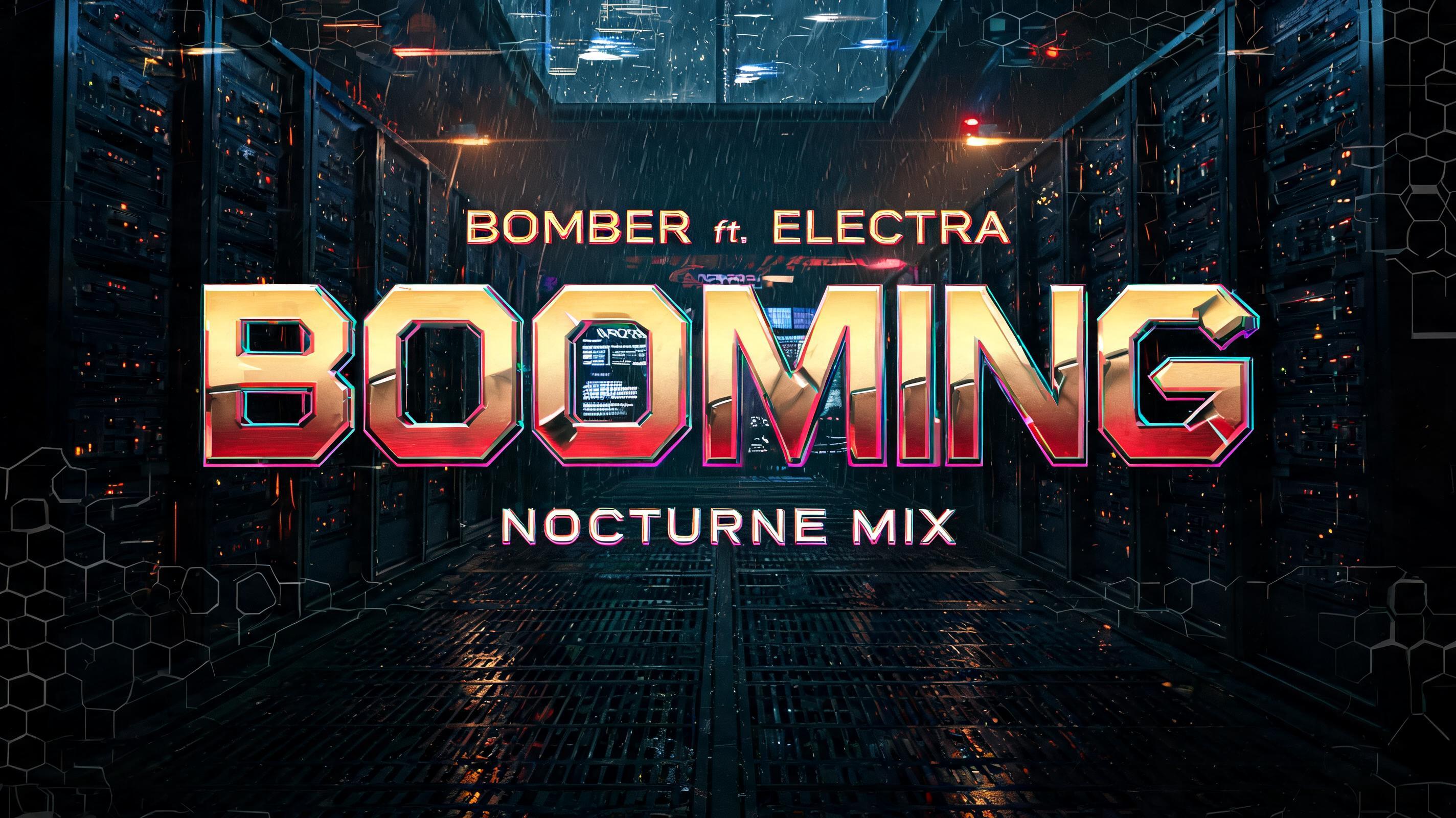


“CHOOM'D”是使用 FontVibe AI 创作的Cyberpunk 2077文字效果。灵感来自标志性的夜之城美学——黄红铬金字体,硬朗的切角,还有满屏霓虹的氛围感。
Yellow-gold to hot-red gradient saturating every letterform face — the signature Night City commercial palette, running from chrome-bright gold at stroke tops to deep ember-red at stroke bases. Angular geometric cuts interrupt each letter: deliberate diagonal notches, beveled corner slices, and corporate logo incisions that follow the same design logic as Arasaka and Militech branding. Holographic edge fringe: a thin 1–2px chromatic aberration line along every letter edge — cyan on the upper-right, magenta on the lower-left — suggesting the text is projected by corporate UI rather than printed on any surface. Letter surfaces carry a polished hard-chrome quality: specular highlight razor-thin along the top plane of each stroke, deep shadow on the under-plane, zero diffuse scatter. The overall material read is: machined corporate hardware, not hand-crafted. When no specific material is defined by the font: default environment — yellow-gold to red gradient fill, angular geometric notch cuts, 1px holographic edge fringe, deep black background, faint corporate grid pattern at 8% opacity behind the letters. A rain-lashed Night City street at midnight, framed by towering megabuildings whose windows dissolve upward into amber fog. Wet black asphalt catches broken reflections of gold, red, and distant cool-blue signage; narrow rain streaks slash through the foreground. Center frame, “CHOOM'D” dominates as a single luminous word, large and sharply separated from the city behind it. Its letter faces shift from chrome-bright yellow-gold at the upper edges to hot ember-red below, with razor-thin highlights above each stroke and deep, hard shadows beneath. Crisp diagonal notches and beveled corner incisions cut visibly into the letters, like expensive corporate hardware. A fine holographic fringe traces every edge, cyan at the upper-right and magenta at the lower-left, as if the word is projected by a corporate interface. Keep the text warm, polished, and threatening; reserve cool blue and violet for distant neon and rain reflections. Amber haze parts behind the lettering, giving it clear negative space, while a slender megabuilding spire and faint flying-vehicle light trails recede in the background. No extra words or logos. Square composition.
生成于 2026年10月28日 · 1024 × 1024 · JPEG · OpenAI GPT-Image-2.5 Sunburst · 公开作品 · 可免费商用(CC BY 4.0)