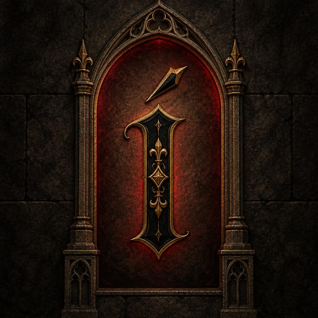
Í - 哥特字体 Text Effect


用原作的模型 OpenAI GPT-Image-2.5 Sunburst · 15 积分





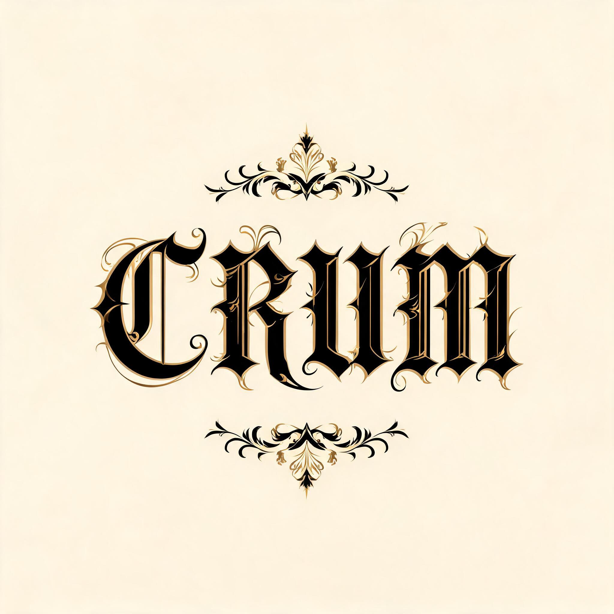


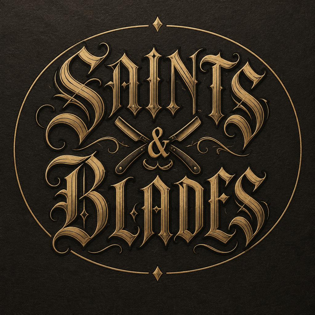
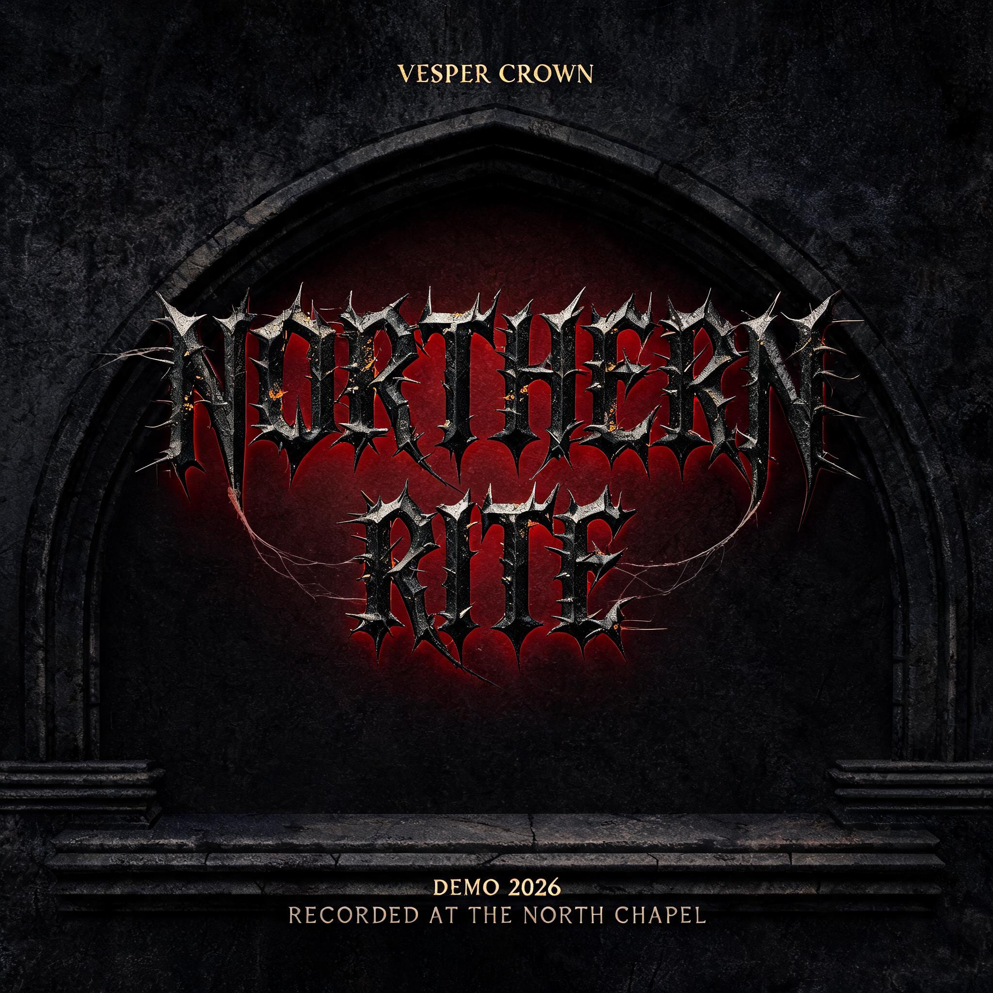
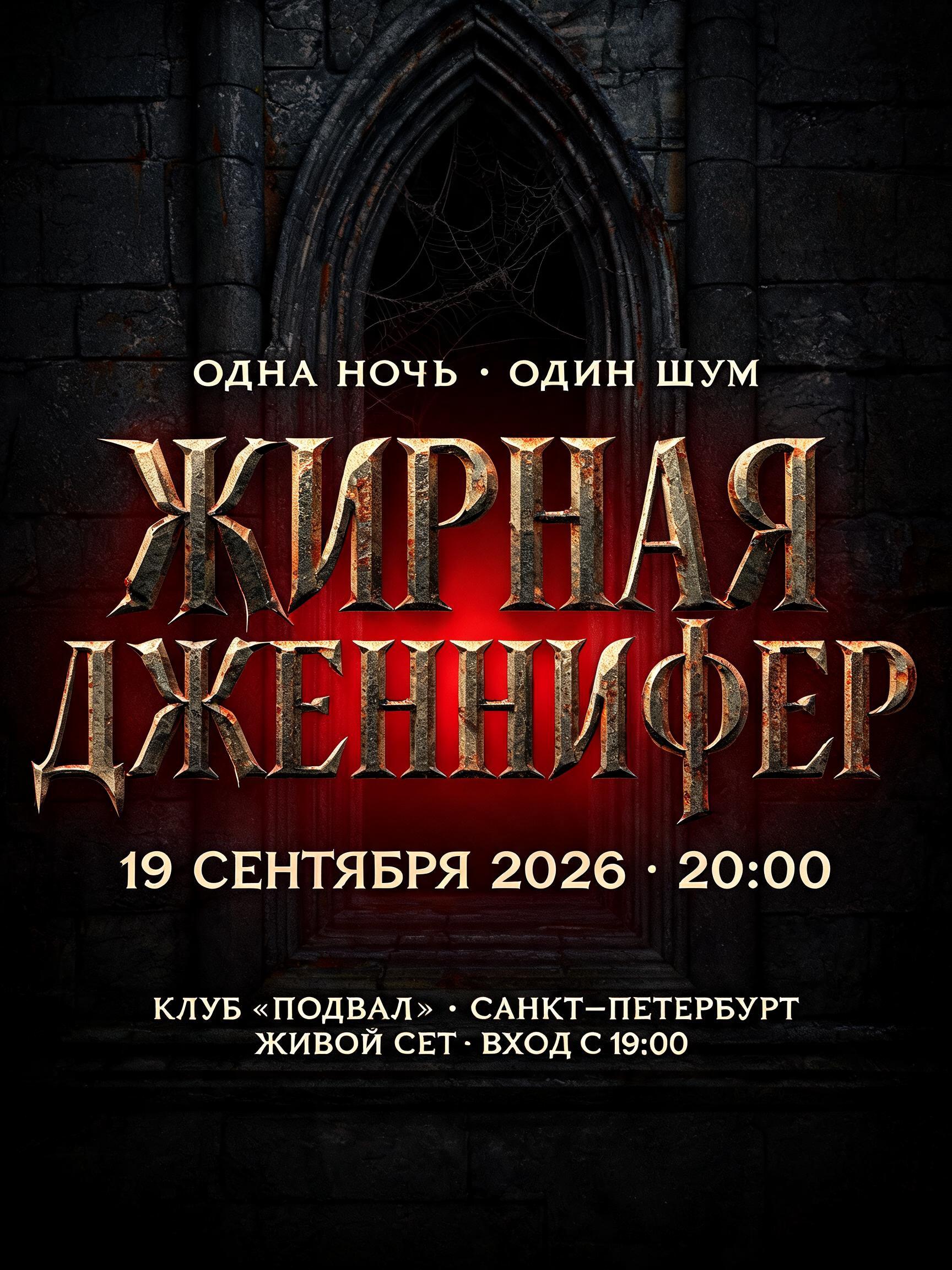
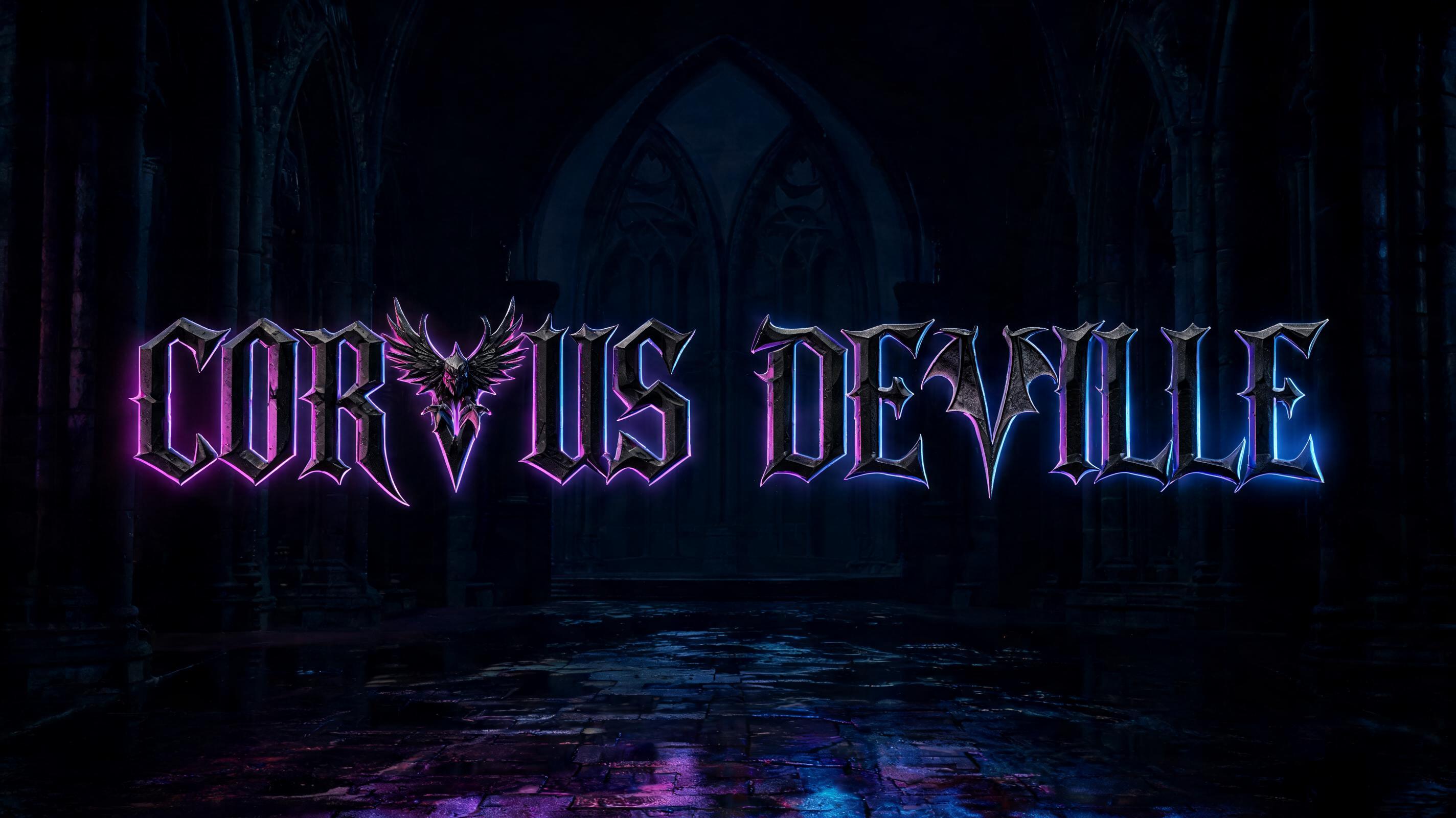


“Í”是使用 FontVibe AI 创作的哥特字体文字效果。严谨的 Textura 哥特黑体:窄长的折笔、菱形笔端和强烈粗细对比,黑墨带金色描边,写在深色旧羊皮纸上。
Create a finished square typographic emblem featuring exactly one readable character: “Í”. Make the uppercase I unmistakable as an ornate medieval blackletter, with the acute accent clearly separated above it and never mistaken for a flourish. Build the glyph with a strong medieval blackletter skeleton, deep heavy stems, pointed arch counters, sharp diamond terminals, Victorian ornamental overlays, and a small number of hairline swash extensions. The main strokes are rich black ink with warm depth on a dark, aged-parchment face; add restrained gold-ink edging and fine interior ornament. Preserve clear silhouette and legibility at small size. The hairline ornaments catch narrow, raking highlights while the broad stems stay shadow-rich. Set the letter centered inside a tall, narrow Gothic cathedral lancet arch, which frames but does not obscure it. Behind the arch, use a deep charcoal stone ground with a controlled crimson backlight halo, strongest at the arch’s inner edge. Keep the atmosphere stark and martial, with subtle parchment grain, dark stone texture, and precise medieval craftsmanship; no rust, cobwebs, fog, extra symbols, or additional lettering. The single Í is the dominant focal point, filling roughly 55% of the canvas height, with generous dark negative space around the arch. High contrast, crisp ornamental edges, restrained gold glints, no modern typography.
用途: 伦巴第哥特花体
生成于 2026年10月28日 · 1024 × 1024 · JPEG · OpenAI GPT-Image-2.5 Sunburst · 版式:Lancet Emblem · 公开作品 · 可免费商用(CC BY 4.0)


