I'm gonna take you there myself, fly you to the Moon. That's a promise - Cyberpunk 2077 Text Effect

用原作的模型 OpenAI GPT-Image-2.5 Sunburst · 15 积分
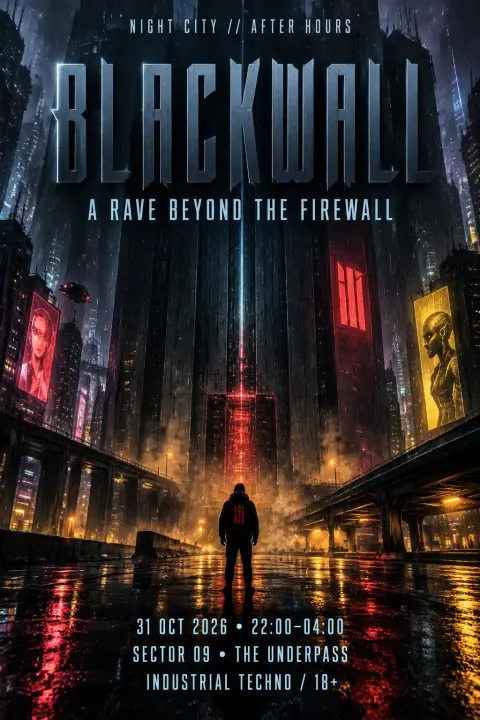
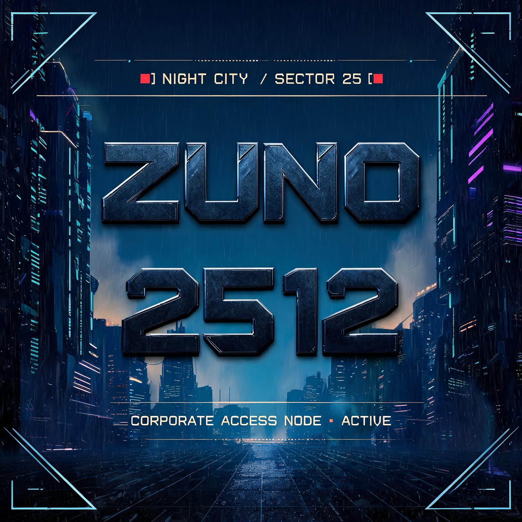
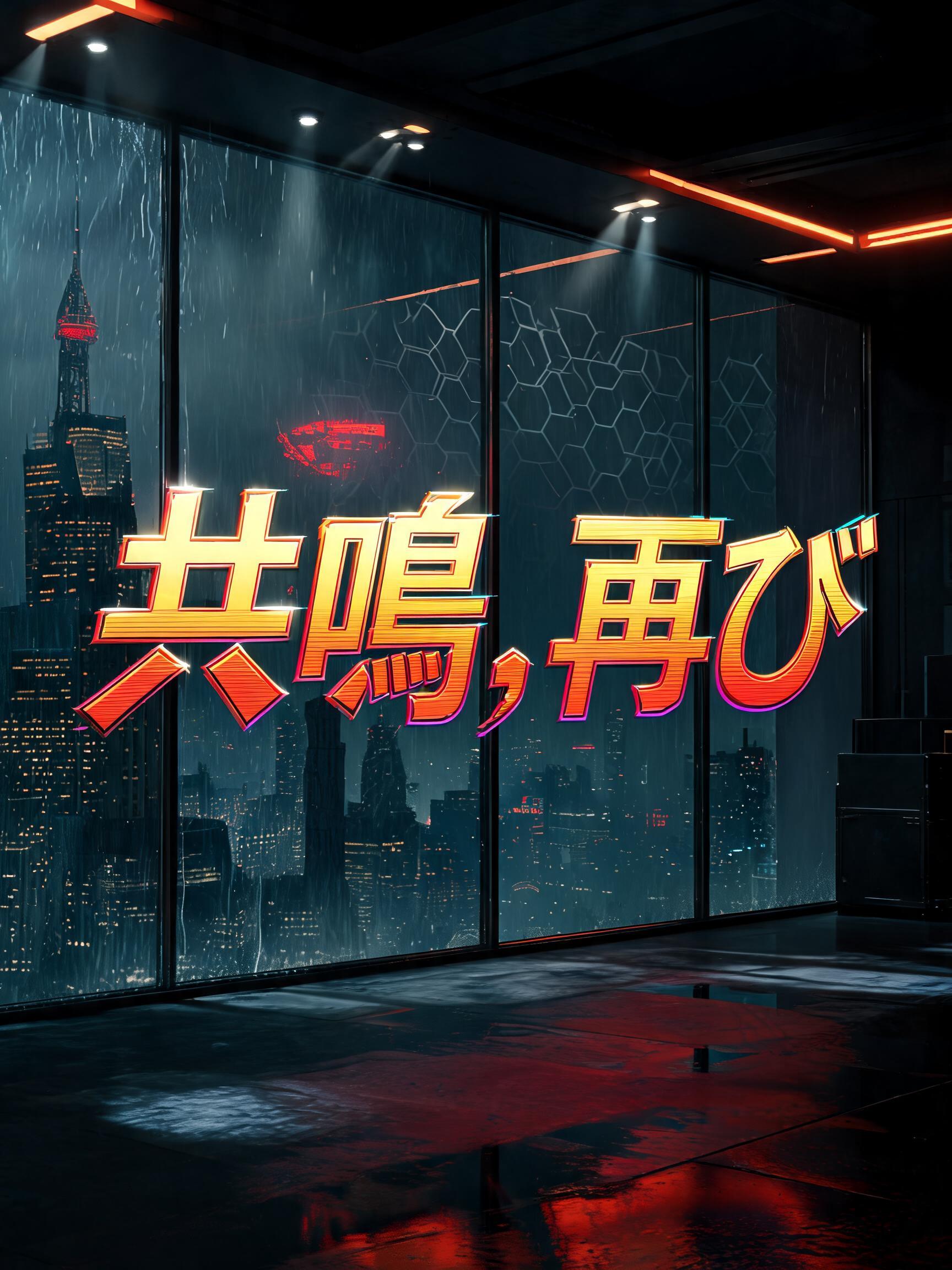


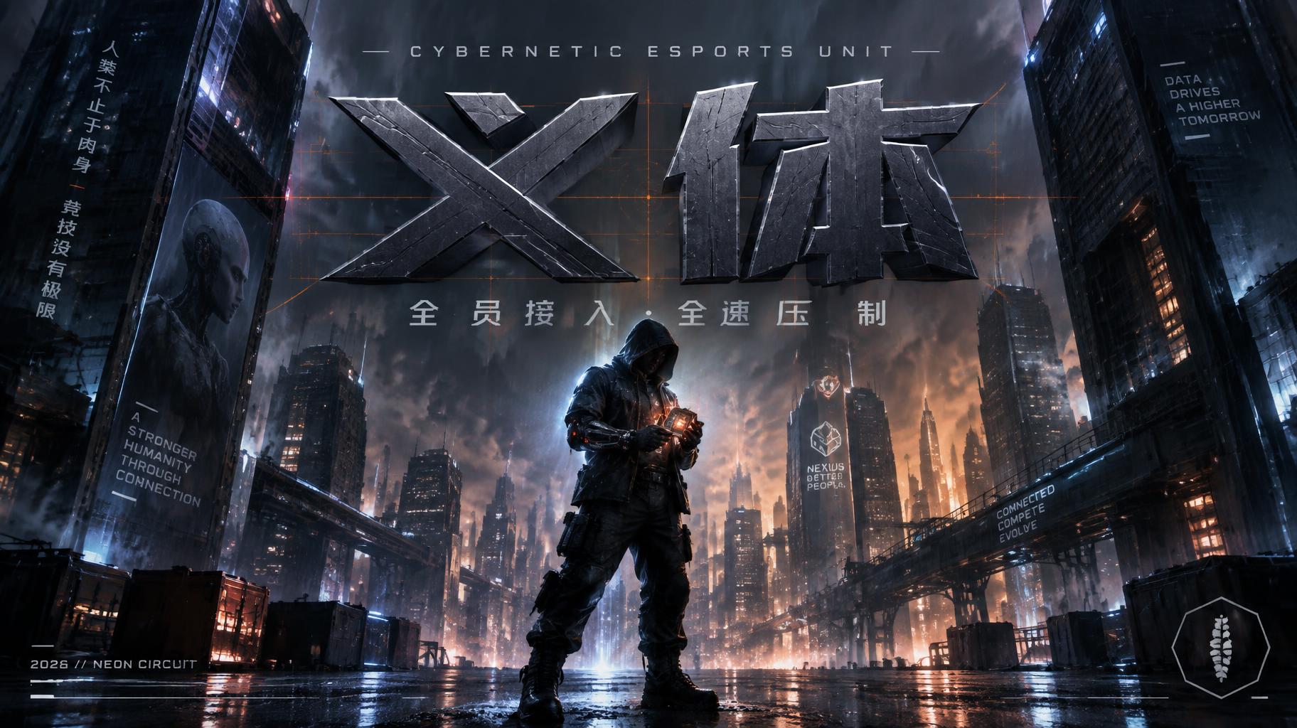
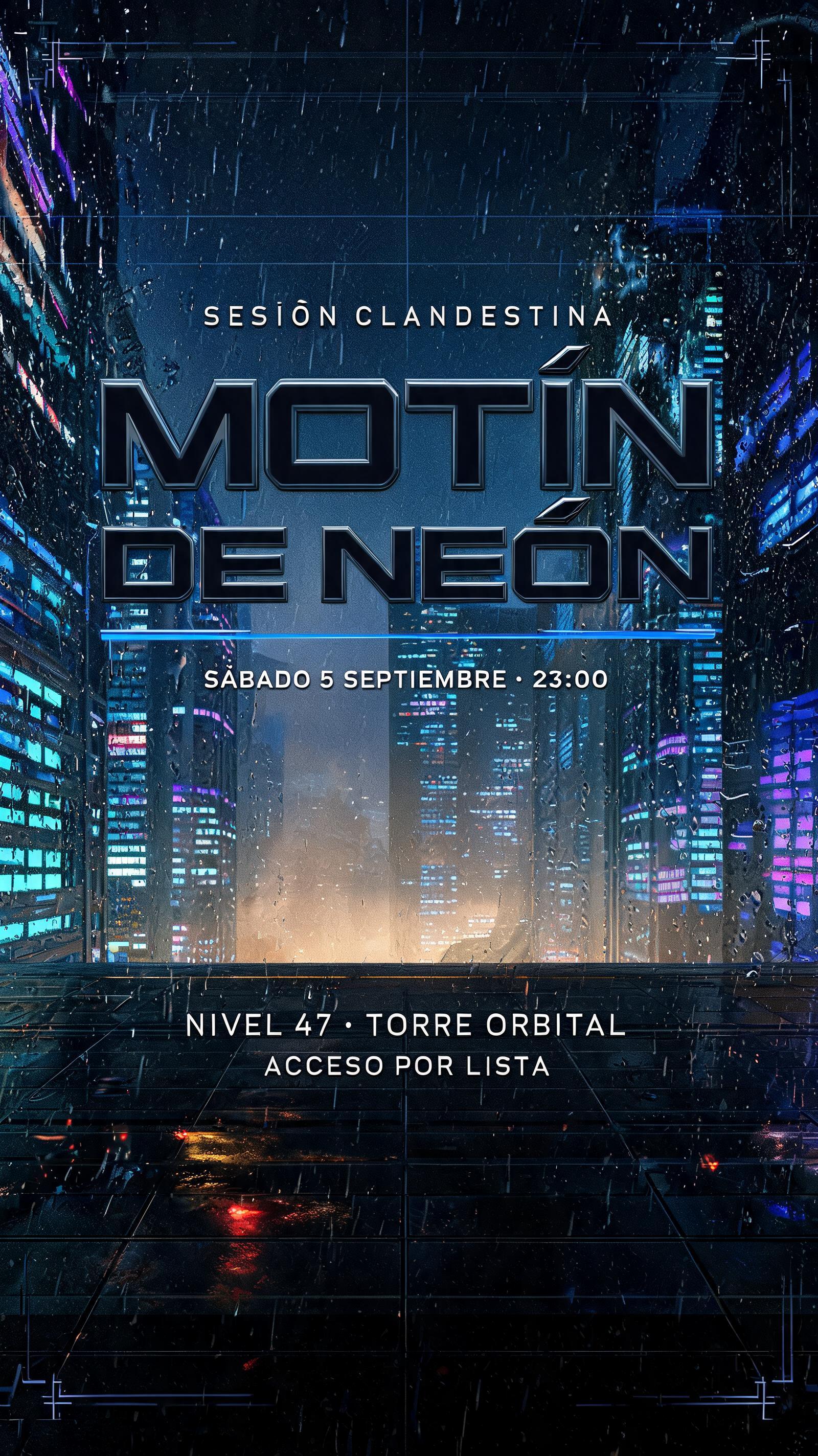
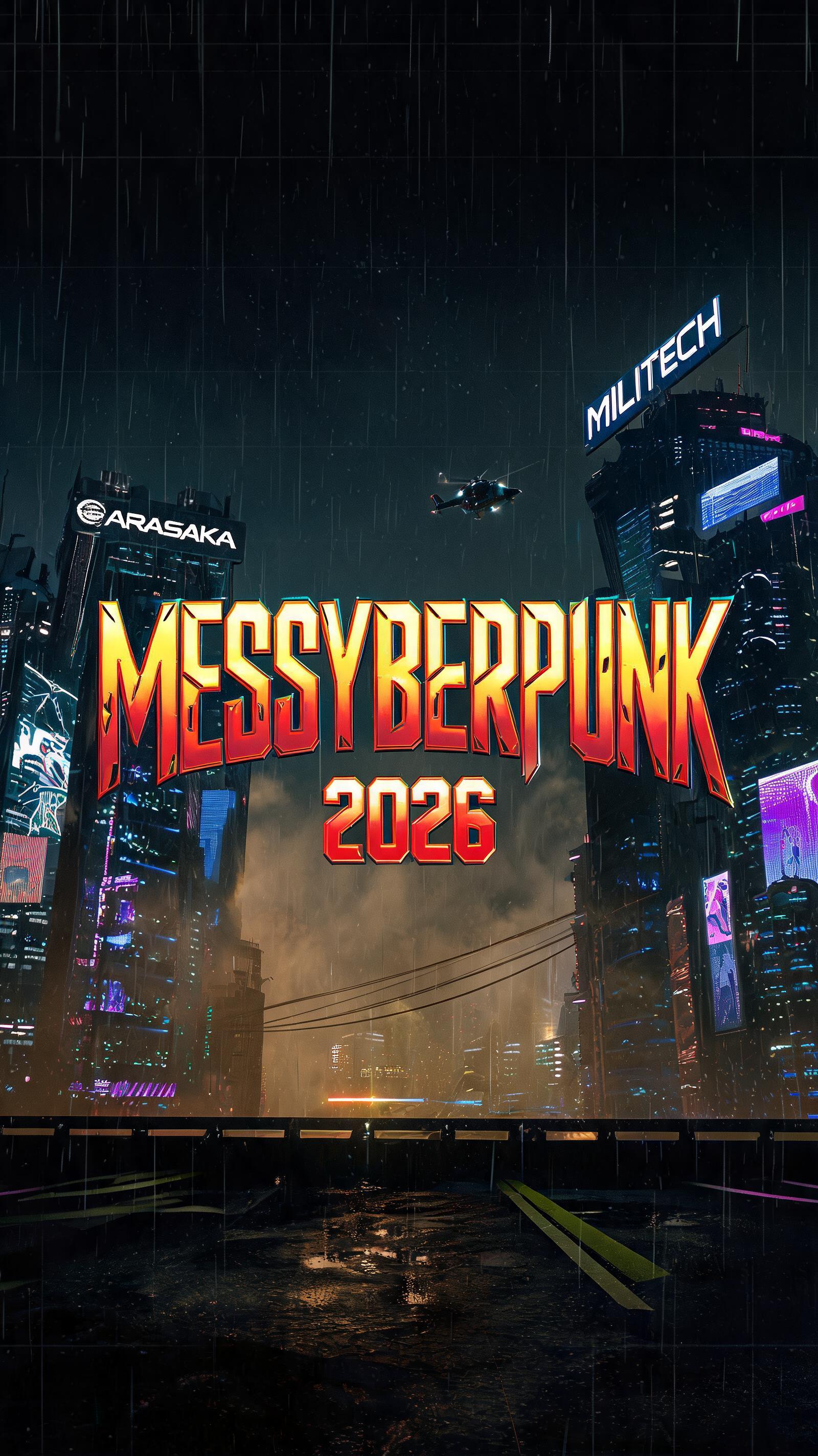


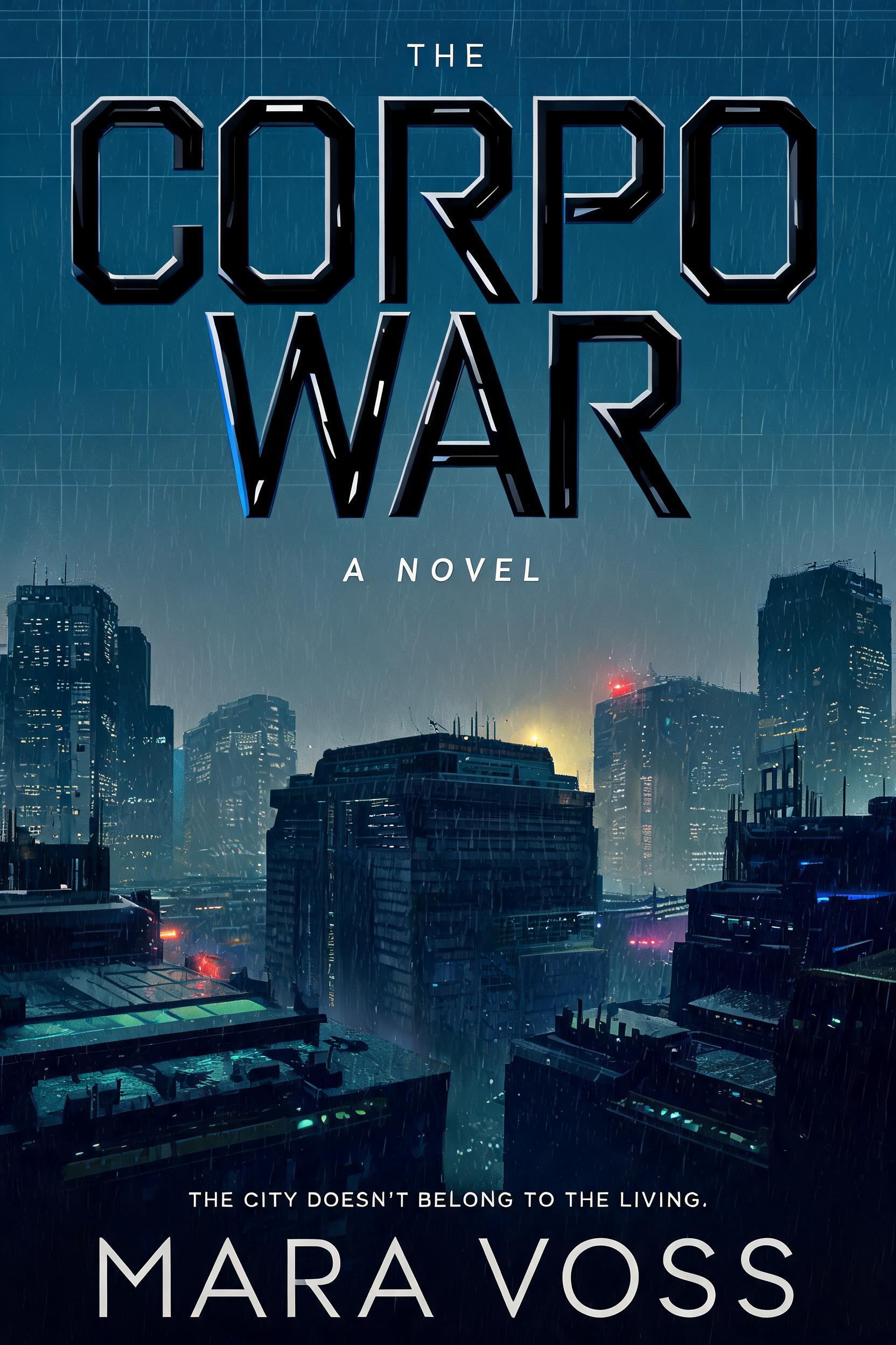
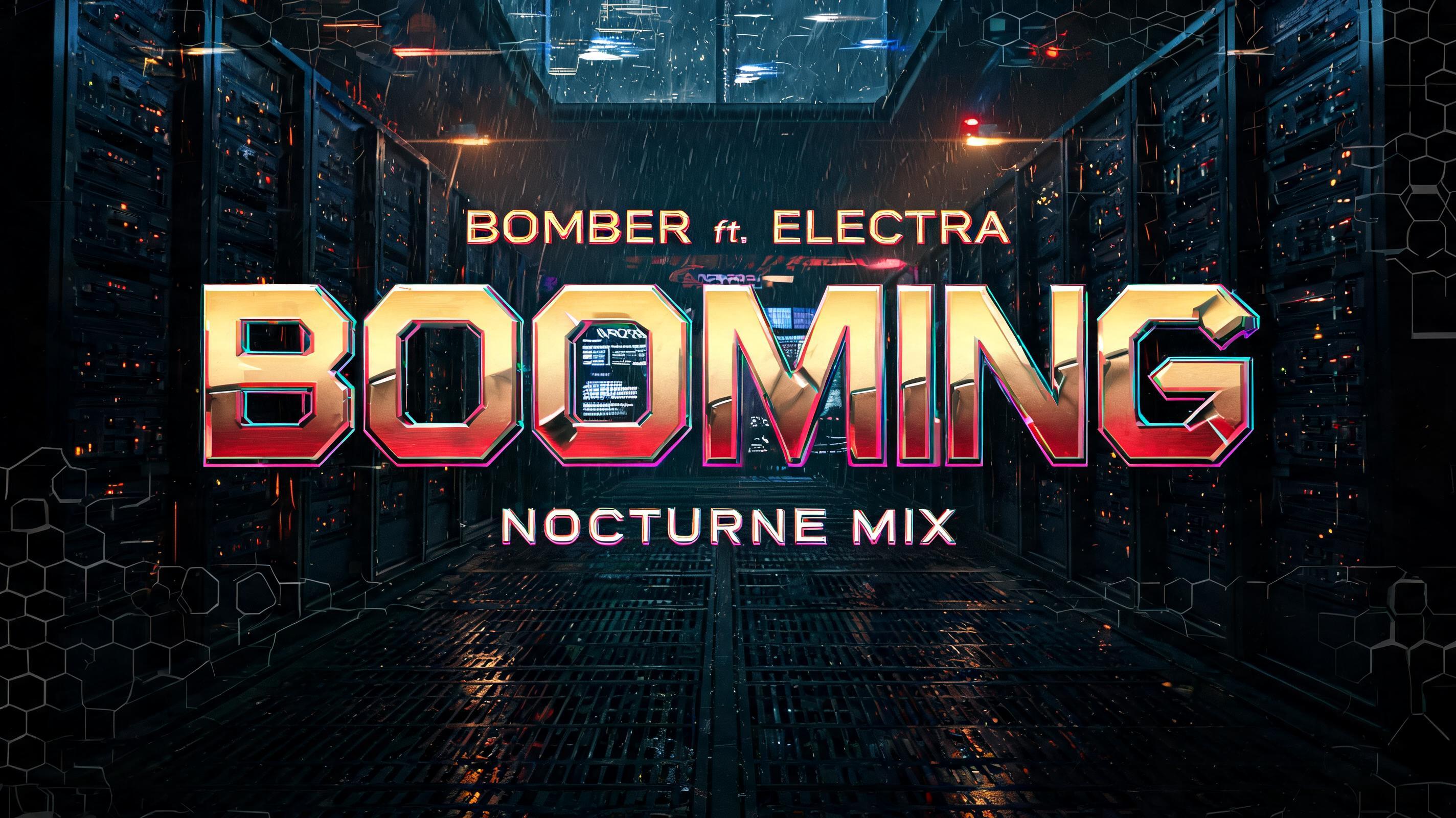


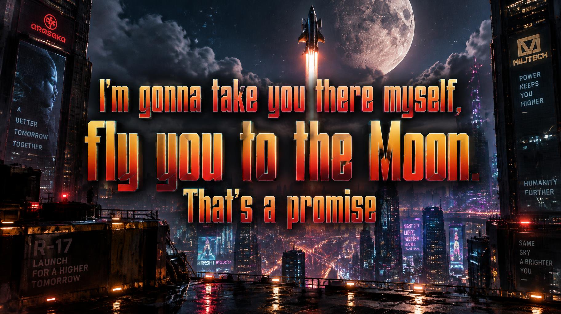
“I'm gonna take you there myself, fly you to the Moon. That's a promise”是使用 FontVibe AI 创作的Cyberpunk 2077文字效果。灵感来自标志性的夜之城美学——黄红铬金字体,硬朗的切角,还有满屏霓虹的氛围感。
Yellow-gold to hot-red gradient saturating every letterform face — the signature Night City commercial palette, running from chrome-bright gold at stroke tops to deep ember-red at stroke bases. Angular geometric cuts interrupt each letter: deliberate diagonal notches, beveled corner slices, and corporate logo incisions that follow the same design logic as Arasaka and Militech branding. Holographic edge fringe: a thin 1–2px chromatic aberration line along every letter edge — cyan on the upper-right, magenta on the lower-left — suggesting the text is projected by corporate UI rather than printed on any surface. Letter surfaces carry a polished hard-chrome quality: specular highlight razor-thin along the top plane of each stroke, deep shadow on the under-plane, zero diffuse scatter. The overall material read is: machined corporate hardware, not hand-crafted. When no specific material is defined by the font: default environment — yellow-gold to red gradient fill, angular geometric notch cuts, 1px holographic edge fringe, deep black background, faint corporate grid pattern at 8% opacity behind the letters. A Night City rooftop launch platform above a canyon of megabuilding towers, rain streaking through amber fog as a sleek corporate shuttle rises toward a vast moonlit sky. The Moon hangs bright beyond the towers, its pale surface reflected in wet black glass and puddles; cool blue and violet city signs and vehicle light trails recede into the distance, contrasting with the warm, expensive threat of the lettering. Set the exact text as a cinematic three-line promise, centered and dominant: “I'm gonna take you there myself,” / “fly you to the Moon.” / “That's a promise”. Give the first line the greatest width, let “fly you to the Moon.” command the strongest visual emphasis, and place the final line beneath as a compact, resolute seal. Letter faces carry a saturated yellow-gold to hot-red gradient, chrome-bright along their upper planes and ember-dark at their bases, with razor-thin highlights and hard under-plane shadows. Cut sharp diagonal notches and beveled incisions into the letter edges, unmistakably precise and corporate. Add a fine cyan fringe on upper-right edges and magenta on lower-left edges, like projected corporate UI. Keep the background richly atmospheric rather than flat black; leave clear breathing room around the text and let the shuttle’s ascending light trail lead toward the Moon. Wide cinematic composition.
生成于 2026年10月29日 · 1824 × 1024 · JPEG · OpenAI GPT-Image-2.5 Sunburst · 公开作品 · 可免费商用(CC BY 4.0)