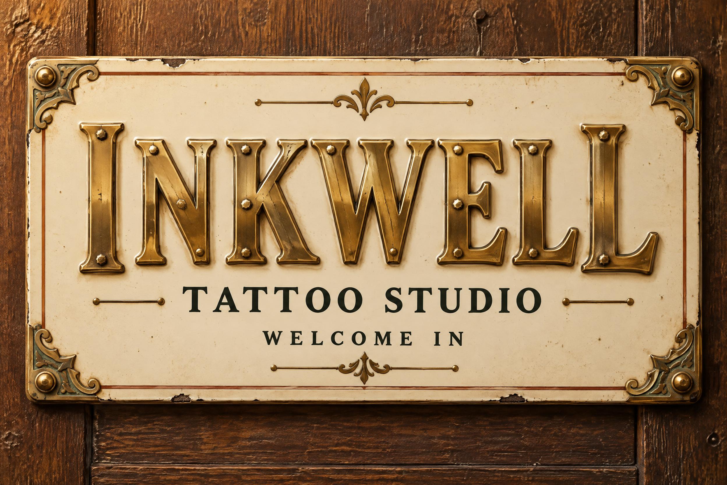
INKWELL TATTOO STUDIO WELCOME IN - 复古 Text Effect


用原作的模型 OpenAI GPT-Image-2.5 Sunburst · 32 积分




“INKWELL TATTOO STUDIO WELCOME IN”是使用 FontVibe AI 创作的复古文字效果。衬线大写字母凸版压印进米色棉卡纸,墨色略有破损,放在旧印刷机台面上,周围散落金属活字。
Finished horizontal 3:2 exterior door-plate sign for a welcoming tattoo studio, photographed straight-on at readable sign distance. A warm ivory #F3E8D2 enamel plaque with softly rounded corners occupies most of the frame, mounted against deep, aged walnut wood; refined, reassuring neighbourhood-craftsman character, never aggressive, no skulls, no needles, no tattoo-flash clichés, no extra words. Decorative framework sits behind and around the typography: a thin oxide-red #A4472B pinstripe inset border, antique brass #C89B45 corner brackets with faint verdigris in their recesses, a few restrained engraved flourishes, and tiny aged-brass rivets. Preserve a generous ivory field and clear negative space. The plaque has honest enamel depth, minute chips at a few edges, subtle age freckles and a soft waxed sheen; the wood is dark and gently worn. Warm amber light falls from upper left, with a calm soft shadow under the plaque and faint airborne dust. Set the exact headline "INKWELL" as the dominant line, broad across the upper-middle of the plaque with generous left and right margins. Custom tall, sturdy Victorian foundry serif capitals: precision-cast, mirror-polished brass faces with a warm gold gradient, visibly raised relief, satin-brushed gold sidewalls, fine micro-tooling marks, faint casting flash at the base, and distinct bright specular lines along every top edge. Rich narrow shadow gathers at the letter roots, making each letter exceptionally legible. Small hexagonal brass fasteners are integrated discreetly near letter corners and midpoint joins without obstructing readability. Directly beneath, centered in a noticeably narrower straight line, set "TATTOO STUDIO" in crisp small-cap deep ink #172A2A engraved serif lettering, lightly pressed into the ivory enamel with restrained antique-brass hairline separators. Below that, centered in an even narrower final line with ample breathing room, set "WELCOME IN" in warm deep-ink small capitals, simple and friendly. Keep all three lines perfectly horizontal, centered, sharply legible, and visually calm; headline first, studio name second, welcome line last. The total design feels like an enduring Victorian brass-and-enamel shop sign that an older neighbour would trust and enjoy entering.
生成于 2026年10月30日 · 2496 × 1664 · JPEG · OpenAI GPT-Image-2.5 Sunburst · 版式:弧形徽章 · 公开作品 · 可免费商用(CC BY 4.0)