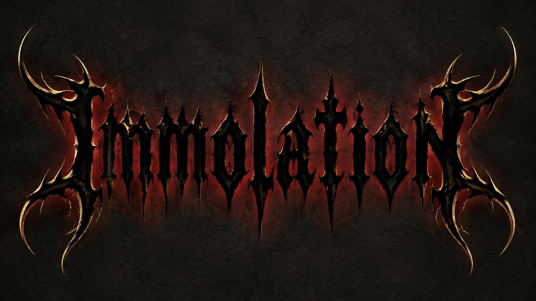
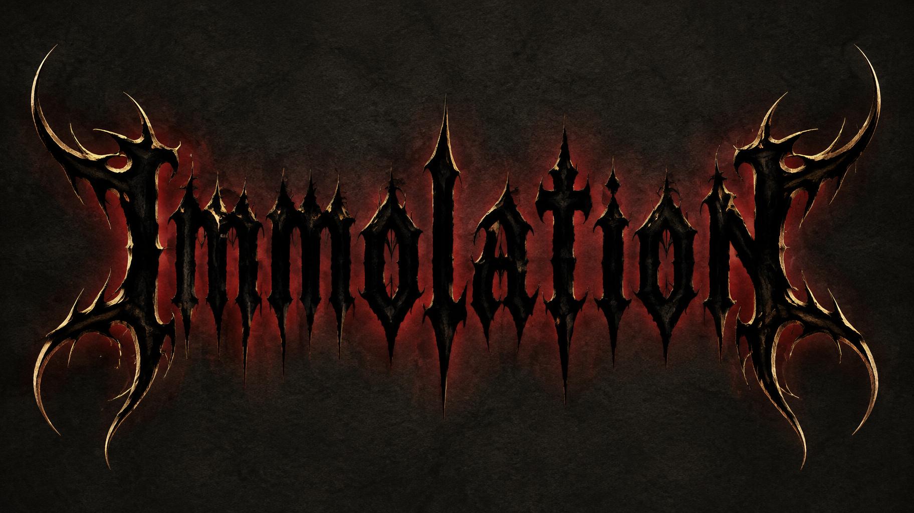
Immolation - 哥特字体 Text Effect


用原作的模型 OpenAI GPT-Image-2.5 Sunburst · 15 积分


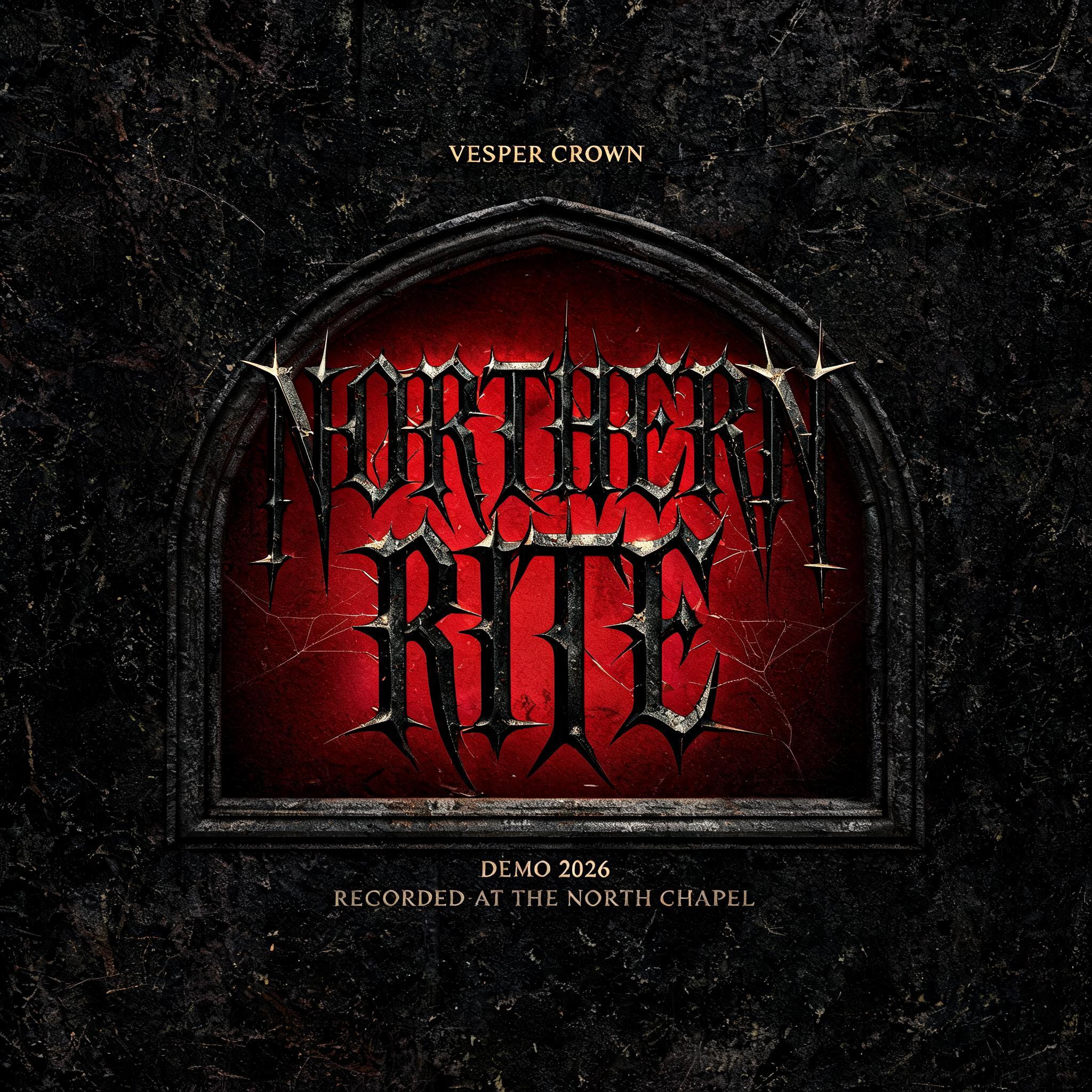

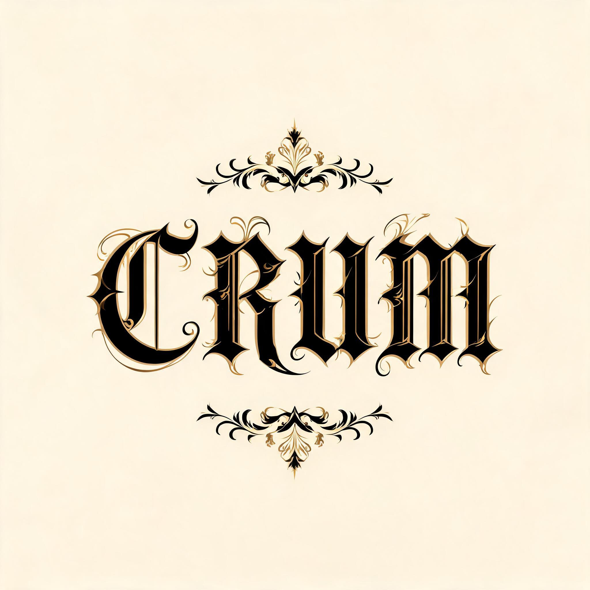

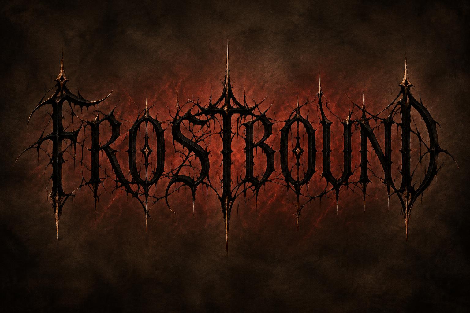
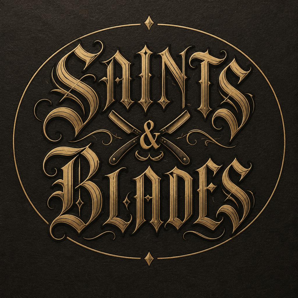
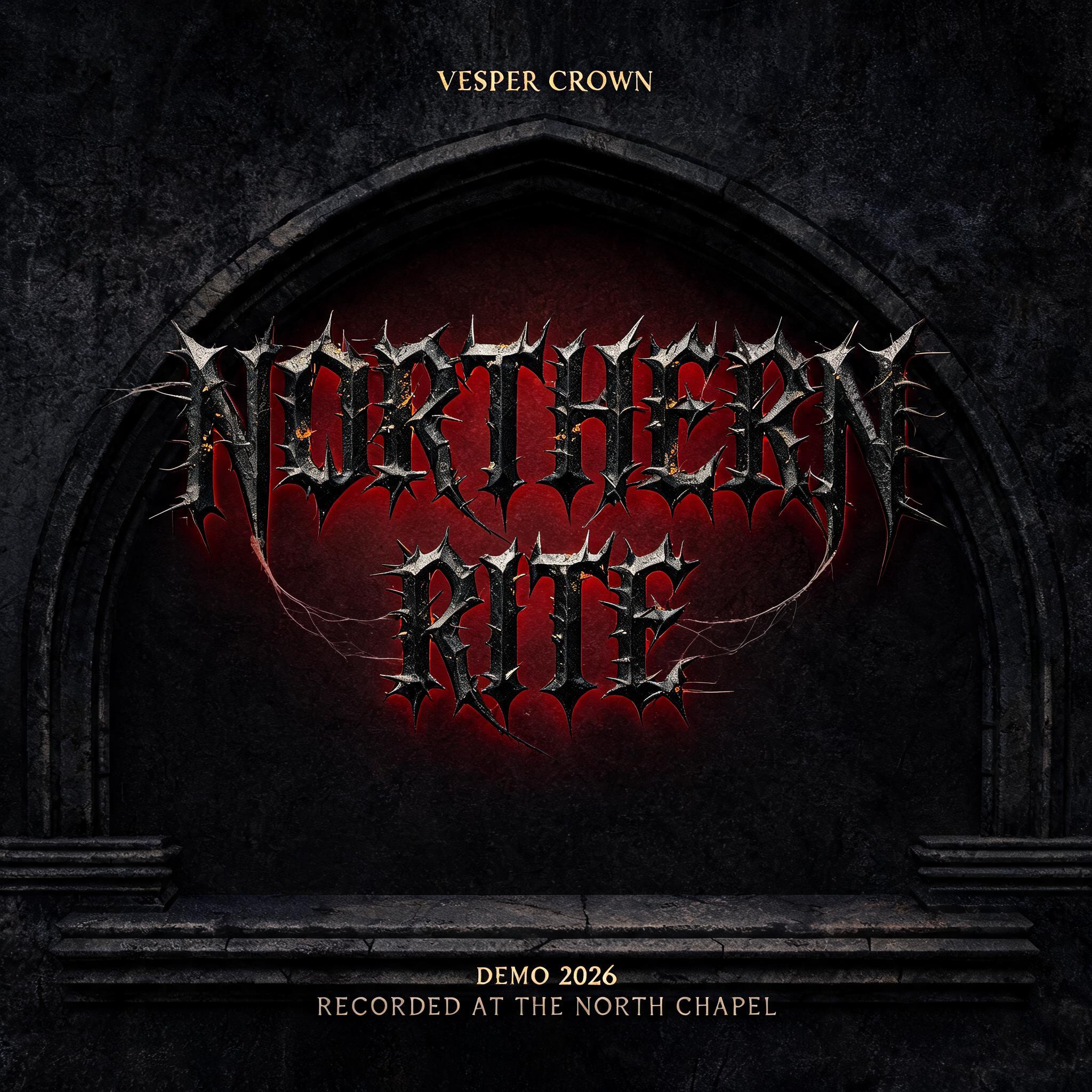
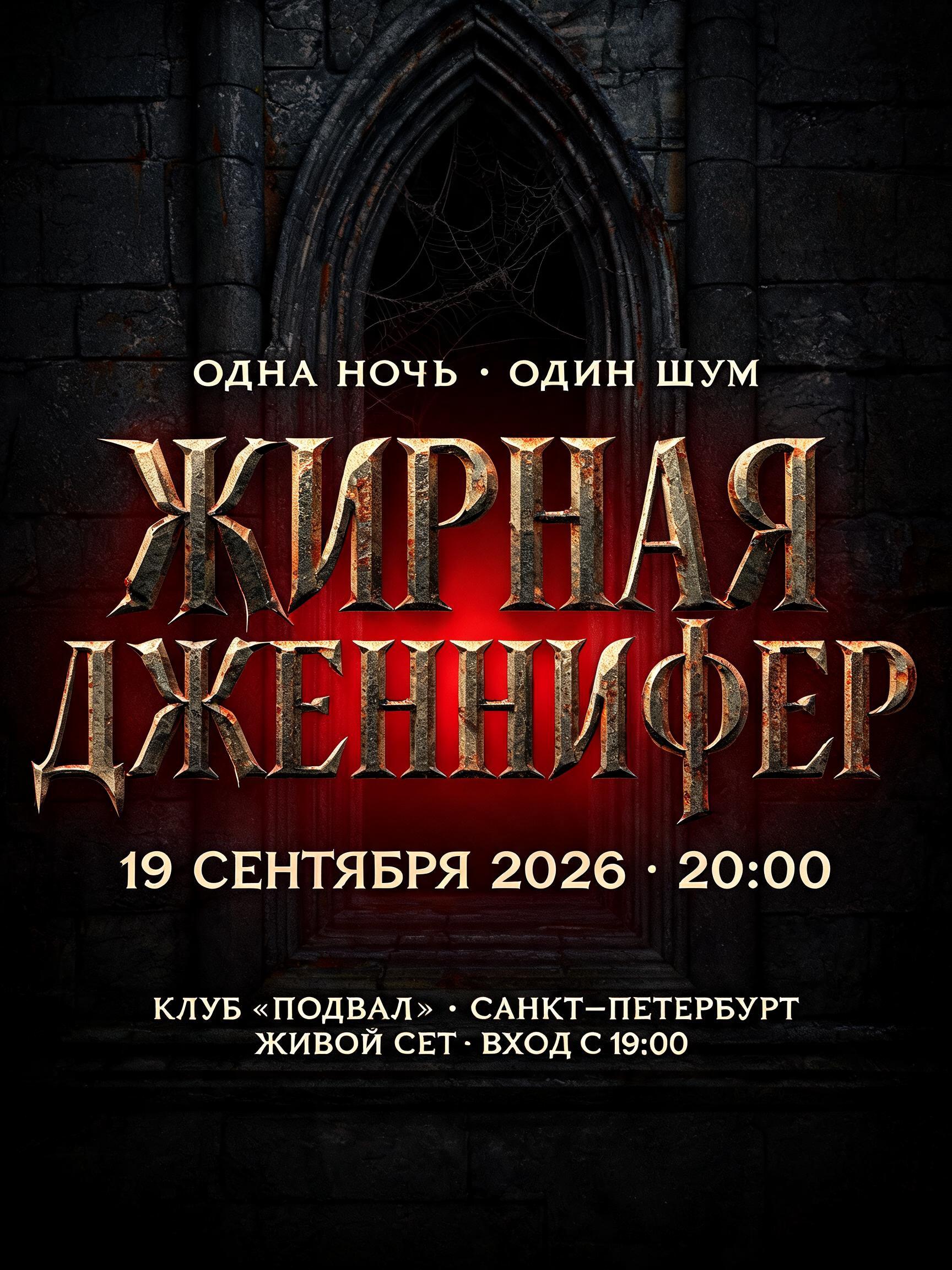
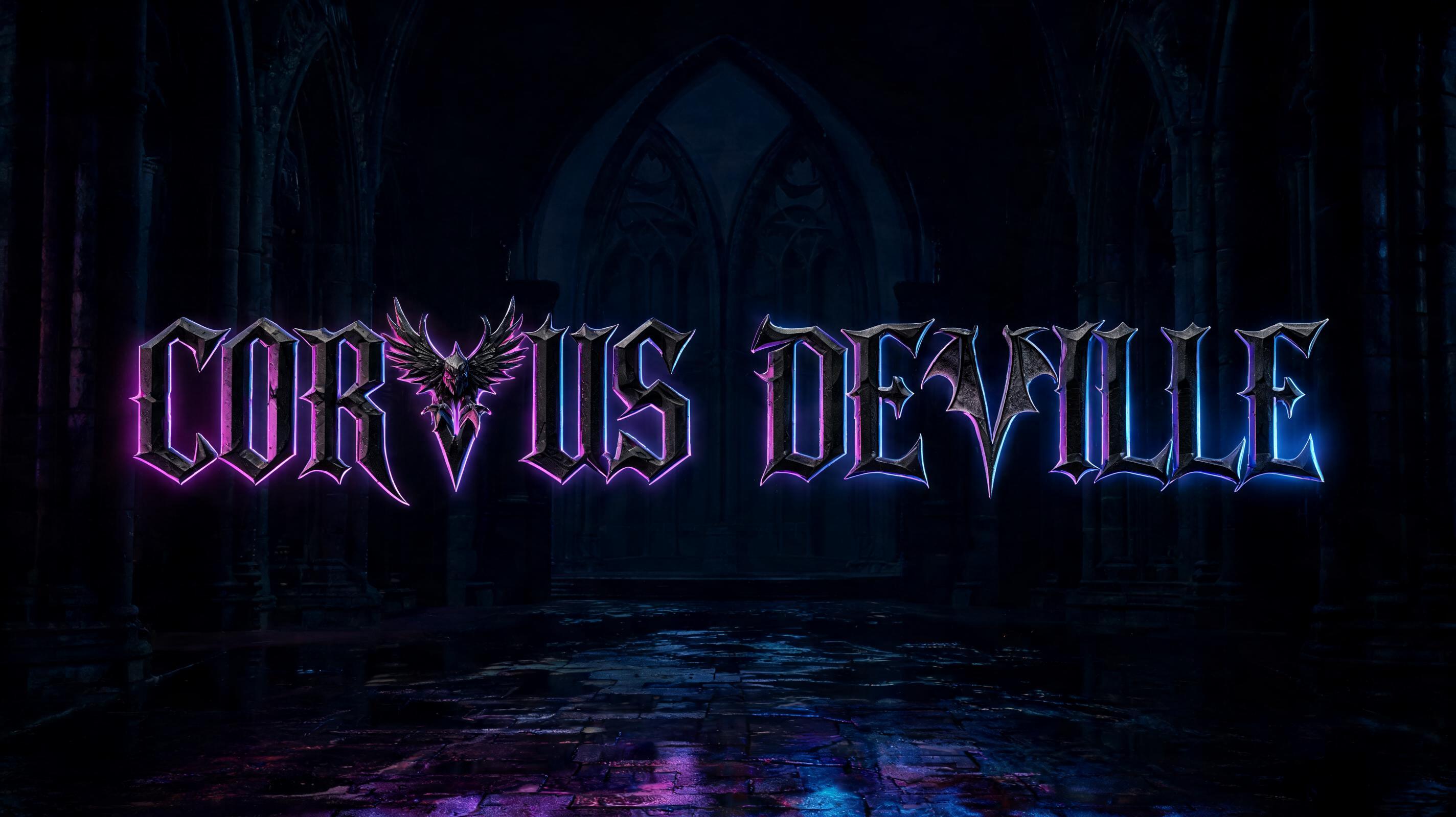


“Immolation”是使用 FontVibe AI 创作的哥特字体文字效果。严谨的 Textura 哥特黑体:窄长的折笔、菱形笔端和强烈粗细对比,黑墨带金色描边,写在深色旧羊皮纸上。
A black metal band logotype that reads exactly "Immolation", a single word on one line, centred in a wide banner. The letters are tall, condensed and ultra-bold, in deep ink black with a faint warm sheen. Every stroke ends in a needle-sharp point. The edges are jagged, as if corroded or torn, and thin spikes grow from the joints and from the tops and bottoms of the letters. The thick-thin contrast is violent, and the strokes are slightly tangled so the logo reads as a dark organic emblem. It stays legible. The first letter "I" carries a signature ornament: from its top and base grow long, curved, branching thorn-horns that sweep out to the left, with a hooked spike that curls downward like a flame-licked claw. The final letter "n" carries exactly the same ornament, geometrically mirrored horizontally so that its horns sweep to the right and curl inward, towards the word. The two ornaments are identical in shape, weight and detail and form a symmetrical frame, like a pair of claws or flames closing around the name. The middle letters m, o, l, a, t, i, o stay compact, with smaller spikes, and their baseline and height are even. Fine gold-ink highlights run along the tips of the spikes and horns and along the first and last letters only. The rest of the word is pure matte black. Behind the word there is a faint crimson ember glow, which gives the letters a dark halo. The background is dark charcoal parchment with a subtle grain, with no fog, cobwebs, rust, flames or extra objects. The only text in the image is the word. Centred composition, with the word filling about 85% of the width and generous empty space above and below. A sharp, high-contrast finished logo.
用途: 黑金属哥特
生成于 2026年11月1日 · 1824 × 1024 · JPEG · OpenAI GPT-Image-2.5 Sunburst · 版式:超大 · 公开作品 · 可免费商用(CC BY 4.0)


