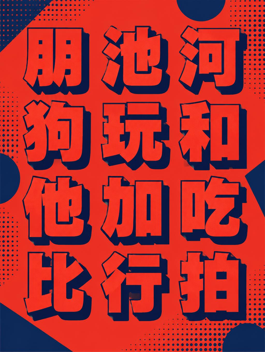
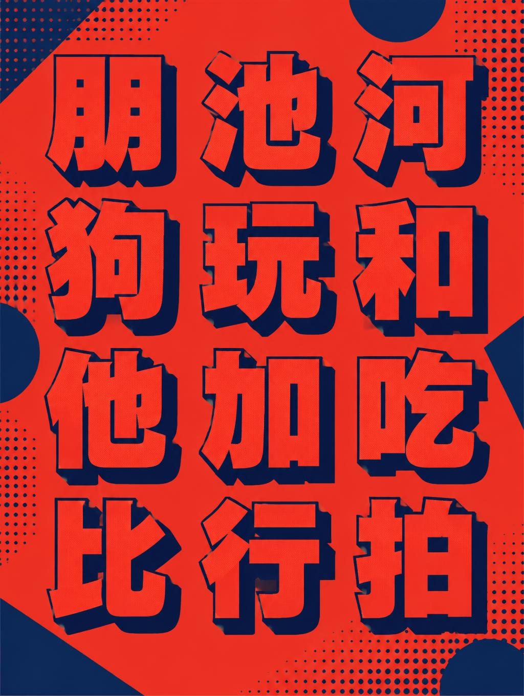
朋,池,河,狗,玩,和,他,加,吃,比,行,拍, - Duotone Text Effect


Nutzt OpenAI GPT-Image-2.5 Sunburst, das Modell dieses Werks · 15 Credits

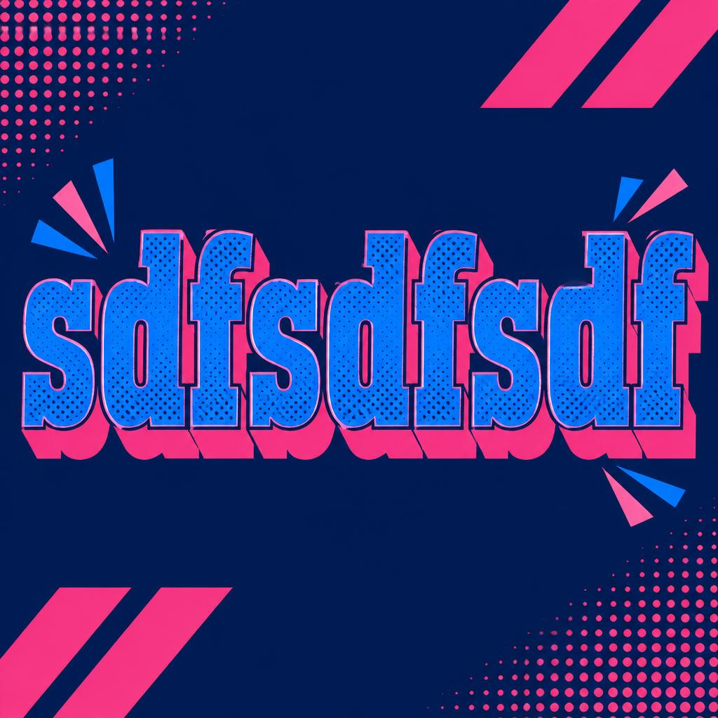
„朋,池,河,狗,玩,和,他,加,吃,比,行,拍,“ ist ein Duotone-Texteffekt, erstellt mit FontVibe KI. Kräftige, schmale Slab-Versalien in einer leuchtenden Farbe mit Rasterpunkt-Textur und einem versetzten Vollschatten in einer zweiten Farbe, auf einem flachen Kontrastgrund.
a bold duotone piece — graphic, punchy and print-like. SURFACE / STYLE: the lettering is rendered in a striking two-color treatment — one bright color dominating the letter face, a second deep contrasting color filling the drop shadow, bevel inset or offset layer — with a visible halftone screen-dot pattern in the dominant color and a crisp hard-edged graphic finish. SCENE ATMOSPHERE: a flat bold poster setting — clean two-tone ground, simple geometric or halftone accents, high-contrast graphic energy. PALETTE: any high-contrast two-color pair — vermillion red + midnight navy, electric blue + hot pink, black + bright accent — flat, saturated and bold, never gradient-soft or muddy. LETTERFORM PRIORITY: when the chosen font carries its own treatment (retro or Clarendon slab, condensed or geo sans, halftone comic, 3D shadow, sticker outline), that font's letterform takes priority and owns the letters; this style governs the two-color split, the halftone dots and the graphic poster finish. FALLBACK MATERIAL: if the font carries no material of its own, render the letters in a bold duotone — bright face with a deep contrasting offset shadow and a halftone dot pattern — so the punchy two-color graphic always reads. Create a finished, bold Chinese-character duotone poster, with all twelve supplied characters rendered exactly once and no additional text: 朋,池,河,狗,玩,和,他,加,吃,比,行,拍. Arrange them in a precise three-column by four-row grid, read left to right and top to bottom, with generous even spacing and clear separation so every character remains legible. Make the grid large and central, occupying most of the canvas, with a strong, balanced visual rhythm. Use a flat vermillion-red field against midnight-navy geometric panels, keeping the palette strictly limited to these two saturated inks. Give each character a bright vermillion face, a crisp navy offset shadow, and visible halftone screen dots that remain clear without obscuring the strokes. Add a few restrained navy circles, angular blocks, and halftone patches in the surrounding negative space to create lively print-poster energy without competing with the text. Keep edges hard, colors flat, and contrast high; no gradients, extra symbols, borders, or decorative lettering. The result should feel like a carefully composed, contemporary two-color screen-print poster.
Generiert am 9. November 2026 · 1024 × 1360 · JPEG · OpenAI GPT-Image-2.5 Sunburst · Von der erstellenden Person geteilt · Kostenlos kommerziell nutzbar (CC BY 4.0)



