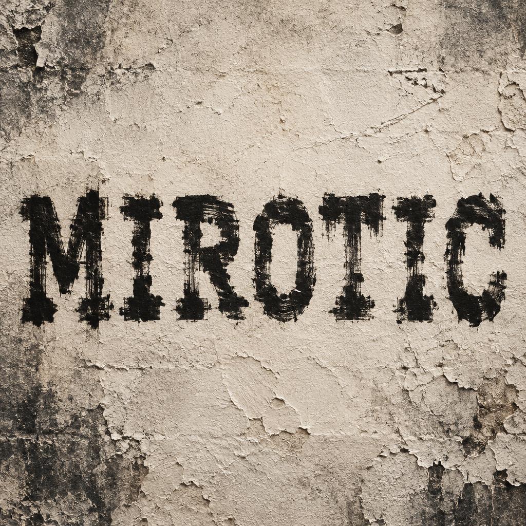
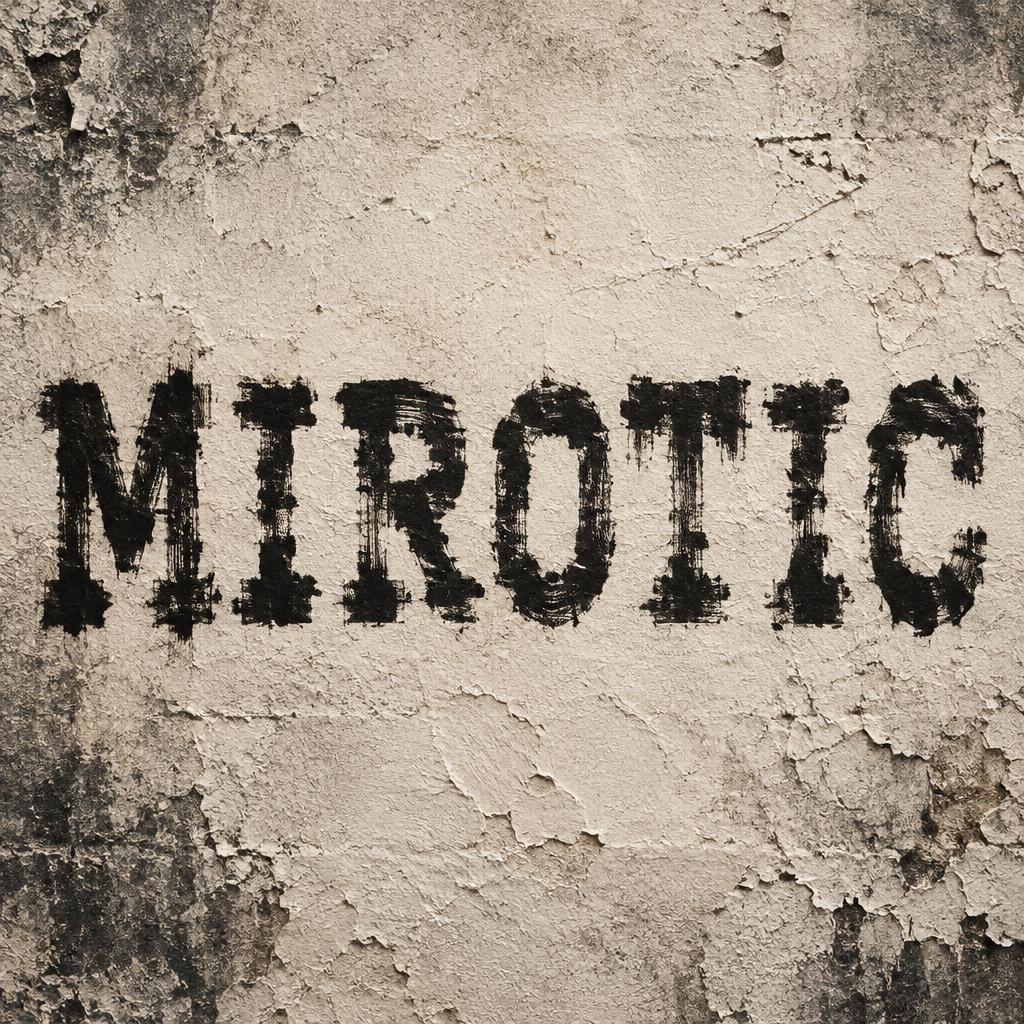
MIROTIC - Trockenpinsel Text Effect


Nutzt OpenAI GPT-Image-2.5 Sunburst, das Modell dieses Werks · 15 Credits
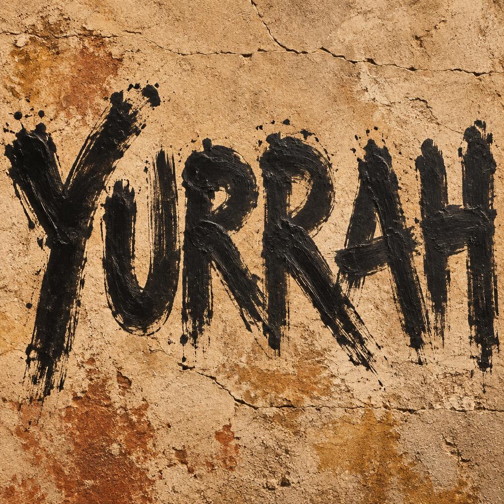
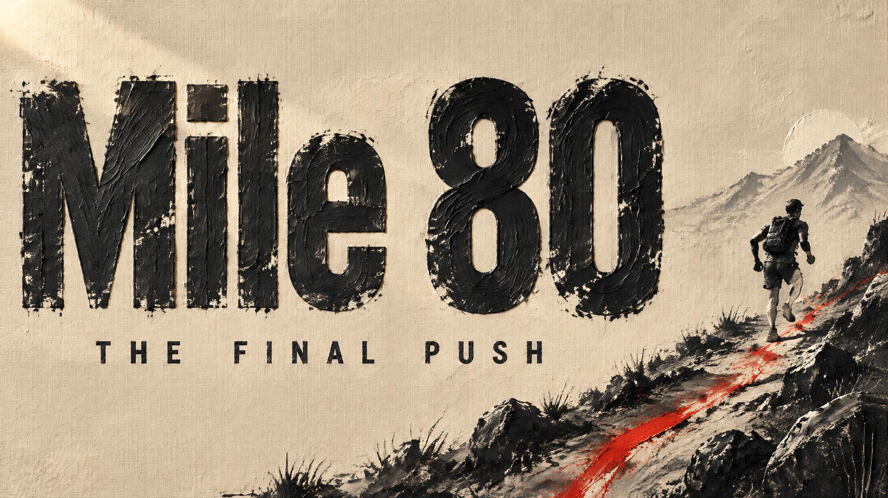
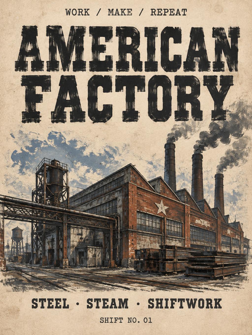
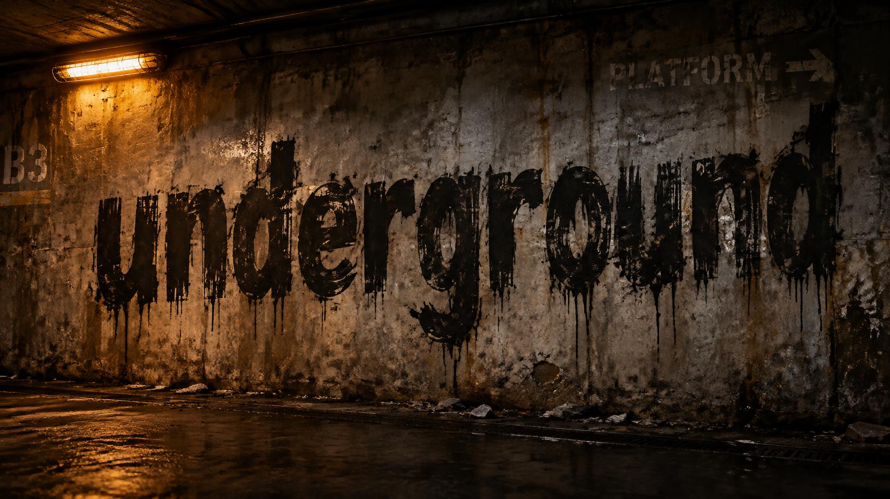
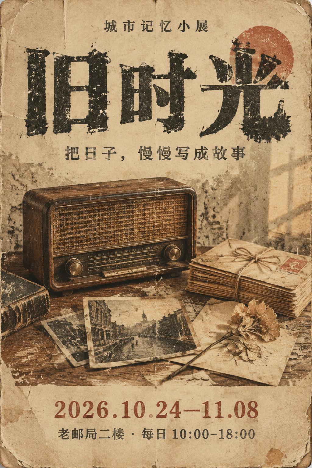

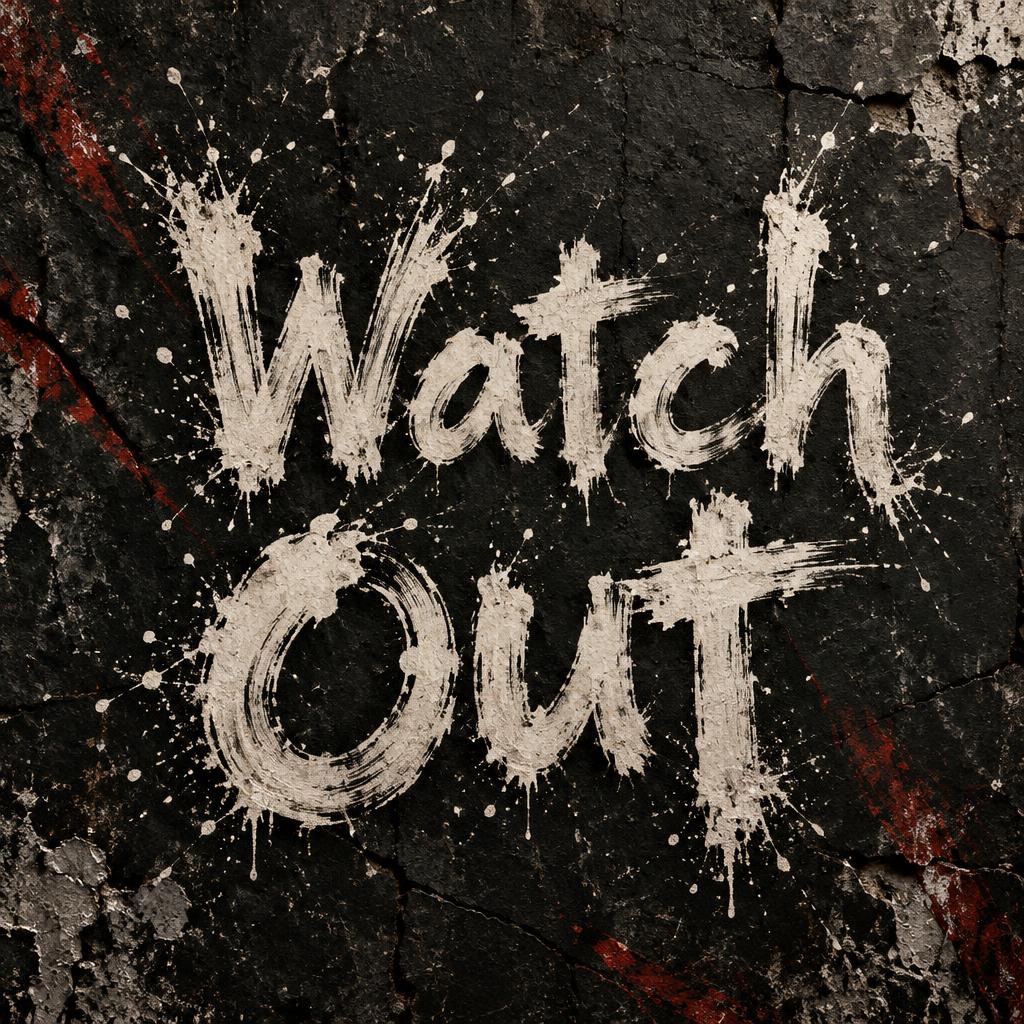
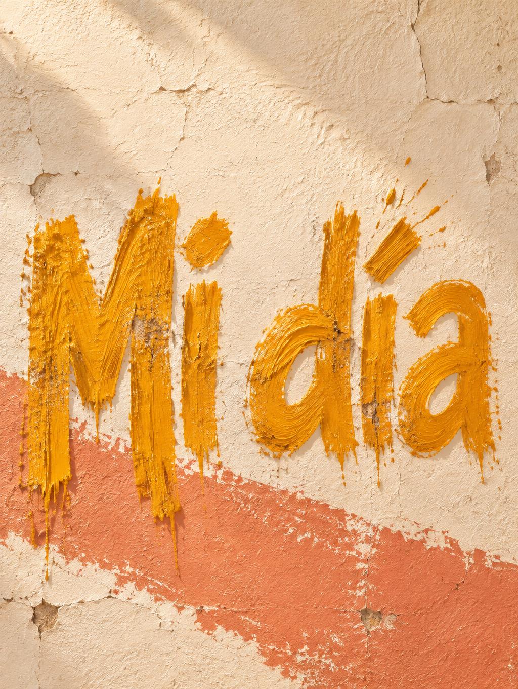
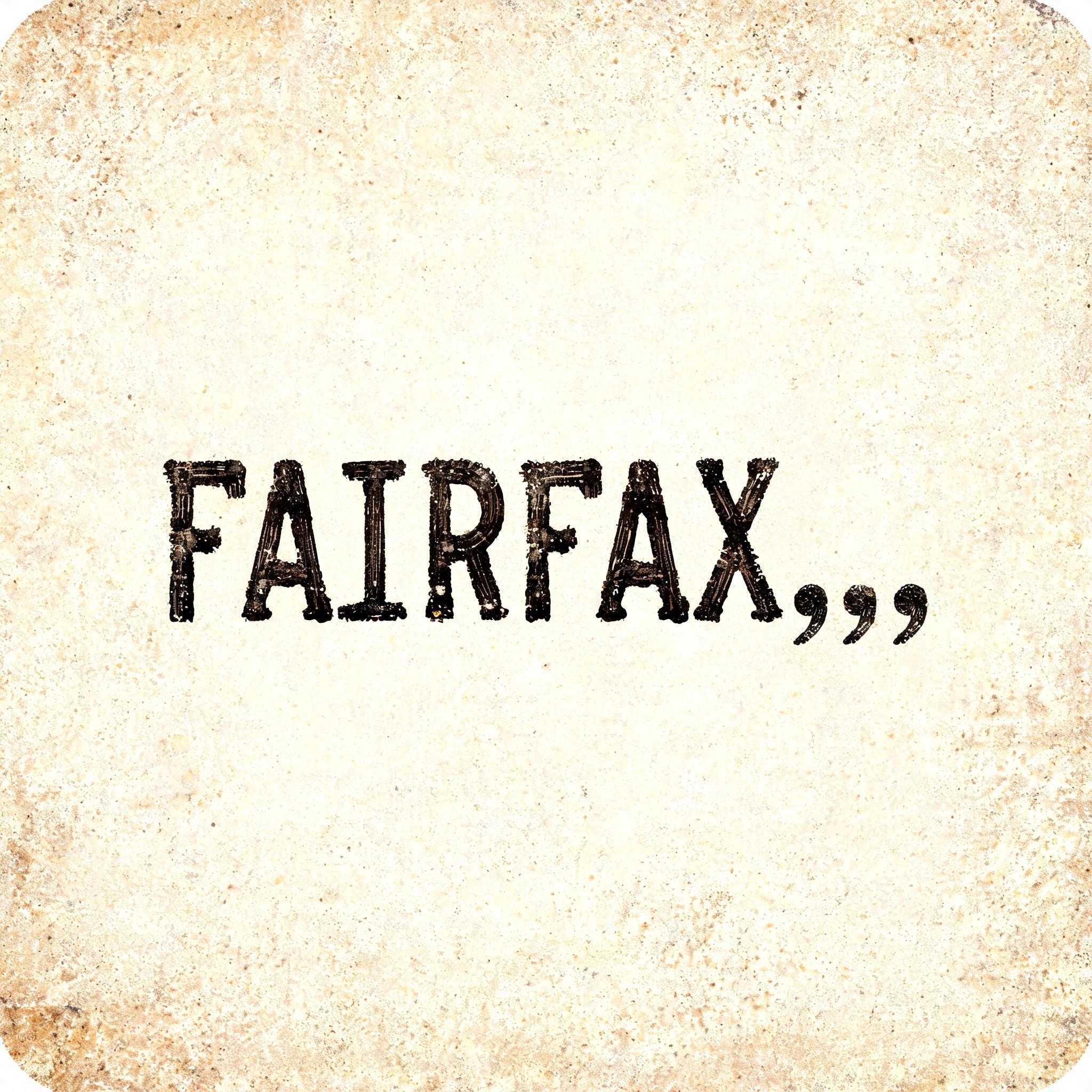
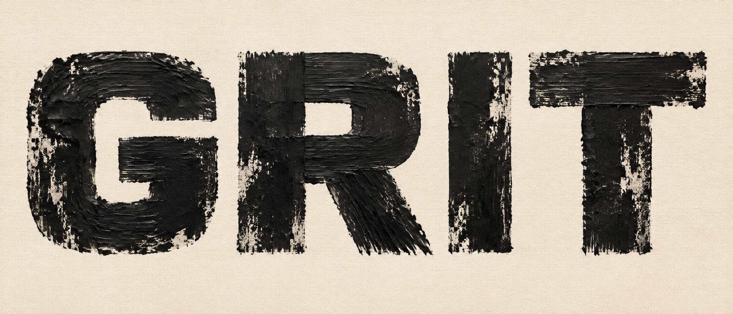
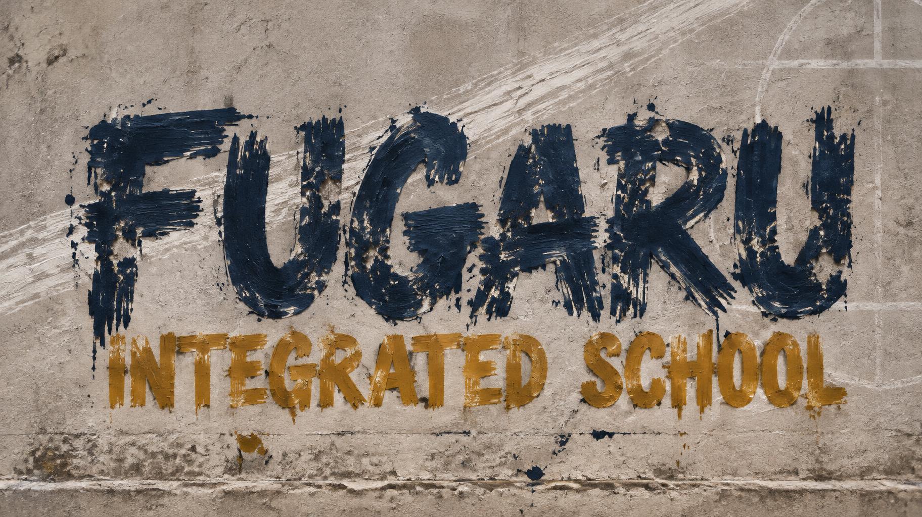
„MIROTIC“ ist ein Trockenpinsel-Texteffekt, erstellt mit FontVibe KI. Rohe Pinsel Schrift im Trockenpinsel-Look mit kräftiger Textur, gespreizten Borsten und unregelmäßiger Körnung. Farbgeladene Striche, raue, ramponierte Kanten und echte handgemalte Energie. Perfekt für Streetwear, Musik-Branding, Sport, Verpackung und jedes Projekt, das rohe, greifbare Wucht braucht.
rendered in dry brush paint style. Bold letterforms created with a heavily loaded paint brush — thick impasto strokes with visible bristle spread across each letterform surface. Raw gritty texture throughout: individual bristle lines visible, rough torn edges where paint runs thin, paint buildup at stroke centers. Distressed grain and organic imperfection in every mark. High-contrast raw paint energy. LETTERFORM PRIORITY: when the chosen font carries its own treatment, that font's letterform shapes take priority and own the letters; this style governs the dry-brush paint medium, the bristle texture and the raw gritty grain. FALLBACK MATERIAL: if the font carries no material of its own, render the letters as thick impasto dry-brush strokes with visible bristle spread, rough torn thin edges and paint buildup at stroke centers. COLOR PRIORITY: keep the font's own colors if specified; otherwise a single bold raw off-black paint. Create a finished, square album-cover image built around the exact word “MIROTIC,” set large across the center in one commanding line. Keep every letter fully legible and preserve the spelling exactly. Let the word occupy most of the canvas width, with tight, deliberate spacing and a small margin of breathing room around it. Render the lettering as bold off-black dry-brush paint, thickly laid onto a pale, weathered plaster wall. Make the paint visibly tactile: individual bristle tracks rake through the strokes, dark paint builds up at their centers, and the edges break into rough, torn strands. Allow a few thin passages to skip, exposing the chalky surface beneath, while keeping the word unmistakable at a glance. Add restrained, irregular charcoal smudges and faint scraped marks behind the lettering, clustered near the edges rather than competing with it. Use a stark palette of warm bone, soot black, and muted gray, with directional light grazing the wall to reveal its gritty relief and cast shallow shadows from raised paint. Keep the composition graphic, raw, and deliberate, with no other text, symbols, or decorative objects.
Gemacht für Distressed-Schriftgenerator
Generiert am 12. November 2026 · 1024 × 1024 · JPEG · OpenAI GPT-Image-2.5 Sunburst · Von der erstellenden Person geteilt · Kostenlos kommerziell nutzbar (CC BY 4.0)



