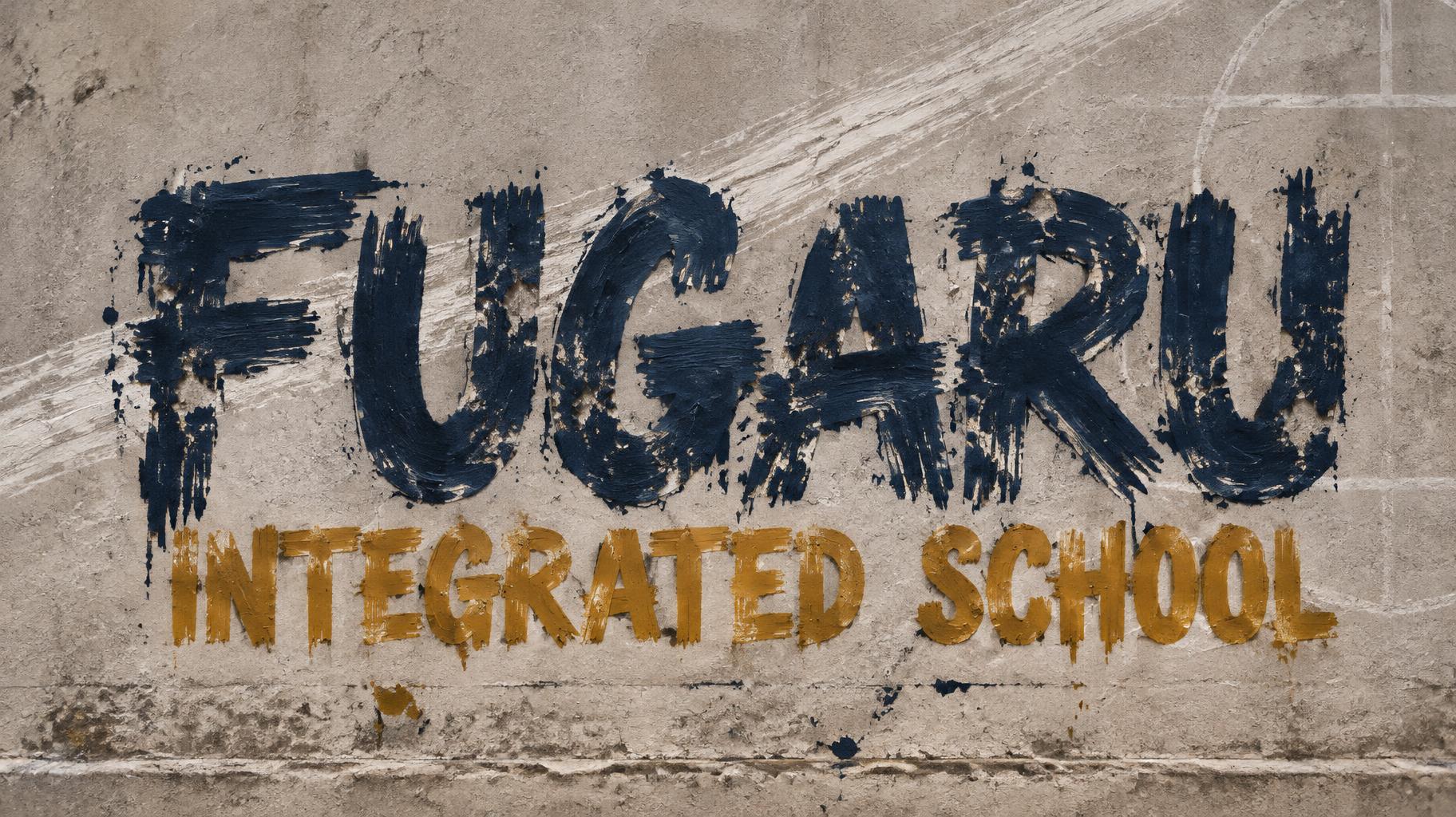
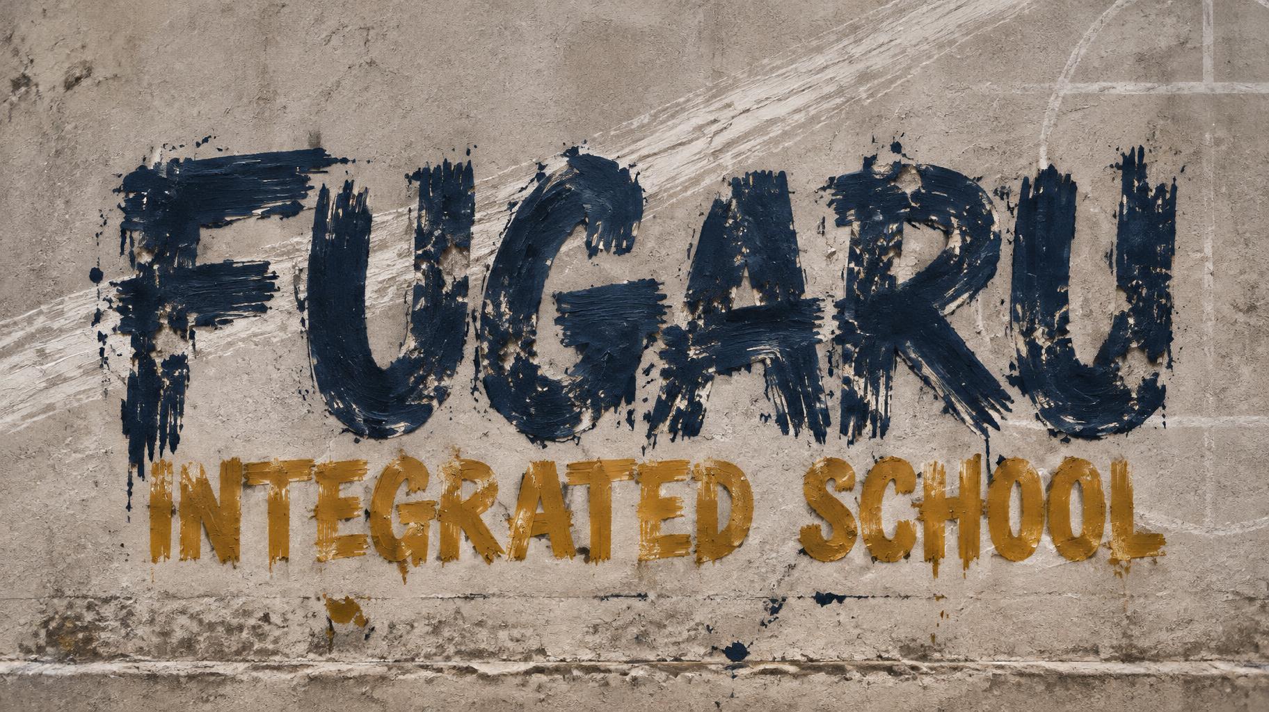
FUGARU INTEGRATED SCHOOL - Trockenpinsel Text Effect


Nutzt OpenAI GPT-Image-2.5 Sunburst, das Modell dieses Werks · 15 Credits
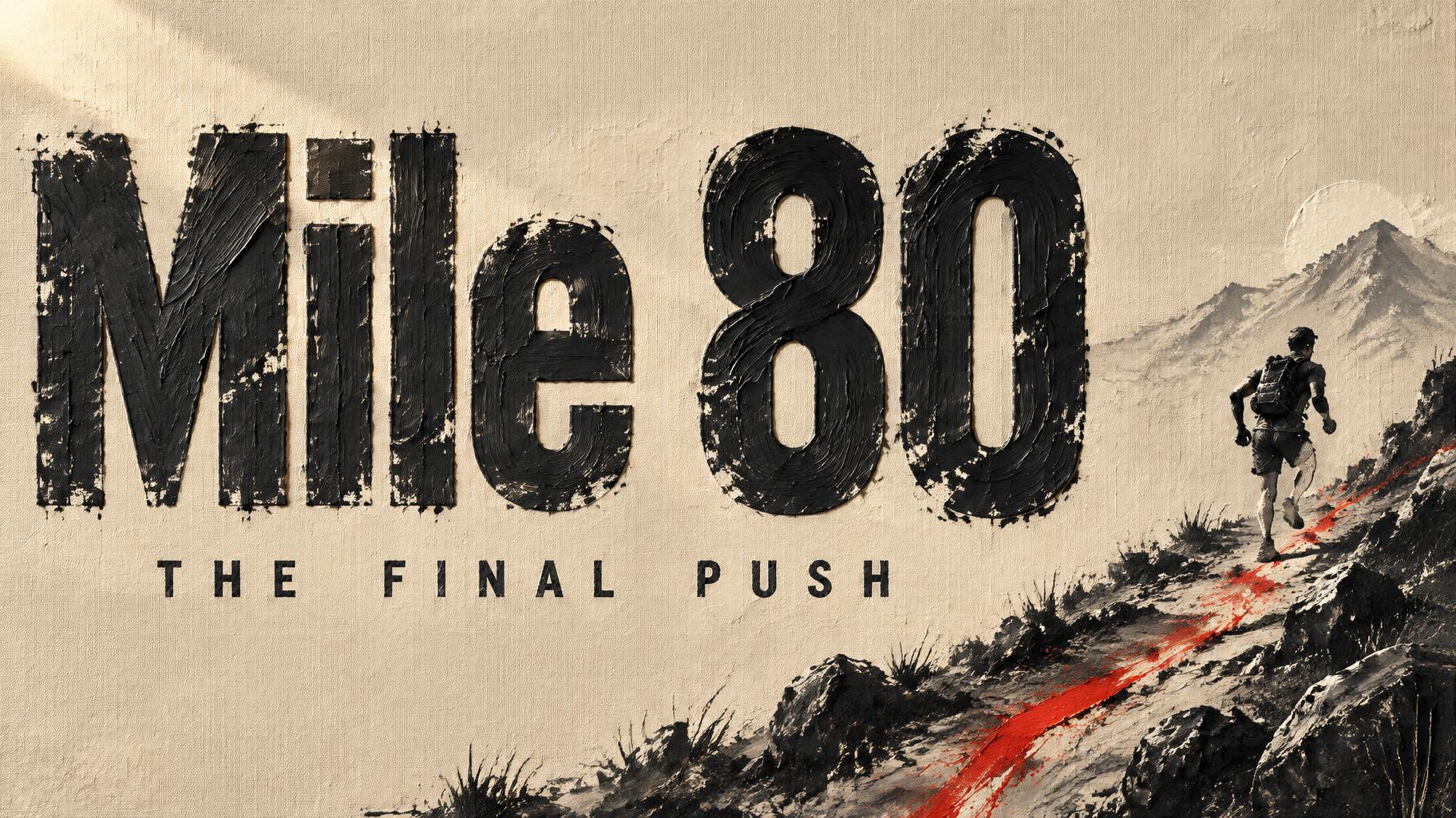
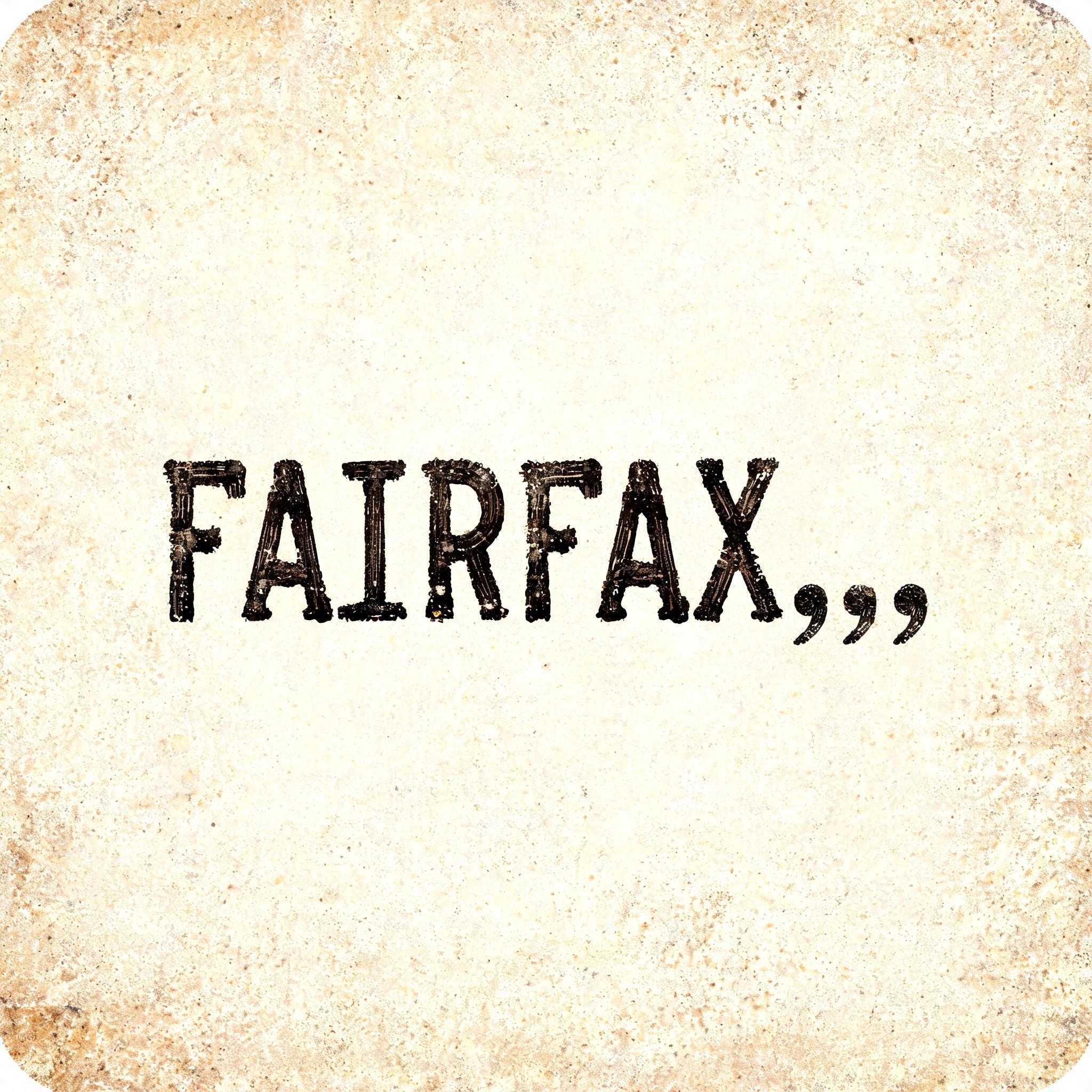
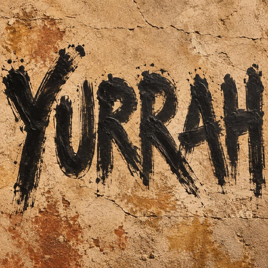
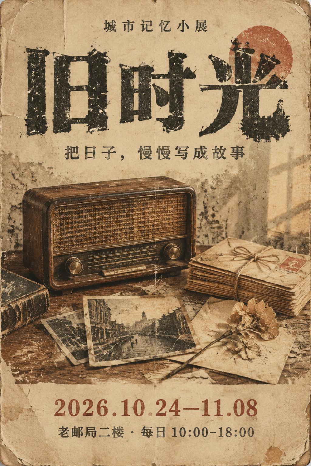
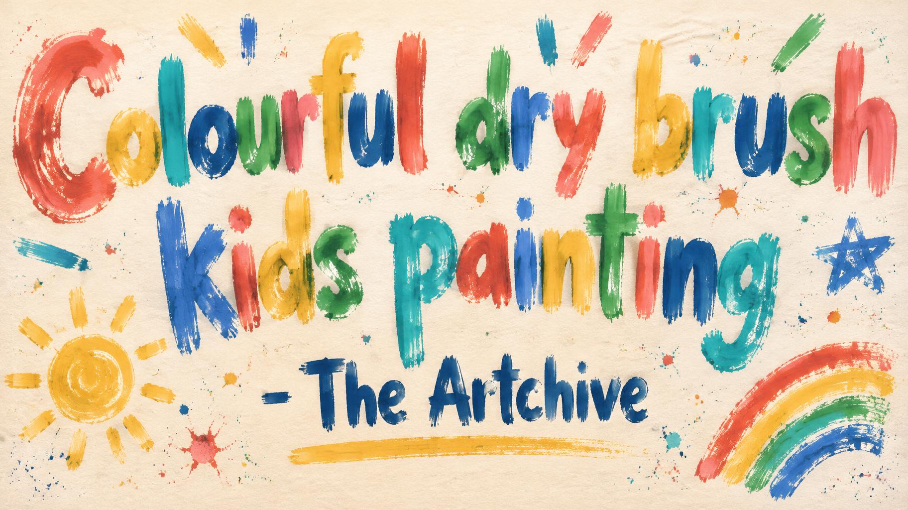
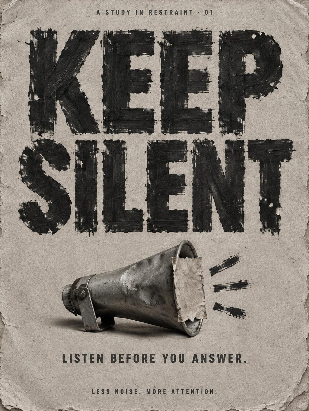

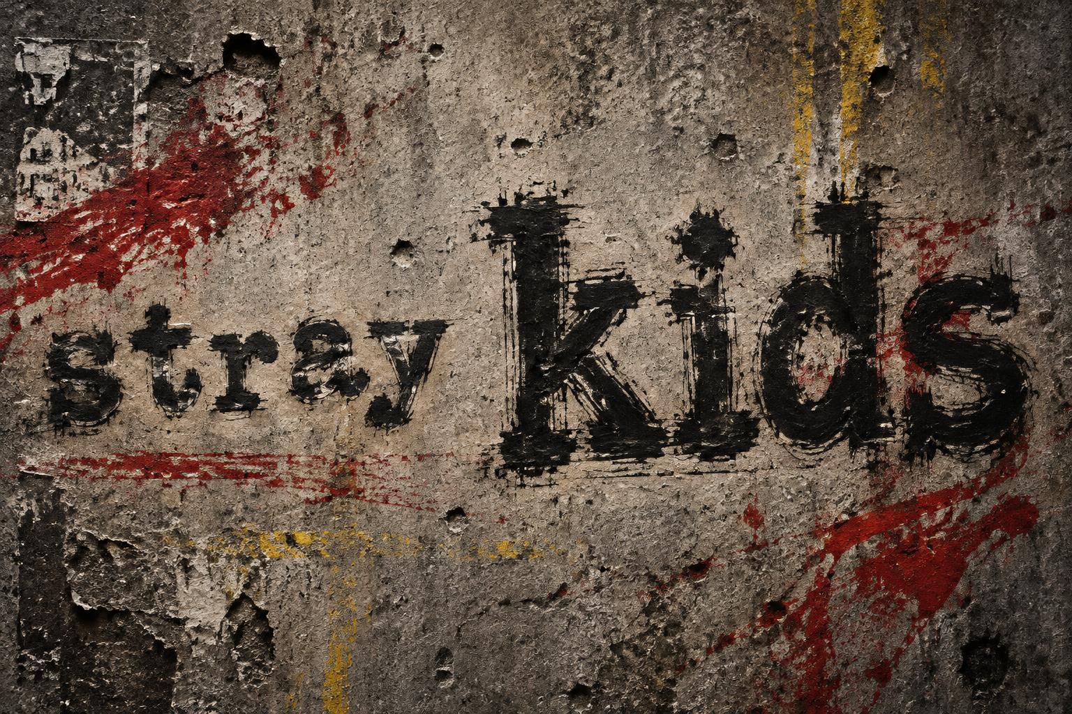
„FUGARU INTEGRATED SCHOOL“ ist ein Trockenpinsel-Texteffekt, erstellt mit FontVibe KI. Rohe Pinsel Schrift im Trockenpinsel-Look mit kräftiger Textur, gespreizten Borsten und unregelmäßiger Körnung. Farbgeladene Striche, raue, ramponierte Kanten und echte handgemalte Energie. Perfekt für Streetwear, Musik-Branding, Sport, Verpackung und jedes Projekt, das rohe, greifbare Wucht braucht.
rendered in dry brush paint style. Bold letterforms created with a heavily loaded paint brush — thick impasto strokes with visible bristle spread across each letterform surface. Raw gritty texture throughout: individual bristle lines visible, rough torn edges where paint runs thin, paint buildup at stroke centers. Distressed grain and organic imperfection in every mark. High-contrast raw paint energy. LETTERFORM PRIORITY: when the chosen font carries its own treatment, that font's letterform shapes take priority and own the letters; this style governs the dry-brush paint medium, the bristle texture and the raw gritty grain. FALLBACK MATERIAL: if the font carries no material of its own, render the letters as thick impasto dry-brush strokes with visible bristle spread, rough torn thin edges and paint buildup at stroke centers. COLOR PRIORITY: keep the font's own colors if specified; otherwise a single bold raw off-black paint. Wide academic identity composition on a weathered warm-gray concrete wall, with faint chalk dust, hairline scratches, and subtle faded schoolyard geometry behind the lettering. “FUGARU” dominates the upper half in dense deep-navy dry-brush paint; “INTEGRATED SCHOOL” sits beneath in a smaller but clearly legible two-line hierarchy, painted in sunlit ochre. Every letter is built from heavily loaded, uneven brush passes: thick impasto buildup through the stroke centers, separated bristle tracks, ragged dry edges, broken paint skips, and small areas of raw wall showing through. The navy paint has charcoal-black variation in its densest areas, while the ochre carries dusty golden highlights along rough upper edges. A restrained diagonal swath of pale chalk-white dry brush crosses behind the title without obscuring it, suggesting forward motion and shared energy. Keep generous negative space around the compact text block. Ground the composition with a few scattered paint flecks and imperfect brush drag marks below, but avoid decorative icons. Tactile, spirited, resilient school-pride atmosphere; raw handmade paint rather than polished signage.
Generiert am 22. Oktober 2026 · 1824 × 1024 · JPEG · OpenAI GPT-Image-2.5 Sunburst · Von der erstellenden Person geteilt · Kostenlos kommerziell nutzbar (CC BY 4.0)


