

Alma & JP - Comic Text Effect


Nutzt BytePlus Seedream 5.0, das Modell dieses Werks · 15 Credits
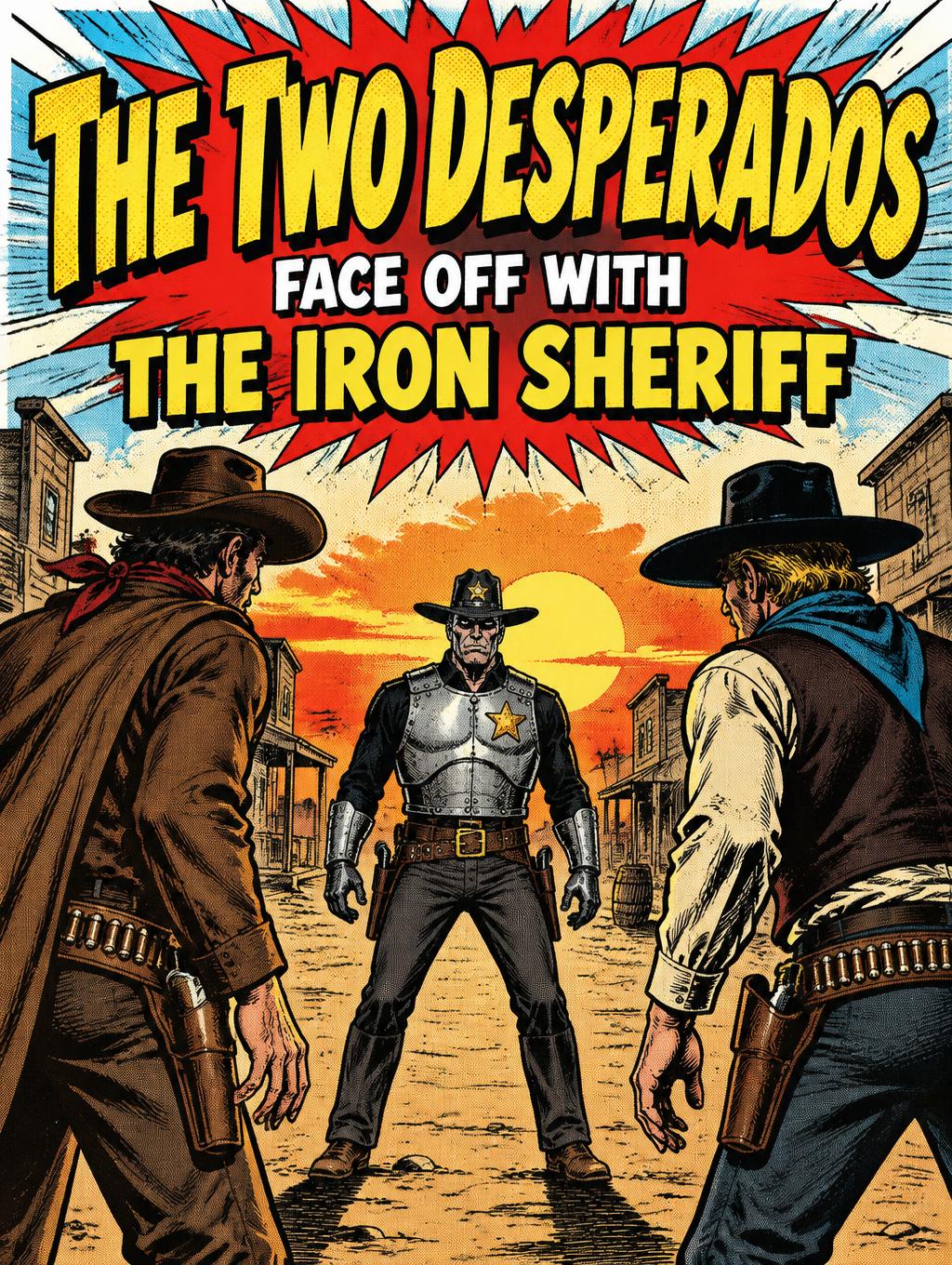
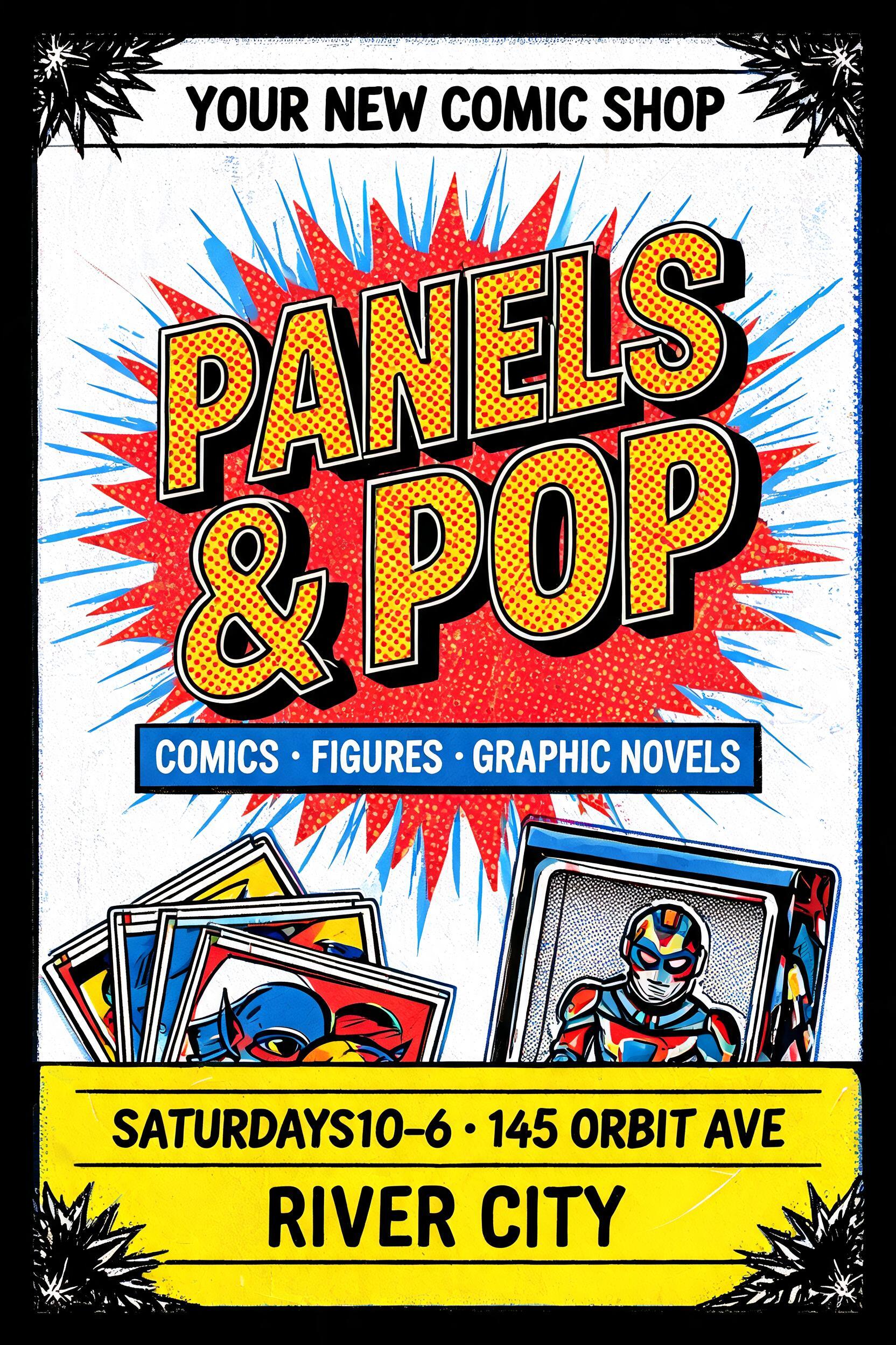
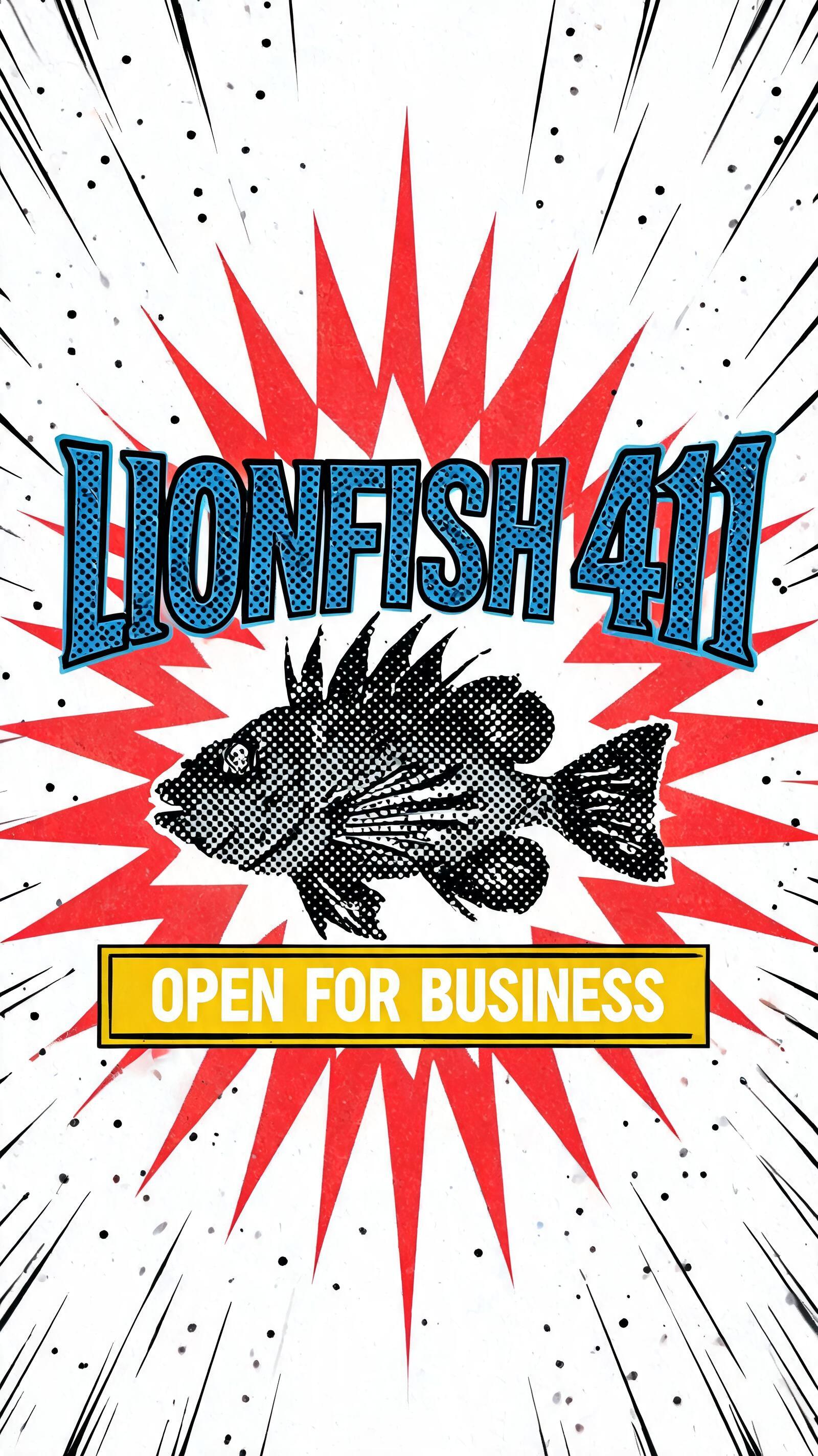


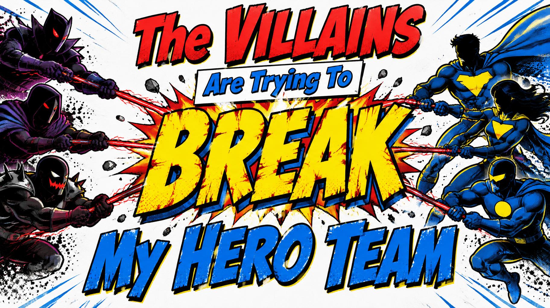


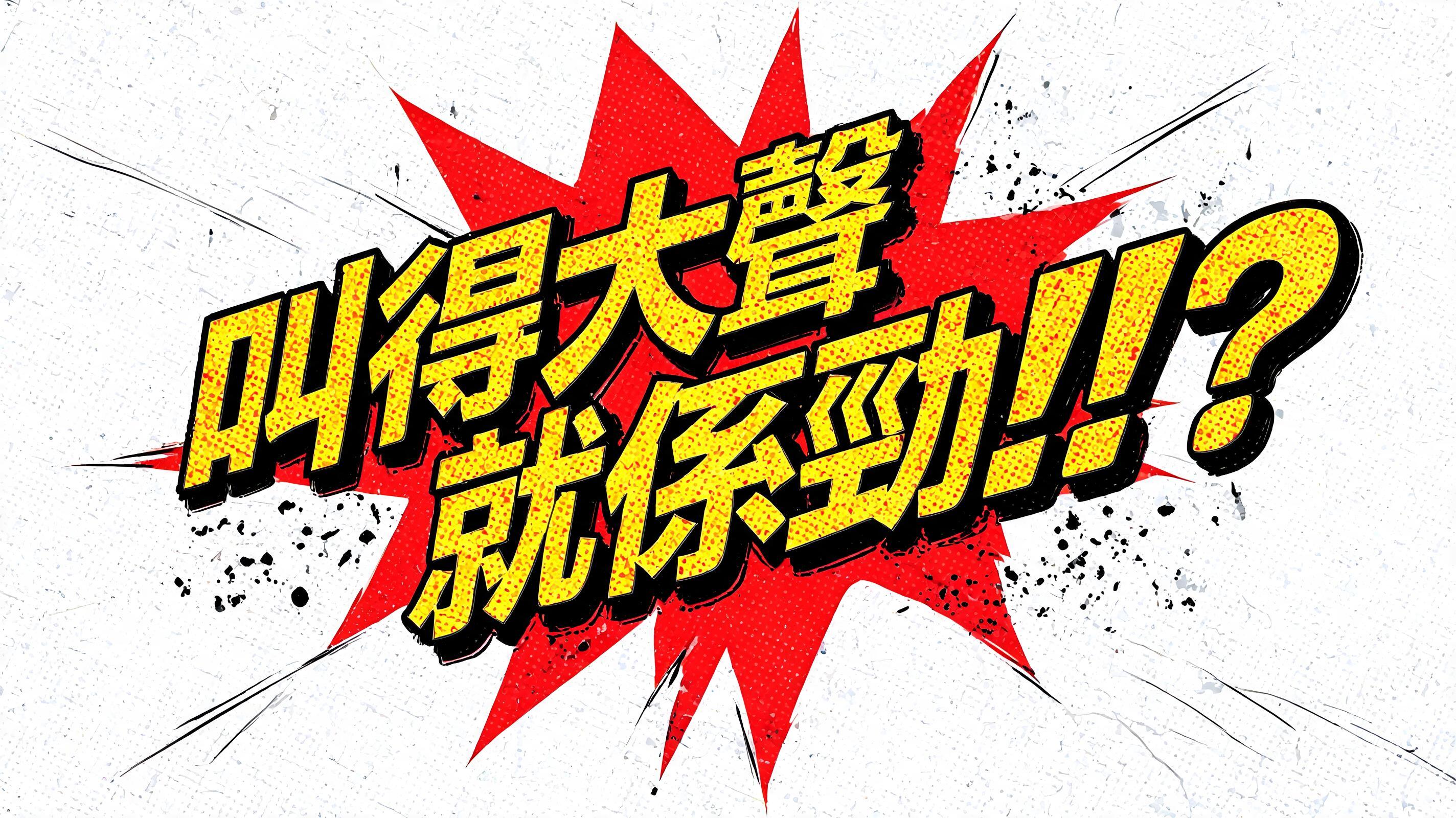


„Alma & JP“ ist ein Comic-Texteffekt, erstellt mit FontVibe KI. Kräftige Comic-Action-Typografie mit Halbtonpunkten, Speed-Lines, Pow-/Bam-Explosionseffekten und klassischem Superhelden-Lettering. Diese Comic Schrift bringt jede Botschaft mit voller Wucht auf die Seite.
Bold black ink outline tracing every letterform edge — a clean, hard border between 2 and 6 pixels thick, ensuring every letter reads as a distinct graphic element against any background. Ben-Day halftone dot screen underlying all color areas: regular circular ink dots on white paper substrate, creating the characteristic optically-mixed color of classic four-color printing. Color palette operating at maximum primary contrast: action yellow, impact red, force blue, knockout white — the exact pigments of Silver Age comic printing, saturated to their loudest value. Ink energy in the environment: diagonal speed lines radiating from behind letterforms, faint Kirby Krackle energy dots scattered in the shadows, halftone dots diffusing into white at the edges of color areas. The letters exist as graphic symbols pressed onto the page — flat, bold, and a pure statement of graphic force. When no specific material is defined by the font: default environment — action yellow fill on each letterform, thick black outline border, Ben-Day halftone dot pattern overlay at 40% across color areas, white knockout background with speed-line radiating marks. {"scene":"Comic book t-shirt graphic — square format. 'Alma & JP' in varsity block collegiate-comic letterforms filling 70% of 1:1 frame. Letters: royal blue fill with thick white inner double-outline border, outer black edge. Below main text: no secondary text line. Background: clean white/light grey — optimized for shirt printing. Bold, wearable, statement energy. Square 1:1."} Wait, I need to reconsider — the template has a secondary line 'SINCE 2024'. The new text is 'Alma & JP' which is similar in length to 'LEGEND', so the main text layout stays the same. But there's no instruction to remove the secondary line — I should keep the structure. Let me re-examine: the user only gave "Alma & JP" as the new text, which replaces 'LEGEND'. The 'SINCE 2024' is a separate text element. Since the user didn't provide a replacement for it, I should keep it as-is. {"scene":"Comic book t-shirt graphic — square format. 'Alma & JP' in varsity block collegiate-comic letterforms filling 70% of 1:1 frame. Letters: royal blue fill with thick white inner double-outline border, outer black edge. Below main text: 'SINCE 2024' in smaller varsity caps at 25% scale, same blue color scheme. Background: clean white/light grey — optimized for shirt printing. Bold, wearable, statement energy. Square 1:1."}.
Gemacht für Comic-T-Shirt-Design
Generiert am 22. Juni 2026 · 2048 × 2048 · JPEG · BytePlus Seedream 5.0 · Von der erstellenden Person geteilt · Kostenlos kommerziell nutzbar (CC BY 4.0)


