

RUBY - Japanische Tuschepinsel-Schrift Text Effect


Nutzt ByteDance Seedream 5.0, das Modell dieses Werks · 15 Credits
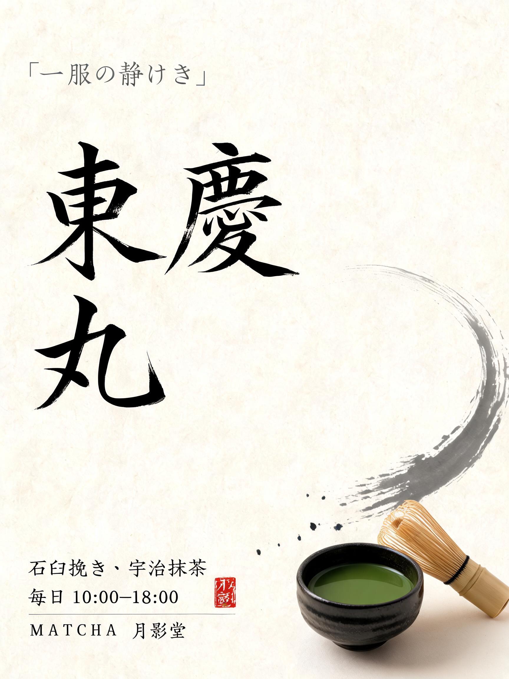
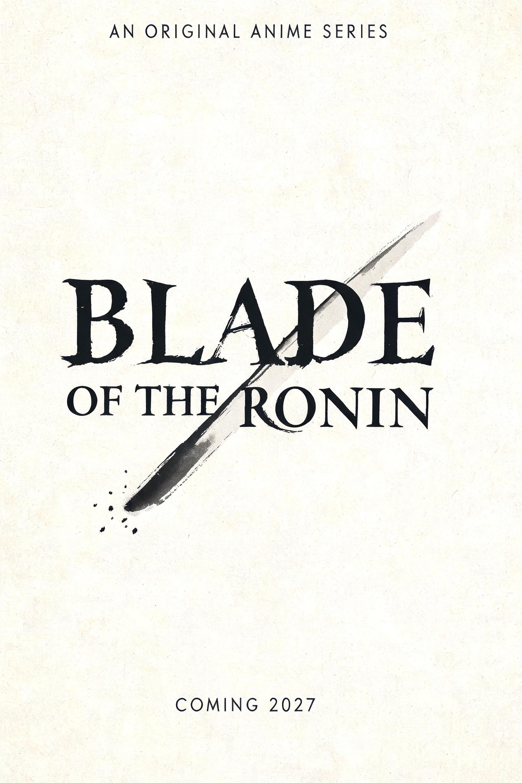


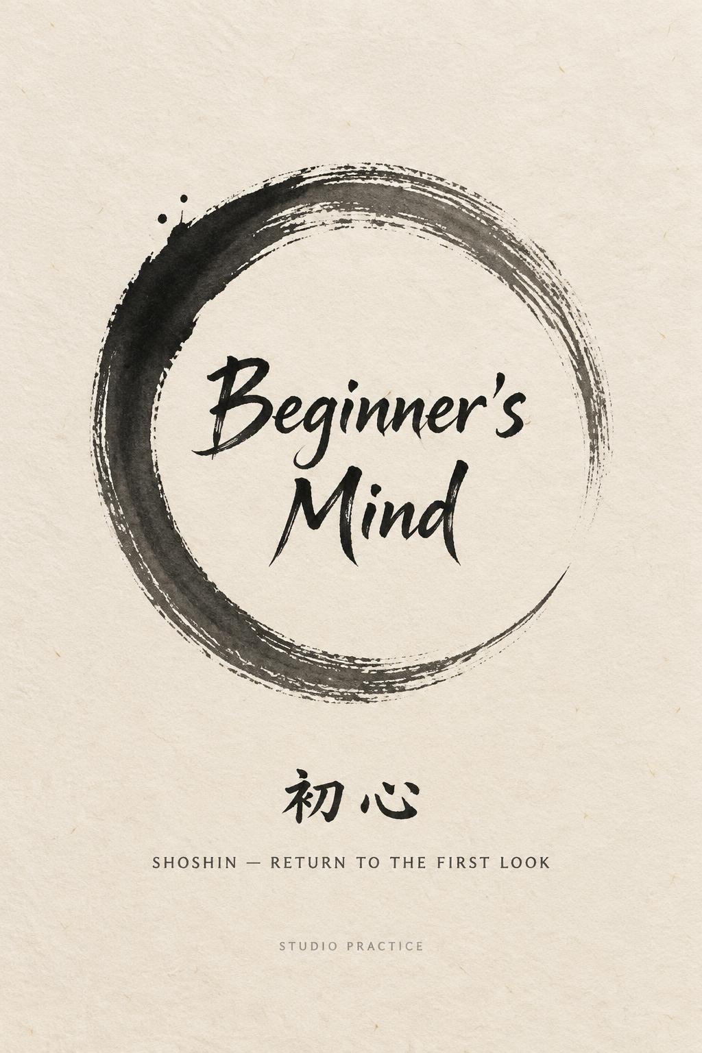
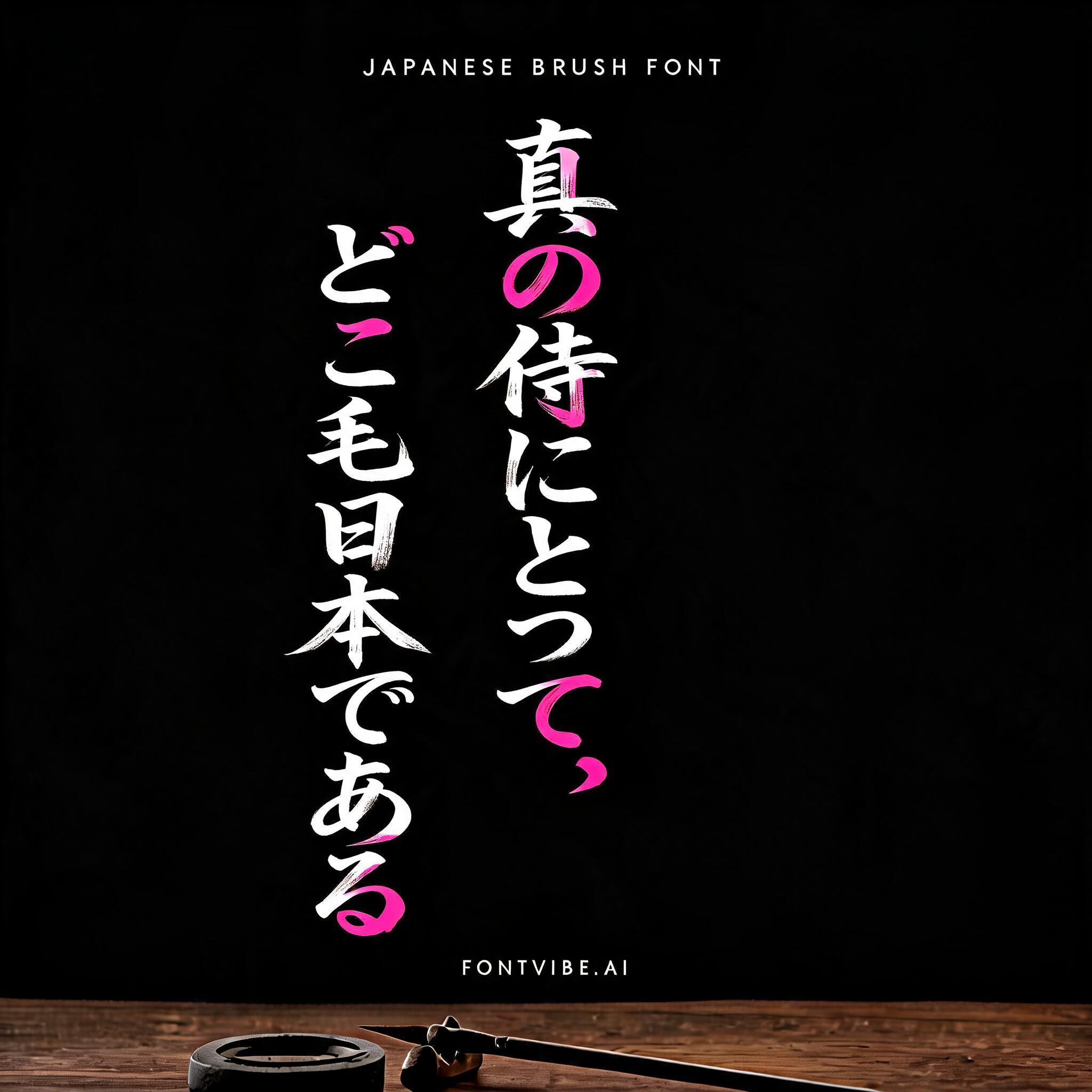


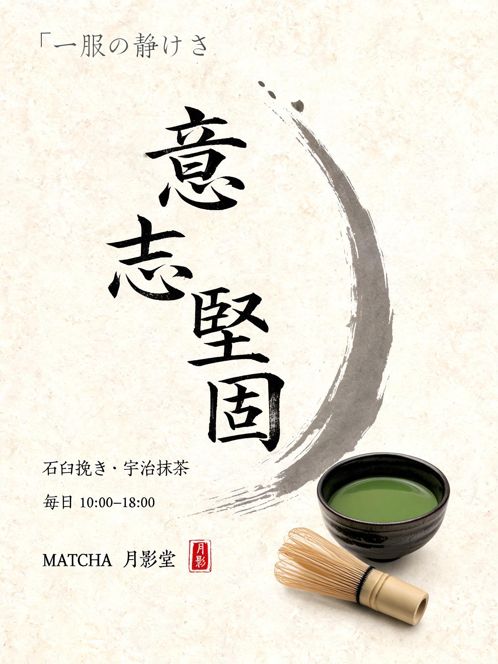


„RUBY“ ist ein Japanische Tuschepinsel-Schrift-Texteffekt, erstellt mit FontVibe KI. Japanischer Shodo-Tuschepinsel-Kalligrafiestil, angewendet auf lateinische Buchstaben. Tiefes Sumi-Schwarz mit authentischer Fude-Pinselenergie, kontrollierten Strichen in eine Richtung und Washi-Papier-Atmosphäre. Perfekt für das Branding japanischer Restaurants, Tattoo-Design, Anime, Kampfkunst und kulturelle Projekte.
Japanese ink brush aesthetic — the visual language of sumi calligraphy on washi paper. INK MEDIUM: sumi pigment in deep black to charcoal range — richest density at mark centers, naturally transitioning outward as ink supply depletes. Fully matte, absorbed into paper surface, producing a tonal range from dense opaque black to transparent grey depending on dilution and brush load. PAPER SURFACE: natural washi — warm cream-white base with visible paper fiber structure giving slight texture. The absorbent surface creates the characteristic soft border quality of East Asian brush work at all mark edges. LIGHT ATMOSPHERE: soft diffuse north-facing studio light — the traditional calligrapher's light source. Even, shadowless, allowing the full tonal range of ink marks to read clearly. Warm cream paper tone contrasts against deep sumi black. AESTHETIC REGISTER: the ma principle — the space between and around marks is as considered as the marks themselves. Compositions have breathing room and deliberate quietness. When no specific material is defined by the font: default environment — deep sumi black marks on warm cream washi paper, soft diffuse overhead light, meditative studio atmosphere. A single sheet of aged washi paper fills the frame, warm cream surface with visible long paper fibers running diagonally across the ground — the material memory of hand-laid kozo pulp. Soft, even north-facing diffuse light falls without shadow, allowing the full sumi tonal spectrum to read without interference. The letters R-U-B-Y are rendered in powerful shodo-informed brushwork — each letter entered with a forceful heel-loaded stroke that deposits near-opaque sumi black at its origin, ink density thinning as the bristles splay and travel, ending in controlled pull-away tails that dissolve into translucent charcoal gray. The B carries the most ink weight, its interior curves holding pooled pigment darkness. The R and Y terminate in dramatic flung-dry brush tails, individual bristle tracks visible where ink supply depleted mid-stroke. U settles into a quieter mid-gray basin. Subtle ink bleed traces along exposed paper fibers at every stroke edge, the soft capillary absorption characteristic of unsized washi. Generous ma — negative space breathes wide around the marks, silence as intentional as the ink. A single small vermilion hanko seal impression sits at one corner, its carved characters slightly ink-starved, pressing warmth against the monochrome field. No embellishment beyond the brushwork itself. The overall tonal register: deep matte sumi black to near-invisible pale gray, warm cream paper, single accent of vermilion.
Generiert am 5. Juli 2026 · 2048 × 2048 · JPEG · ByteDance Seedream 5.0 · Von der erstellenden Person geteilt · Kostenlos kommerziell nutzbar (CC BY 4.0)


