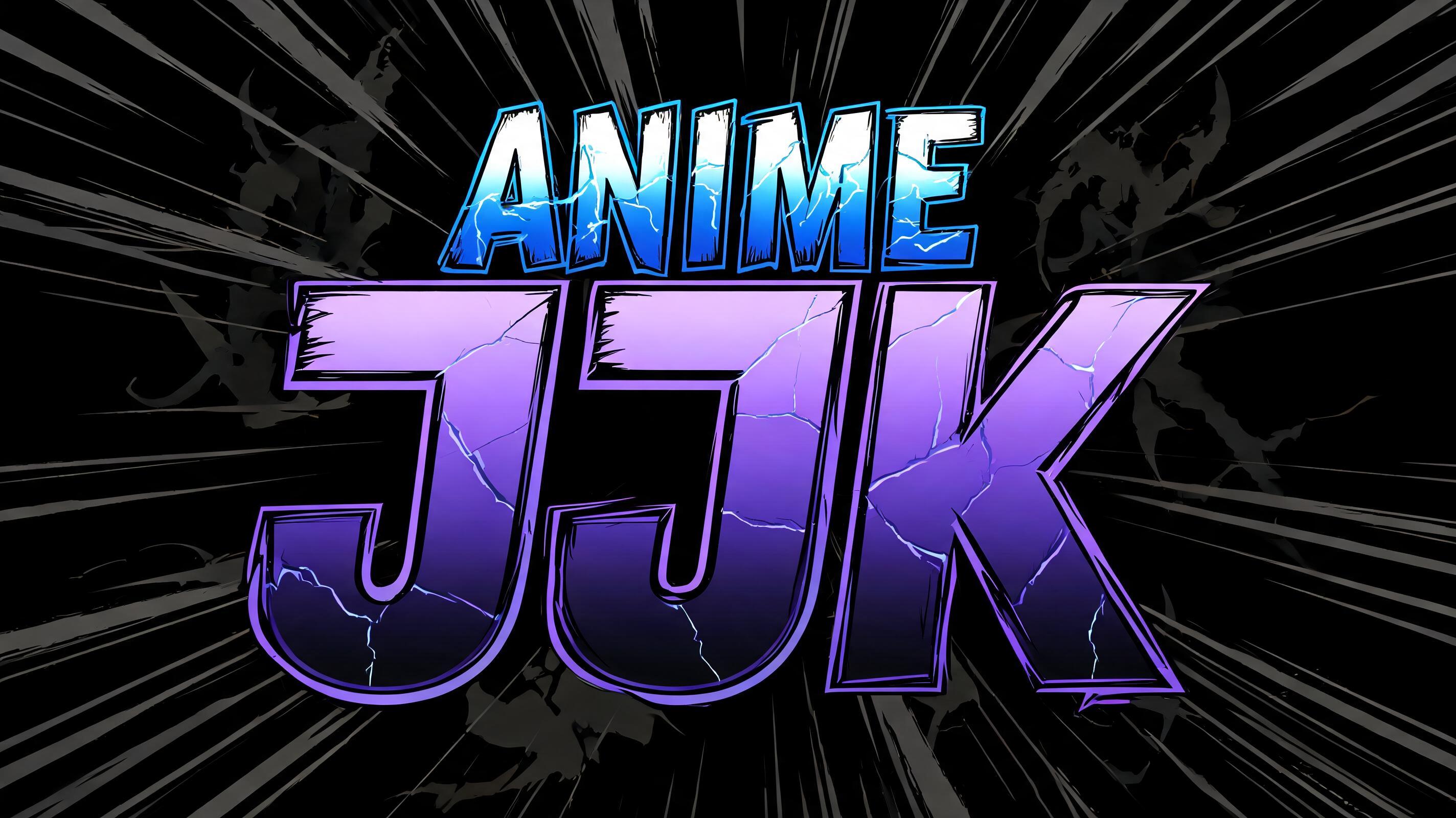
ANIME JJk - Anime Text Effect


Nutzt BytePlus Seedream 5.0, das Modell dieses Werks · 15 Credits

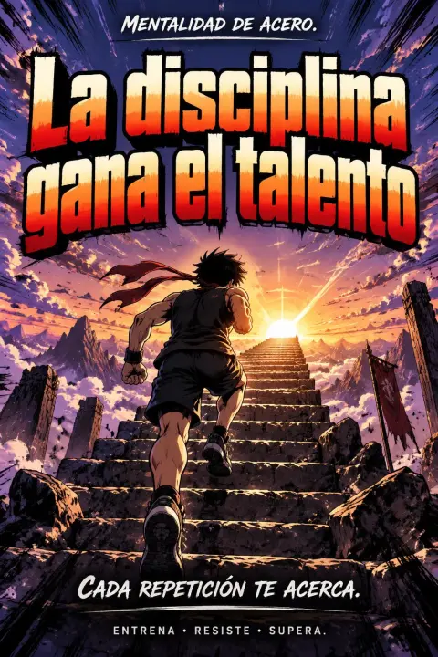

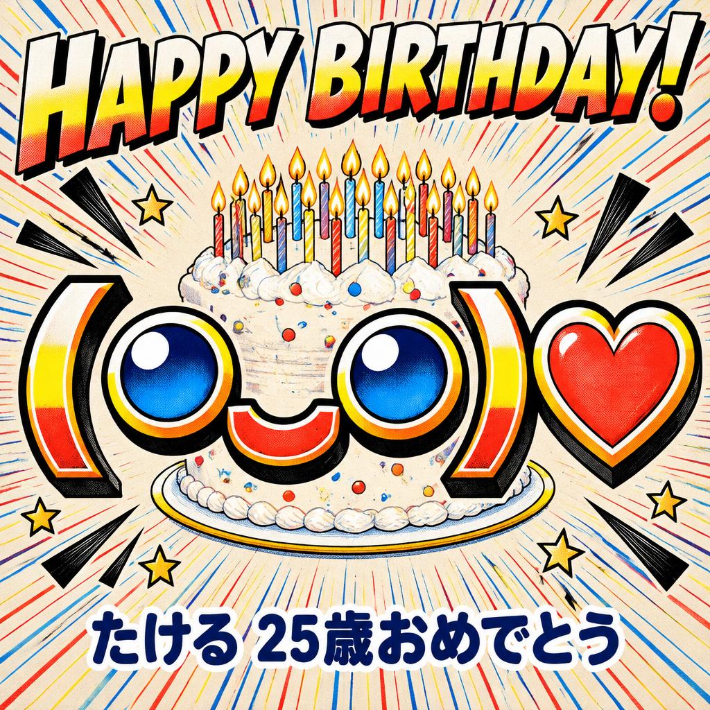
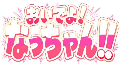
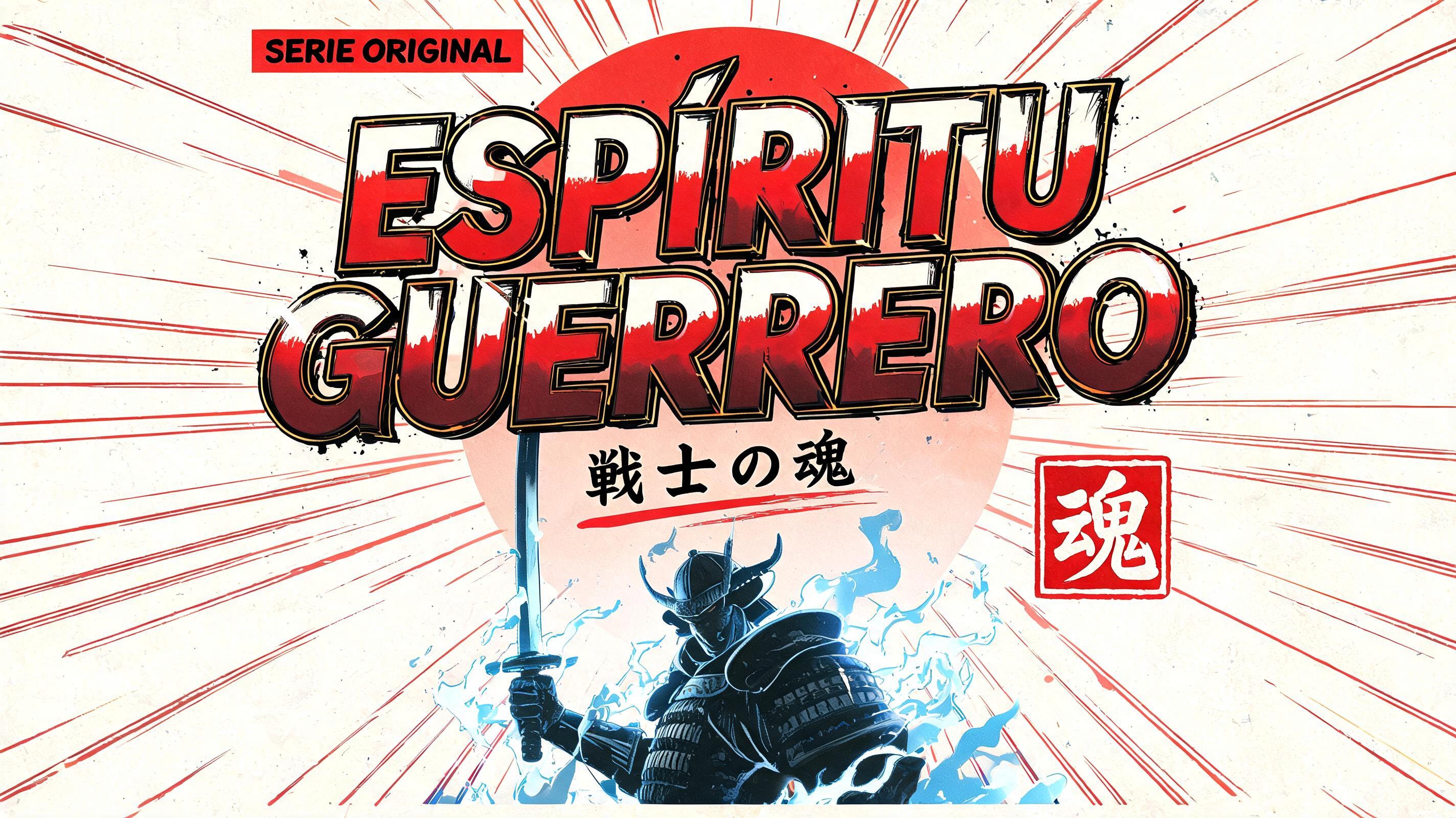
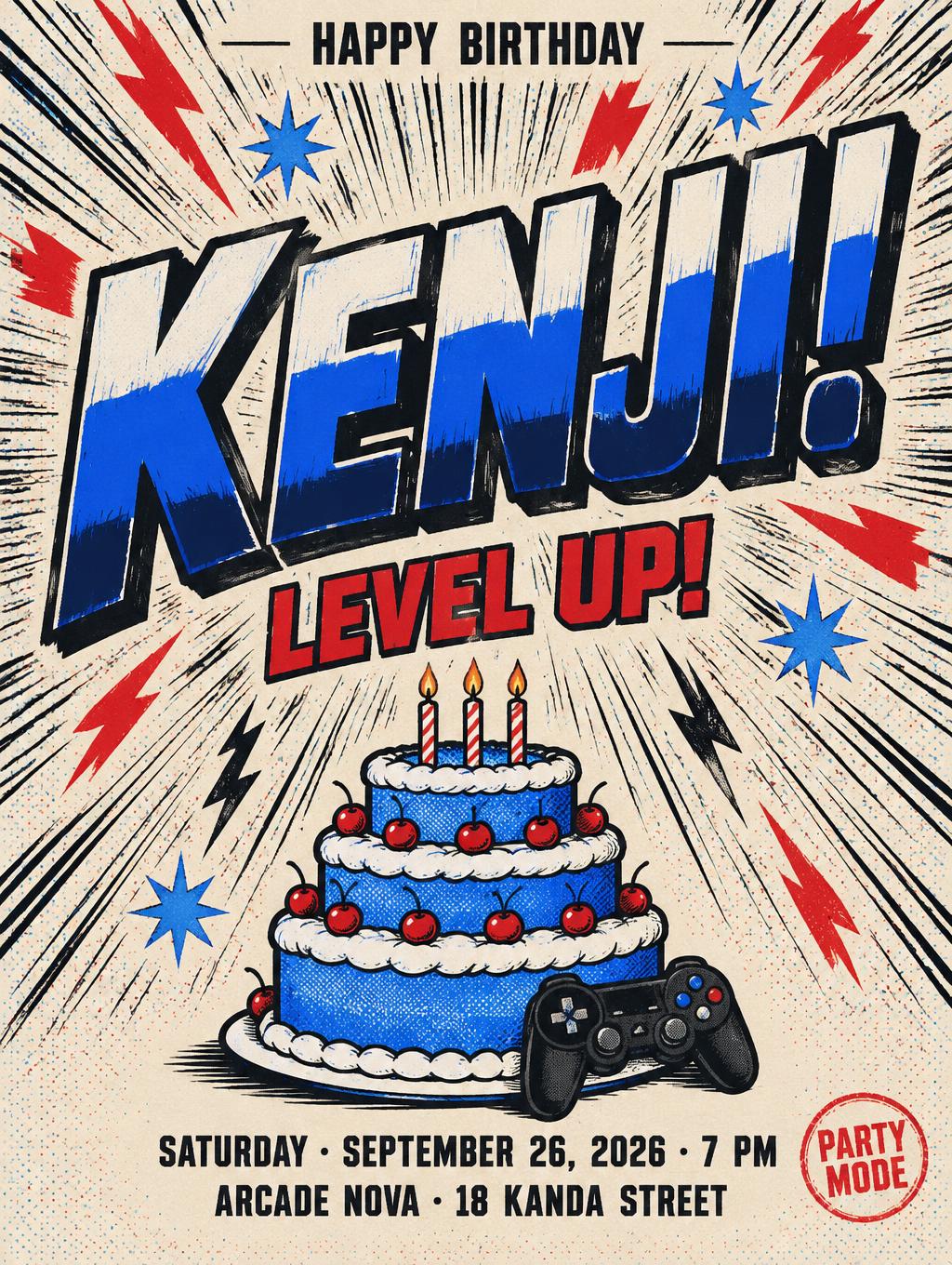
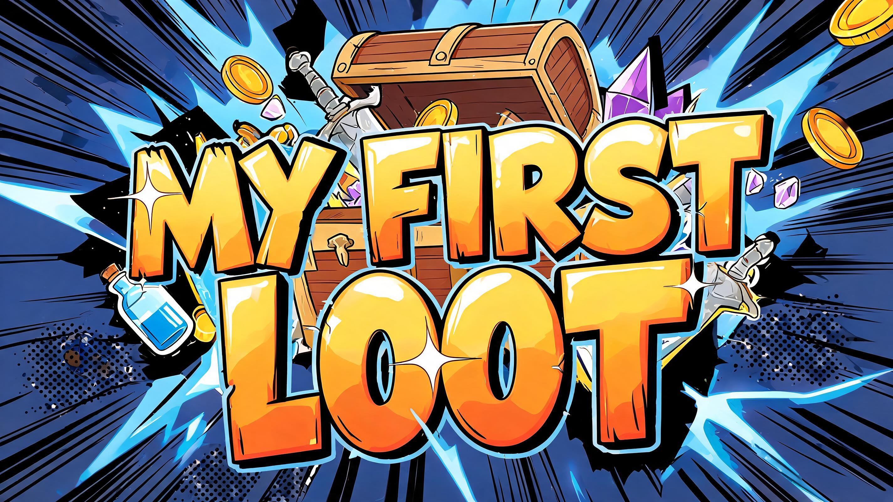
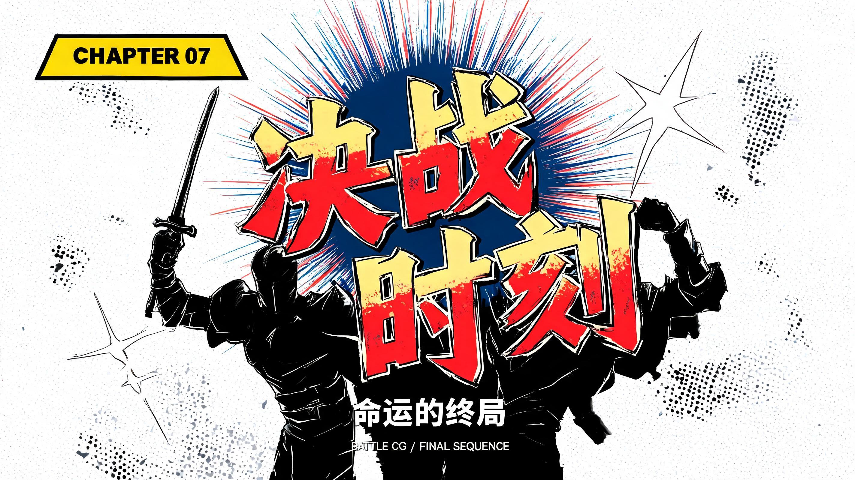
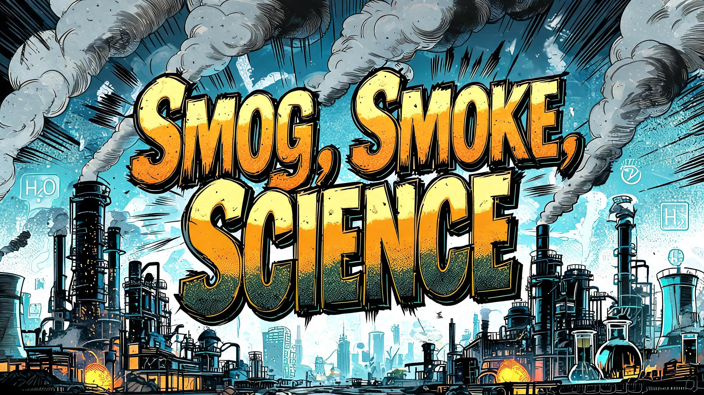
„ANIME JJk“ ist ein Anime-Texteffekt, erstellt mit FontVibe KI. Shōnen-Manga-Titelschrift: dicke, von Hand getuschte schwarze Konturen, flaches Cel-Shading in harten Licht- und Schattenbändern, schräg gestellte, dynamische Buchstaben auf Weiß mit strahlenförmigen Speedlines.
rendered as Japanese shounen anime title treatment — bold hand-inked manga lettering with authentic cel-shaded visual energy. Letter construction follows classic Shonen Jump title card standards: thick black ink outline with natural brush-weight variation defining each letter boundary; flat cel-shading fill with three hard-edge zones — bright highlight zone on upper letter face, highly saturated primary color zone at center, deep shadow zone at lower edge; all zone boundaries knife-edge hard, zero gradient blur, pure flat offset-print ink physics. Energy signature: high-contrast color + thick ink outline = letters that look physically printed on manga paper. The typographic language of Dragon Ball, Naruto, One Piece, Demon Slayer, Jujutsu Kaisen title cards — maximum manga kinetic energy, iconic and immediately recognizable as Japanese anime title typography. LETTERFORM PRIORITY: when the chosen font carries its own treatment, that font's letterform shapes take priority and own the letters; this style governs the inked manga outline, the three-zone cel-shading and the kinetic energy. FALLBACK MATERIAL: if the font carries no material of its own, render the letters as bold hand-inked shounen title lettering with a thick black brush outline and hard three-zone cel-shading. COLOR PRIORITY: keep the font's own colors if specified; otherwise a high-saturation primary fill with hard highlight and shadow zones. ANIME JJK rendered as a bold shounen title card with manga kinetic impact energy — classic Jujutsu Kaisen chapter-title visual language. Pure black background split open by dense radial manga speed lines bursting outward from behind the letterforms, hard angular impact marks scattered across the field. 'ANIME' sits as the secondary display word, slightly reduced in visual weight but still commanding presence — thick black ink outline with natural brush-weight variation, flat cel-shaded fill in icy electric blue: bright near-white highlight zone upper 30%, vivid electric blue primary fill center 50%, deep navy shadow zone lower 20%, all zone boundaries razor-hard, zero gradient blur. 'JJK' commands the dominant scale — oversized hero letters with maximum ink outline weight; flat cel-shaded fill in high-saturation cursed-energy purple-to-black: bright lavender highlight zone upper 30%, deep violet primary fill center 50%, near-black shadow zone lower 20%, knife-edge zone transitions. Both words share the same thick manga ink outline aesthetic. Background carries faint black brushstroke cursed-energy sigil marks, layered behind the speed-line field. Octane render quality, 8k sharpness, flat anime print ink physics throughout.
Generiert am 16. Juli 2026 · 2848 × 1600 · JPEG · BytePlus Seedream 5.0 · Von der erstellenden Person geteilt · Kostenlos kommerziell nutzbar (CC BY 4.0)


