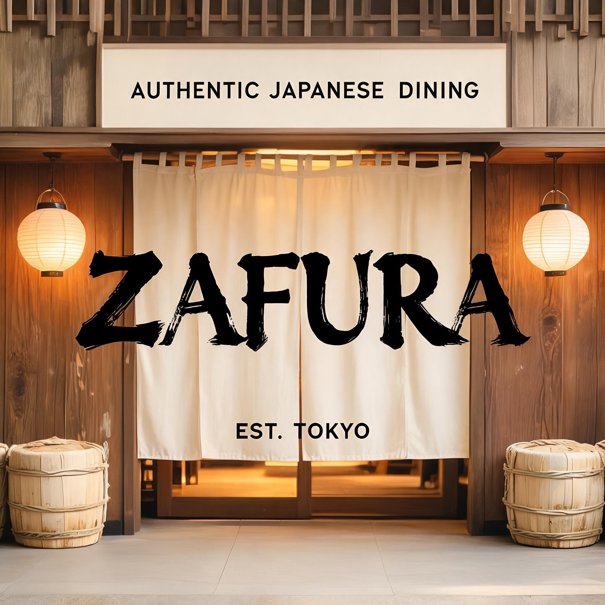
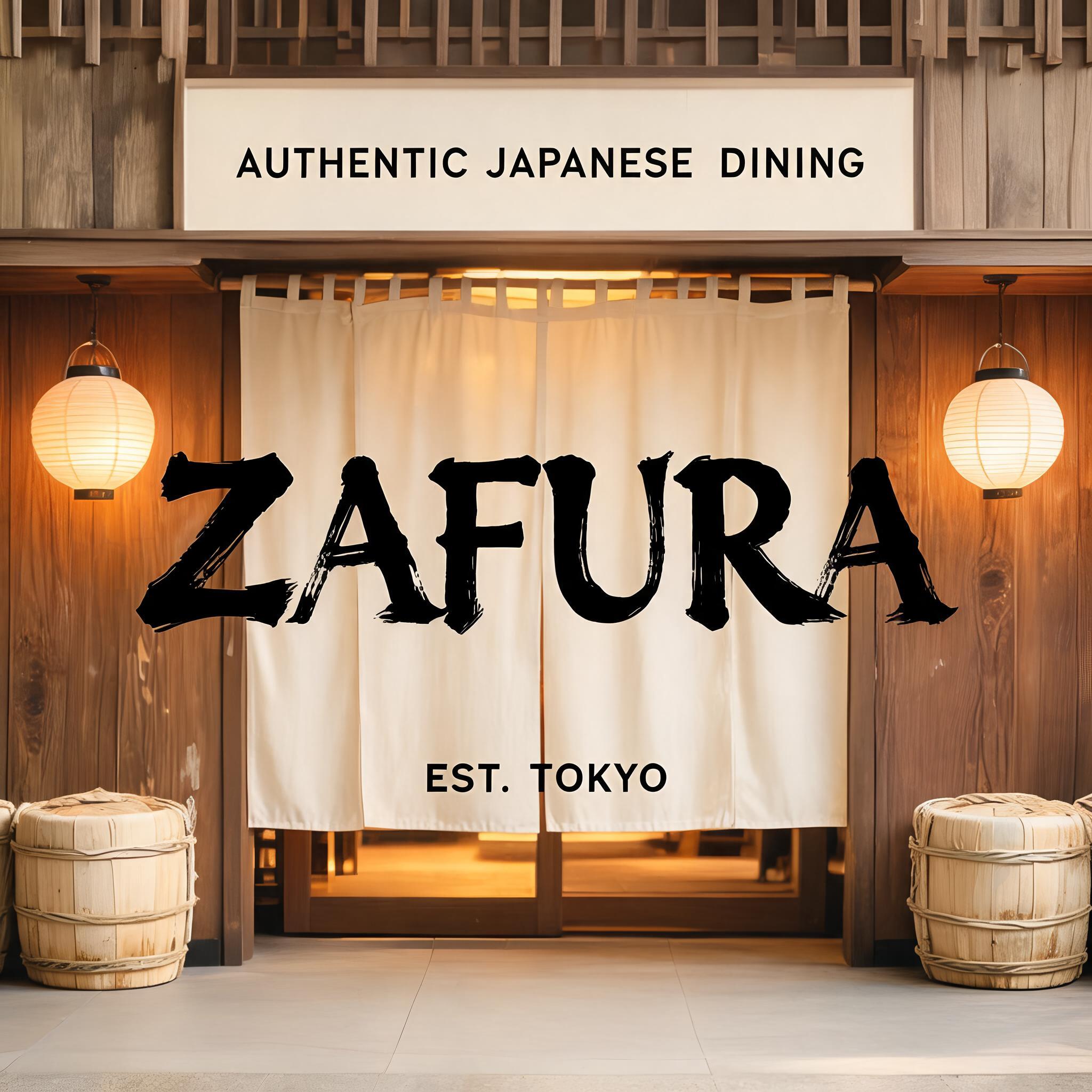
ZAFURA - Japanische Tuschepinsel-Schrift Text Effect


Nutzt BytePlus Seedream 5.0, das Modell dieses Werks · 15 Credits
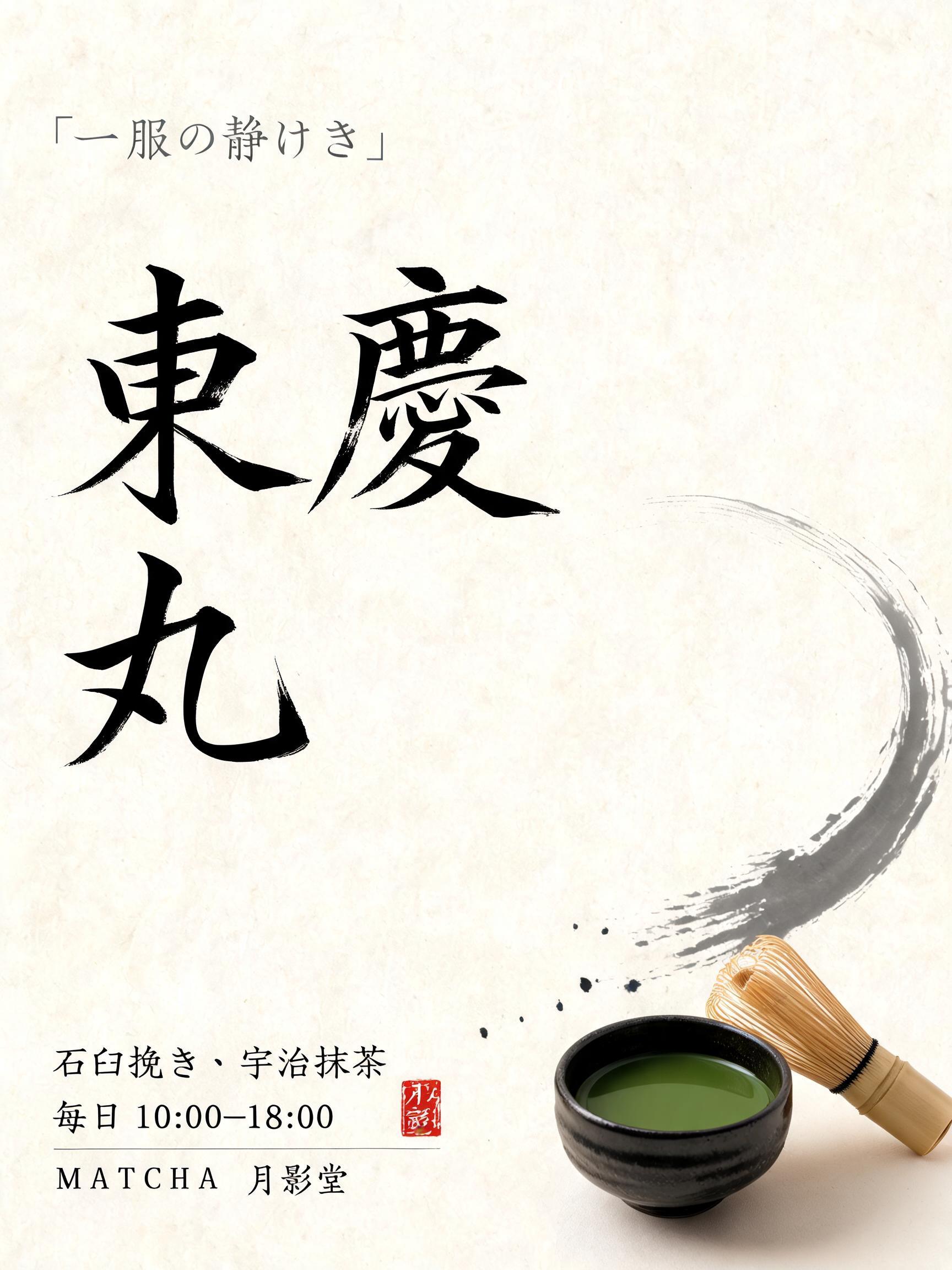
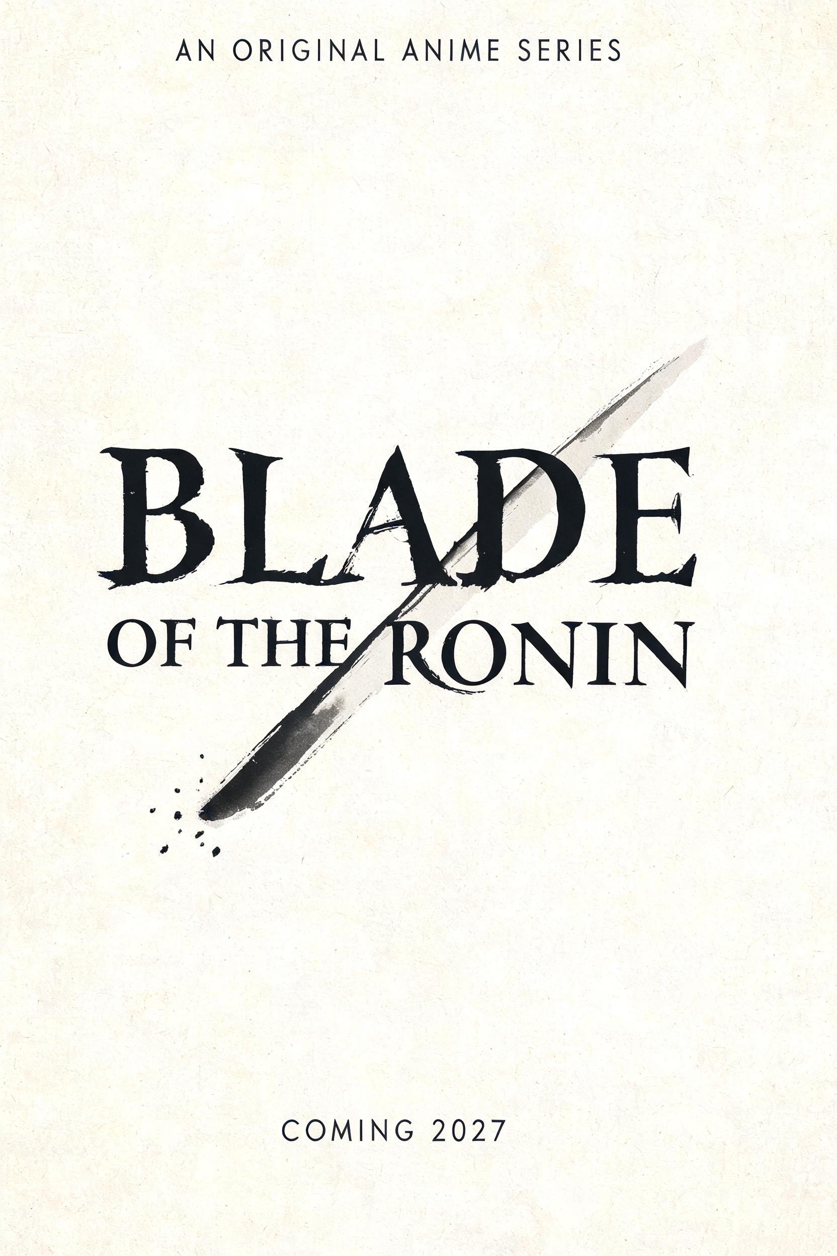


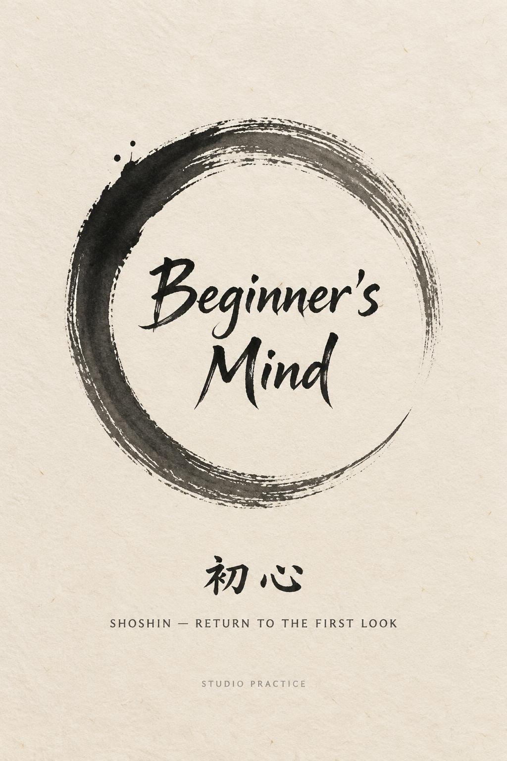
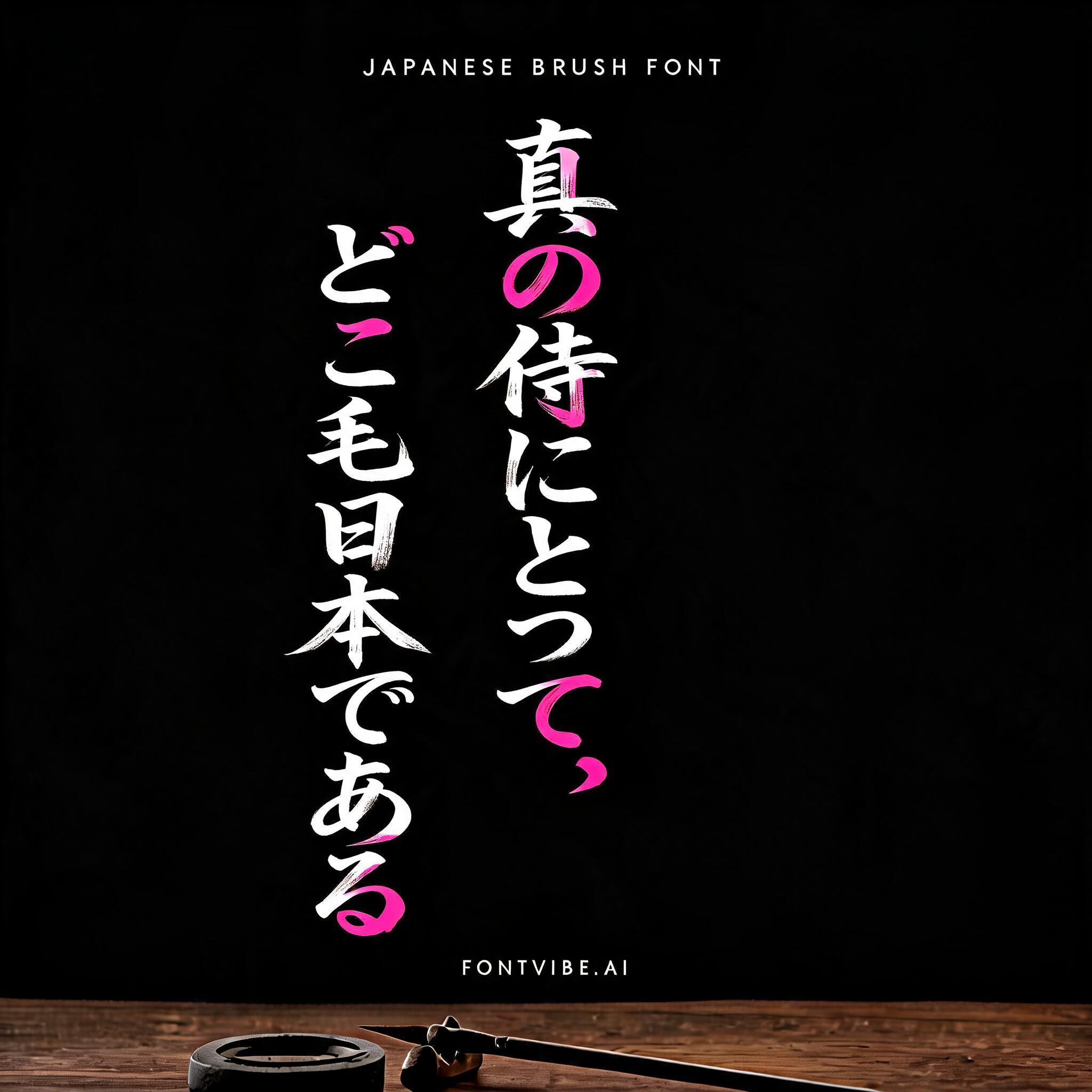


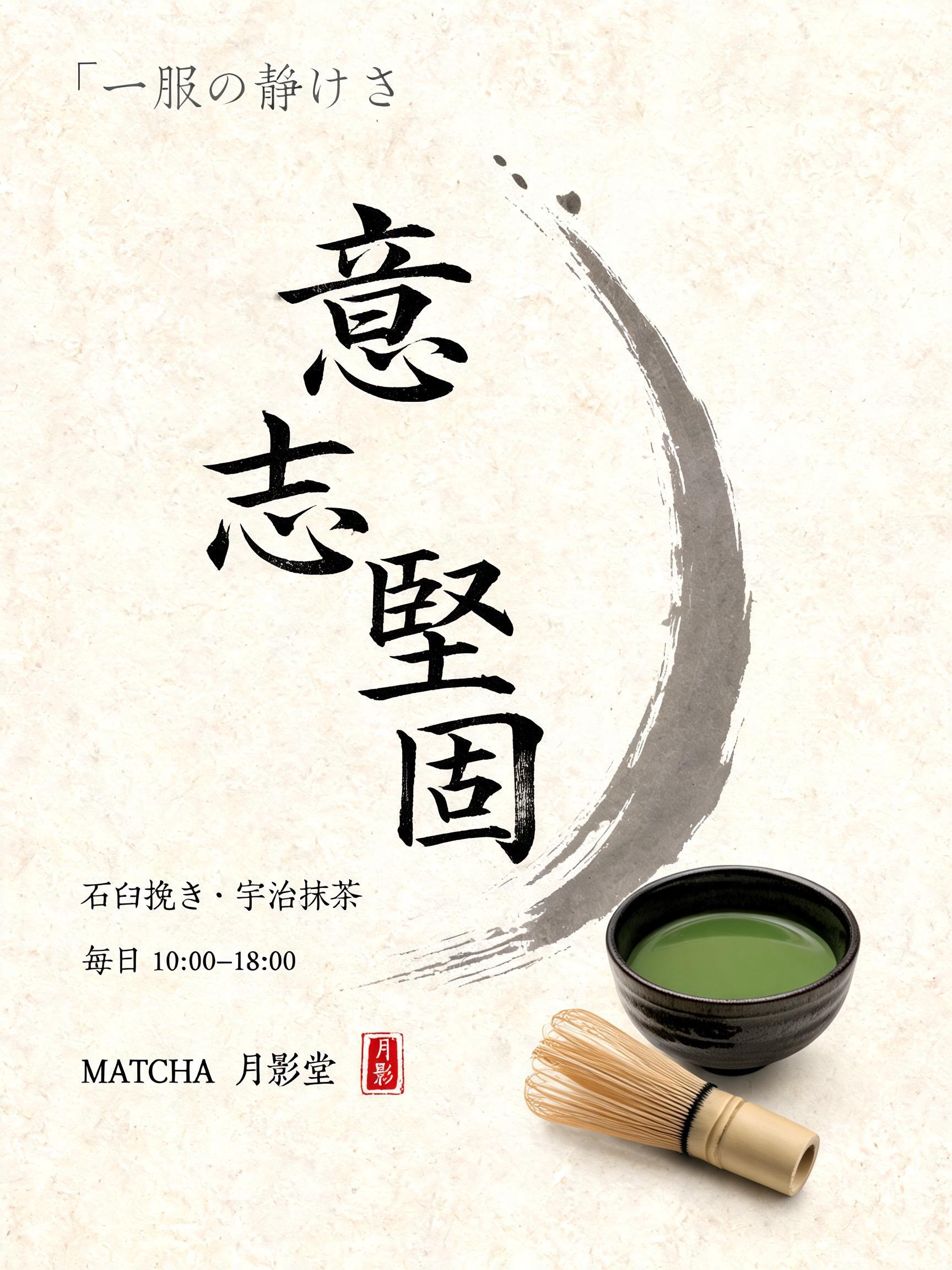


„ZAFURA“ ist ein Japanische Tuschepinsel-Schrift-Texteffekt, erstellt mit FontVibe KI. Japanischer Shodo-Tuschepinsel-Kalligrafiestil, angewendet auf lateinische Buchstaben. Tiefes Sumi-Schwarz mit authentischer Fude-Pinselenergie, kontrollierten Strichen in eine Richtung und Washi-Papier-Atmosphäre. Perfekt für das Branding japanischer Restaurants, Tattoo-Design, Anime, Kampfkunst und kulturelle Projekte.
Japanese Shodo ink brush style optimized for restaurant and commercial hospitality branding. Letterforms balanced between traditional dignity and modern commercial legibility — not as heavy as warrior styles, not as delicate as geisha. Strokes confident and clear, ink consistent and professional, with just enough brush texture to feel authentic rather than digital. Background: neutral warm white or pale cream, clean enough for professional use. The aesthetic: the typographic equivalent of a respected Japanese restaurant's facade — welcoming, quality-signaling, trustworthy. Formal enough for a high-end kaiseki restaurant; approachable enough for a neighborhood sushi bar. Premium Japanese izakaya entrance — a welcoming noren curtain doorway, warm interior glow behind. Aged wood paneling, paper lanterns on either side, subtle sake barrel decorations. The restaurant name "ZAFURA" rendered in the commercial hospitality ink brush style — balanced between traditional dignity and modern commercial legibility. Top-center: tiny restaurant category label "AUTHENTIC JAPANESE DINING" at 45% canvas width, clean commercial caps, inviting. Center: "ZAFURA" as massive dominant brush letters at 65% canvas width, centered — strokes confident and clear, ink balances brush authenticity with commercial readability, the kind of brushwork seen on a premium Tokyo restaurant signboard. Bottom-center: "EST. TOKYO" at 20% canvas width, small establishment marker. Vertical spacing ratio approximately 1:5:1.5. The composition reads as the exterior signage of a premium Japanese restaurant — authentic, commercial, warm, welcoming.
Gemacht für Japanische Restaurant-Schrift
Generiert am 21. August 2026 · 2048 × 2048 · JPEG · BytePlus Seedream 5.0 · Von der erstellenden Person geteilt · Kostenlos kommerziell nutzbar (CC BY 4.0)


