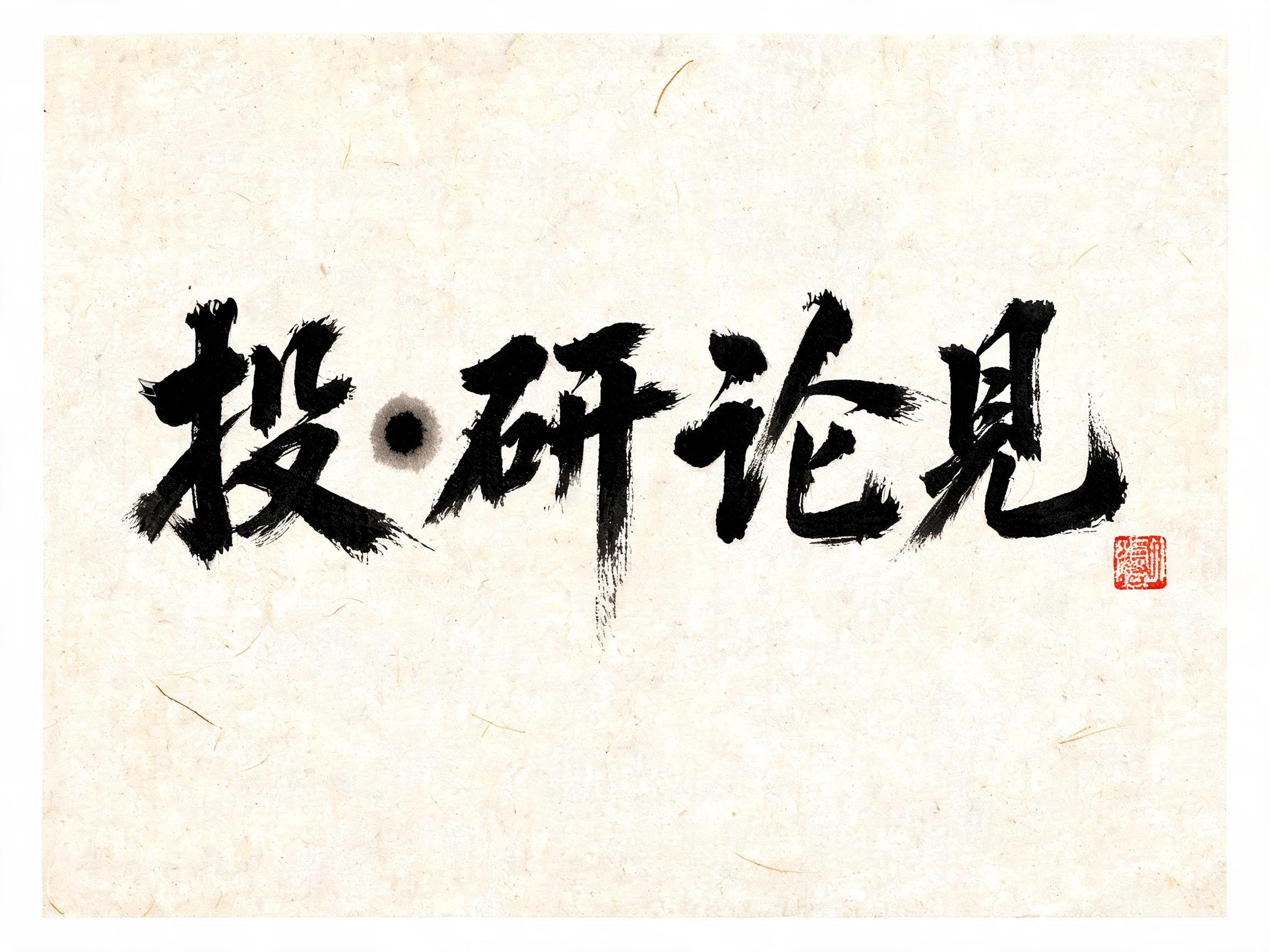
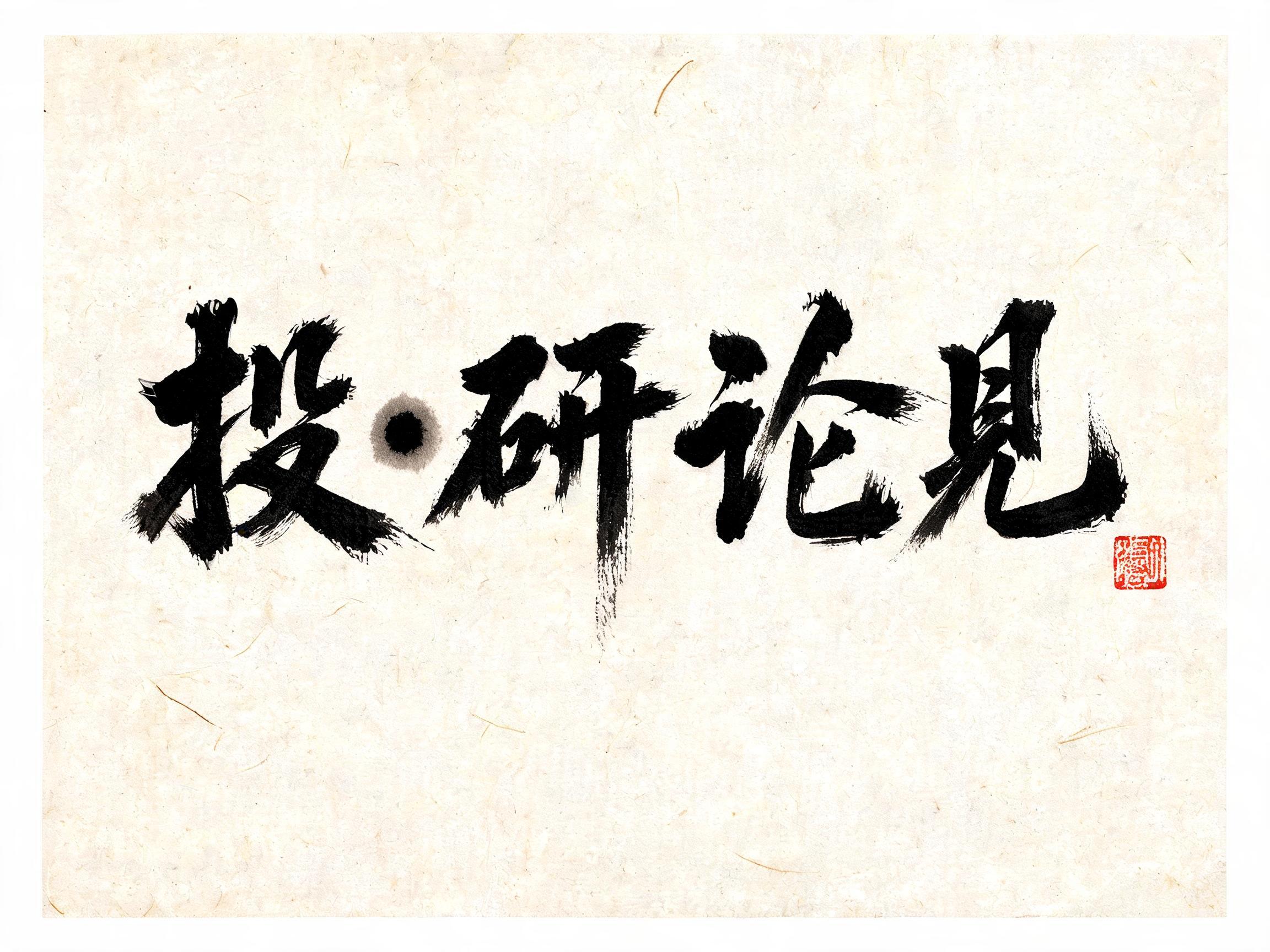
投研•论见 - Chinesischer Tuschepinsel Text Effect


Nutzt BytePlus Seedream 5.0, das Modell dieses Werks · 15 Credits
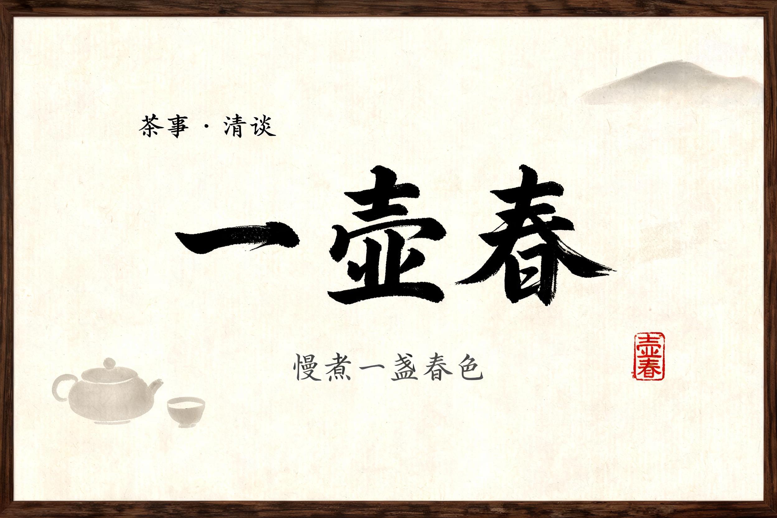


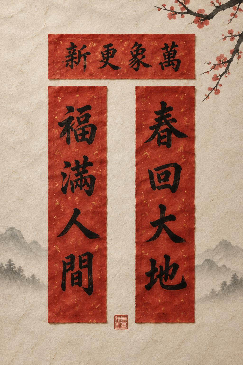
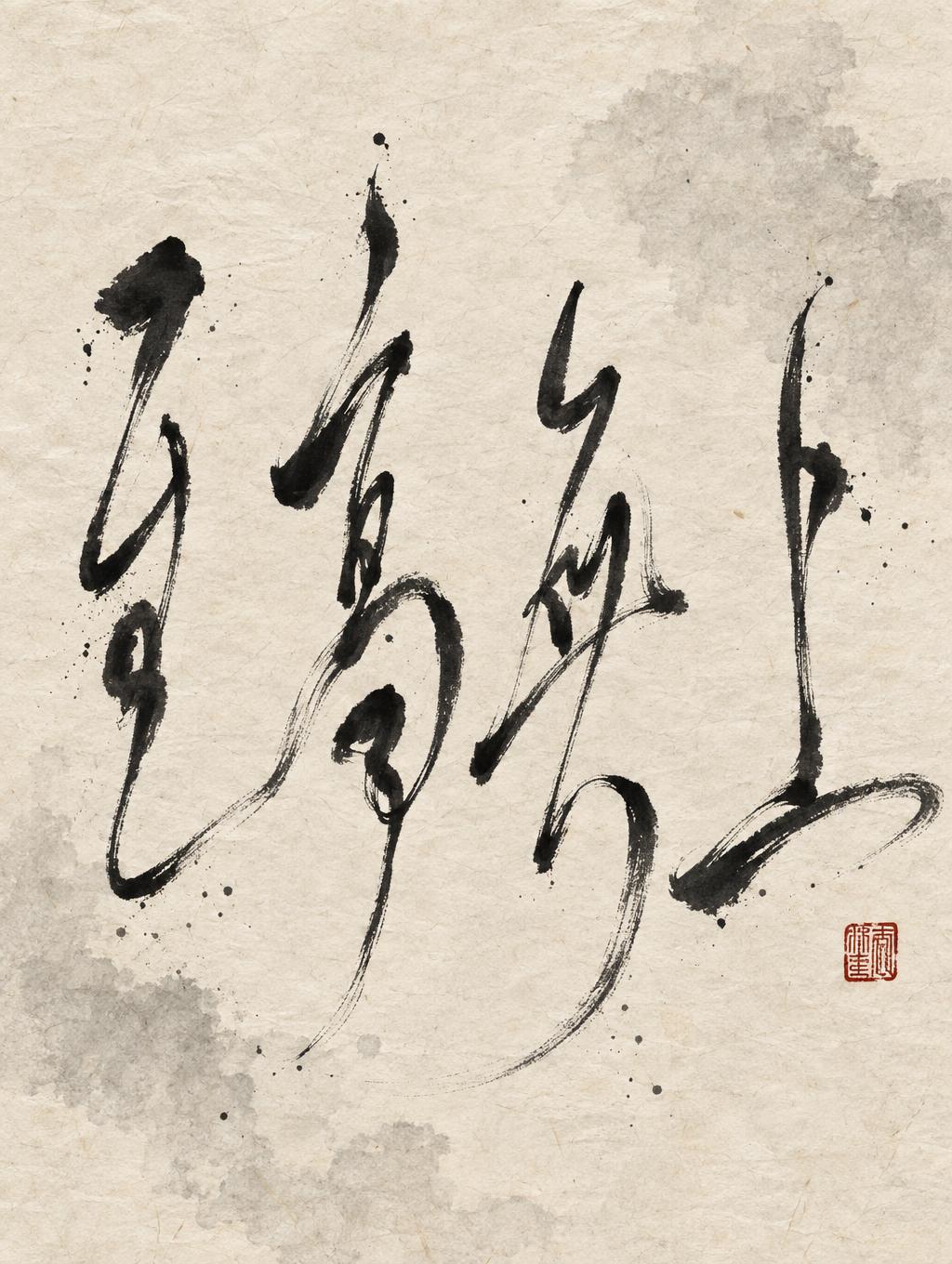
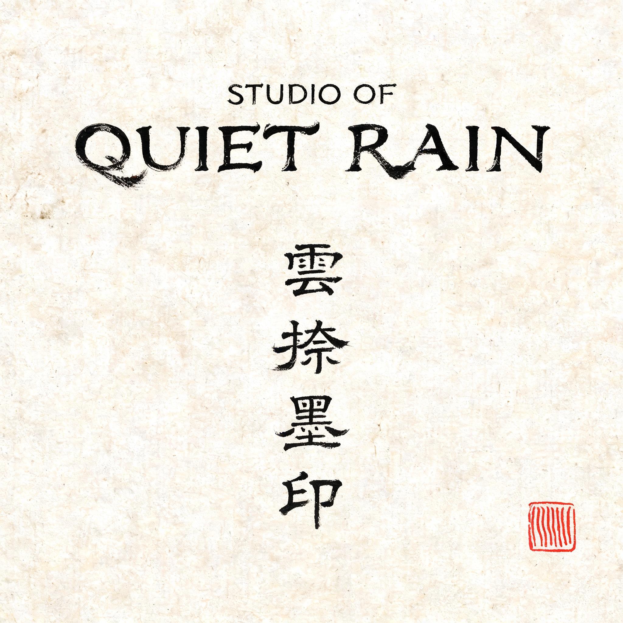

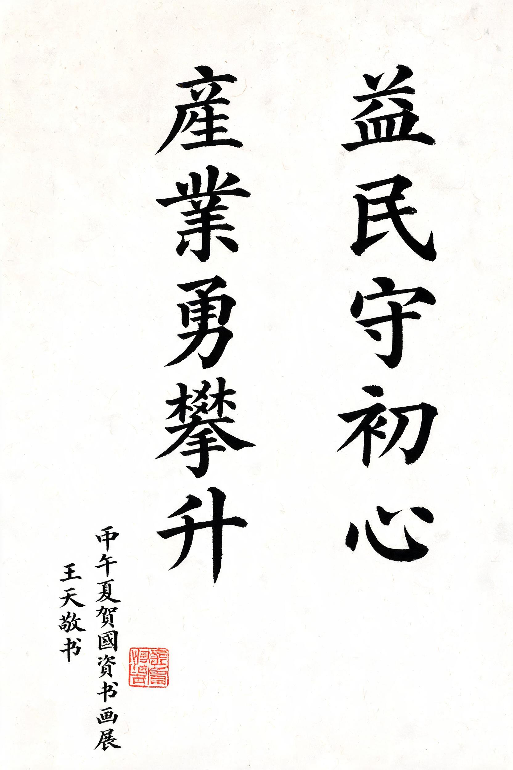
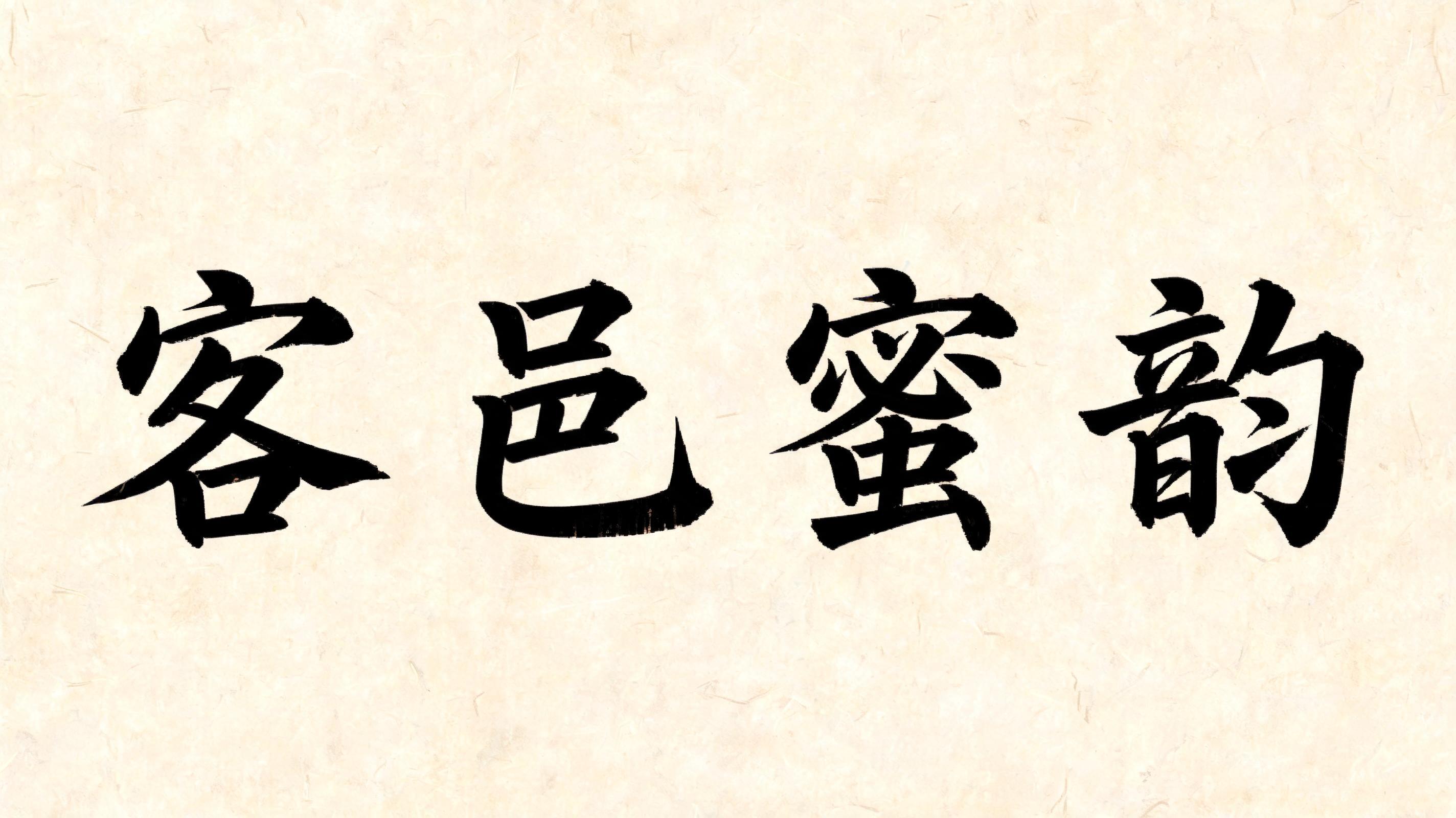

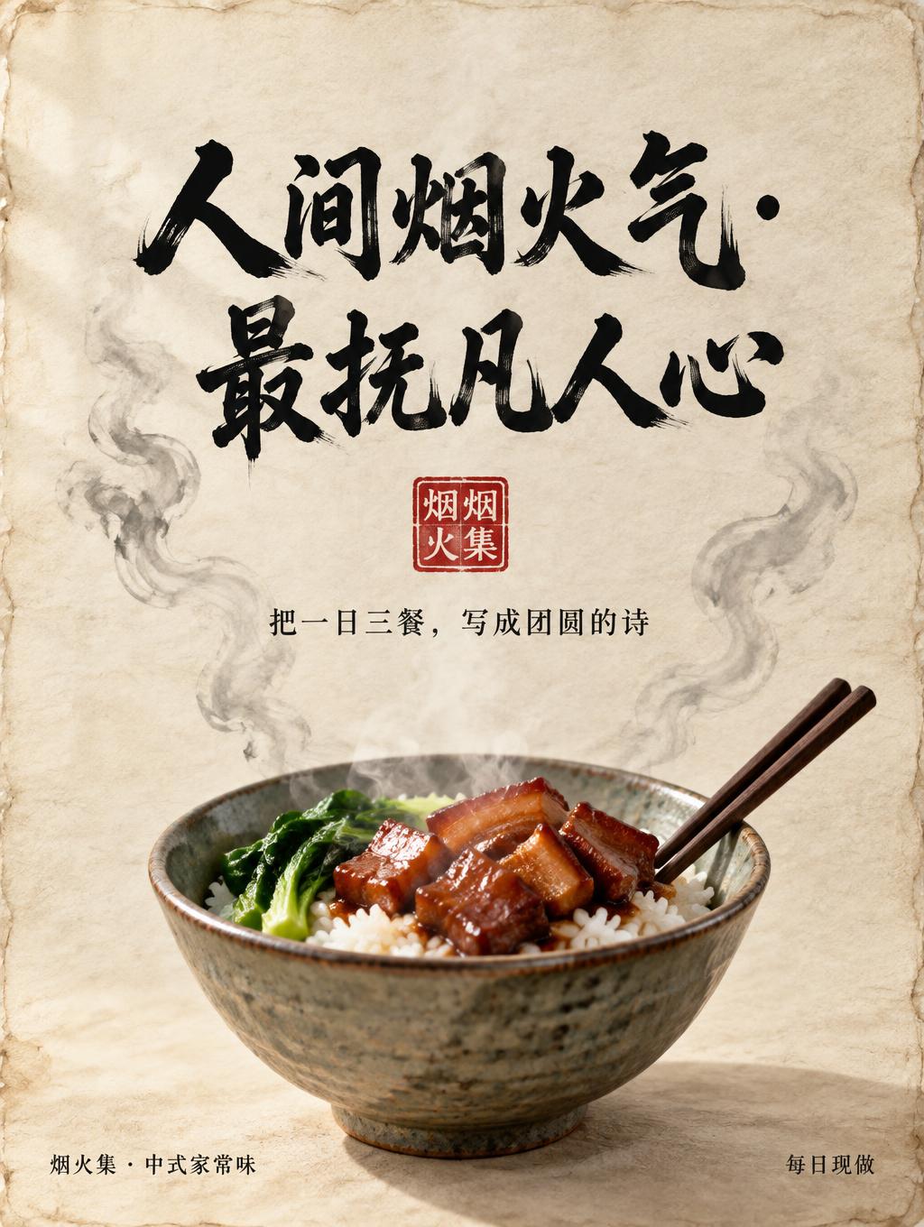
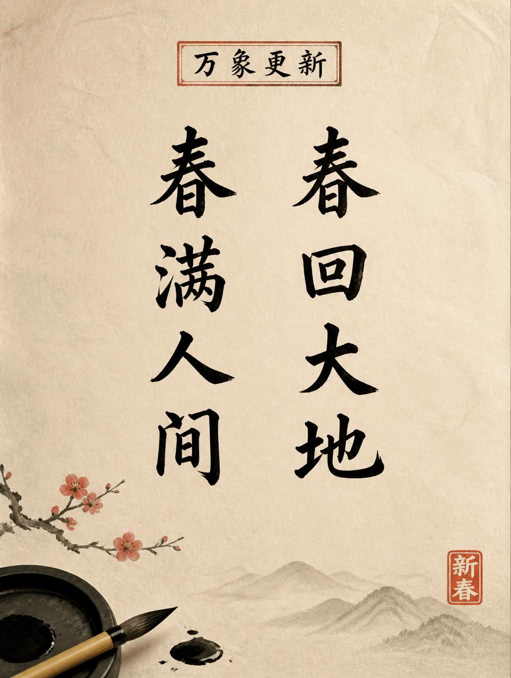
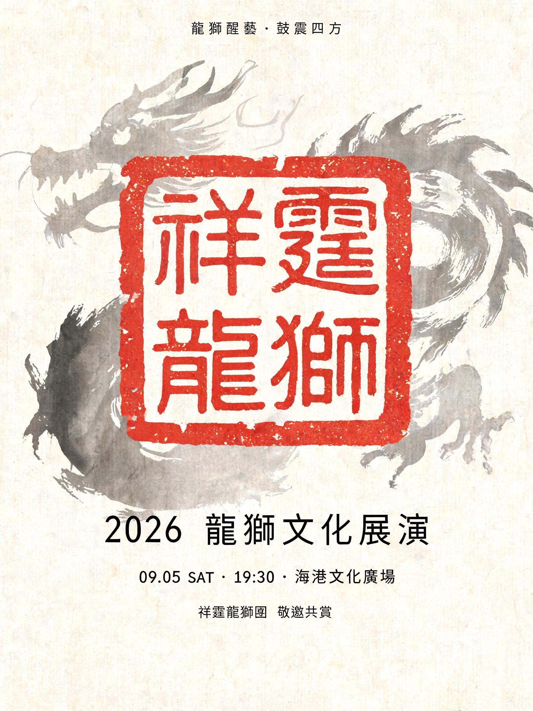


„投研•论见“ ist ein Chinesischer Tuschepinsel-Texteffekt, erstellt mit FontVibe KI. Chinesische Sumi-Tuschekalligrafie im Pinselstil, übertragen auf lateinische Buchstaben. Tiefschwarze Tusche mit authentischer Borstentextur, von dick zu dünn variierenden Strichen und Reispapier-Atmosphäre. Perfekt für das Branding chinesischer Restaurants, Kampfkunst, Wellness und kulturelles Design.
rendered in Chinese ink brush calligraphy style. Letterforms painted with a fully loaded sumi ink brush — deep black ink, visible bristle marks along stroke edges, wet ink pooling at stroke starts, feathered dry-brush trailing ends. Authentic ink density variation: thick rich black cores fading to grey at thin passages. Rice paper texture visible behind. Traditional Chinese calligraphy energy — each stroke confident, intentional, irreversible. LETTERFORM PRIORITY: when the chosen font carries its own treatment, that font's letterform shapes take priority and own the letters; this style governs the sumi ink medium, the bristle and ink-density behavior and the rice-paper ground. FALLBACK MATERIAL: if the font carries no material of its own, render the letters as deep black sumi brush strokes with visible bristle marks, wet ink pooling at stroke starts and feathered dry-brush trails on rice paper. COLOR PRIORITY: keep the font's own colors if specified; otherwise rich black ink fading to grey at thin passages. Render the exact text “投研•论见” as a commanding Chinese ink-brush title on raw warm-ivory xuan paper. Use fully loaded sumi ink with dense blue-black cores, saturated wet pools at the beginnings of major strokes, and translucent charcoal-gray transitions through thinner passages. Preserve visible brush-hair separation along every taper, ragged dry-brush drag at terminal edges, and irregular capillary bleed where ink enters the paper fibers. The characters carry deliberate research-and-debate energy through controlled pressure shifts, broad ink masses, sharp directional flicks, and breathing room in the paper grain. Allow faint diluted ink-wash clouds to diffuse behind and around the title, with a few restrained microscopic ink droplets near the most forceful brush movements. The bullet “•” appears as a small concentrated ink bloom, round but imperfect, with a soft feathered edge. Keep the paper ground tactile: long mulberry fibers, subtle uneven absorbency, pale tea-stained tonal variation, and unprinted margins of luminous ivory. Add one understated vermilion cinnabar seal impression as a decorative accent, lightly distressed by the paper texture. No digital-clean contours, no uniform black fill, no glossy effects; every mark must read as absorbent brush ink on handmade paper.
Gemacht für Wuxia-Schrift-Generator
Generiert am 31. August 2026 · 2304 × 1728 · JPEG · BytePlus Seedream 5.0 · Von der erstellenden Person geteilt · Kostenlos kommerziell nutzbar (CC BY 4.0)


