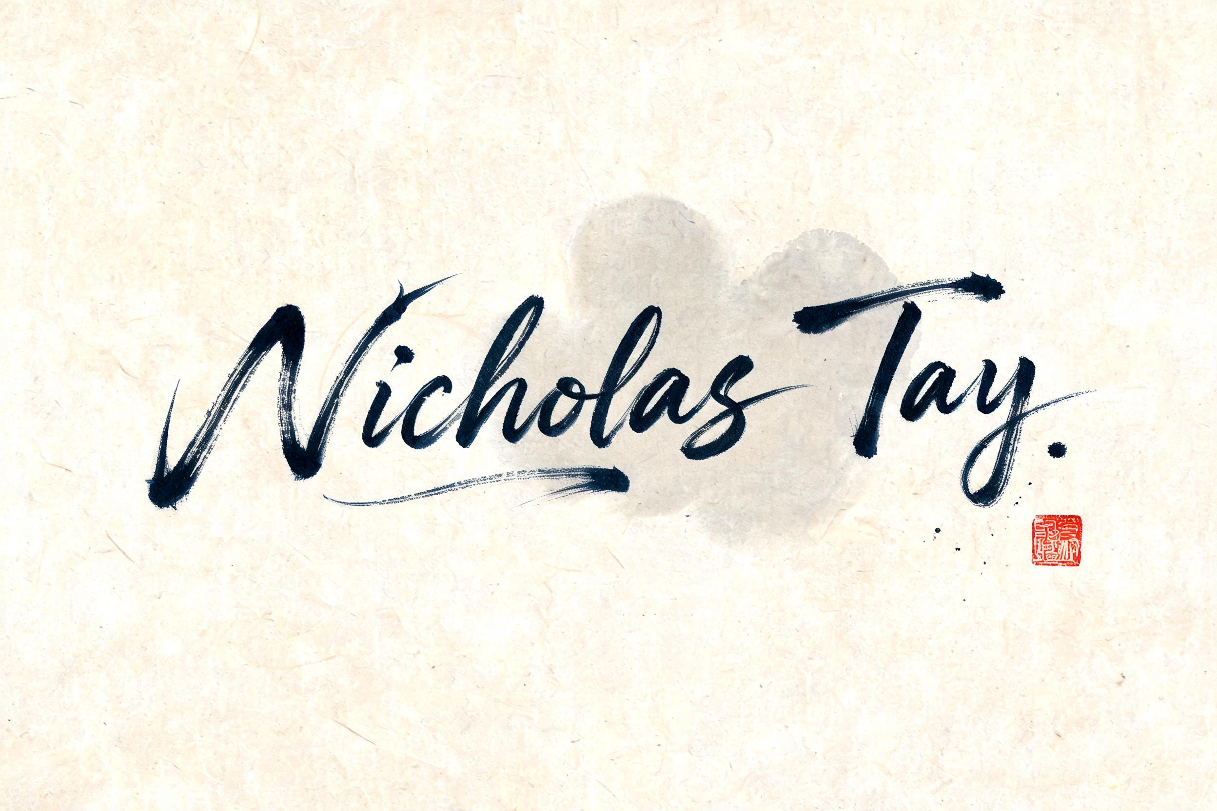
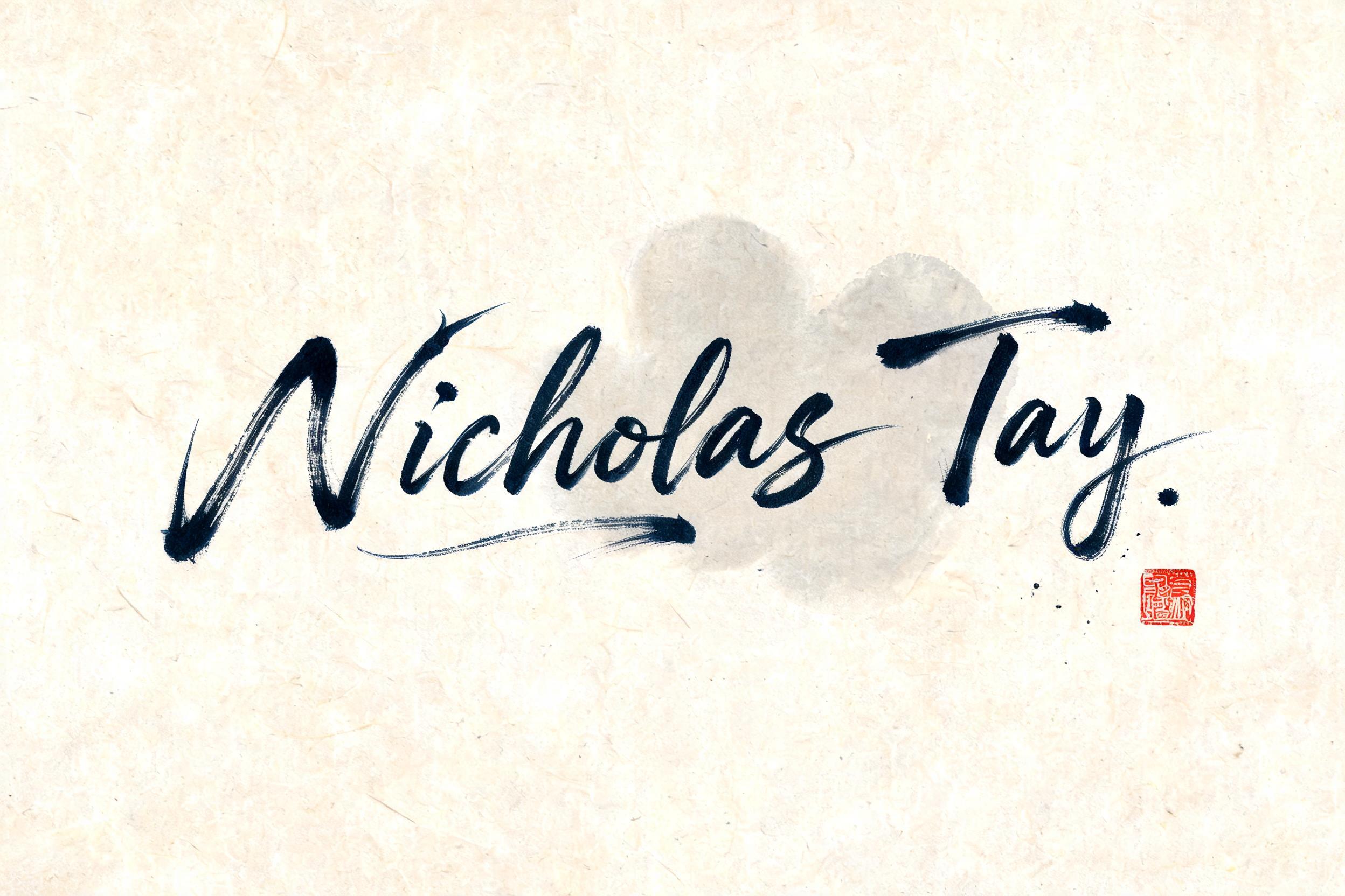
Nicholas Tay - Chinesischer Tuschepinsel Text Effect


Nutzt BytePlus Seedream 5.0, das Modell dieses Werks · 15 Credits
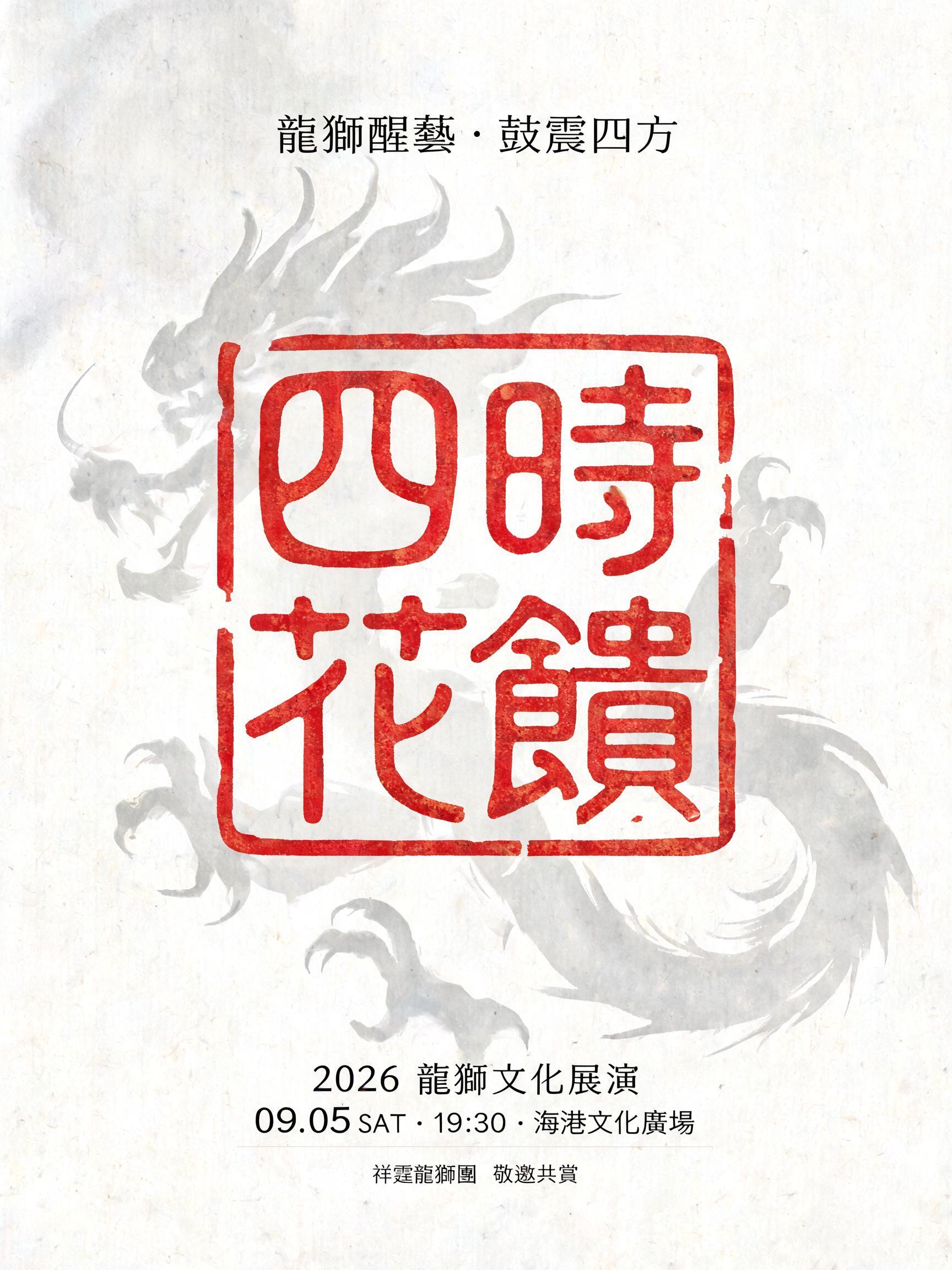
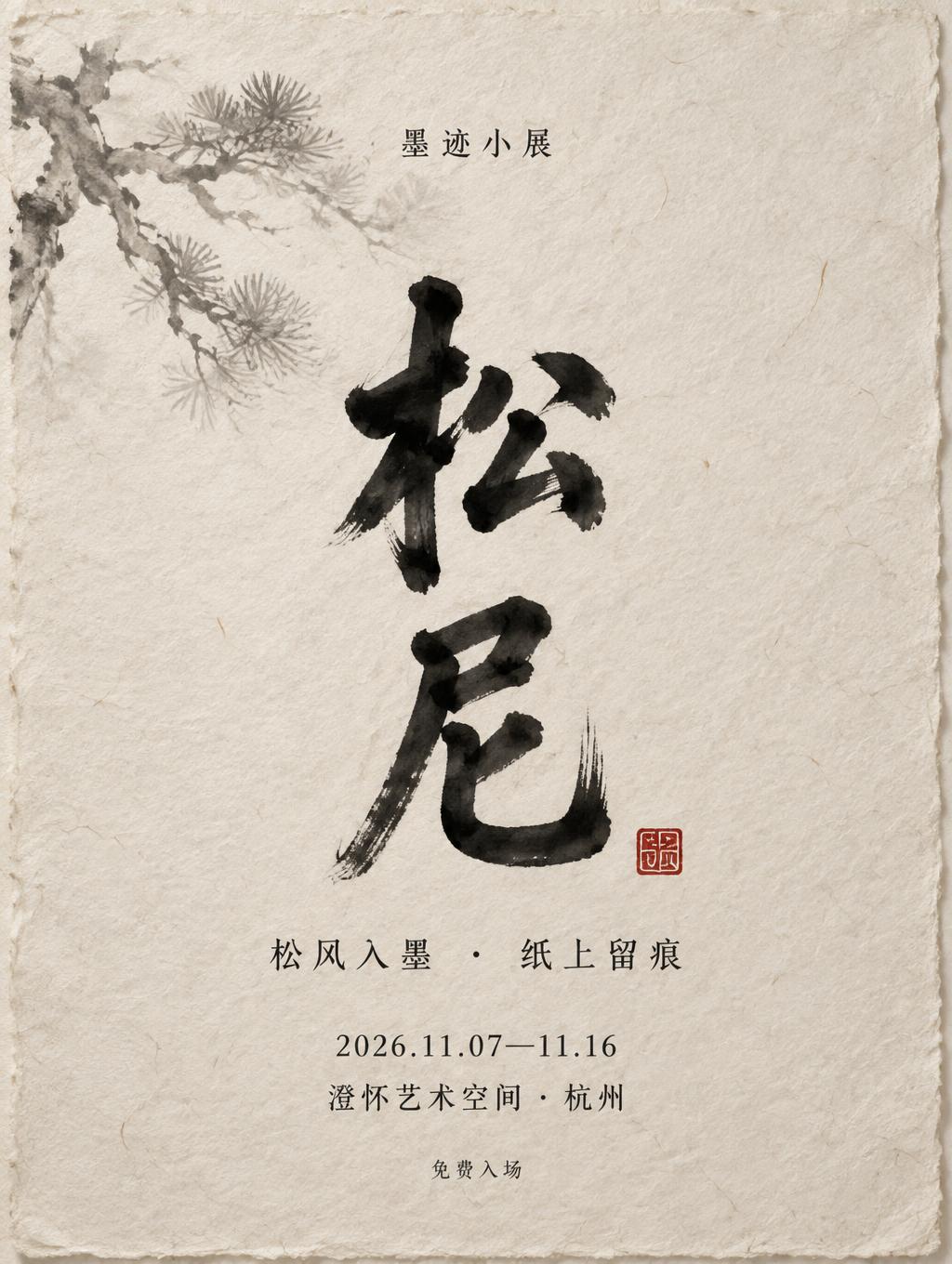
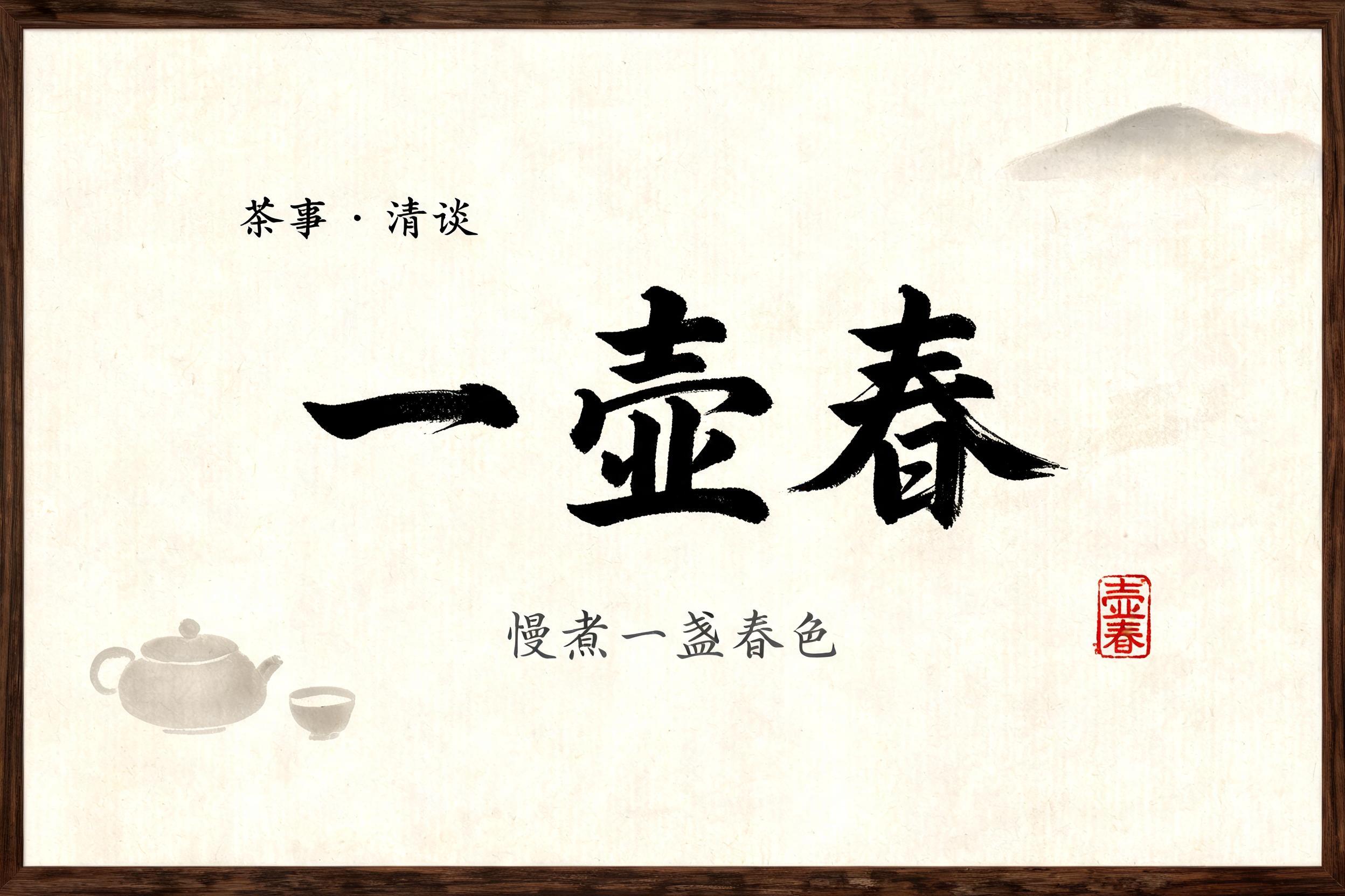


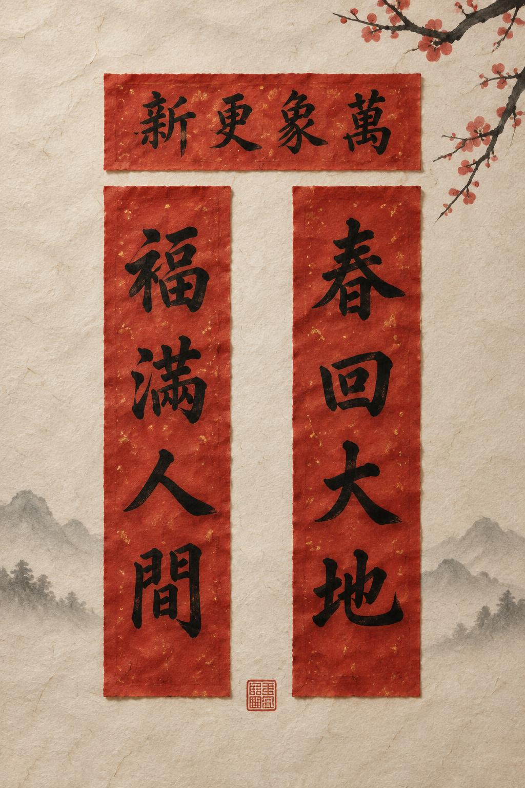
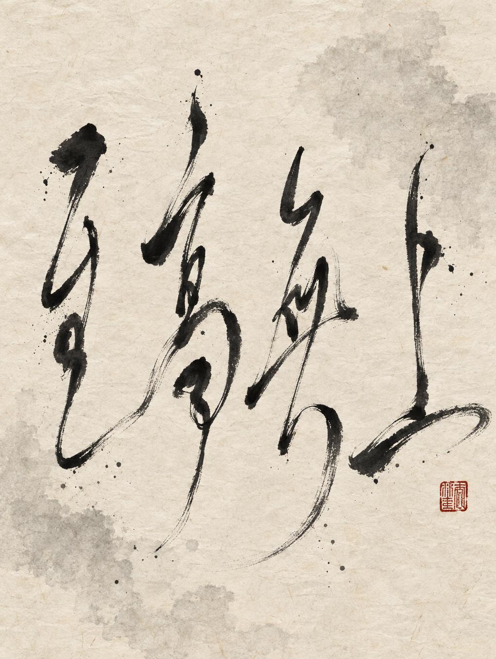
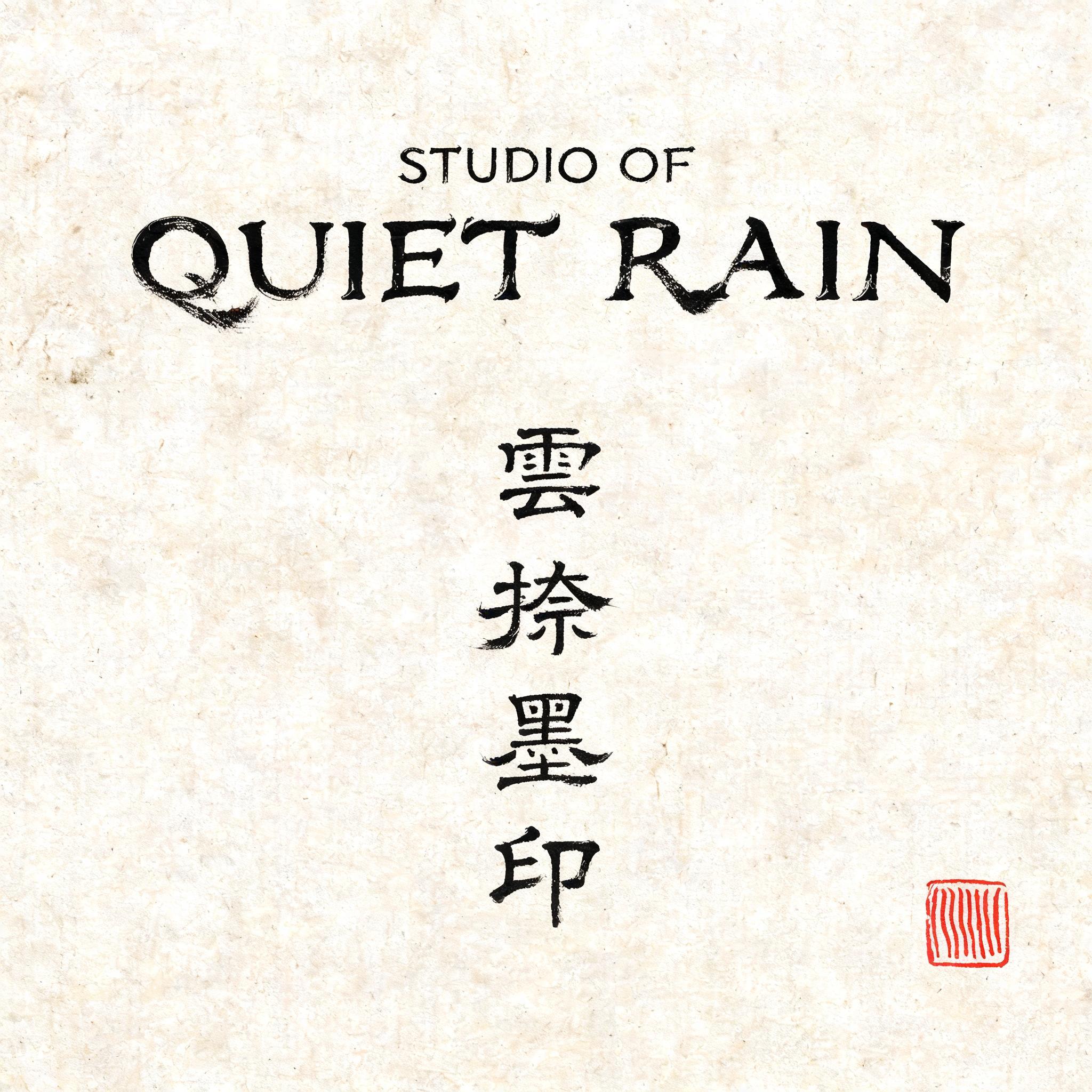

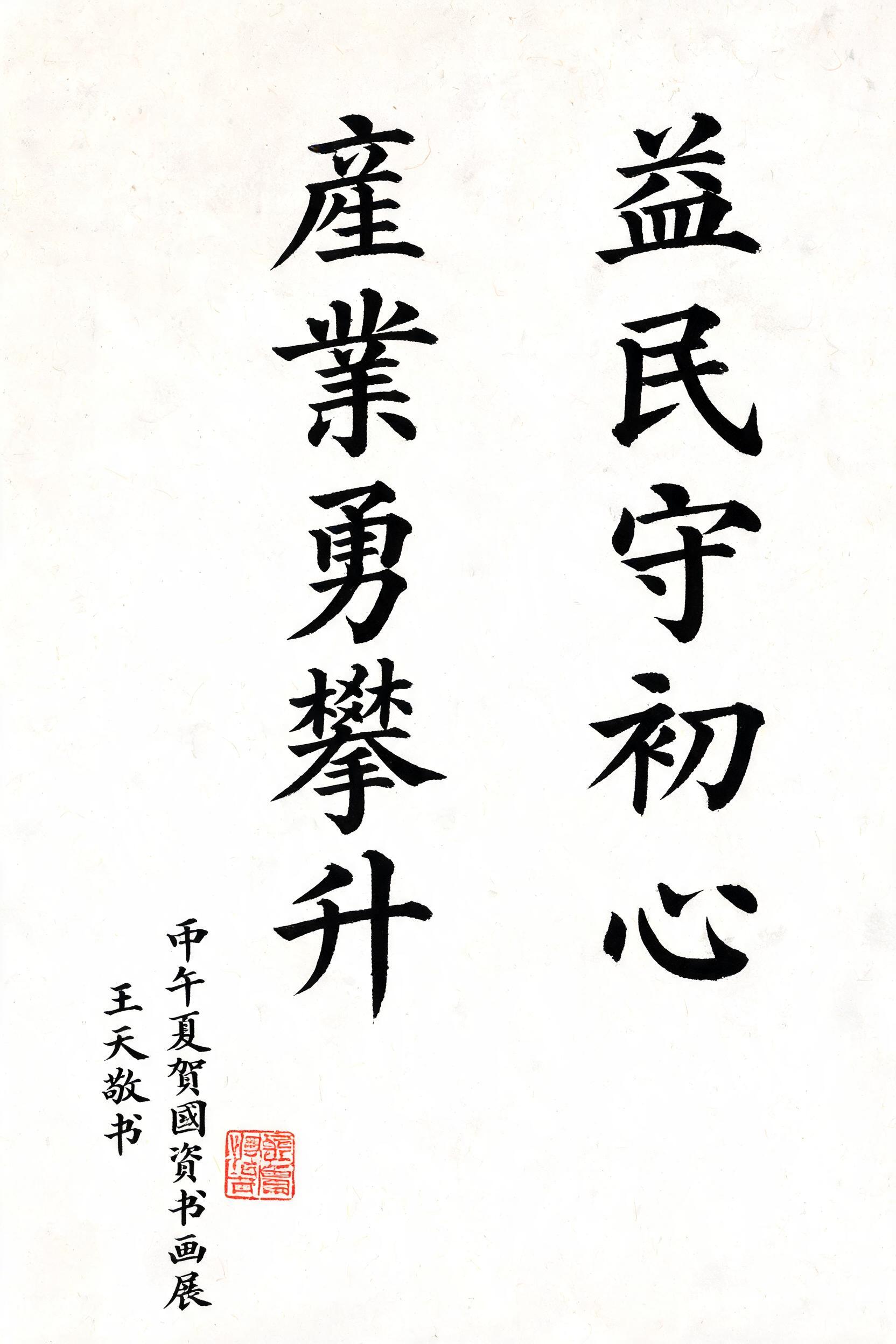
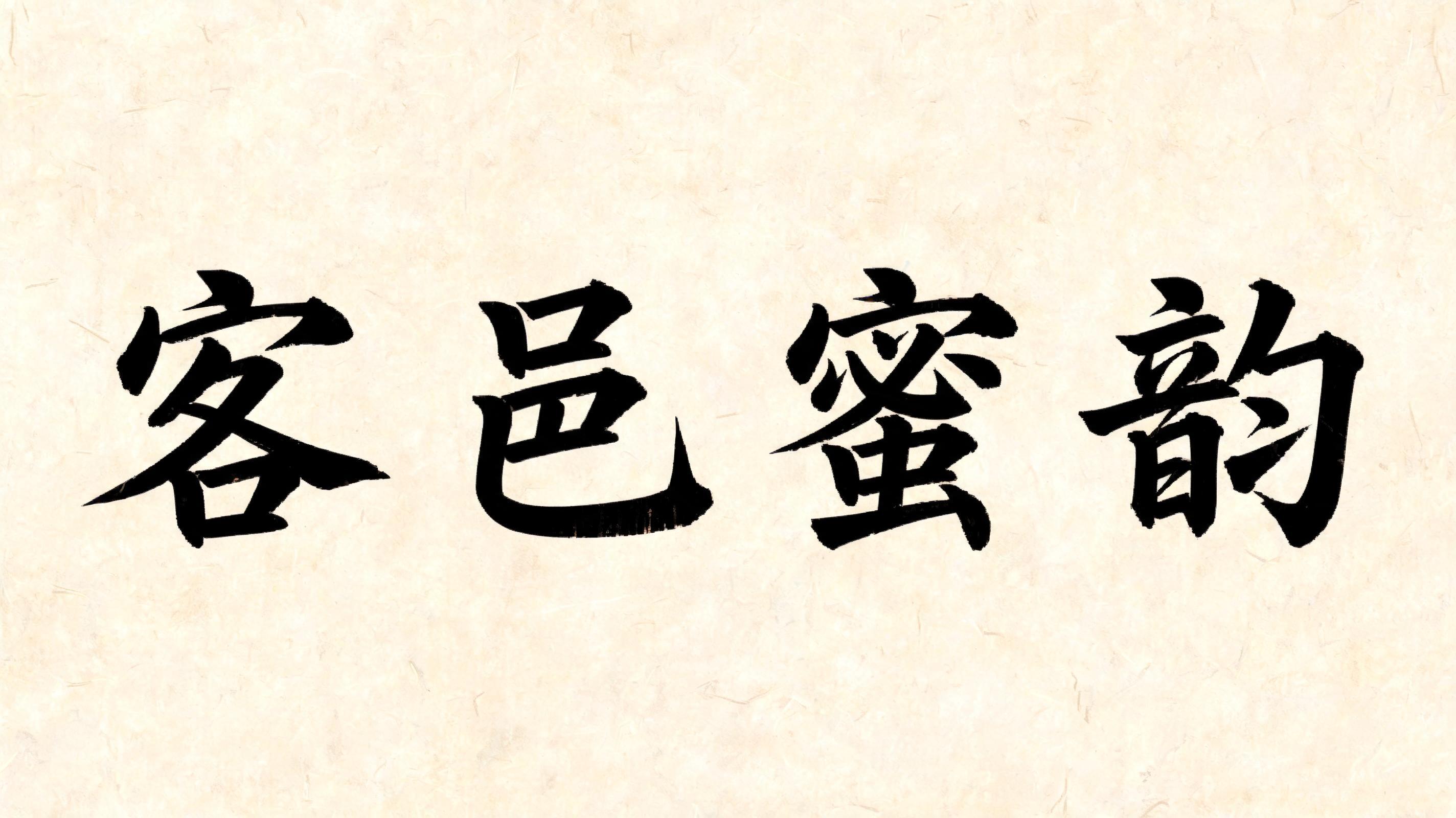

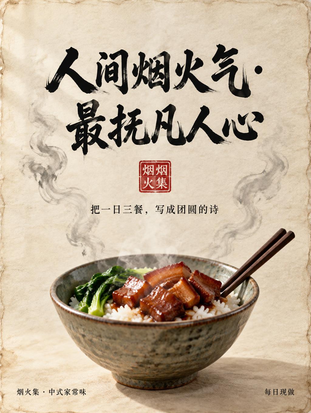
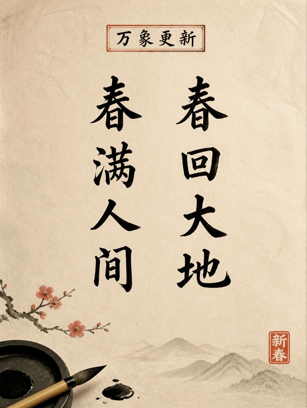


„Nicholas Tay“ ist ein Chinesischer Tuschepinsel-Texteffekt, erstellt mit FontVibe KI. Chinesische Sumi-Tuschekalligrafie im Pinselstil, übertragen auf lateinische Buchstaben. Tiefschwarze Tusche mit authentischer Borstentextur, von dick zu dünn variierenden Strichen und Reispapier-Atmosphäre. Perfekt für das Branding chinesischer Restaurants, Kampfkunst, Wellness und kulturelles Design.
rendered in Chinese ink brush calligraphy style. Letterforms painted with a fully loaded sumi ink brush — deep black ink, visible bristle marks along stroke edges, wet ink pooling at stroke starts, feathered dry-brush trailing ends. Authentic ink density variation: thick rich black cores fading to grey at thin passages. Rice paper texture visible behind. Traditional Chinese calligraphy energy — each stroke confident, intentional, irreversible. LETTERFORM PRIORITY: when the chosen font carries its own treatment, that font's letterform shapes take priority and own the letters; this style governs the sumi ink medium, the bristle and ink-density behavior and the rice-paper ground. FALLBACK MATERIAL: if the font carries no material of its own, render the letters as deep black sumi brush strokes with visible bristle marks, wet ink pooling at stroke starts and feathered dry-brush trails on rice paper. COLOR PRIORITY: keep the font's own colors if specified; otherwise rich black ink fading to grey at thin passages. Render the exact text “Nicholas Tay” as a decisive Chinese ink-brush inscription on raw warm-ivory xuan paper. Use fully loaded sumi ink with dense blue-black pooled pigment at the beginning of major strokes, then let each mark transition through charcoal gray into dry, feathered brush-hair endings. Preserve the externally supplied letterform silhouette exactly; apply the ink medium through irregular bristle texture, broken translucent passages, soft capillary bleed into visible paper fibers, and tiny ink granulation at heavy overlaps. Give the name strong visual dominance with a measured pause between the two words and generous untreated paper around the brush marks. A pale diluted ink-wash cloud sits behind the lettering, formed from watery gray blooms and softly evaporating edges, never obscuring legibility. Include a restrained vermilion cinnabar seal impression as a small decorative accent, with imperfect carved edges and uneven pigment transfer. Add a few isolated micro-splatter droplets near the most energetic stroke exits. Matte natural paper surface, subtle deckled-fiber texture, photographed under soft raking daylight that reveals absorbent fibers and wet-to-dry tonal variation. No digital-clean contours, no uniform black fill, no ornamental border, no translated text.
Gemacht für Schrift im chinesischen Stil
Generiert am 4. September 2026 · 2496 × 1664 · JPEG · BytePlus Seedream 5.0 · Von der erstellenden Person geteilt · Kostenlos kommerziell nutzbar (CC BY 4.0)


