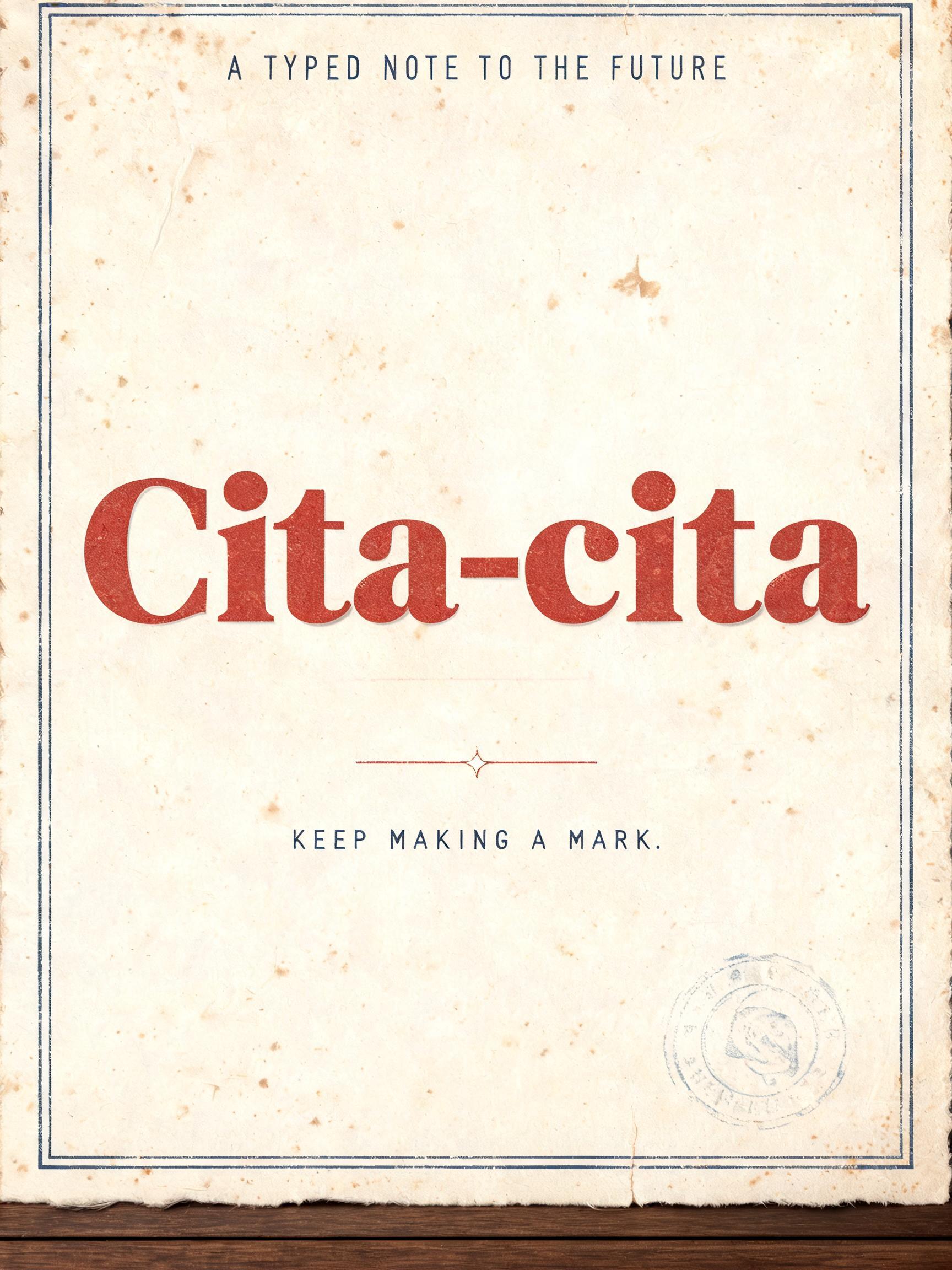
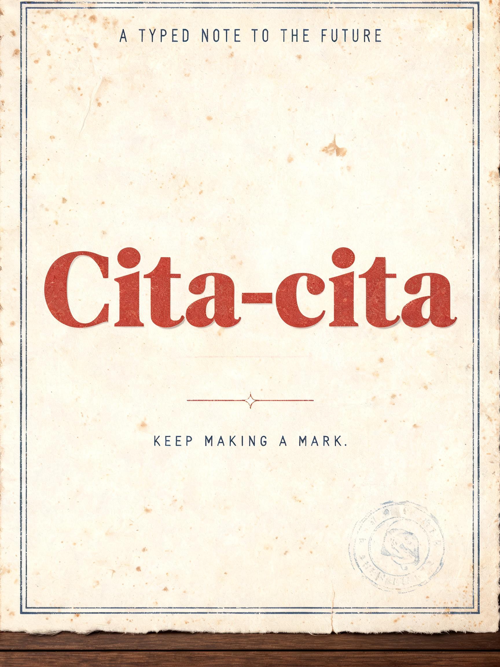
Cita-cita A TYPED NOTE TO THE FUTURE KEEP MAKING A MARK. - Vintage Text Effect


Nutzt BytePlus Seedream 5.0, das Modell dieses Werks · 15 Credits







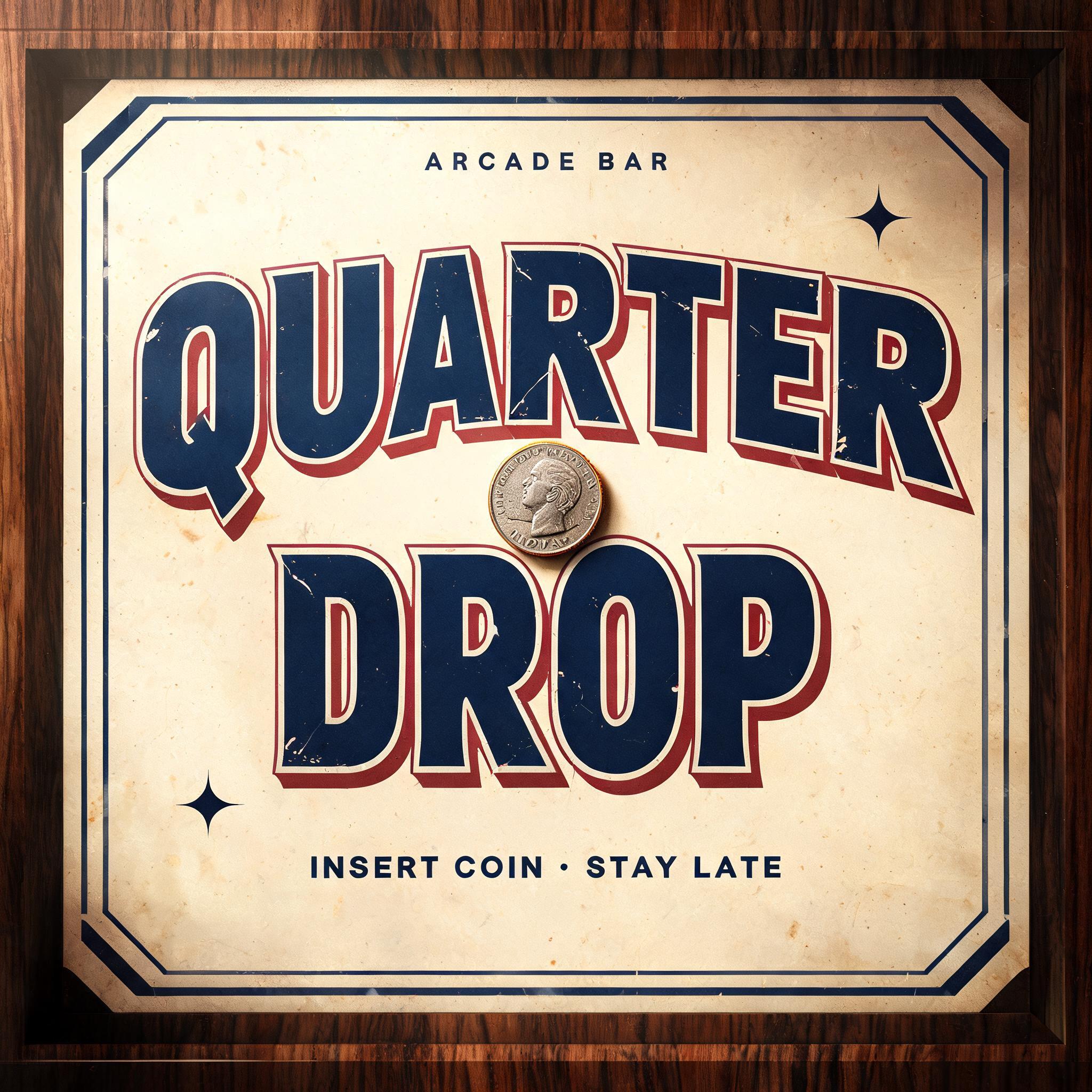


„Cita-cita A TYPED NOTE TO THE FUTURE KEEP MAKING A MARK.“ ist ein Vintage-Texteffekt, erstellt mit FontVibe KI. Serifenversalien im Buchdruck in cremefarbenen Baumwollkarton gepresst, mit leicht ausbrechender Farbe, auf dem Fundament einer alten Presse zwischen verstreuten Bleilettern.
Create a finished vertical literary-print poster, 3:4, with a warm aged heritage-print composition. Centered on thick, slightly uneven cream cotton paper mounted against a dark walnut tabletop edge visible only as a narrow lower strip. Paper has deckled texture, tiny sepia foxing marks, soft fibers, faint fold wear, and a thin double-rule border in faded navy with small breaks in the ink. Exact rendered text, set with flawless spelling: Top small line: “A TYPED NOTE TO THE FUTURE” Main headline: “Cita-cita” Bottom line: “KEEP MAKING A MARK.” Hierarchy: “Cita-cita” is dominant, centered, spanning 78% of the page width across one line. Draw it as custom retro slab serif display lettering: wide sturdy proportions, uniform heavy strokes, thick square slab serifs wider than the stems, low contrast, compact mid-century roadside-sign construction. Print it in faded brick-red ink pressed deeply into the cotton paper; slightly softened outer edges, minute irregular ink breakup, subtle offset shadow impression and tiny speckled voids inside the red ink, like a hand-fed letterpress sheet. Add a restrained typewriter character through a very slight baseline imperfection and mechanical ink mottling, without changing the slab-serif structure. Set the upper and lower supporting lines in small navy monospaced typewriter-style capitals, lightly worn black-blue ink, generous tracking. The upper line sits centered near the top inside the border; the lower line sits centered below the headline, separated by a thin faded red rule and a tiny centered four-point star. Leave generous empty paper around all text. A small faded postal-style date stamp motif, purely decorative and unreadable, sits low right outside the text blocks. Warm amber light from upper left creates shallow paper relief and realistic debossed letterpress shadows. Restrained palette: aged cream, sepia, faded brick red, dusty navy, dark walnut. Flat front-on print photography, no people, no devices, no neon, no glossy foil, no modern gradients, no extra readable text.
Gemacht für Retro-Text-Generator
Generiert am 5. September 2026 · 1728 × 2304 · JPEG · BytePlus Seedream 5.0 · Von der erstellenden Person geteilt · Kostenlos kommerziell nutzbar (CC BY 4.0)


