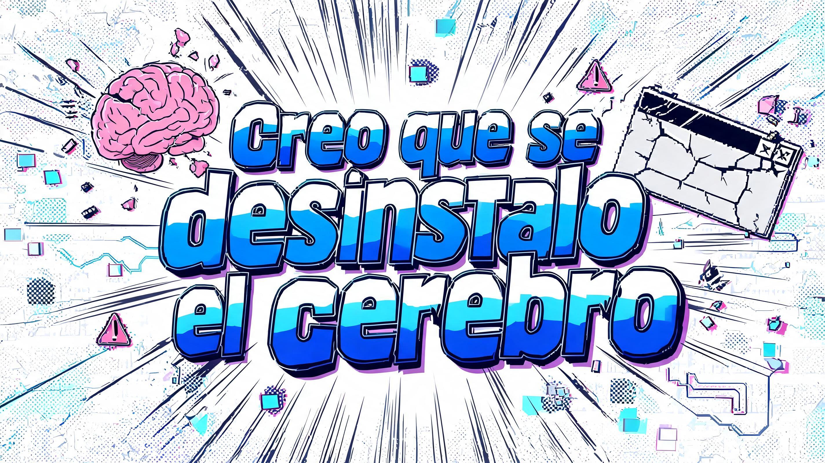
Creo que se desinstalo el cerebro - Anime Text Effect


Nutzt BytePlus Seedream 5.0, das Modell dieses Werks · 15 Credits



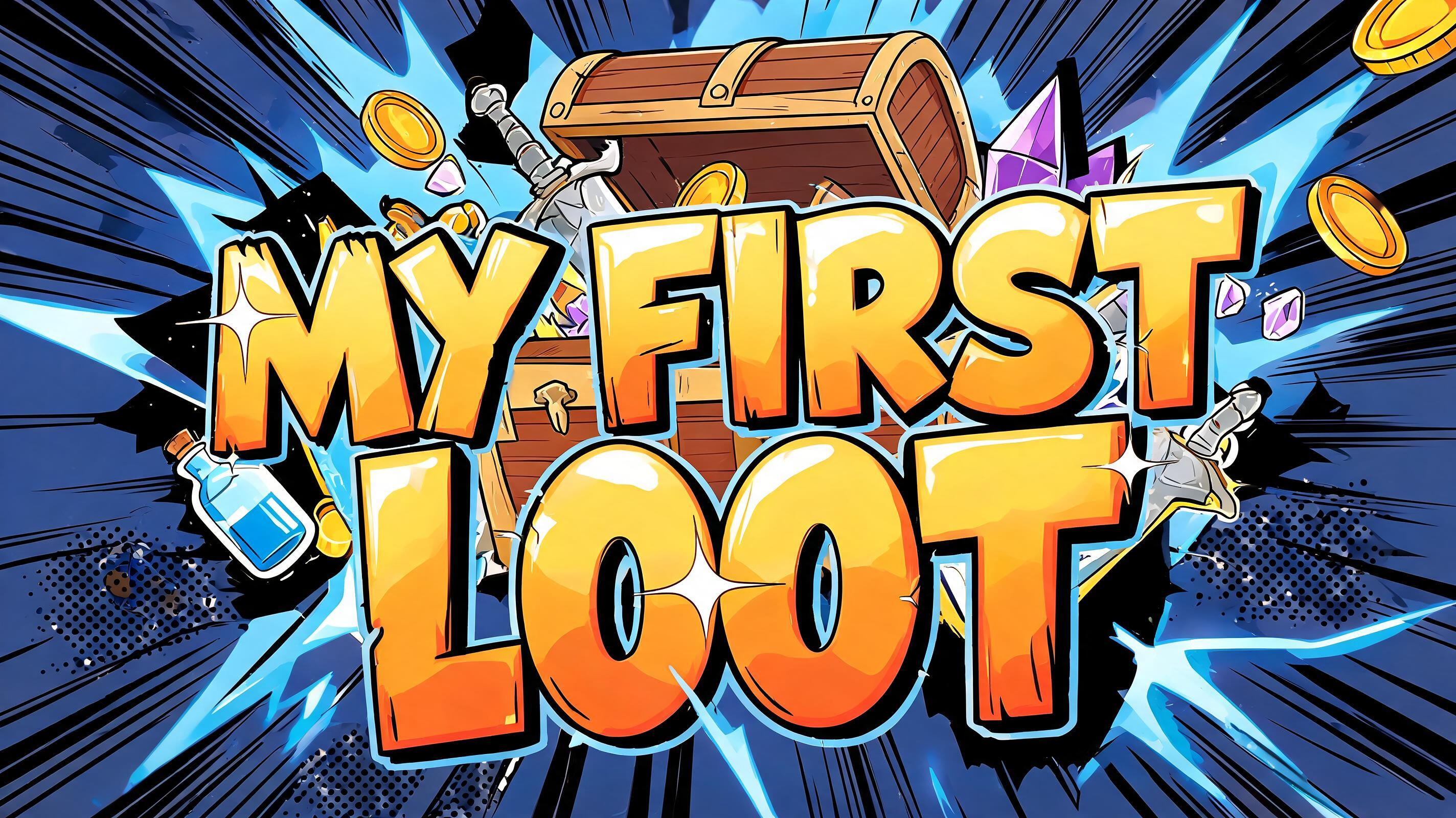
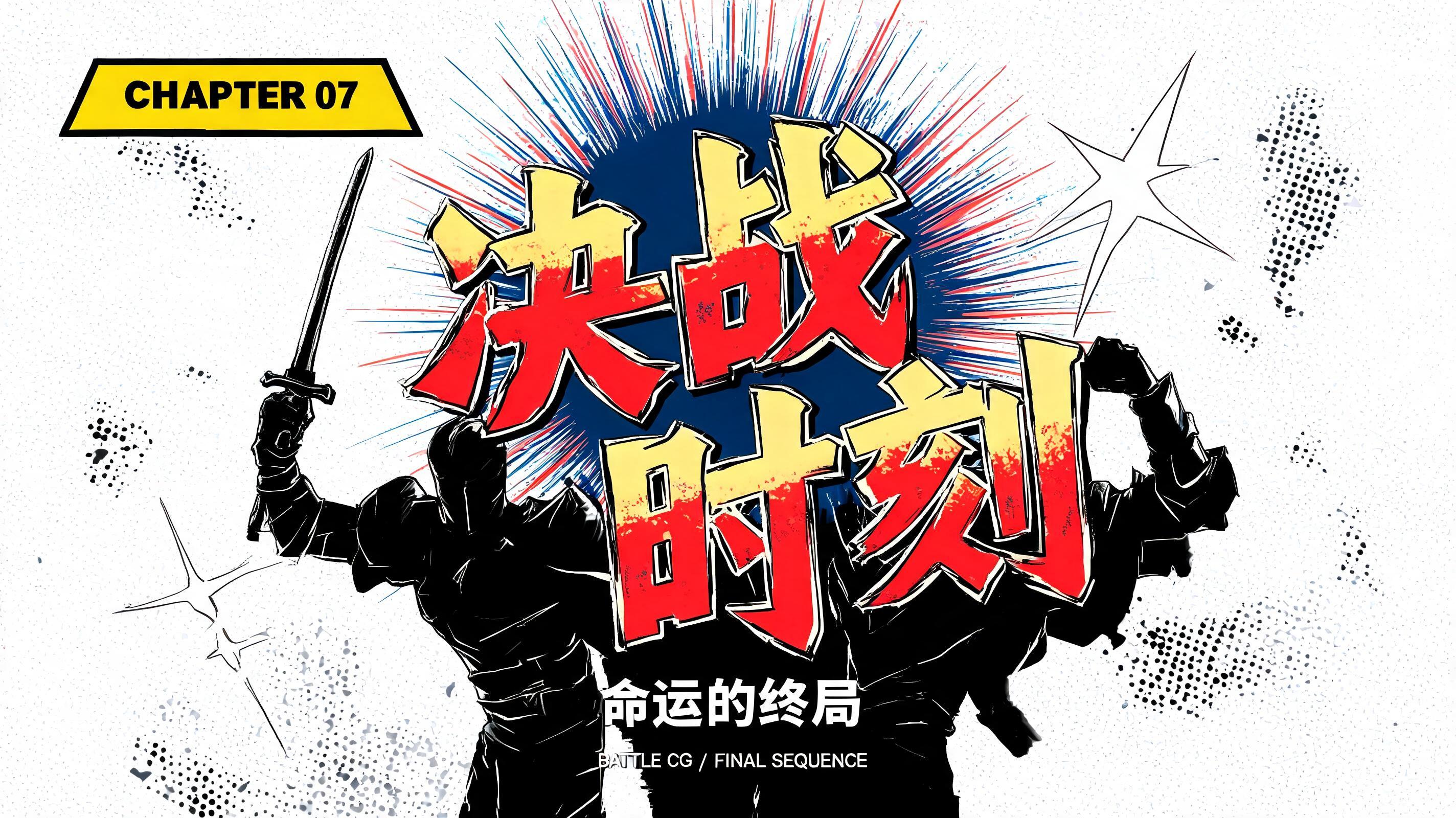
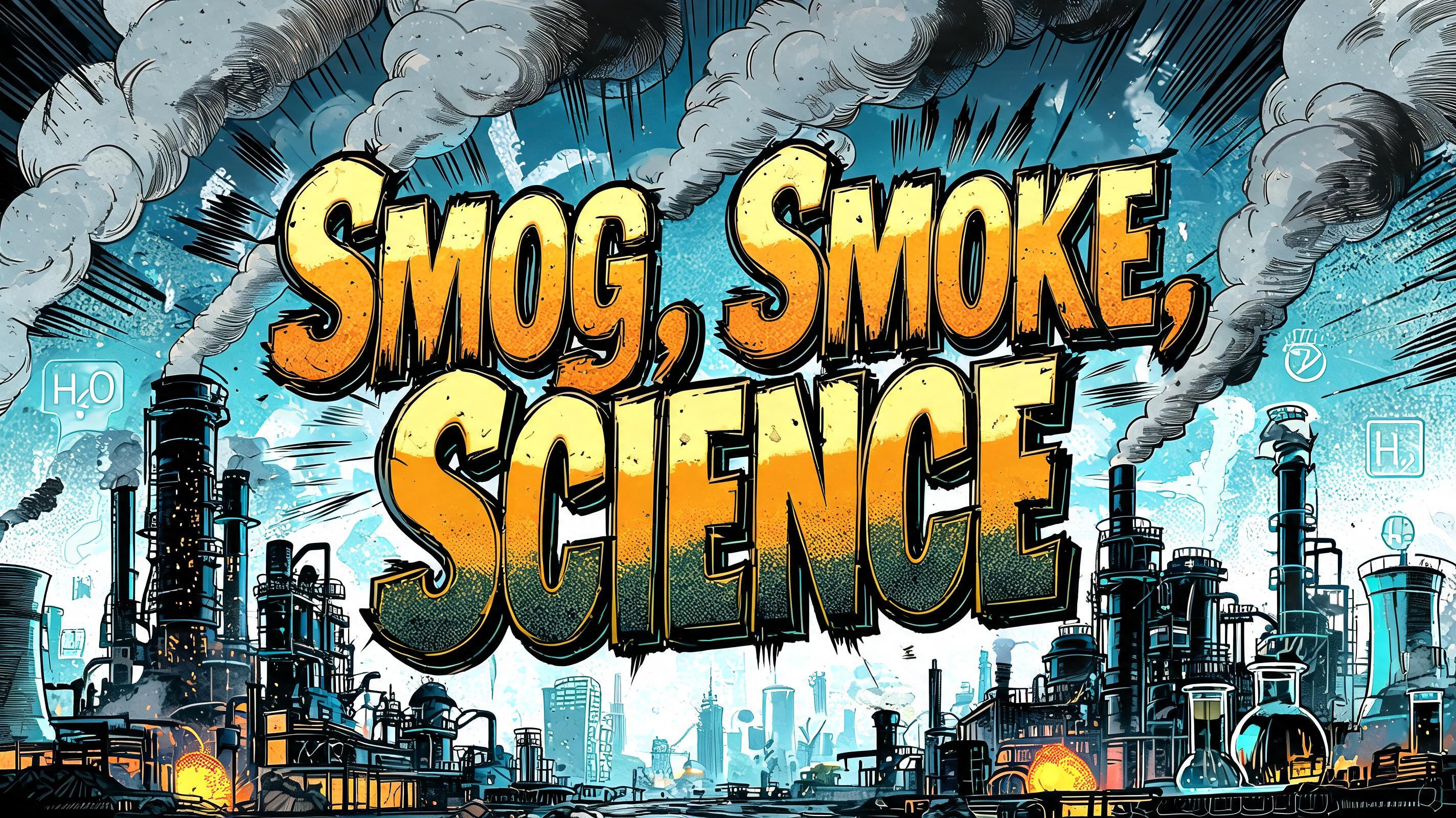
„Creo que se desinstalo el cerebro“ ist ein Anime-Texteffekt, erstellt mit FontVibe KI. Shōnen-Manga-Titelschrift: dicke, von Hand getuschte schwarze Konturen, flaches Cel-Shading in harten Licht- und Schattenbändern, schräg gestellte, dynamische Buchstaben auf Weiß mit strahlenförmigen Speedlines.
rendered as Japanese shounen anime title treatment — bold hand-inked manga lettering with authentic cel-shaded visual energy. Letter construction follows classic Shonen Jump title card standards: thick black ink outline with natural brush-weight variation defining each letter boundary; flat cel-shading fill with three hard-edge zones — bright highlight zone on upper letter face, highly saturated primary color zone at center, deep shadow zone at lower edge; all zone boundaries knife-edge hard, zero gradient blur, pure flat offset-print ink physics. Energy signature: high-contrast color + thick ink outline = letters that look physically printed on manga paper. The typographic language of Dragon Ball, Naruto, One Piece, Demon Slayer, Jujutsu Kaisen title cards — maximum manga kinetic energy, iconic and immediately recognizable as Japanese anime title typography. LETTERFORM PRIORITY: when the chosen font carries its own treatment, that font's letterform shapes take priority and own the letters; this style governs the inked manga outline, the three-zone cel-shading and the kinetic energy. FALLBACK MATERIAL: if the font carries no material of its own, render the letters as bold hand-inked shounen title lettering with a thick black brush outline and hard three-zone cel-shading. COLOR PRIORITY: keep the font's own colors if specified; otherwise a high-saturation primary fill with hard highlight and shadow zones. Japanese shounen anime comedy title card for the exact text “Creo que se desinstalo el cerebro”. Render the phrase as the dominant headline with exaggerated manga impact, each character surrounded by a thick black brush-ink outline with natural pressure variation and tiny irregular ink flecks. Apply flat three-zone cel shading: electric cyan-white upper highlight planes, saturated cobalt-blue midtone faces, and deep indigo lower shadow planes; every transition is a sharp printed-ink boundary with no airbrushed gradients. Surround the lettering with a chaotic exploded computer-brain interface: a pink cartoon brain hovering beside a cracked uninstall dialog box, loose pixel blocks, detached circuit traces, warning triangles, tiny screw heads, and fragmented desktop-window panels flying through the scene. Use radial manga speed lines, black starburst impact marks, halftone dot clouds, white paper texture, and cyan-magenta registration-offset accents. Add a small visual progress bar reading as corrupted UI shapes only, with no additional readable words. Hard cel-shaded lighting, crisp black contour work, saturated offset-print palette, sharp silhouette separation, dense shounen chapter-title energy, clean readable hero text, high-resolution anime key visual.
Gemacht für Manga-Schrift-Generator
Generiert am 13. September 2026 · 2848 × 1600 · JPEG · BytePlus Seedream 5.0 · Von der erstellenden Person geteilt · Kostenlos kommerziell nutzbar (CC BY 4.0)


